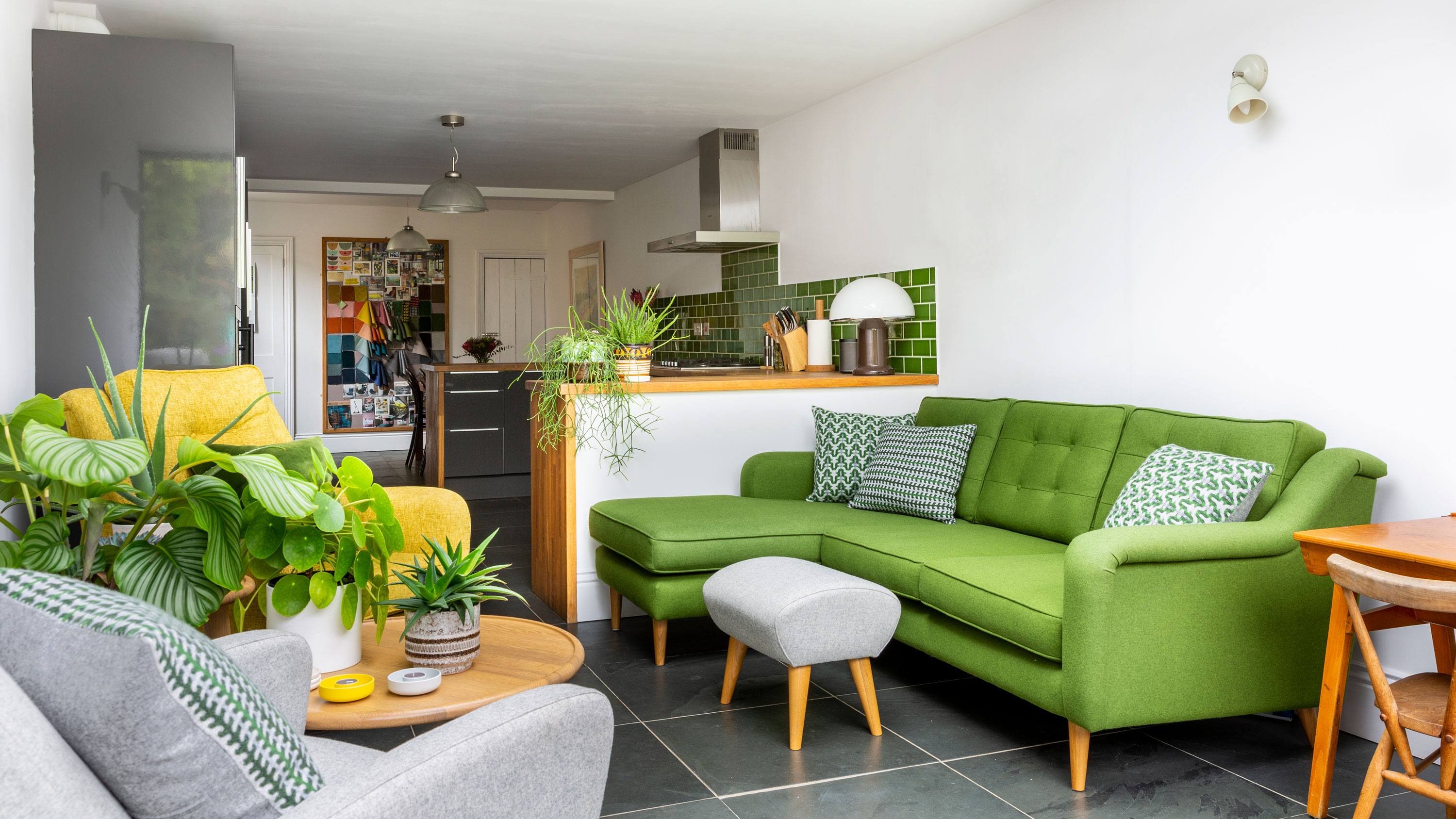
Each morning, when Joanne Coe gets home from dropping her daughter Evie off at school, she puts a pot of coffee on the hob and sets up her laptop on the table in her extended kitchen. Just like that, Jo’s stylish and individual three-bedroom home in a leafy part of Hitchin, Hertfordshire, is transformed into the office and showroom of her small design business, Living Room, which she set up two years ago after 20 years of working as a commercial furniture buyer.
Inspired to transform your home with an extension, just like Jo and Peter have? Go to our guide extending your home for plenty of advice on how to do it. And don't miss the rest of our real home transformations – they're all on our hub page.
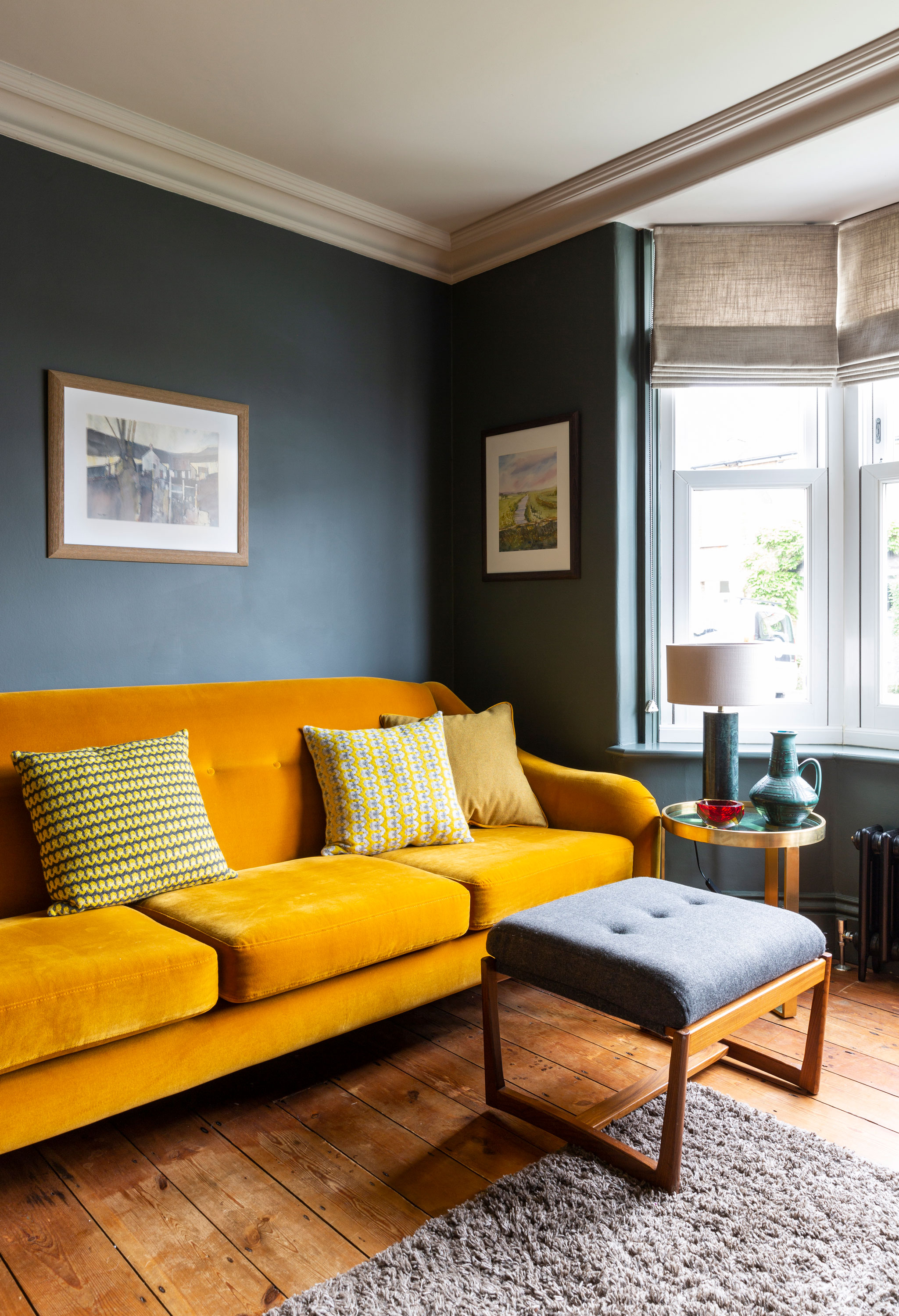
The dark grey-green wall colour is matched from the slate tiles in the bathroom. Sofa in Designer’s Guild fabric and Sally Weatherill cushions, Living Room. 1960s G Plan footstool, Ebay. Side table, Made. Green marble lamp, Graham & Green
Profile
The owners Joanne Coe, who runs furniture design business Living Room (livingroom.uk.com), lives here with her husband, Pete, head of school at a north London adult education college, and their daughter, Evie
The property An extended three-bedroom Victorian semi in Hitchin, Hertfordshire
Project cost £127,000
This narrow Victorian property, originally a worker’s cottage, has been extended at the back to create a long, seamless, open-plan kitchen-diner and living space, where the family spend most of their time, and which at the far end incorporates a roof lantern and bi-fold doors to the garden. Jo’s signature style – a fresh, modern simplicity with a nod to mid-century design – is everywhere to be seen, as are the fruits of her labour – a collection of Living Room-brand upholstered furniture and solid wood cabinetry that’s strongly contemporary while also hinting at her and Pete’s passion for vintage.
‘The house is the brand’s muse,’ she says. ‘It influences the designs because in living with my own products, I’m aware of how I want things to function.’
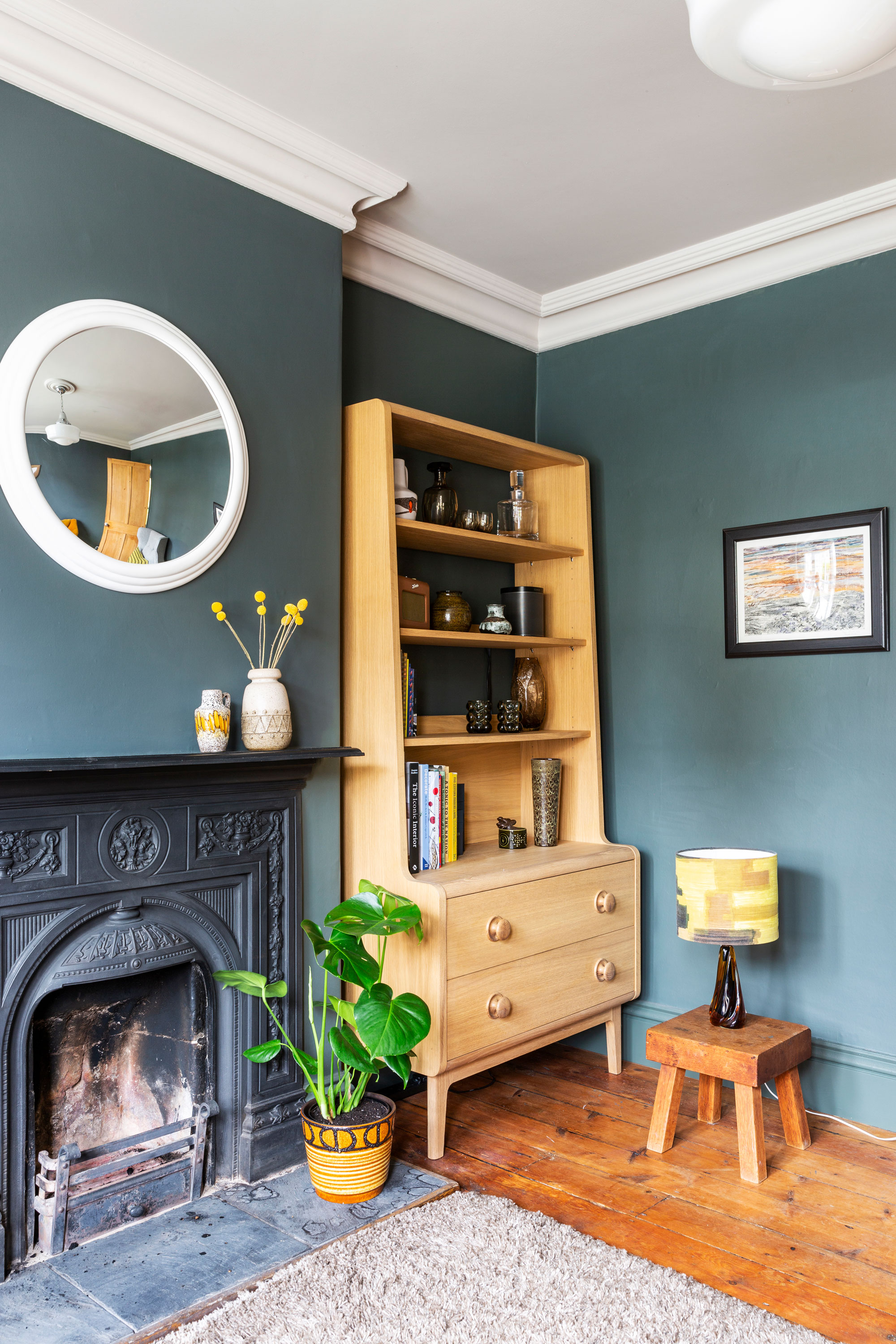
We wanted to keep the period feel of the front room with its original cast-iron fireplace, and actually put back in the right skirting and cornicing,’ says Jo. Bookcase, Living Room. Vintage glass lamp base with handmade shade, Winter’s Moon
Pete, Jo and Evie moved into the house in October 2011, having left a two-bedroom flat in London’s Finsbury Park in search of a better quality of life and good schools. With a shortage of three-bedroom properties in the area and Hitchin’s larger four-beds out of their price range, the challenge was to find a two-bed that could be extended. After three months of looking, the estate agent turned up a turn-of-the-century two-bed with an unusually long garden. ‘What ticked the boxes were location and scope,’ says Jo. ‘As soon as we went into the back garden we knew it would be easy planning-wise because there were other properties in the row that’d been extended.’
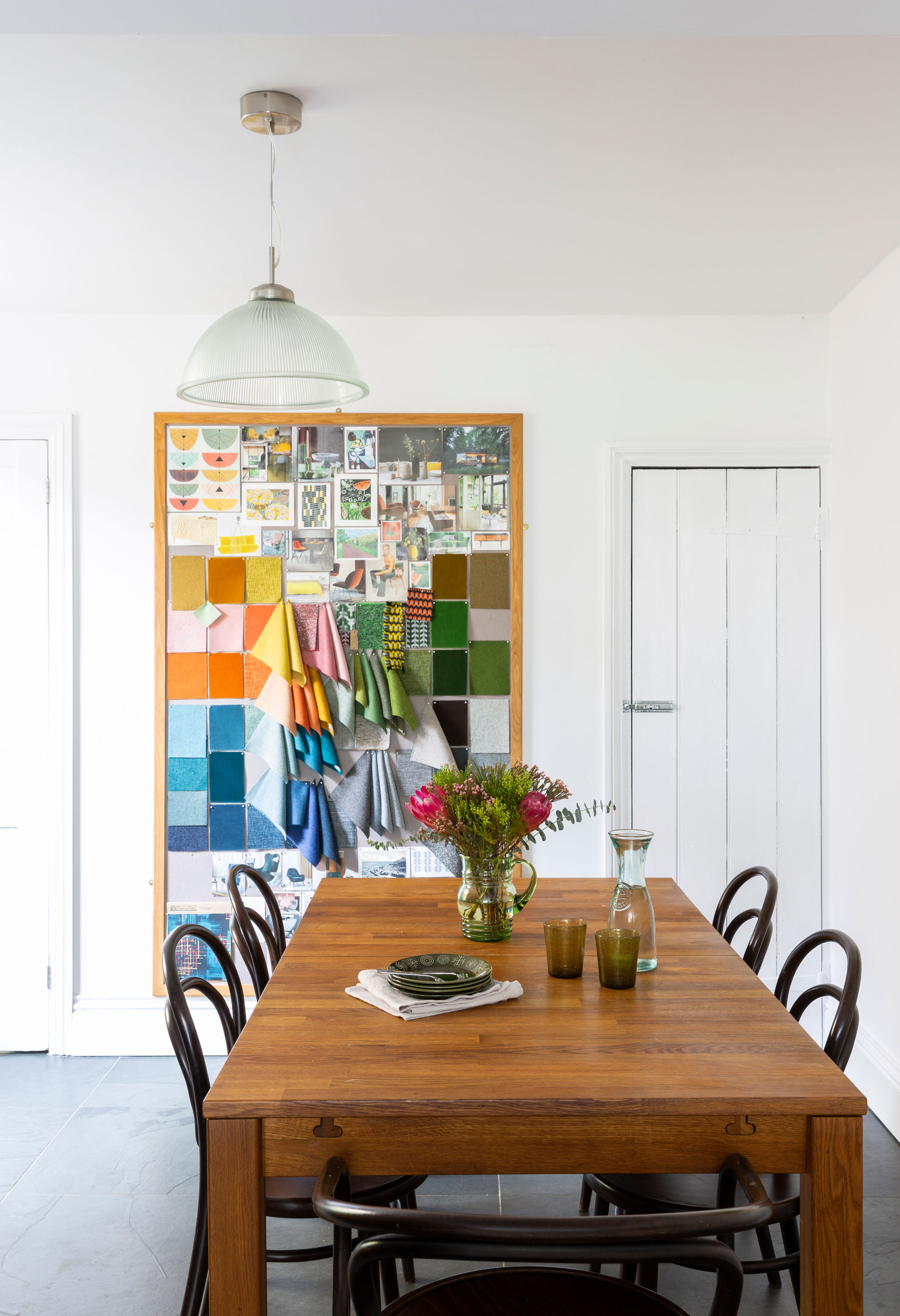
‘The mood board on the back wall of the dining area is a vital tool for the business that I use every day,’ says Jo. Covered in fabric swatches and tear sheets, it also serves as colourful wall art. The bespoke dining table was made for Jo by a supplier. Michael Thonet dining chair, SCP. Ceiling light, Garden Trading
They found an architect and family-run building firm on recommendations from neighbours and, six months after moving in, moved out to a rented two-bed flat across the road. As well as extending the ground floor at the back, upstairs they gained a main bathroom (previously downstairs) and a third bedroom, with the second-storey extension stretching as far as the new roof lantern. ‘Being across the road, we were close to the build and every morning I’d pop in to answer questions before dropping my daughter at nursery and going to work,’ says Jo. ‘Moving out meant they were able to tackle it on all fronts, and within four months it was done.’
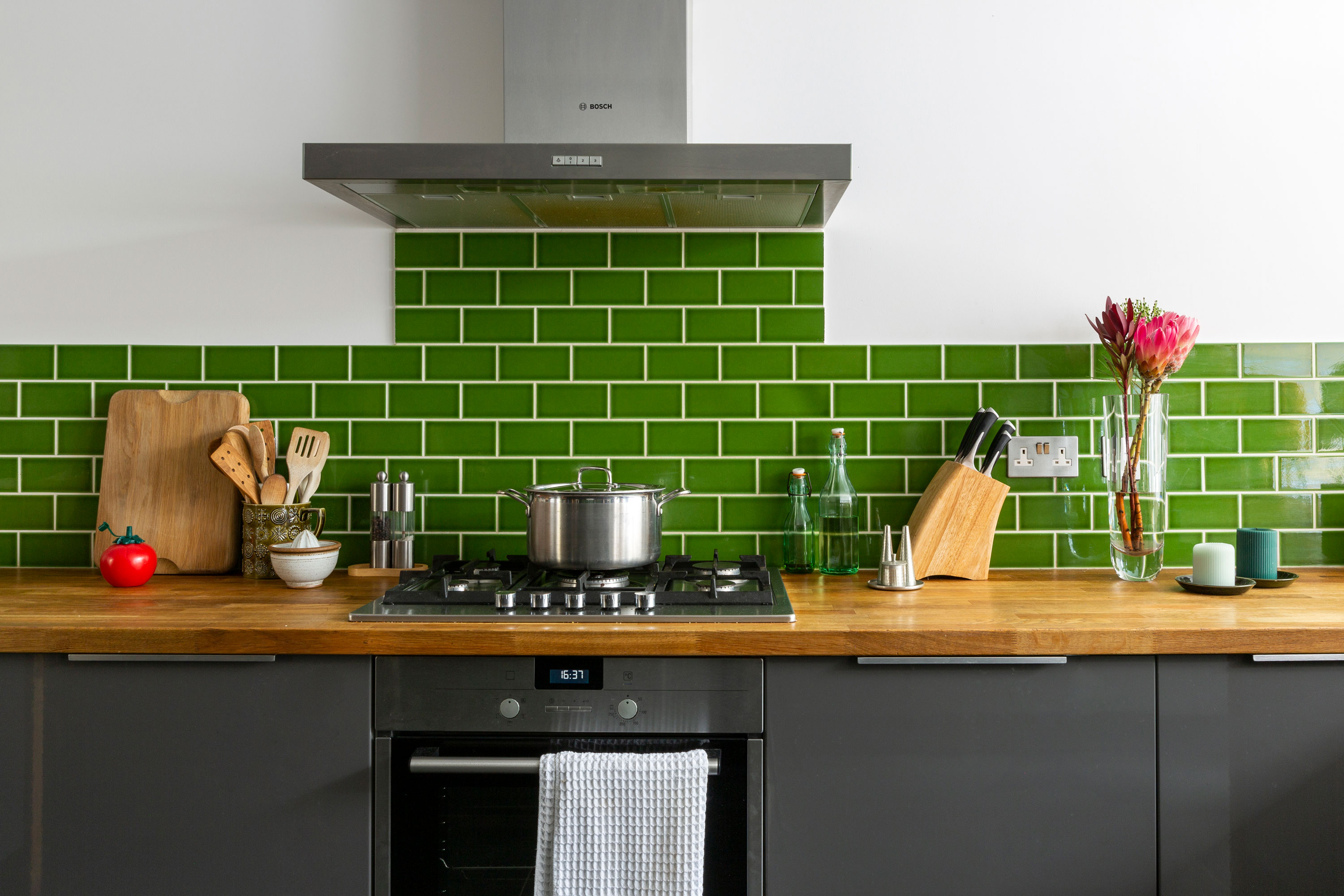
Jo chose bottle green metro tiles for the kitchen, in keeping with the green, white and grey colour scheme of this room. Kitchen and oak worktop, Ikea. Wall tiles, Topps Tiles
The couple ran out of money before they started the kitchen, so they decided on Ikea. ‘We invested a lot in the bi-folds, the stone flooring and the underfloor heating, and that felt more important,’ says Jo. ‘Having worked in commercial retail, I know Ikea kitchens are hard-wearing and a decent specification for the price. We spent extra money putting in solid oak tops to pimp it up a bit, and we’ve been really happy with it.’
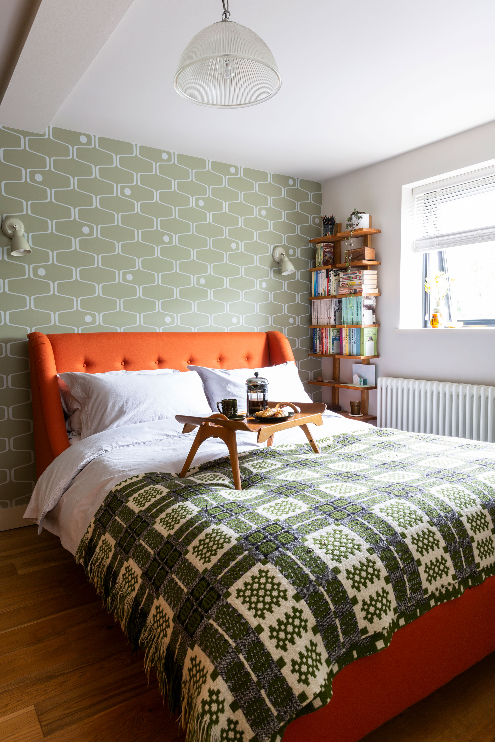
An upholstered bed in saffron orange wool makes a strong statement in the master bedroom where it’s set against the olive green of Net & Ball wallpaper by Mini Moderns. It was designed in conjunction with the Southbank Centre and is inspired by the carpet in the Royal Festival Hall. Bed, Living Room. Wall lights, Garden Trading. Oak wall shelving, John Lewis & Partners. Vintage Welsh blanket, Ebay. Crockery, vintage Portmeirion
Jo and Pete chose dark grey slate to lay over the underfloor heating for its heat-conducting properties, and because it allowed them to extend the same flooring out to the patio, creating a true indoor-outdoor space for the warmer months when the bi-folds are open. Jo settled on a Dulux white Potter’s Clay, to maximise light, adding metro tiles in the kitchen in her favourite colour – green. ‘The minute you walk into the kitchen you are hit with views of the garden, so green was already a dominant colour,’ she says.

A bright red wall brings a cheery pop of colour to Evie’s room, and is the perfect backdrop to a blind in Sanderson’s 1950s-design Mobiles fabric. The vintage 1960s teak chair is by G Plan. Wall painted in Atomic Red, Little Greene. Chandelier, wardrobe, side table and cushion, all Tesco. Rug, Made. Vintage suitcase, Sunbury Antiques Market. ‘Penny Chicken’ money box, Cath Kidston
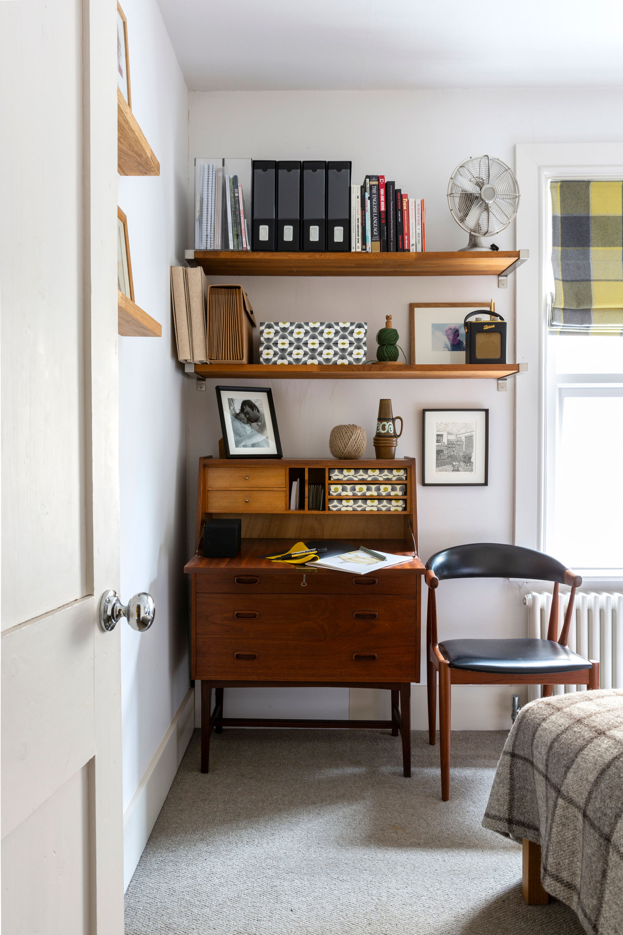
Jo and Pete’s house showcases their vintage furniture, and Living Room’s vintage-inspired designs. The spare bedroom features a ‘60s teak bureau by Younger and ‘60s chair in Danish Teak for Andersen, both Ebay. Shelves, Ikea. Walls painted in Potters Clay, Dulux. Vintage fat lava vase, Ebay
Contacts
Architect Red Shed Design
Builder Triner & Sons, 07778 903574
Bi-fold doors Origin
The green-grey-white theme with added pops of colour continues throughout the house. ‘The look is a combination of respect for the period of the property and our own taste,’ says Jo. ‘Pete and I have always been passionate about design from the 1950s and 1960s and are huge fans of Mid-century modern. We’ve always owned vintage, and I think Victorian properties are quite sympathetic to that look. We get a lot of customers visiting us here because they like to see Living Room in a home environment. When they come here and look around, it makes complete sense to them. They really get what we’re trying to do.’
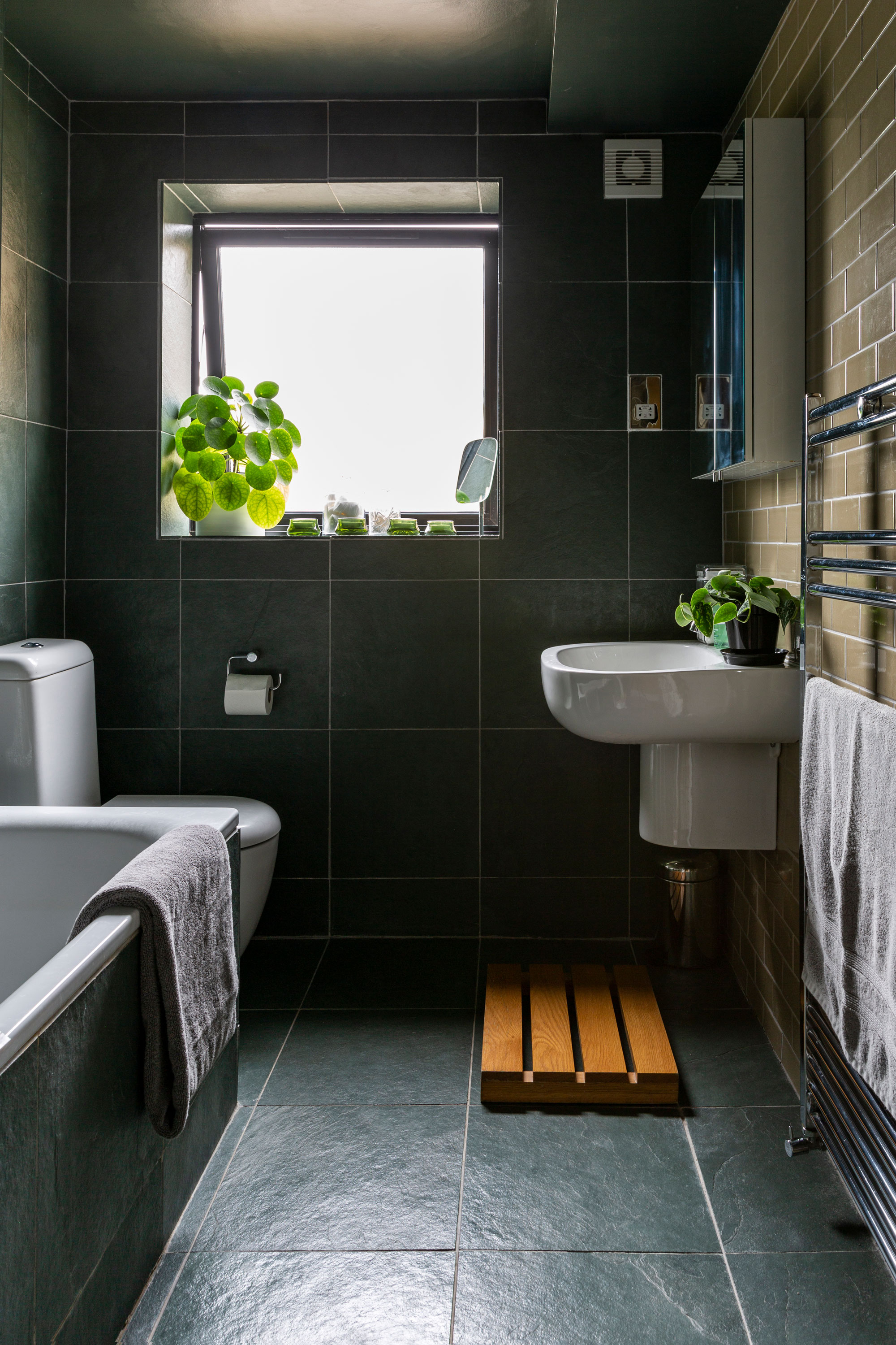
The slate floor and wall tiles in the bathroom reflect the slate tiles in the kitchen-diner. ‘I like my home to have a continuity of palette and materials. I find it calming and harmonious to live with,’ says Jo. Bathroom suite, Bathstore. Oak bath mat and towels, John Lewis & Partners
Subscribe to Real Homes magazine
Want even more great ideas for your home from the expert team at Real Homes magazine? Subscribe to Real Homes magazine and get great content delivered straight to your door. From inspiring completed projects to the latest decorating trends and expert advice, you'll find everything you need to create your dream home inside each issue.
More reading:
Join our newsletter
Get small space home decor ideas, celeb inspiration, DIY tips and more, straight to your inbox!
-
 This colourful home makeover has space for kitchen discos
While the front of Leila and Joe's home features dark and moody chill-out spaces, the rest is light and bright and made for socialising
By Karen Wilson
-
 How to paint a door and refresh your home instantly
Painting doors is easy with our expert advice. This is how to get professional results on front and internal doors.
By Claire Douglas
-
 DIY transforms 1930s house into dream home
With several renovations behind them, Mary and Paul had creative expertise to draw on when it came to transforming their 1930s house
By Alison Jones
-
 12 easy ways to add curb appeal on a budget with DIY
You can give your home curb appeal at low cost. These are the DIY ways to boost its style
By Lucy Searle
-
 5 invaluable design learnings from a festive Edwardian house renovation
If you're renovating a period property, here are 5 design tips we've picked up from this festive Edwardian renovation
By Ellen Finch
-
 Real home: Glazed side extension creates the perfect garden link
Louise Potter and husband Sean's extension has transformed their Victorian house, now a showcase for their collection of art, vintage finds and Scandinavian pieces
By Laurie Davidson
-
 I tried this genius wallpaper hack, and it was perfect for my commitment issues
Beware: once you try this wallpaper hack, you'll never look back.
By Brittany Romano
-
 Drew Barrymore's new FLOWER Home paint collection wants to give your walls a makeover
Drew Barrymore FLOWER drops 27 brand-new paint shades, and every can is made from 100% post-consumer recycled plastic.
By Brittany Romano
