
Ellie and Nick’s house rabbits were as important to their kitchen extension design as their young daughter, Tia. The couple wanted a space that would work for Rocco and Flannie’s free-roaming needs as much as the humans in the house, and top of the list for everyone was a flexible, open-plan space that could accommodate the family as they grow.
Enlisting the help of architects Nimtim, the couple have created a bright extension that works for all the family. Clever ideas like a ‘hutch’ door for the rabbits sit alongside touching additions like Tia’s tiny footprint set into a splashback tile. Ellie reveals how they created their dream kitchen.
Are you feeling inspired to add on to your home like Ellie and Nick have? We have masses of ideas and helpful advice on what to do and where to start in our feature on kitchen extensions.
For more real home transformations, head to our hub page.
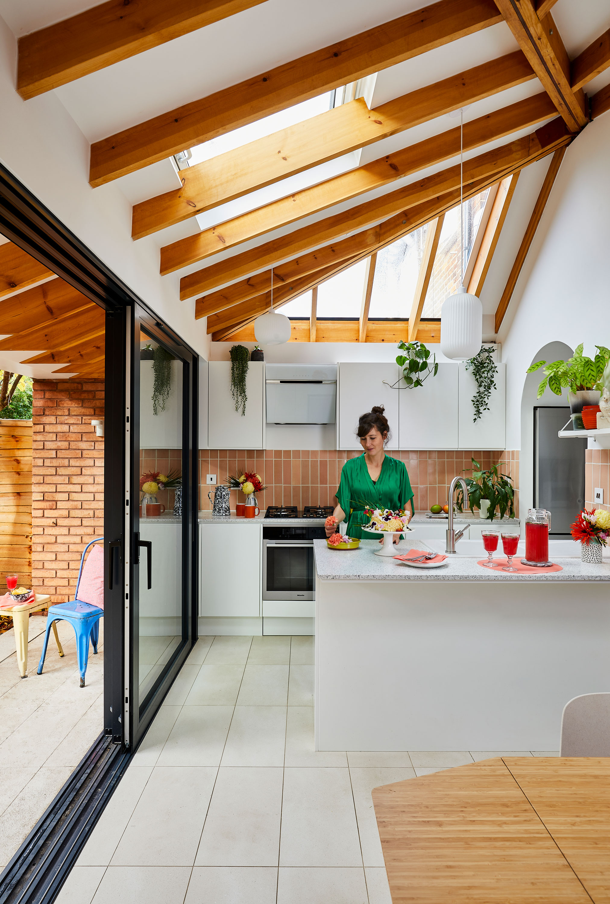
Ellie and Nick prioritised light in their new extension space – ‘We were like, “Give us as much as possible!”,’ says Ellie – through rooflights and full-width glazing. Rooflights, Velux. Rooflights, doors and windows, ODC Door & Glass Systems. Kitchen units, Howdens, and door fronts, Terrazzo by Diespeker. Pendant lights, Heal’s
Profile
The owners Ellie, a designer specialising in ceramics and glass, her partner, Nick, a social media consultant, their daughter, Tia, and pet rabbits Rocco and Flannie
The property A three-bedroom Edwardian end-of-terrace in Bermondsey, London
Project cost £200,000 for extension and whole house renovation
‘There were lots of defects in the surveyor report when we bought this house,’ says Ellie. ‘The windows were broken so you couldn’t open or close them. There was a small extension built by a previous owner but it was constructed badly. The roof was in a bad state and we were concerned about leakage. We decided that if we were going to fix it, we might as well do it the way we wanted to.'
‘We looked online at some projects we liked, contacted the architects and met with them to get ideas and rough price points. It was Nick who met Nimtim to begin with – they were a winner because he really liked their dog! All the signs pointed towards us going with them. We liked their style, their attitude, and their people, too.’
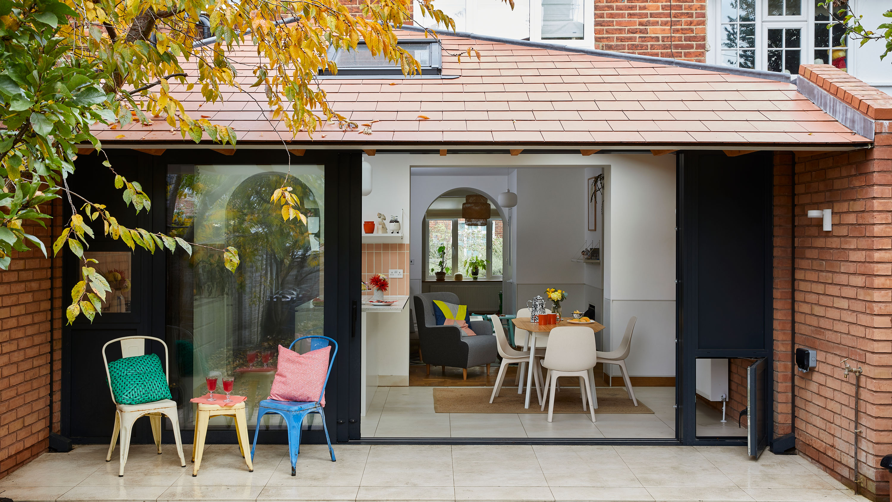
The roof of the extension overhangs the rear wall to create a sheltered terrace area. The couple’s pet rabbits have their own mini door out to the garden at one side of the space. Brick, Taylor Maxwell. Roof tiles, Marley
‘We were specific in terms of what we wanted, but we didn’t know how to express it in terms of materials. We needed something to prevent the rabbits from nibbling the skirting and edging – an issue in previous properties – and we wanted an open layout so we could easily monitor them. Nimtim showed us examples of what could work and we played around with layouts until we settled on something we loved.
‘We wanted a herringbone oak floor to tie in with the arts and crafts history of the house, and we used exposed beams to add warmth. The space needed to be bright and airy, too. We’re not British so we’re not used to the lack of natural light. We were like, “Give us as much as possible!” – hence the big skylights and the sliding doors.’
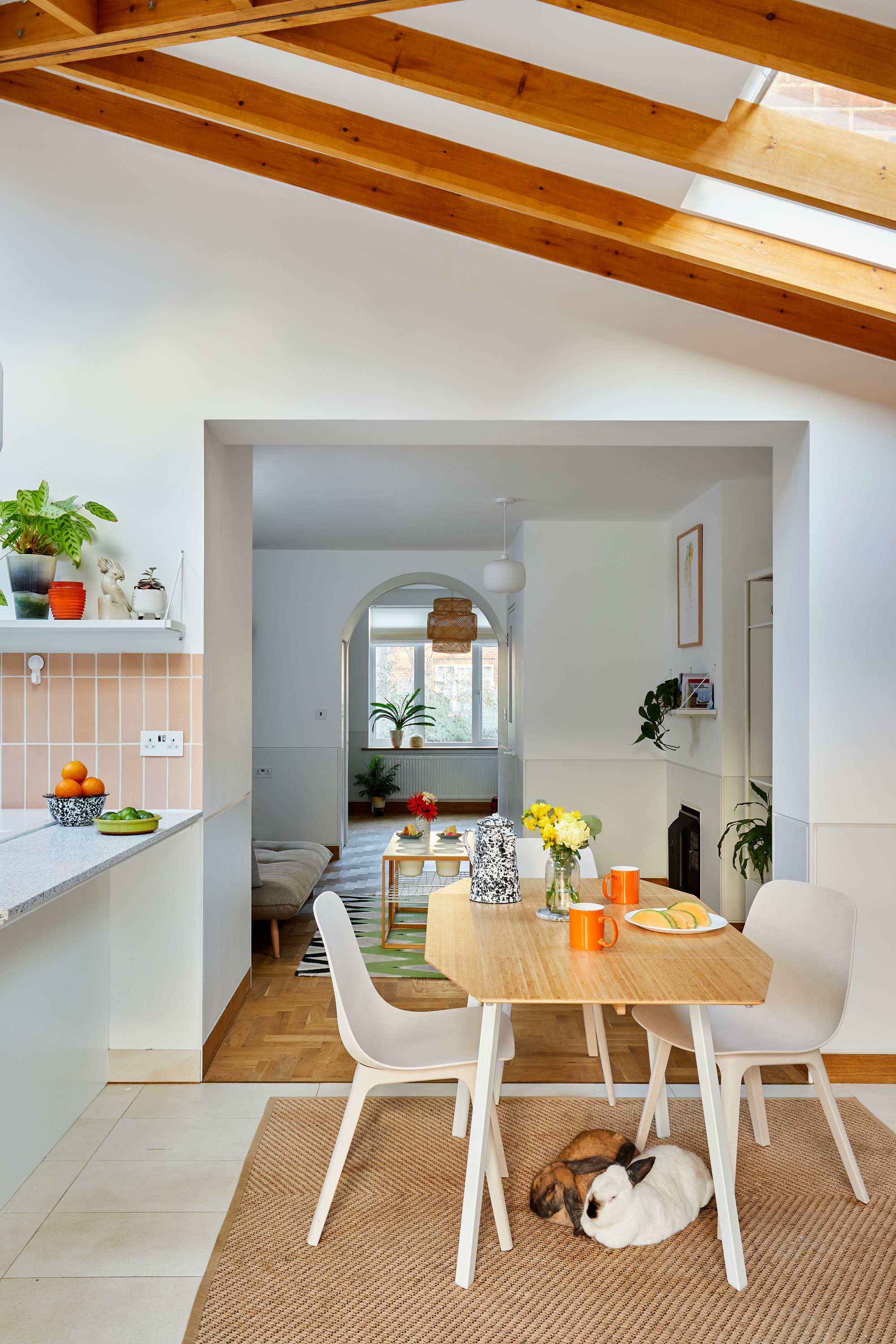
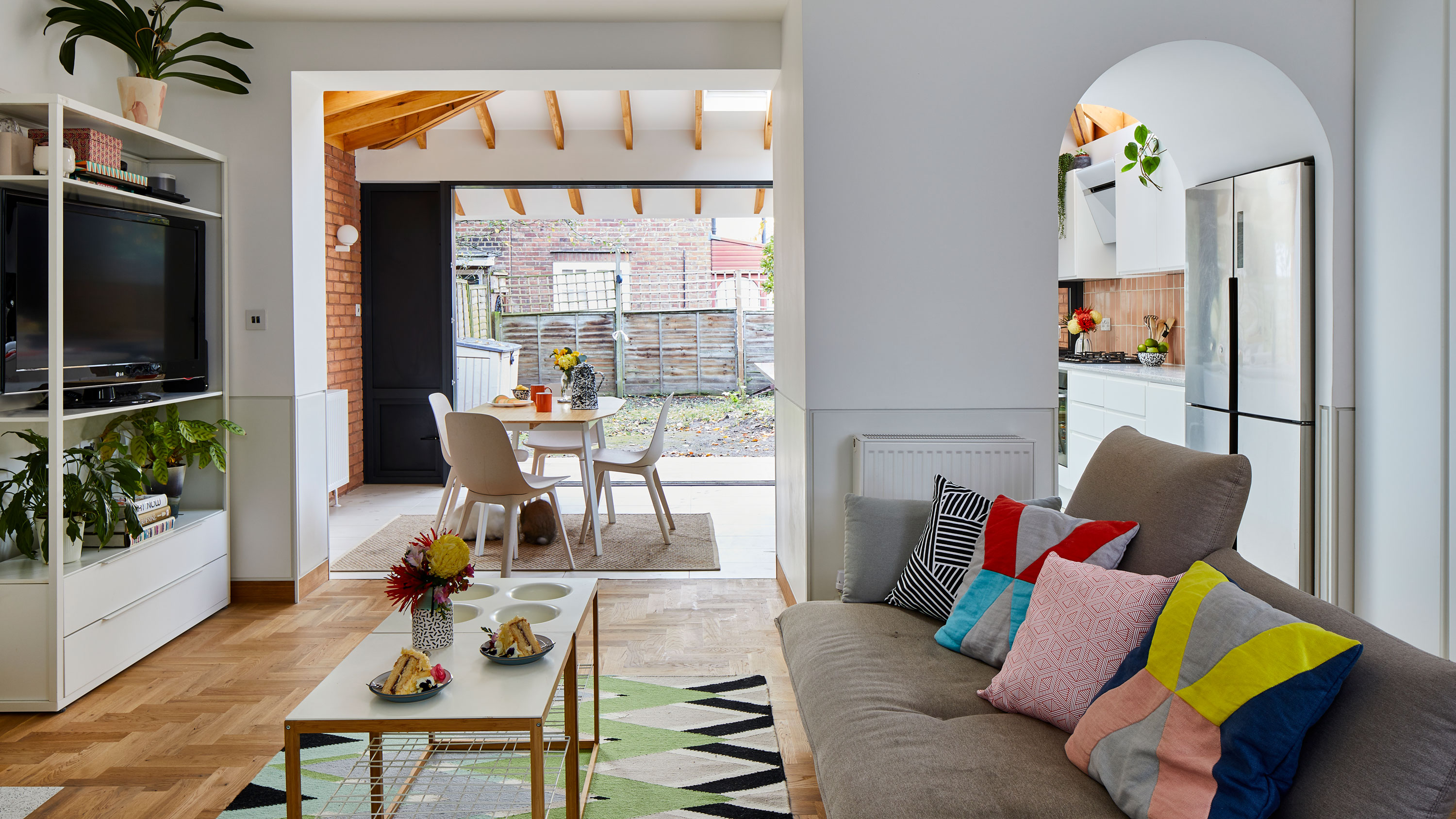
Keeping the layout of the living area open-plan means that Ellie can keep track of Tia and their two pet rabbits, Rocco and Flannie, whether she’s cooking or watching TV. Dining table, chairs, and rug, Ikea
'Because we had Nimtim and weren’t going through the project alone, we were more relaxed about the process. We were more than happy to pay the architect fee – Nimtim’s guidance took a massive load off us in terms of stress.
‘In any project, there’s some things that go unanticipated, but that’s just the way it goes. One thing we regret is not including the garden in the original renovation. We wanted to get finished and moved in as fast as we could, then think about the garden at a more convenient time – but now, we realise it might have been easier to do it all at the same time to save extra fuss and make the two spaces feel more connected. Mostly, we took our time to think about things. Every compromise we had to make, we were happy to do.'
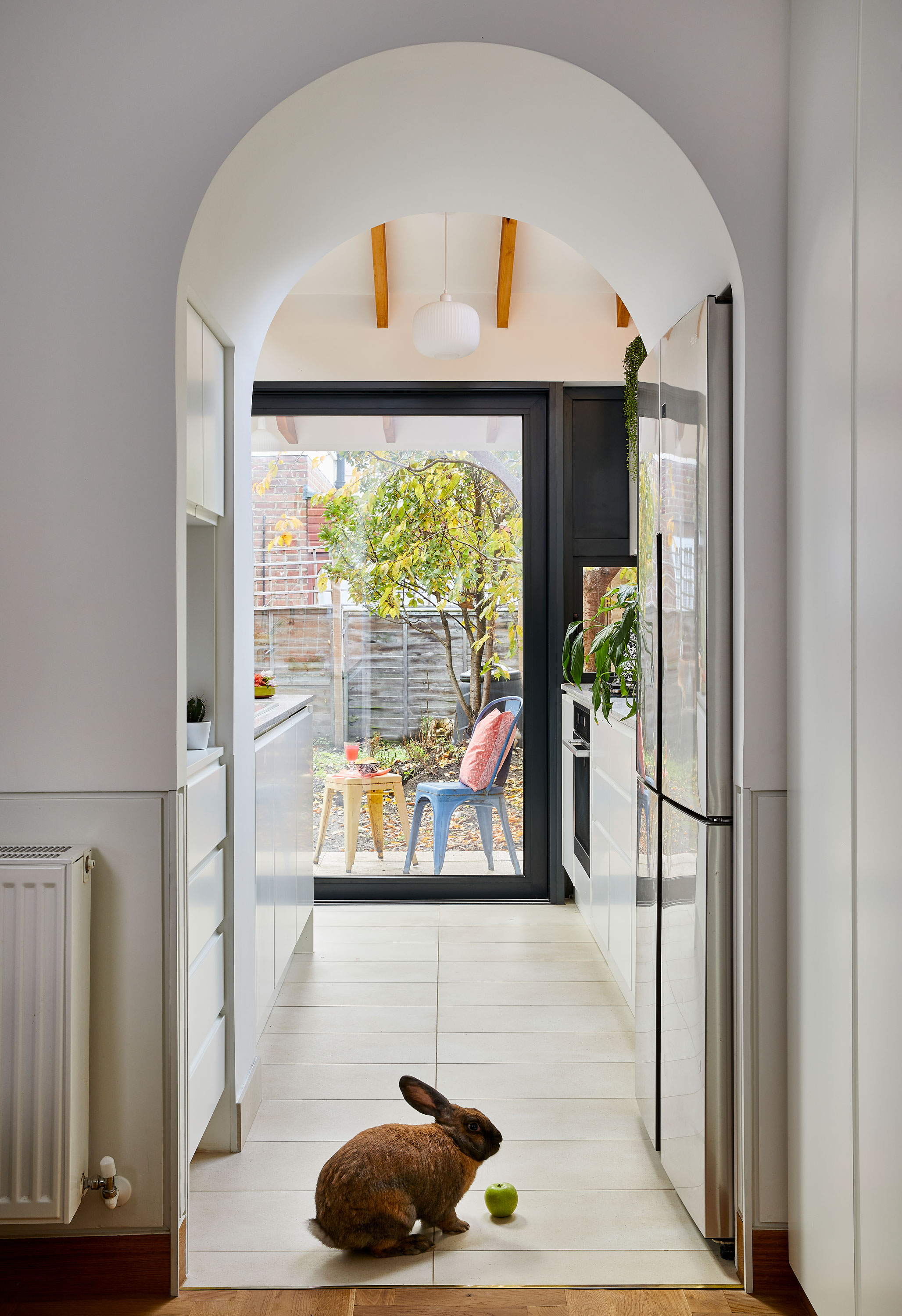
Floor tiles, Pentagon Tiles
‘One of the projects Nimtim showed us had tiles made bespoke by a ceramicist. Nick looked at me and said, “You’re a ceramicist – you could make the splashback tiles”. It gave me something to do while Tia was at nursery so I wasn’t just going crazy at home! We added her handprints and footprints to some of them. We made her and we made the extension, so this was a nice way to combine the two.
‘Nimtim’s solution to the rabbit problem was to add a line 90cm up the wall, under which everything was made rabbit-proof. The paint is washable and they used recessed oak skirting to prevent nibbling. It was an expensive undertaking but it works really well – Rocco and Flannie never go near the walls, and it’s a nice decorative feature.’

The couple struggled with how to use the middle room of the house until they settled on a multiuse live-play-sleep space. ‘We have family abroad so it’s useful when they come to stay,’ says Ellie. Sofa, Habitat. Coffee table and TV shelving unit, Ikea. For a similar rug, try Wayfair
Contacts
Architect Nimtim,
Structural engineer SD Structures
Main contractor TW Space Conversions
'We were trying to think of what we could do with the room in the middle
of the ground floor. It needed to be something versatile while our family grows. We treat it as a flexible space. It’s a living area and playroom during the day, a guest bedroom when family come to visit, and maybe another bedroom in the future.
‘My favourite part of the house is the kitchen – there’s a lot to love about it. We also love the terrace because we can sit outside and enjoy the garden even when it’s raining. Going open-plan has given us a lot of freedom. Everyone can do what they want, and I don’t have to worry about Tia because she’s always in sight. It takes away the anxiety of having a young child – and two mischievous rabbits.’
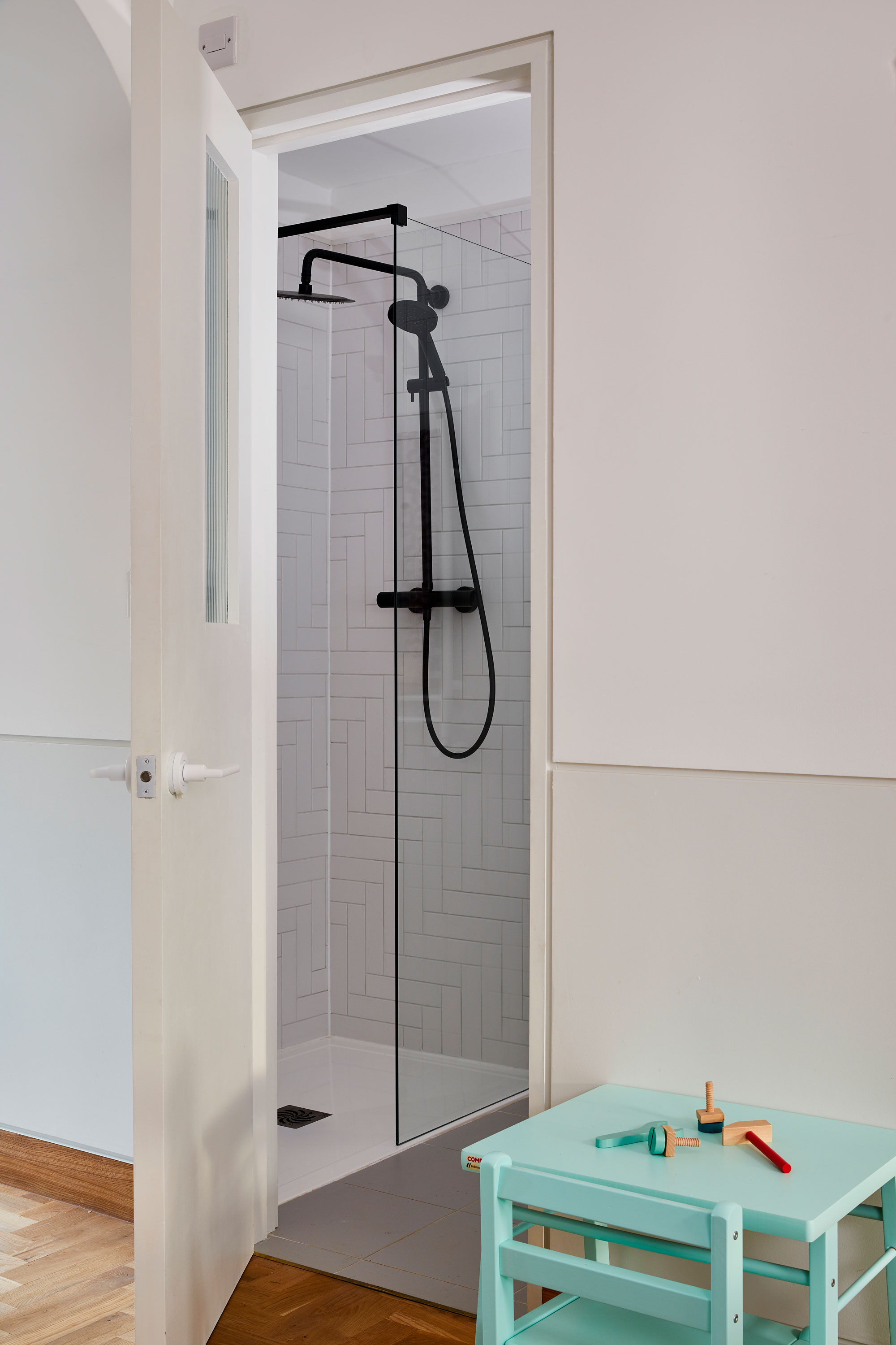
For a similar shower, try the JTP Vos Matt Black Thermostatic Shower, Victorian Plumbing
Subscribe to Real Homes magazine
Want even more great ideas for your home from the expert team at Real Homes magazine? Subscribe to Real Homes magazine and get great content delivered straight to your door. From inspiring completed projects to the latest decorating trends and expert advice, you'll find everything you need to create your dream home inside each issue.
More reading:
Join our newsletter
Get small space home decor ideas, celeb inspiration, DIY tips and more, straight to your inbox!

Formerly deputy editor of Real Homes magazine, Ellen has been lucky enough to spend most of her working life speaking to real people and writing about real homes, from extended Victorian terraces to modest apartments. She's recently bought her own home and has a special interest in sustainable living and clever storage.
-
 This colourful home makeover has space for kitchen discos
While the front of Leila and Joe's home features dark and moody chill-out spaces, the rest is light and bright and made for socialising
By Karen Wilson Published
-
 How to paint a door and refresh your home instantly
Painting doors is easy with our expert advice. This is how to get professional results on front and internal doors.
By Claire Douglas Published
-
 DIY transforms 1930s house into dream home
With several renovations behind them, Mary and Paul had creative expertise to draw on when it came to transforming their 1930s house
By Alison Jones Published
-
 12 easy ways to add curb appeal on a budget with DIY
You can give your home curb appeal at low cost. These are the DIY ways to boost its style
By Lucy Searle Published
-
 5 invaluable design learnings from a festive Edwardian house renovation
If you're renovating a period property, here are 5 design tips we've picked up from this festive Edwardian renovation
By Ellen Finch Published
-
 Real home: Glazed side extension creates the perfect garden link
Louise Potter and husband Sean's extension has transformed their Victorian house, now a showcase for their collection of art, vintage finds and Scandinavian pieces
By Laurie Davidson Published
-
 I tried this genius wallpaper hack, and it was perfect for my commitment issues
Beware: once you try this wallpaper hack, you'll never look back.
By Brittany Romano Published
-
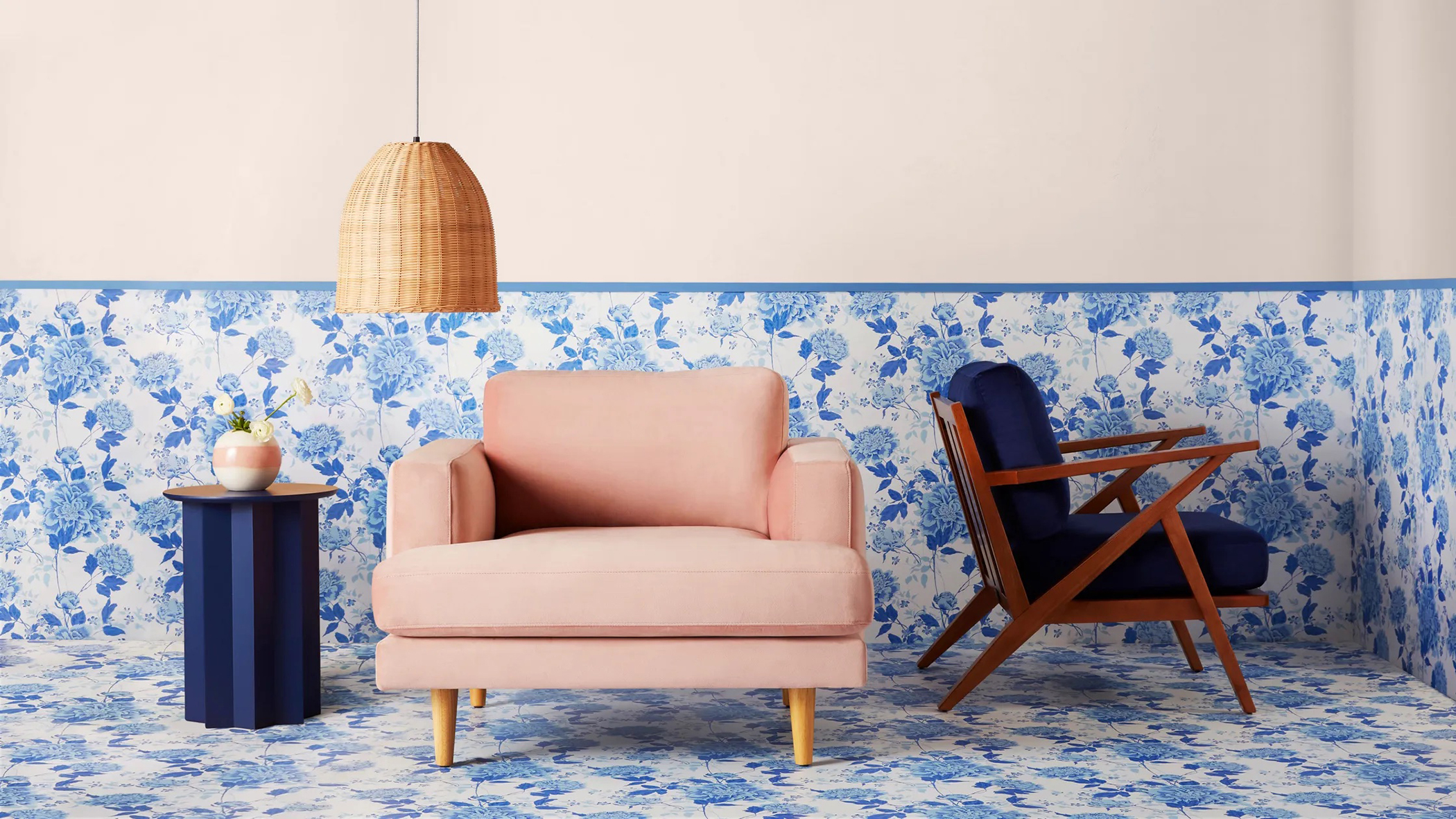 Drew Barrymore's new FLOWER Home paint collection wants to give your walls a makeover
Drew Barrymore FLOWER drops 27 brand-new paint shades, and every can is made from 100% post-consumer recycled plastic.
By Brittany Romano Published
