Real home: this Mid-century home is a riot of colour inside
From bright blue to sunny yellow, Nikki and Luke left no shade untouched when they transformed their 1960s home


Get small space home decor ideas, celeb inspiration, DIY tips and more, straight to your inbox!
You are now subscribed
Your newsletter sign-up was successful
For Nikki and Luke, decorating is all about having fun with colour, and it shows: every room in their home is a different shade, from forest green to punchy pink. Creativity was key to the project they took on when they bought their unloved 1960s terrace, and one extension, remodel and redecoration later, they’ve transformed it into a series of bright and inspiring spaces. The couple reveal how Palm Springs and parties influenced their choices, and and who’s in charge of colouring in their home.
Need more space for a kitchen-diner? We have lots of help and advice for extending a house. For more real home transformations, head to our hub page.
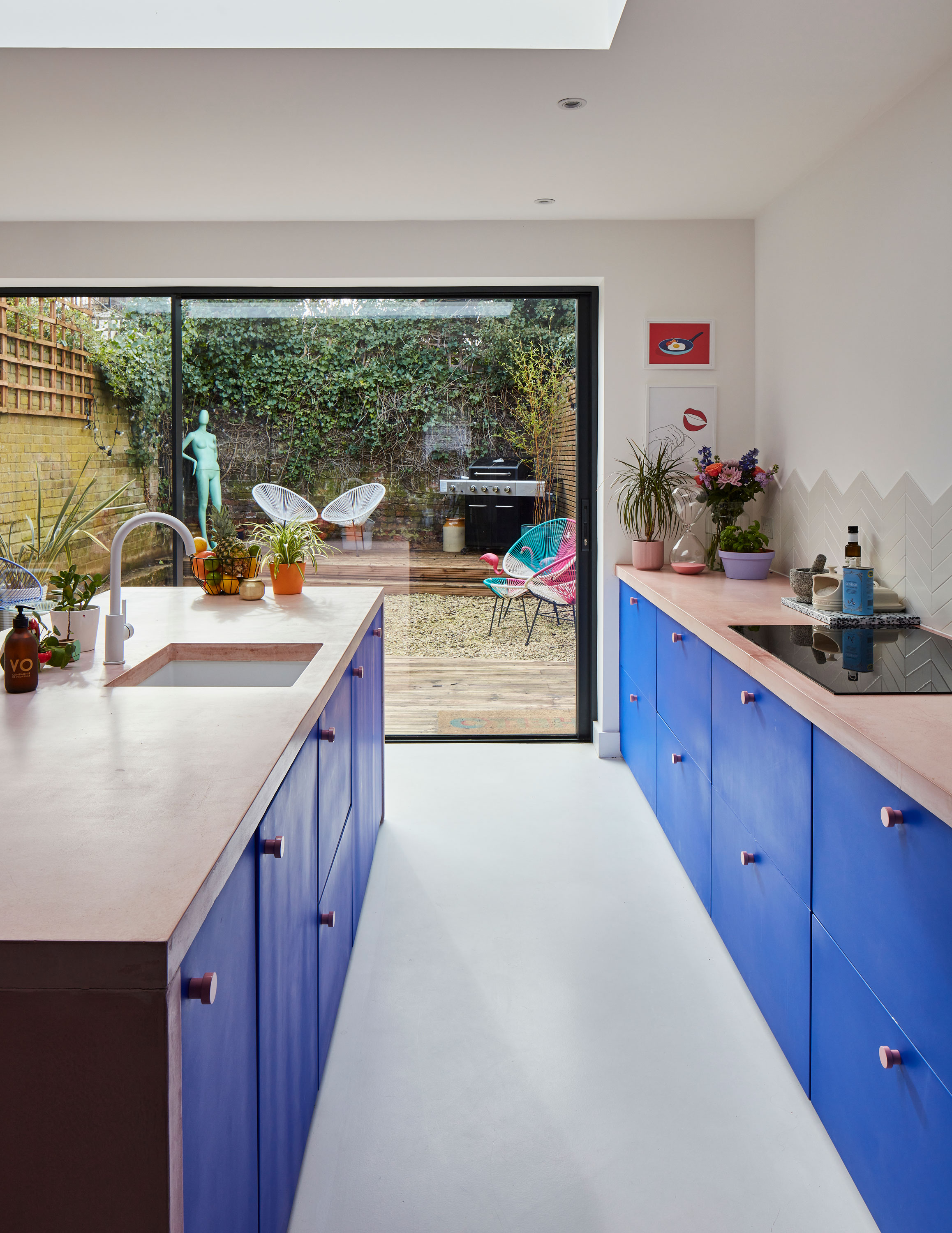
‘We were going to continue the flooring outside to create an indoor- outdoor link, but the material wasn’t suitable,’ says Luke. ‘We also looked at bi-folds, but sliding doors give better views to the garden.’ White resin flooring, Chasingspace. Sliding doors, My Best Windows. Kitchen, Ikea, painted in Film, Television & Theatre 018, Mylands. Worktop, Mortise. Belfry tap, Wayfair. Splashback tiles, Porcelain Superstore. Fried egg print, Krystal Wong. Taco print, Desenio
Profile
The owners: Nikki Griffiths (@tierneyterracelocation),
a communications consultant, her partner Luke Moseley, a songwriter and music producer, and their dogs, Paloma and Pilot.
The property: A three-bedroom 1960s ex-council terraced house in Streatham Hill, south London.
Project cost: £140,000.
Nikki: 'We lived on the same road as this house and walked past it every day for months while it was on sale, discounting it every time,' says Nikki. 'Eventually we got curious, went to see it and realised it was full of potential. It had good bones and because the back was south-facing, it was really bright, too. We were looking for a project – something we could make our own and add value to. We’re both self-employed, so this is a sort of pension for us as well as a passion project.'
Article continues below 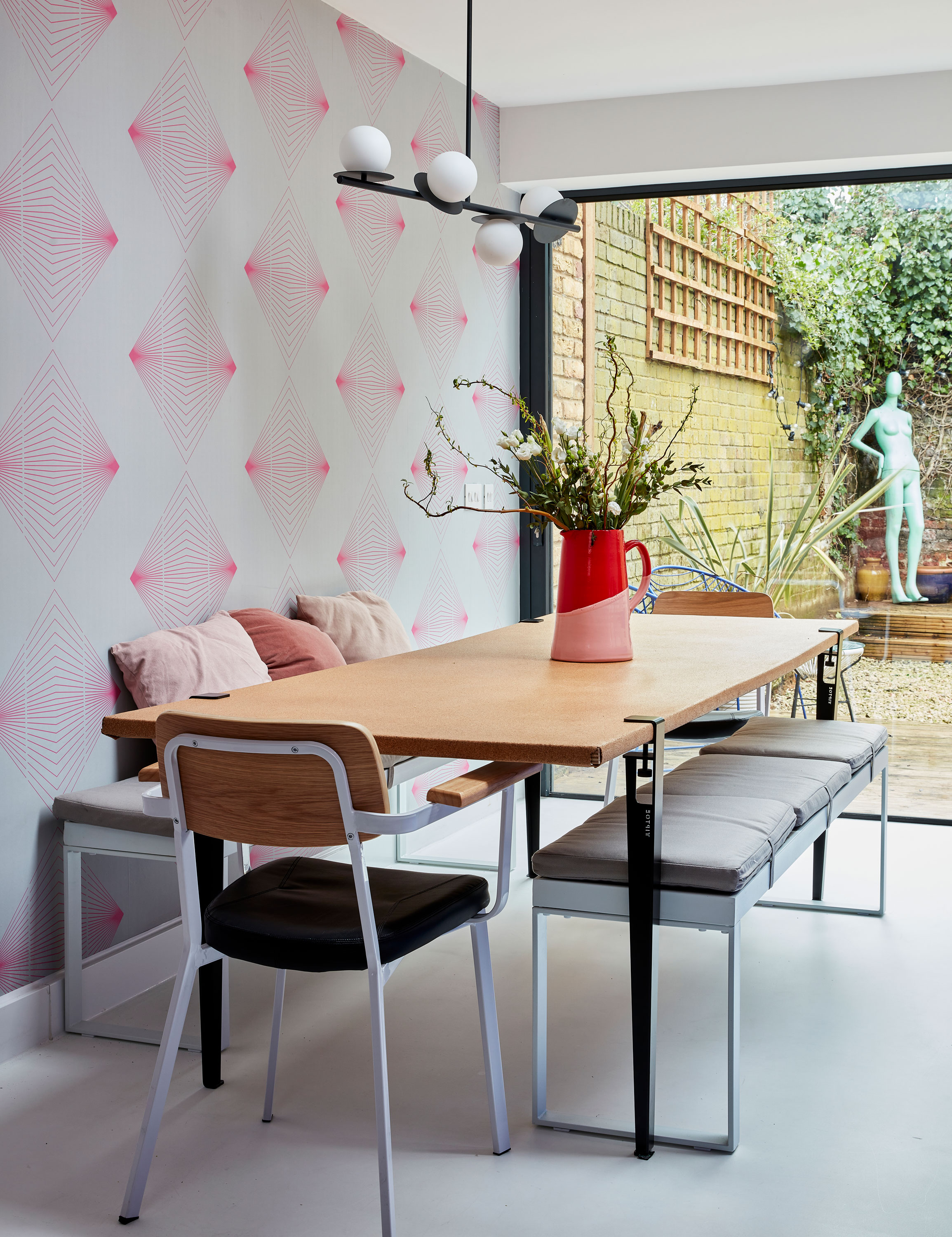
‘This wallpaper was the perfect pick,’ says Nikki. ‘I love pink and Luke loves geometric patterns.’ Wallpaper, Quirk & Rescue. Table legs, Tiptoe. Benches, Made. Chairs, Cult Furniture. Pendant light, Houseof.com. Jackson & Levine red and pink jug, Habitat
Luke: 'We lived here for a year before we started work, but that was because we couldn’t find the right builder when we moved in. It was a blessing in disguise, actually. We ended up spending a year getting the plans in place and deciding what we wanted to do. The build itself took seven months.'
Nikki: 'The colour came because I’m obsessed with Palm Springs architecture – it’s my dream to do the Palm Springs door tour one day. We took inspiration from 1960s modernism and Americana, and then applied that to south London. We like to keep everything really fun, so bright, colourful interiors are really important.'
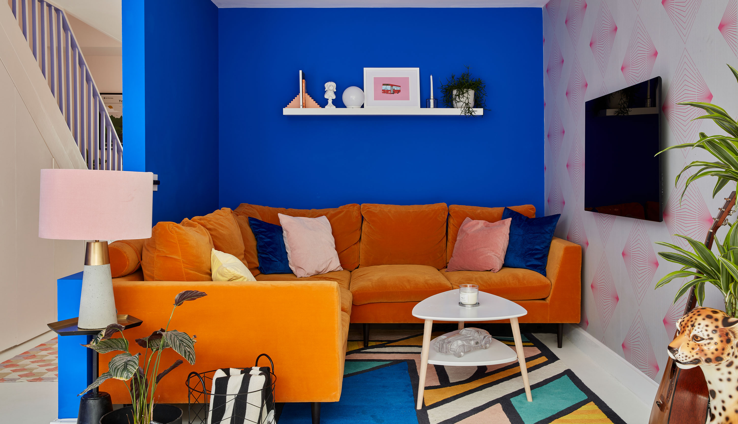
‘This is a darker corner compared to the rest of the house, so we thought it would make a good living room,’ says Nikki. ‘By putting it here, too, we freed up space at the front of the house for a utility room and a bathroom with a decent-sized bath in it.’ Sofa, Love Your Home. Coffee table, Maisons du Monde. Walls painted in Film, Television & Theatre 018, Mylands. Lamp, Oliver Bonas. Supermundane rug, Made
Nikki: 'Our architect is a friend of a friend. They’re a husband and wife team, and they were able to really understand and interpret what we needed from our home. We’ve been burned by builders in past projects, so we were fixed on finding the right people. We found ours through a local recommendation and they’ve been brilliant from start to finish – we were lucky. We had to get planning permission for the extension, and also because the changes at the front were quite radical. We were pleasantly surprised by how open the council and our neighbours were to it all. This row of houses is a little run-down, so I think people were pleased that someone had started doing up one of the properties.'
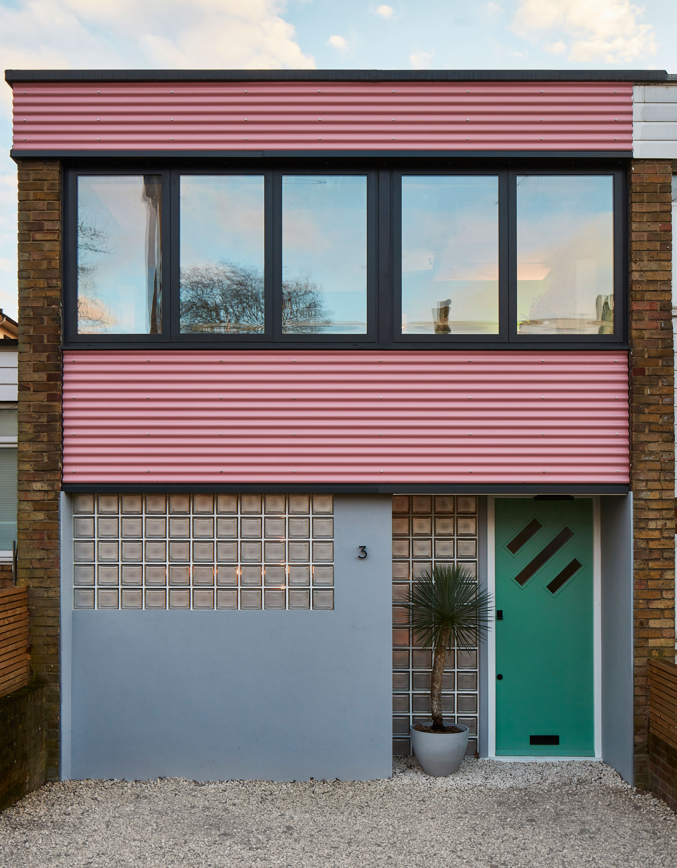
‘We didn’t love the look of the house when we moved in,’ says Nikki. ‘So we moved the front door and exchanged the windows for glass bricks.’ Windows, My Best Windows. Front door, custom made by Dulwich Reclamation. Cladding, Accord Steel Cladding
Nikki: 'All the light is at the back, so we wanted to make the most of that with an extension. We have people round for dinner a lot so we wanted to make sure that, in what’s quite a small footprint of a house, we made the most of the space so we could cram as many people in as possible! We moved the kitchen from the front of the house and added a nook at the back of the open-plan space, which is a cosy space just for us.'
Get small space home decor ideas, celeb inspiration, DIY tips and more, straight to your inbox!
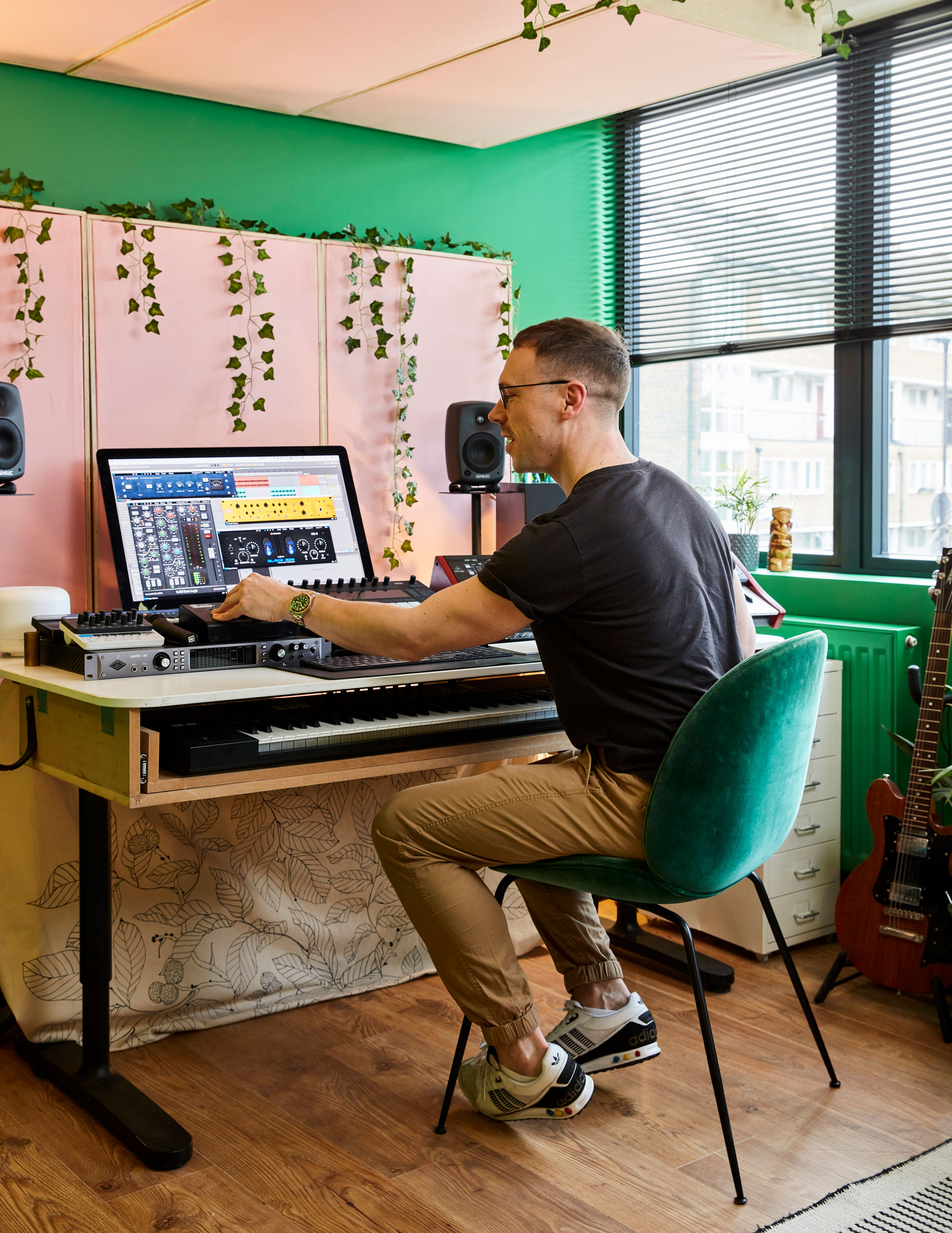
We were keen not to cross over the colours in any of the rooms,’ says Luke. ‘We had blue in the kitchen, pink in the bathroom, yellow in the bedroom. This green feels vibrant when it’s light outside, and quite rich when it’s dark. Thanks to the ivy, it seems quite jungle-ish in here. I worked with an acoustician in Germany to make the sound-absorption panels myself.' Walls painted in Film, Television & Theatre 011, Mylands. Flooring, Homebase. Desk, Ikea
Nikki: 'We wanted something really vibrant and happy in the kitchen. We originally looked at a classic pink and green, but…'
Luke: 'Basically, Nikki had seen too many other people using it, so we went off it! It happened with the countertop as well – we went through loads of custom samples with the team to try and get a unique enough pink.'
Nikki: 'The sliding doors were one of our really big expenses, but they make all the difference – the frames are thin and they let in so much light. The windows in the rest of the house are a cheaper option to make some of the money back. We prioritised the kitchen because it’s where we spend most of our time.'
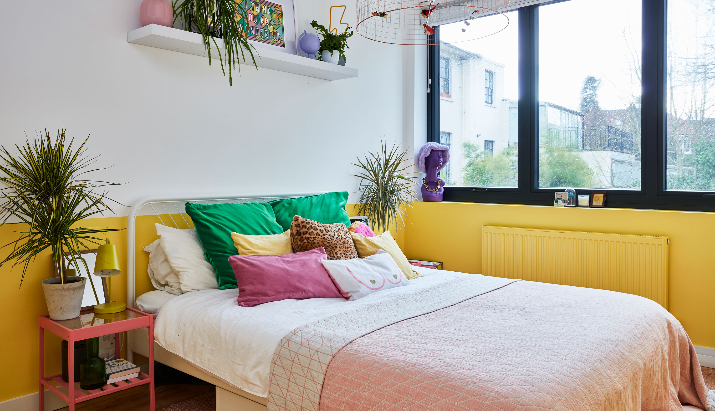
‘I saw the ceiling light about 10 years ago, but it’s quite expensive so it was always really unobtainable – until my mum gave me some money towards it for my birthday,’ says Nikki. ‘I’ve based the rest of the room around it. The yellow is a lovely chalky banana-coloured paint, it’s such a happy colour to wake up to. Plus, it was one of the only colours left on the spectrum that we hadn’t already used!’ Walls painted in Banana, Benjamin Moore. Bed and side tables, Ikea. Throw, Made. La Volière pendant light, Mathieu Challières
Luke: 'When it comes to design decisions, a lot of it comes from Nikki, for sure. I’d never think to pay that much attention to a room. She always consults me on things she likes, and then my role is to pare her ideas back a little bit so that we don’t end up with a crazy rainbow kaleidoscope in every room.'
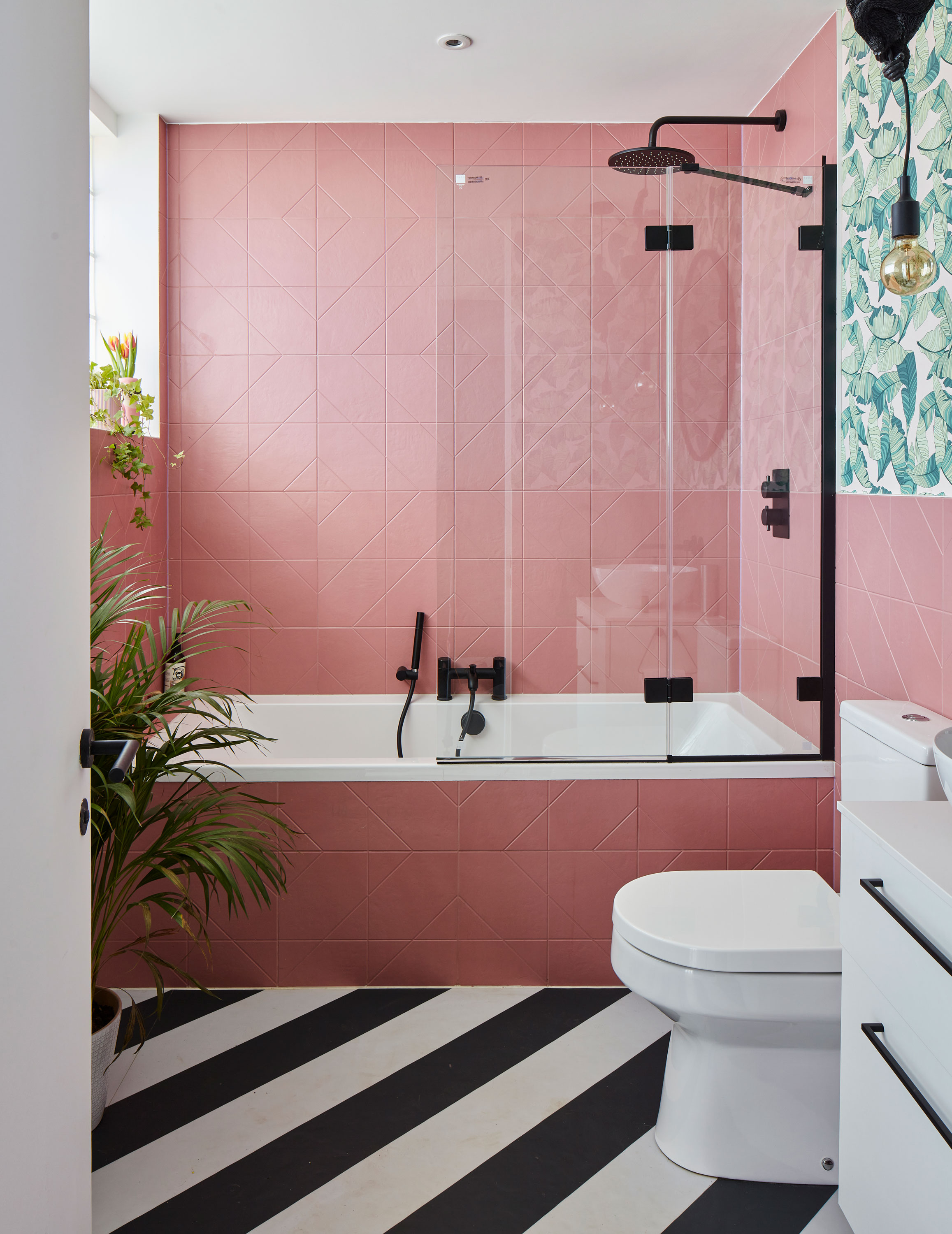
We call this our geometric jungle bathroom,’ says Nikki. ‘It’s my favourite room in the house because I had so much fun with it. It’s like the inside of my head in here!’ Wall tiles, Topps Tiles. Flooring, Atrafloor. Sink, toilet and Mode shower, Victoria Plum. Vanity unit, Ikea, with handles from The Handle Studio. Pendant lights, Dowsing & Reynolds. Wallpaper, Murals Wallpaper
Contacts
Architects Maude & Edwards
Builders Bellaghy Developments
Glazing My Best Windows
Luke: 'Our architects told us not to scrimp on the things we touch every day. We took their advice and never regretted it. We could have bought light switches for a third of the cost, for example, but they’re great quality with a really tactile feel.'
Nikki: 'The thing that did us really well was finding the right builders. They weren’t the cheapest quote but they were trustworthy and easy to work with. At no point did they say, "No, we can’t do that". Never scrimp and save on your builders – you have to work with them for a really long time!'
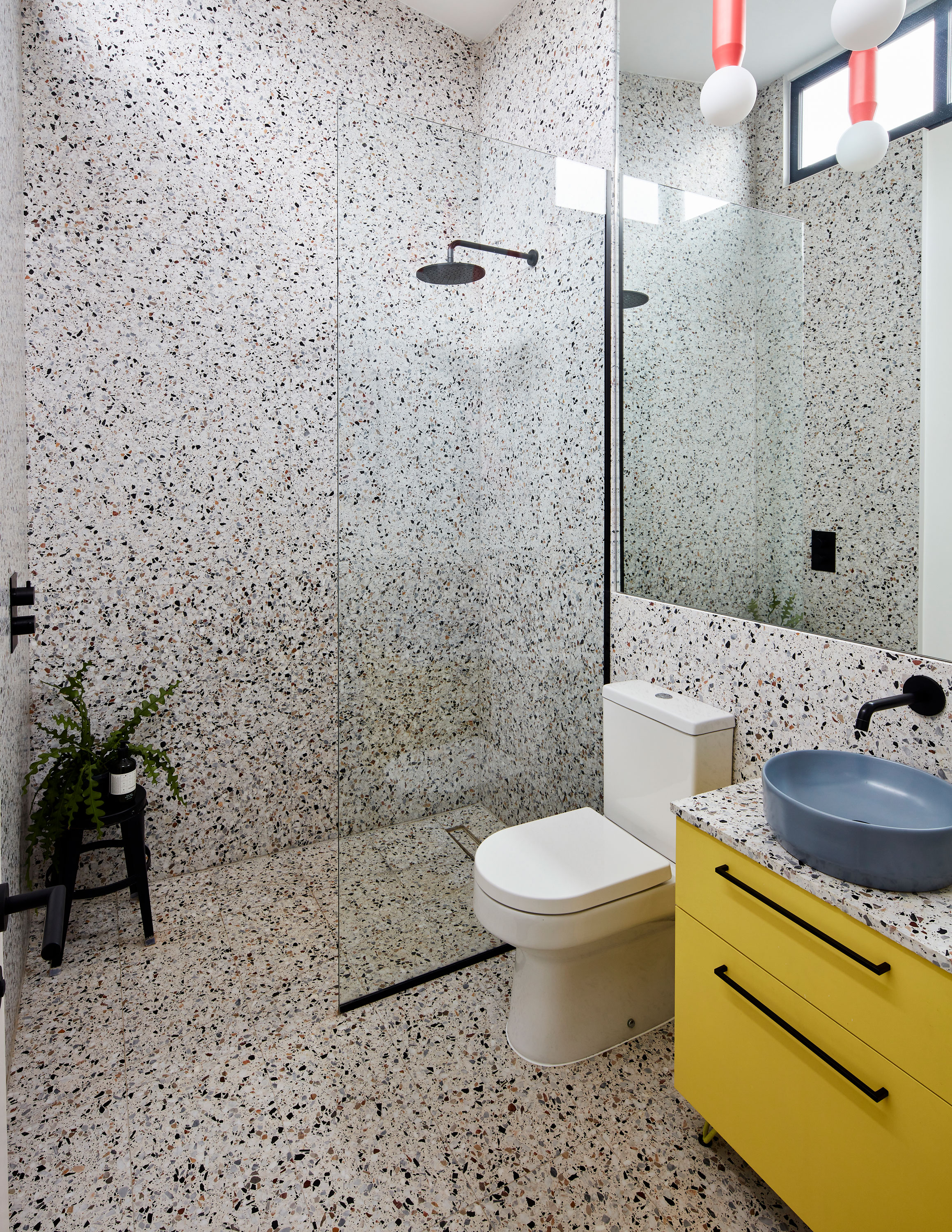
I’ve always wanted terrazzo and it’s fitting for the era of the house, so it felt like the right time to do it,’ says Nikki. ‘This bathroom is the tallest room in the house. It originally had a false ceiling because it housed the water tank, but we took that out to make the most of the amazing height.’ Terrazzo tiles, Terrazzo UK. Vanity unit, Ikea, painted in Verdure, Mylands. Sink and Mode shower, Victoria Plum. Mirror, Fitted Mirrors & Glass of Brixton. Pendant lights, Houseof.com
Subscribe to Real Homes magazine
Want even more great ideas for your home from the expert team at Real Homes magazine? Subscribe to Real Homes magazine and get great content delivered straight to your door. From inspiring completed projects to the latest decorating trends and expert advice, you'll find everything you need to create your dream home inside each issue.
More reading:
- Bi-fold doors and sliding doors: 16 gorgeous designs ideas
- 21 kitchen paint ideas to update your space
- This extended kitchen is pretty in pink and grey

Formerly deputy editor of Real Homes magazine, Ellen has been lucky enough to spend most of her working life speaking to real people and writing about real homes, from extended Victorian terraces to modest apartments. She's recently bought her own home and has a special interest in sustainable living and clever storage.
