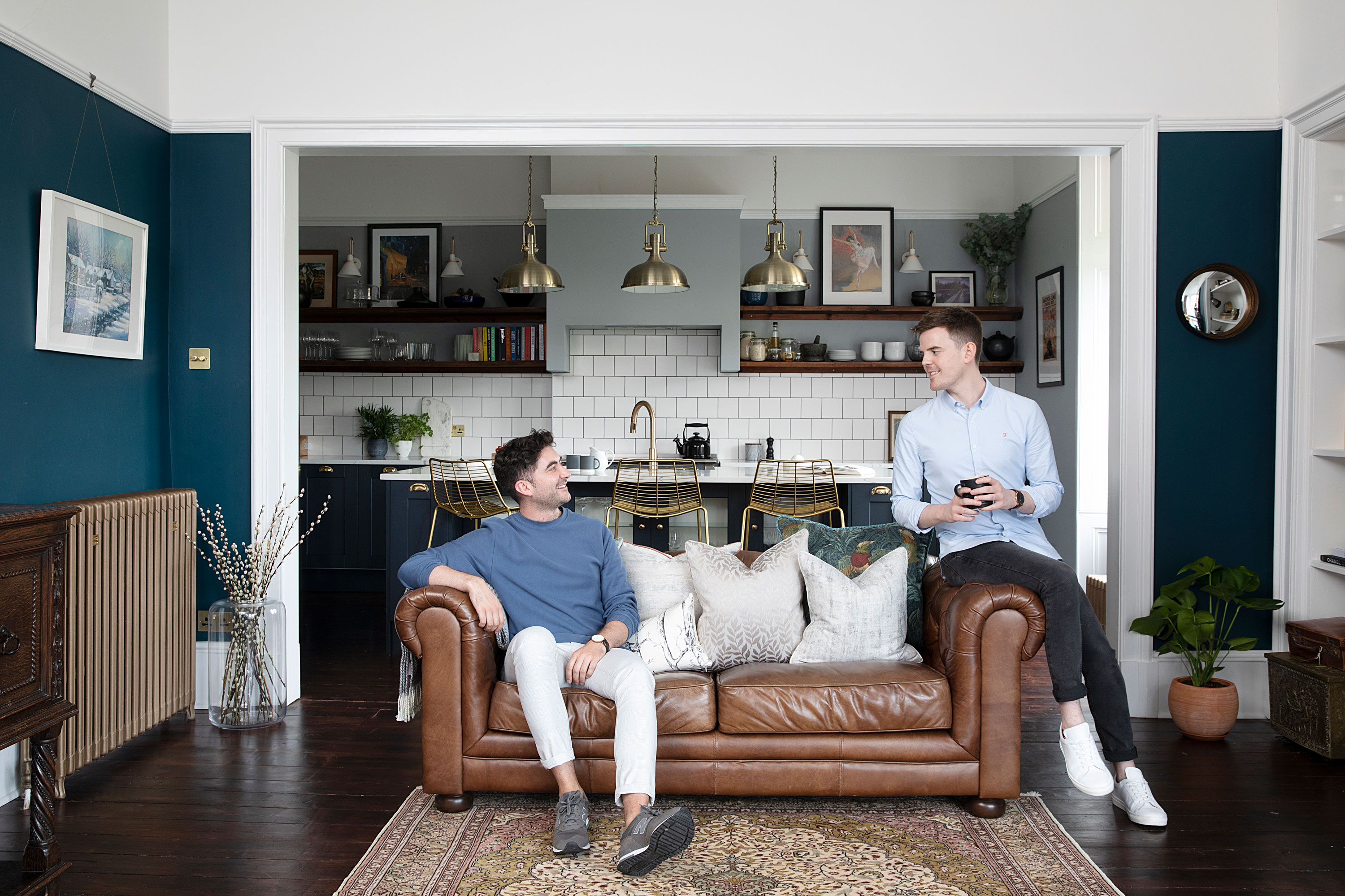
Walking into Iain and Eóin’s Glasgow tenement flat, the generous hallway feels like a room in itself, and the balance between living spaces and bedrooms makes it seem like the layout has always been that way. It’s clear why they fell in love with the high ceilings, stained glass windows and period features, but it required a bit of replanning to unlock the flat’s potential.
The couple’s master stroke was to move the kitchen from the rear of the apartment to a spare room at the front and knock through to the living room. Light was brought into the windowless hallway via a glass-panelled double doorway, a new utility/pantry was added and the old kitchen was split into a guest bedroom and master en suite. They’ve even revamped the narrow bathroom – a common feature in Scottish tenements – to create a three-zone wet room with Japanese style bath. They tell us how they made an elegant home fit for modern living
If you have your own renovation to tackle, we have plenty of ideas and helpful advice on what to do and where to start in our feature on house renovation. For more real home transformations, head to our hub page.
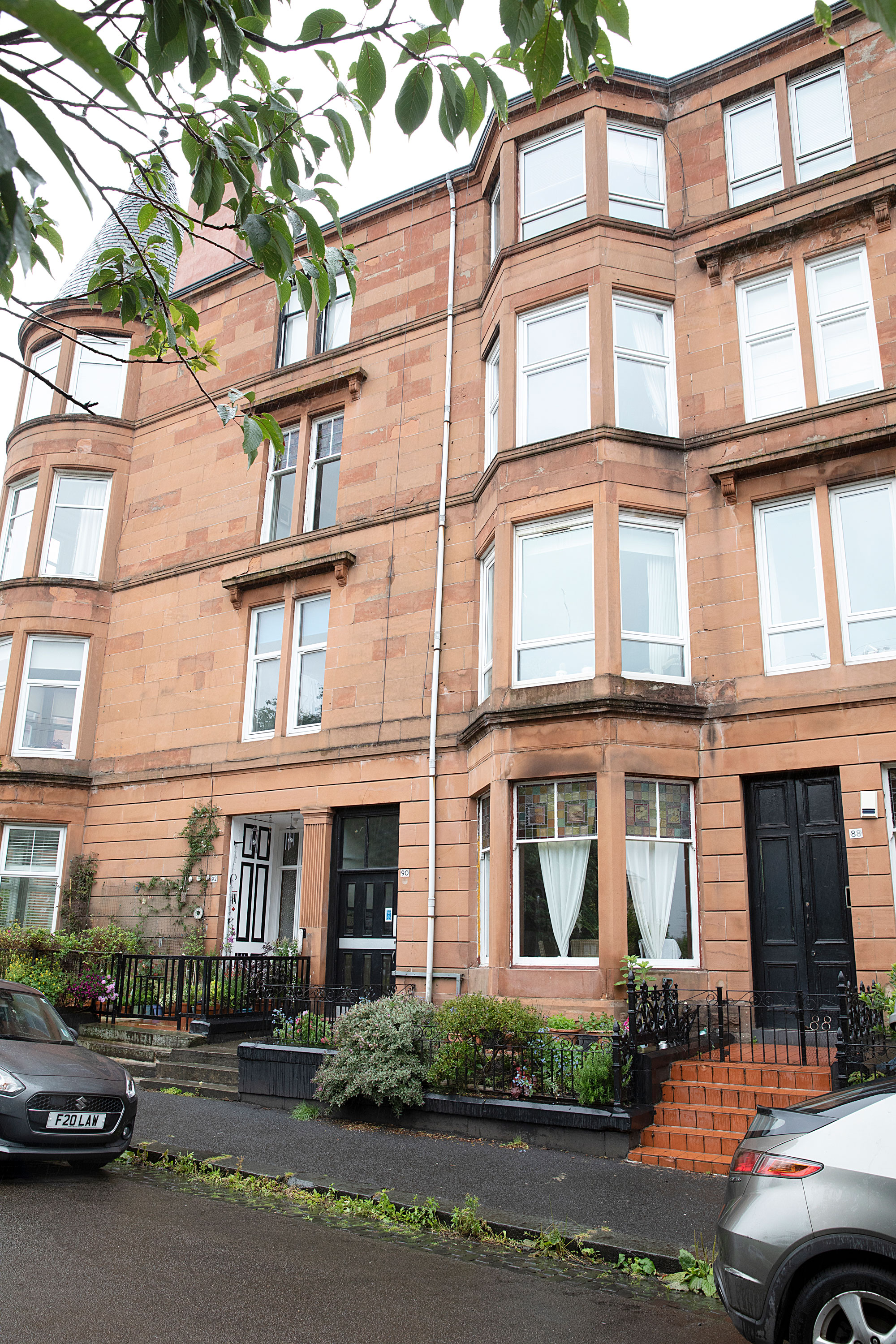
The outside of the property promised elegant period proportions inside
Profile
The owners Iain Martin, an obstetrician and gynaecologist, lives with his partner Eóin Colgan, a GP
The property A three/four bedroom apartment in a 19th-century Victorian tenement (@tenement.style)
Project cost £65,828
‘Having renovated a two-bedroom flat in Glasgow together, we wanted somewhere bigger in a quieter location. We found a four-bedroom tenement flat 10 minutes away,' says Iain. 'Walking into the unusually spacious hallway, I’d never seen such a big tenement with so much potential, but we tried to play it cool and hide our excitement. Luckily our cheeky offer was accepted the same day, and our flat sold within 10 days for well over the asking price. When we moved in, all we had was a footstool and a four-poster bed as our buyer purchased most of the furniture.'
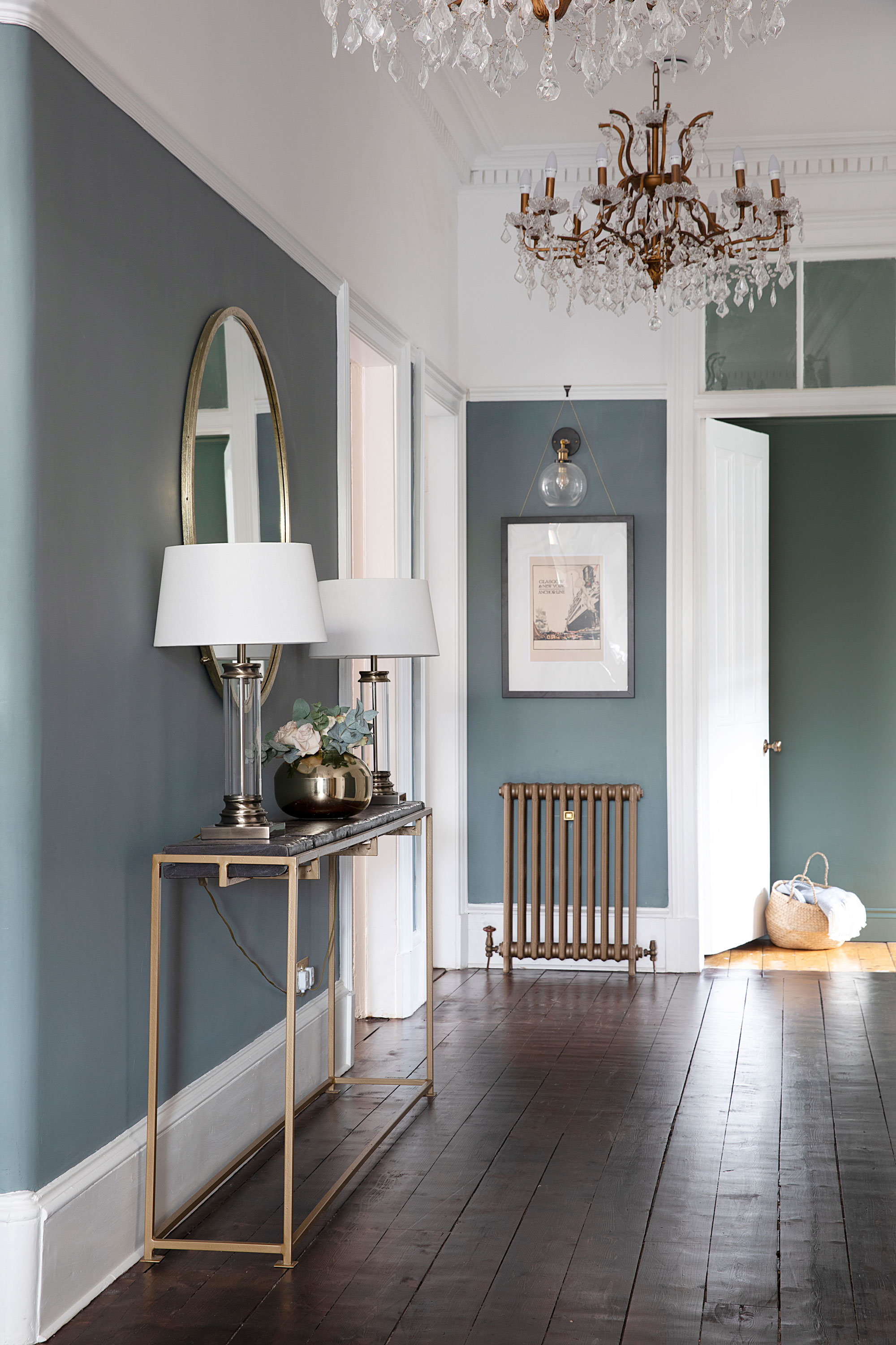
‘Installing glass paned double doors lightened the hallway,’ says Iain. ‘We added a second ceiling rose to have two chandeliers. It’s such a long room, it needed that drama. The console table was made from my dad’s workbench, like the dining table.’ Walls painted in Brandenburg Gate, Valspar. Radiator, Glasgow Architectural Salvage. Lamps, Wayfair. Mirror, Laura Ashley. Chandeliers, Ebay
‘When I first walked around the flat, I was blown away by the high ceilings and loved the bay window in the living room with views across the park,' says Eóin. 'An additional lounge didn’t seem to serve a purpose and the kitchen just didn’t work at the back of the property, so I knew straight away it should be moved to the front.
‘Our plan was to live here while the work was done, but in the end we were getting in the way of the builders so moved out to speed things up.'
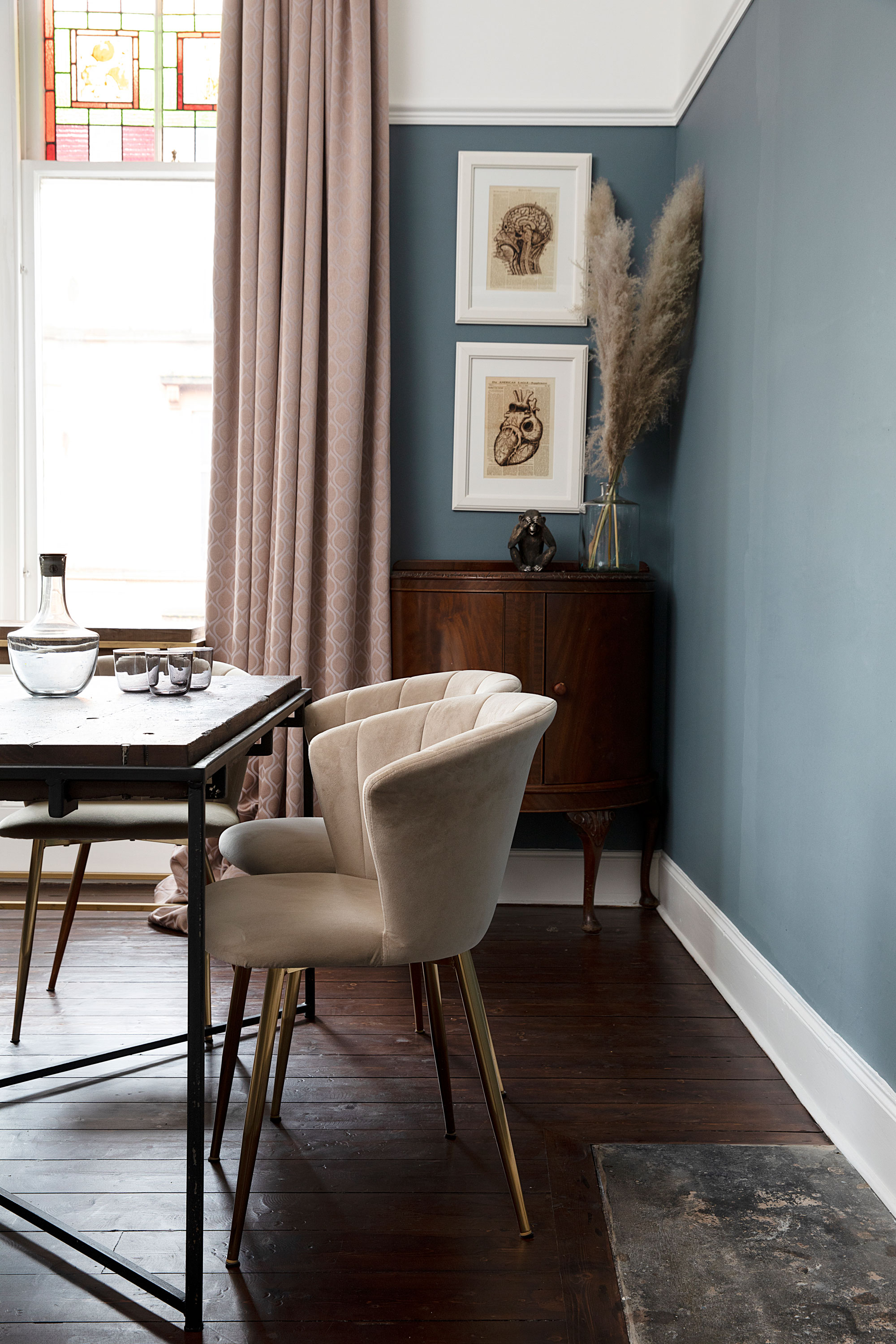
‘Most of the furniture is from charity or antique shops, like this sideboard,’ says Iain. ‘I’d describe our style as eclectic, chic, decadent and glamorous. The dining table is made from a mahogany workbench my dad used in his construction business, with a frame made by a fabricator. It seats eight and is something I would never part with.’ For a similar dining table, try Riz and Mica Make on Etsy. Dining chairs, Dunelm. Artwork, Dream Printable on Etsy
‘It was Eóin’s idea to relocate the kitchen to the front and knock through to the living room,' says Iain. 'I wasn’t sure I had the energy but it elevates the property so much as the kitchen is now the heart of the home and full of light. We also transformed the main bathroom with a bespoke tiled bath to fit the 1.4m width of the room, and a wet floor shower.'
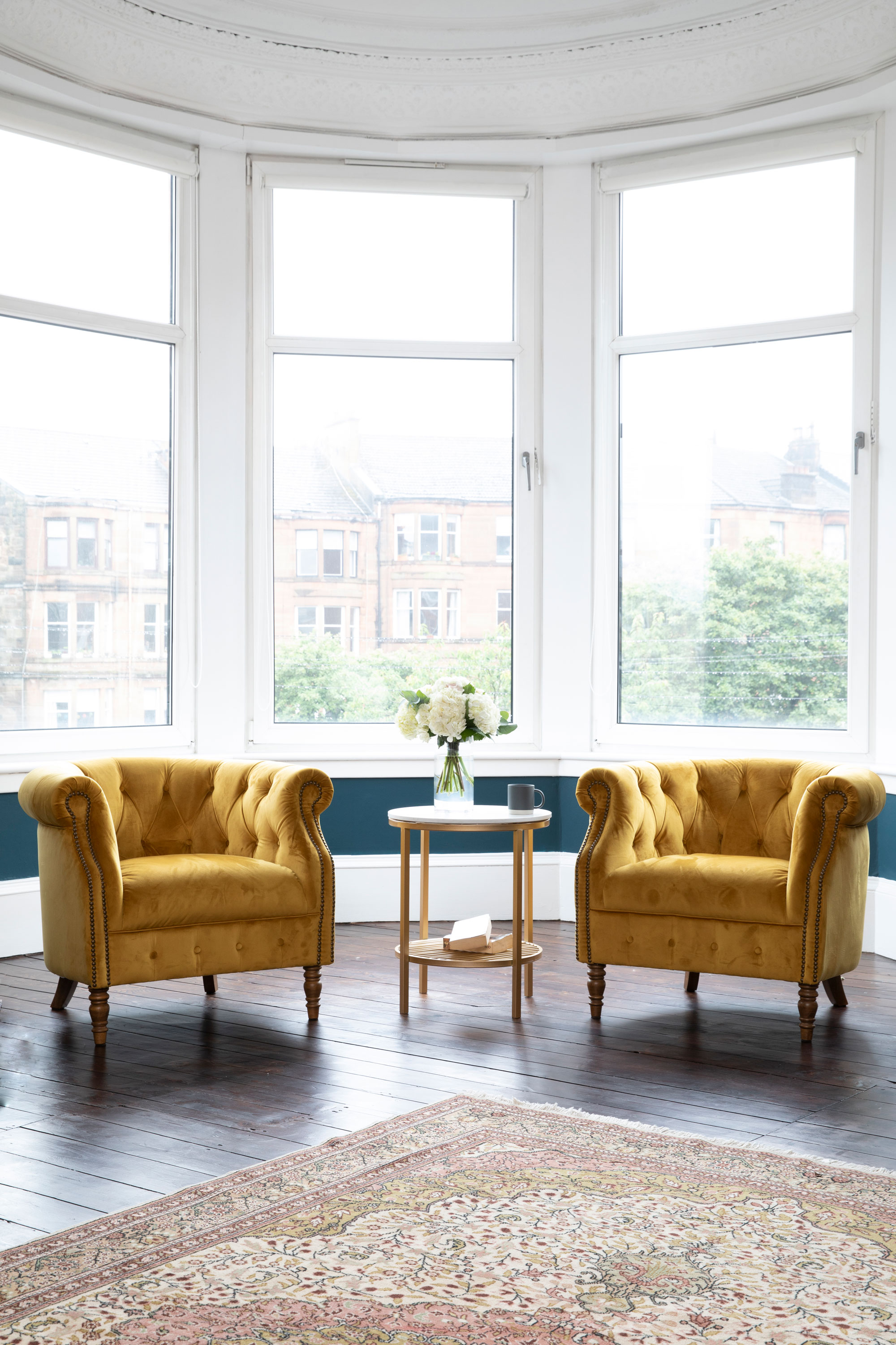
‘I really love the Turkish rug, which my mum bought on a family holiday 20 years ago,’ says Eóin. ‘We picked the yellow armchairs to pop against the dark colours.’ Alexander & James armchairs and framed map, both Annie Mo’s. Agora side table from Swoon is similar
‘It took longer than expected as sanding and restaining the flooring was a huge job. We also had to upgrade the boiler to accommodate our new cast- iron radiators – it’s probably suitable for a small hotel! These delays meant our six-week stay with my parents in South Lanarkshire ended up lasting over four months, during which time we were commuting 80 miles a day.'
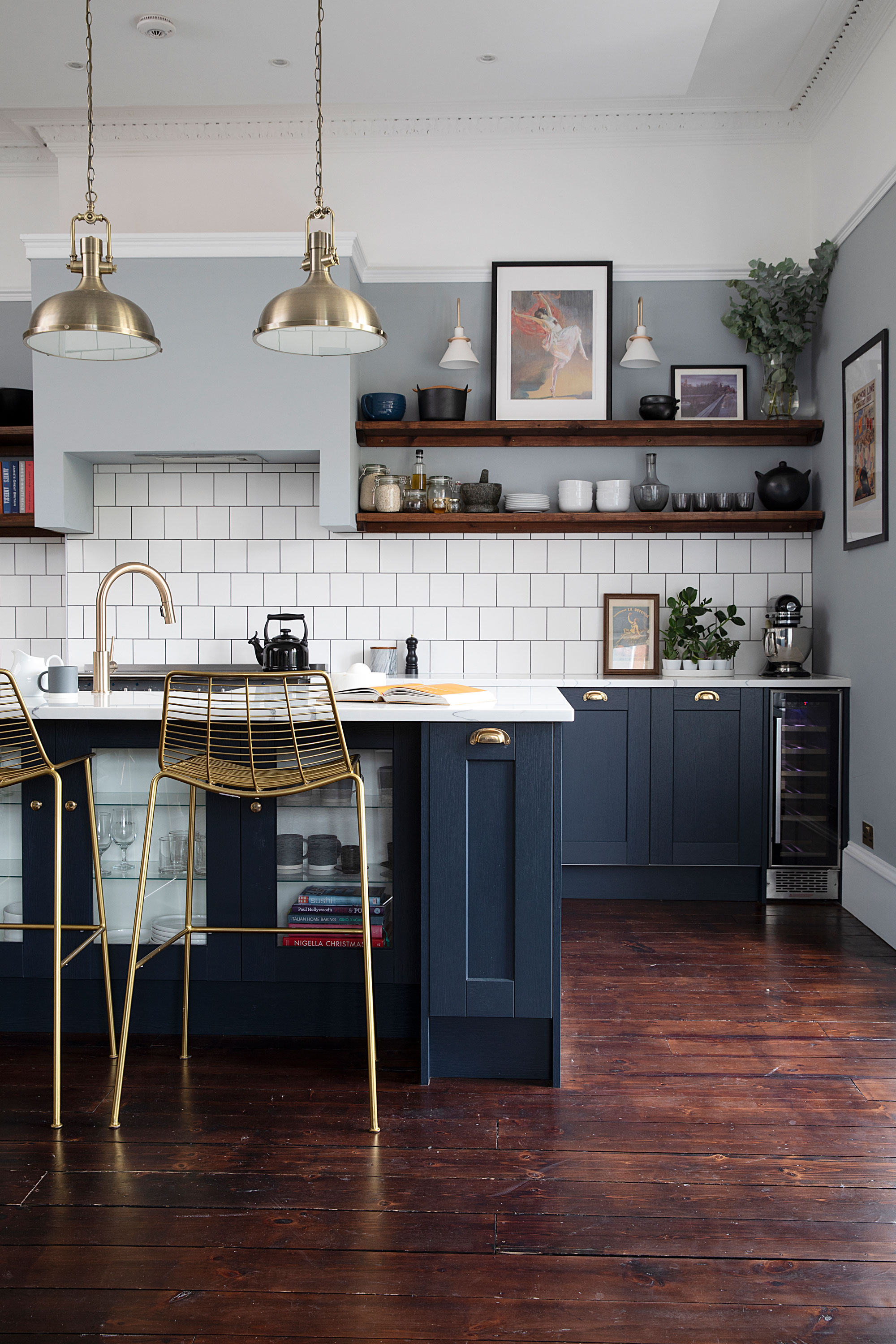
‘Our builder thought up the idea of a platform to accommodate the pendant lights and spotlights as the existing ceiling was too old,’ says Iain. ‘We thought it might look awful but it’s actually very discreet, has LED lights around it and doesn’t interfere with the beautiful coving.’ Kitchen, Howdens. Kitchen walls painted in Battlement Grey, Valspar. Pendant lights, Wayfair. Wall lights, Juicy Home. Stools, Made. Wayfair sells the Anna Pavlova art print by John Lavery
‘Moving the kitchen took an awful lot of planning,' says Eóin. 'The pipes had to be run through the ceiling as going through the floor would’ve meant cutting three joists. We now have three Saniflow pumps in the island, utility and behind the fridge so the system isn’t overloaded. It was more expensive but worth it for the entertaining space we’ve ended up with.
‘Iain likes more things than me and I’m probably a bit fussier, but we have very similar tastes and enjoy mixing traditional and modern. I’m quite good at imagining things but Iain has to rein me in a bit if it’s not going to work on a practical level.'
- Keep reading: Kitchen ideas - 65+ tips, trends, and transformations to get you inspired
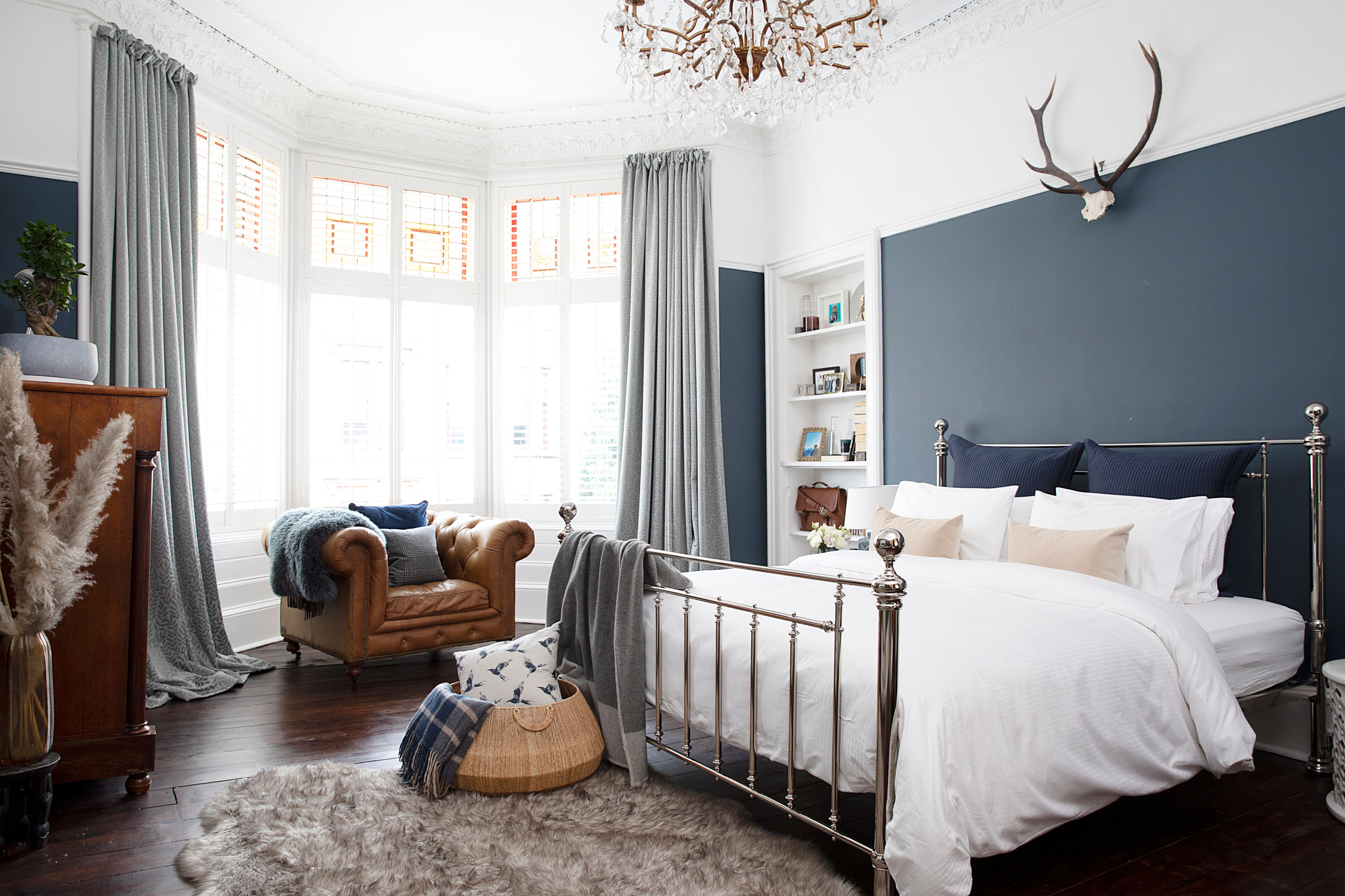
‘I absolutely love the curtains in here,’ says Iain. ‘They were gifted by interior designer Ruth Bond of Crimson in return for using the flat as a backdrop for taking some marketing pictures.’ Walls painted in Thundercloud, Valspar. Bed, Feather & Black. Halo armchair, Barker & Stonehouse. Curtains, Crimson
‘Eóin’s a dreamer and he has great ideas, but I’m the one getting quotes and organising the builders,' says Iain. 'We’re good at deciding things together, though. If one of us doesn’t like something, we won’t have it, so what we agree on ends up working better. I never have a vision of a room totally finished – it kind of evolves as the builders ask questions about fittings we want. Eóin’s really good at visualising and very meticulous – he loves symmetry. Style-wise we both wanted something classic but also masculine, so chose dark colours and traditional materials with vintage furniture and chandeliers for drama.'
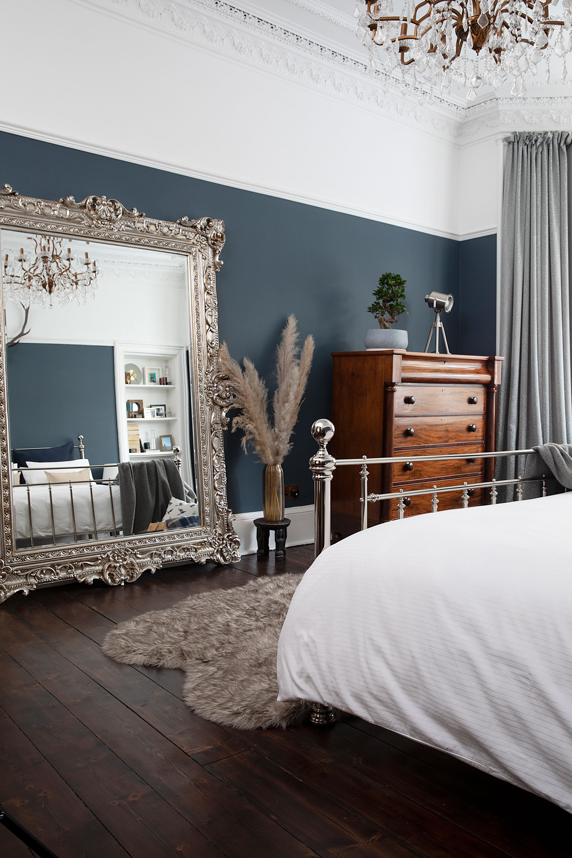
‘We’d used this blue colour in the living room of our old flat and wanted to use it again somewhere else because we loved it so much,’ says Iain. Walls painted in Thundercloud, Valspar. Chest of drawers, Glasgow City Antiques. Mirror, William Wood Mirrors. Bed, Feather & Black
‘Because of the shifts we were working, we shared tasks equally. Whoever wasn’t working would deal with the problem of the day or Iain’s mum would step in,' ‘Eóin says. 'Inevitably, it took longer than we thought. If someone says it’ll take six weeks, double it and add 10! Luckily the builder was good at running everything by me so nothing ended up in the wrong place.'
- Keep reading: 50 bedroom ideas to create the perfect space
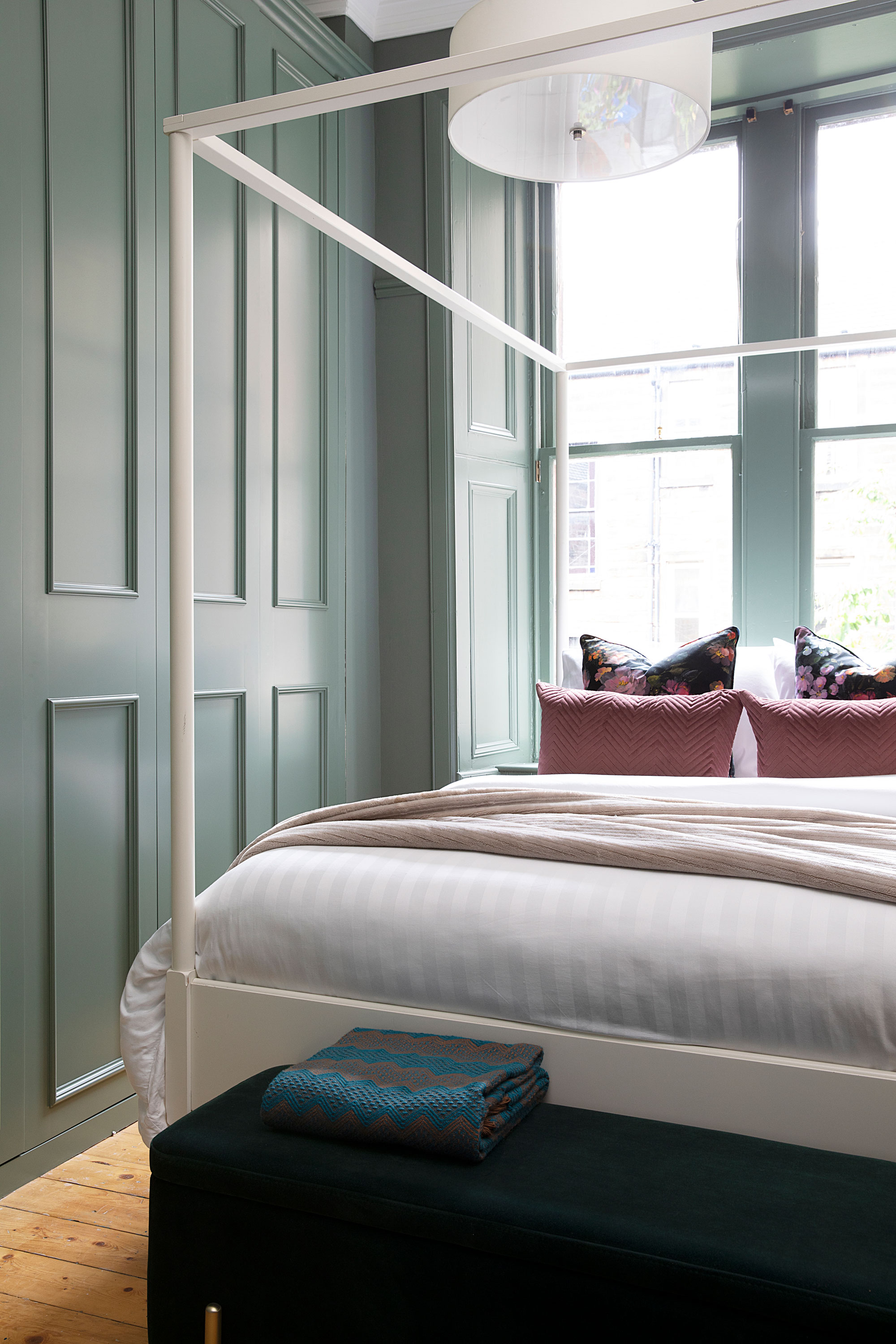
As this room used to be the kitchen, it was looking a bit tatty and needed built-in wardrobes to hide the boiler and provide storage,’ says Iain. ‘They’re custom-made to look like a panelled wall as the doors are handleless.’ Wardrobes, Ingrained Bespoke. Woodwork painted in Green Smoke, Farrow & Ball. The Celeste four-poster bed, Maisons du Monde, is similar. Cushions, Sofa.com and TK Maxx. Pendant light, Wayfair. Ottoman, Made
‘After Christmas 2018, we moved back in even though we still had the last bedroom to finish,' adds Iain. 'At that point we’d run out of money and enthusiasm, and took a year off to enjoy the new layout before the final push. We went about £10,000 over budget but we’re happy with the result. Having the bedrooms private at one end of the apartment and the reception rooms and kitchen at the other works so much better.’
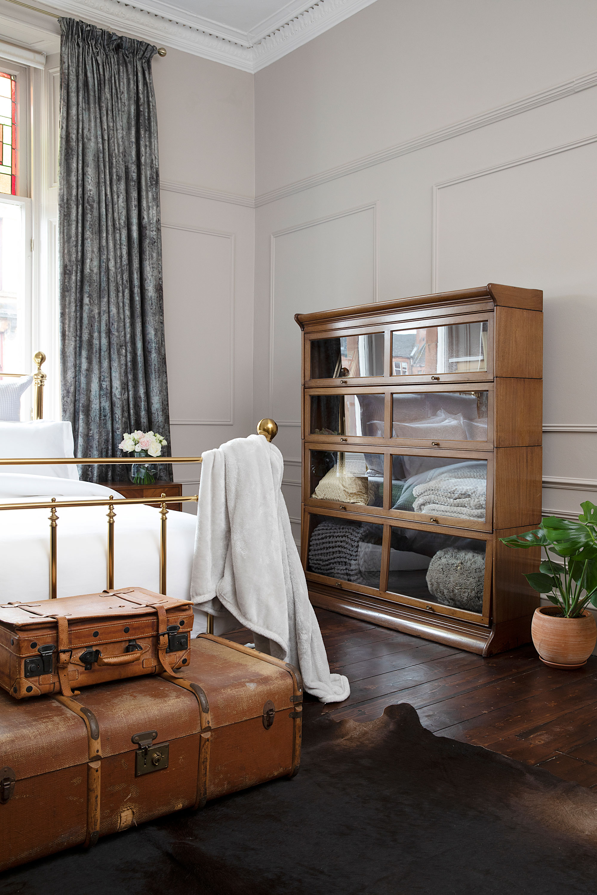
‘When we first moved in, we painted this room green but it looked disgusting,’ says Iain. ‘During lockdown we created the panelling over three weekends and went light on the walls. It was an experiment as everywhere else is dark.' Walls painted in Elephant’s Breath, Farrow & Ball. Bed, Feather & Black. Globe Wernicke bookcase and trunks, Glasgow City Antiques. Bedside cabinet, Homesense
Contacts
Structural engineer Prime Structural Solutions
Bathrooms Bathroom People
‘My favourite part is the open-plan kitchen and living room, which is where we spend the majority of our time,' says ‘Eóin. 'It’s so nice to come home and chat about our days while one of us cooks and the other relaxes. We poured so much time and energy into our home, I’m happy we’ve breathed new life into it.’
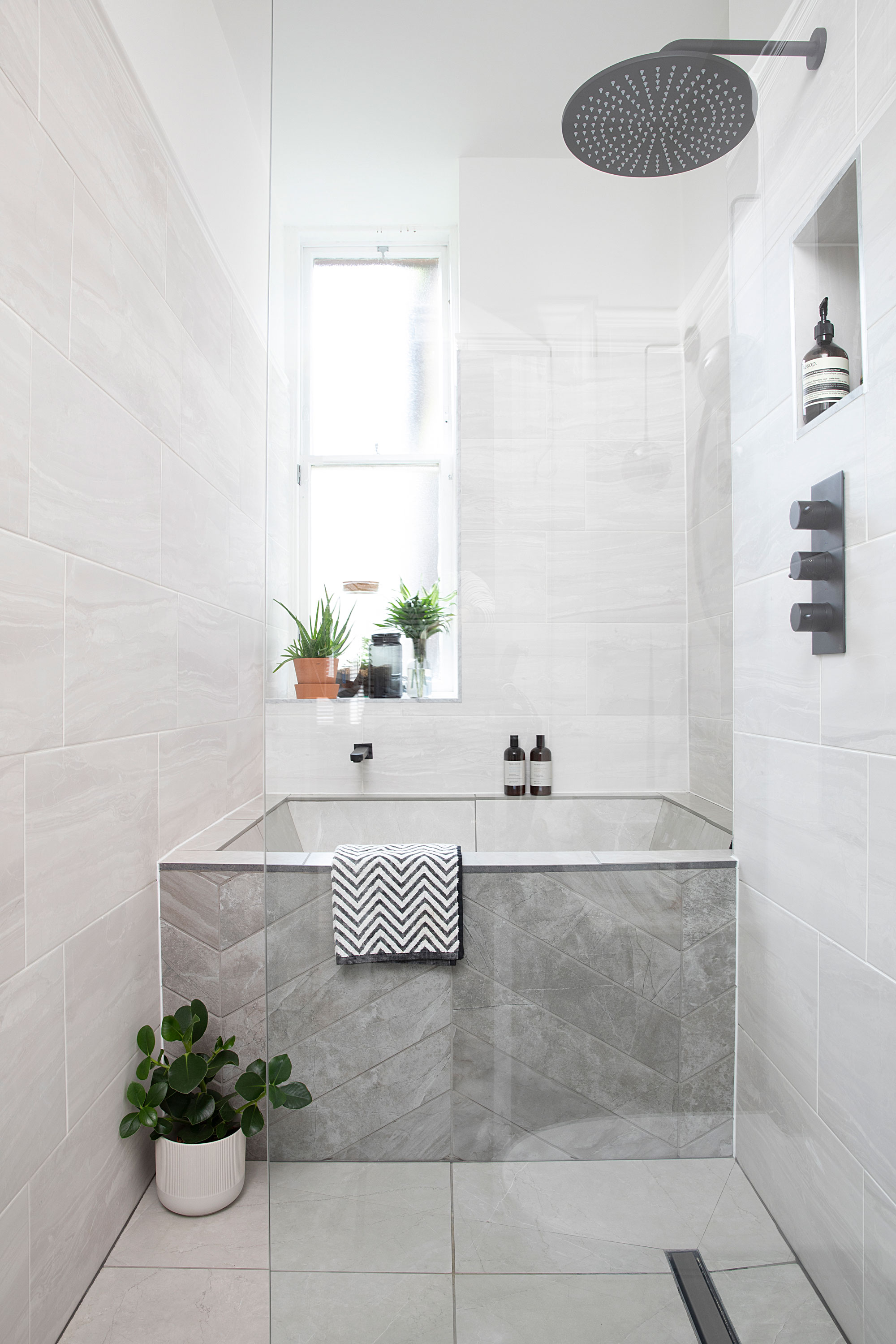
‘We wanted a separate bath and shower but the room is so narrow it was a real challenge. We saw the idea on Pinterest for a made-to-measure Japanese style fibreglass bath, which is tiled inside. It’s shorter than a standard bath but is deeper and wider so still feels luxurious.’ Bath, Abbacus via Bathroom People. Fittings, Crosswater. Wall tiles, B&Q. For similar bath tiles, try Dartrey Grey Rhombus tiles, Topps Tiles
Subscribe to Real Homes magazine
Want even more great ideas for your home from the expert team at Real Homes magazine? Subscribe to Real Homes magazine and get great content delivered straight to your door. From inspiring completed projects to the latest decorating trends and expert advice, you'll find everything you need to create your dream home inside each issue.
Join our newsletter
Get small space home decor ideas, celeb inspiration, DIY tips and more, straight to your inbox!
-
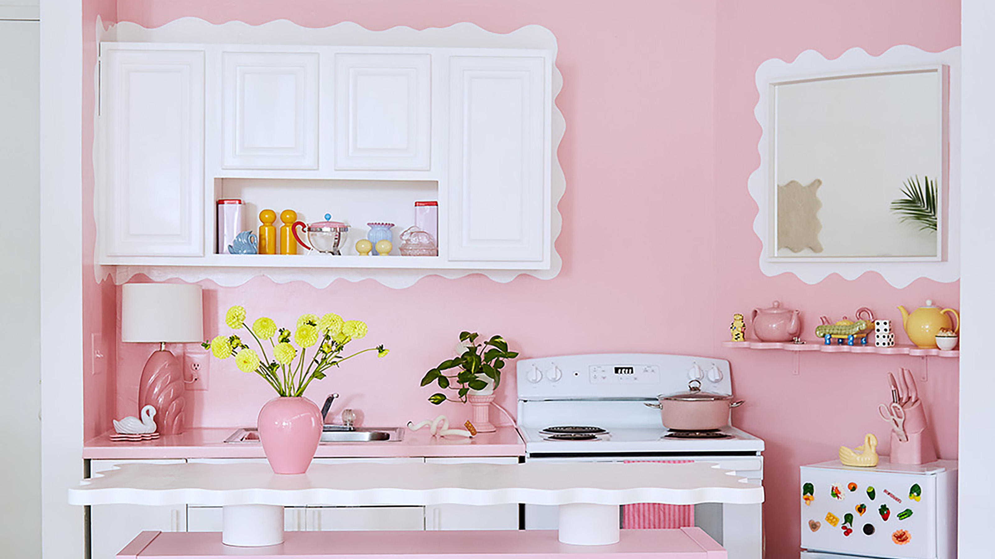 This furniture designer's pink loft apartment will make color minimalists rethink their spaces
Furniture designer Sophie Collé's apartment is a whimsical pink dream. Here's where her inspiration comes from and where she found her decor
By Camille Dubuis-Welch
-
 Before and after: this renter completely transformed her home on a £10k budget
A lick of paint and some new furniture has made this place unrecognisable
By Karen Wilson
-
 Real home: 8 design ideas to copy from this grey-themed home that's anything but boring
And now we've fallen back in love with this versatile colour
By Karen Wilson
-
 Real home: Take a tour of this photographer's incredible creative home – complete with tropical garden
It'll have you dreaming of sunnier climes
By Ifeoluwa Adedeji
-
 Real home: 7 lessons we learned from Ally Dowsing-Reynolds' dark and daring house tour
From finding your design personality to creating a scheme to suit your mood
By Ellen Finch
-
 Real home tour: This island home is what beachside dreams are made of
Olivia and Mark returned to the Isle of Wight to renovate their first home together, and it's gorgeous!
By Louise O'Bryan
-
 Real home tour: This vintage lover's home is a study in using blue
Suzi Jench and Lewis Robinson’s Brighton terraced house has been decorated in calming coastal shades and dressed in unique finds
By Maxine Brady
-
 Real home tour: A colourful kitchen is primed for parties
Isobel and Jeremy Thomson-Cook's stunning extended kitchen is designed for entertaining
By Mandi Miller
