
Mike and Sasha’s search for the perfect family home brought them to the pretty Kentish town of Cranbrook, and the imposing Victorian semi they now call their
own. The couple were keen to balance out the floors, reversing the ‘top heavy’
feel of the house and adding a modern kitchen extension.
Mixing minimalist design, clever glazing and antique bargains, they created an open-plan kitchen that’s perfect for relaxed dining and summer parties. Mike reveals how his directing expertise helped him get hands-on in the design process.
Mike and Sasha thought outside the box when it came to creating more space. If you are inspired to start extending your home, we have plenty of ideas and advice on how to do it. For more completed projects, head to our hub page.

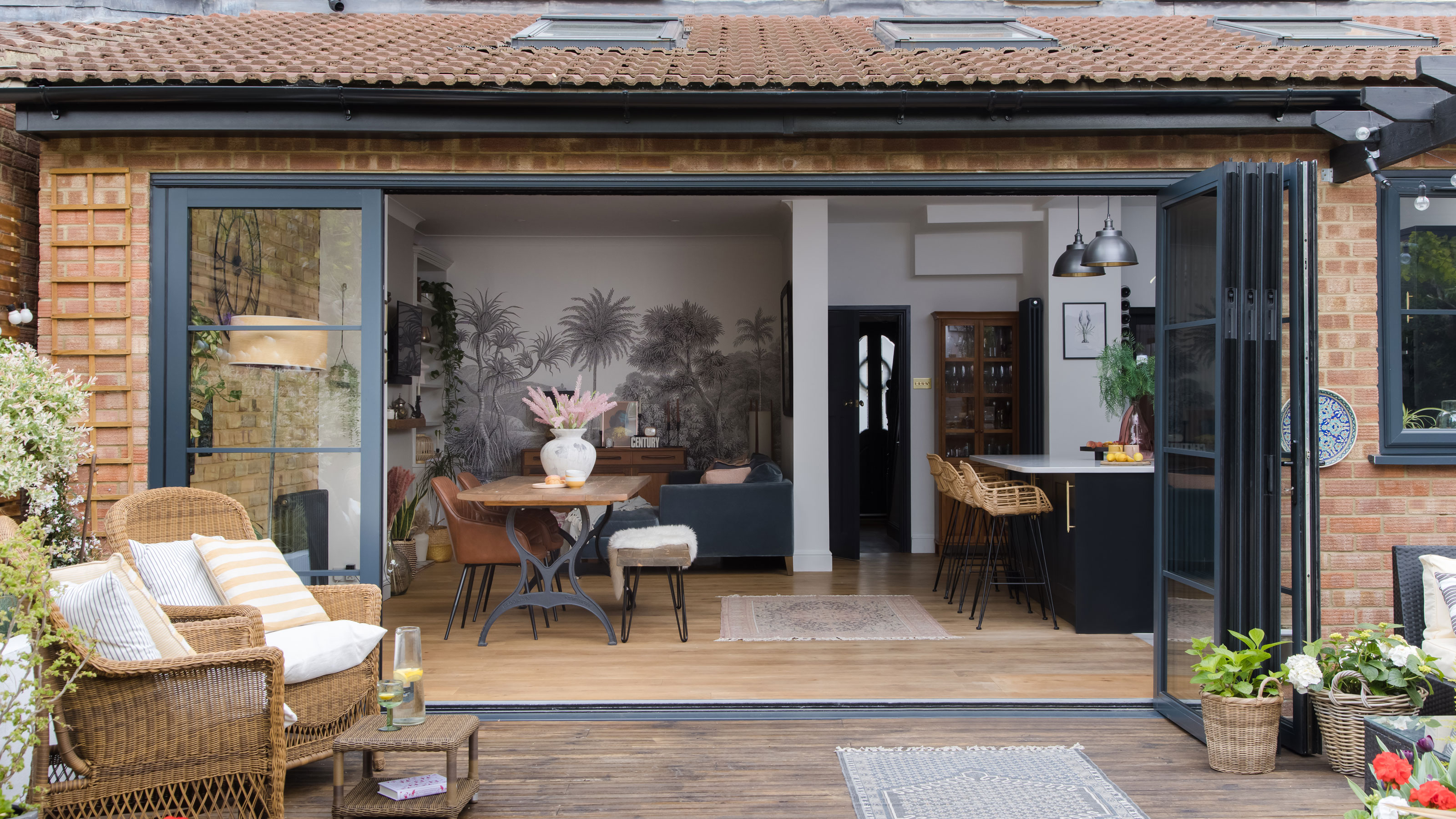
The walls to a warren of small poky rooms were removed and an extension added along the side of the house. Even though the space is north-facing, the glass panels and bi-fold doors let in plenty of light. The ceiling extractor is remote controlled and has adjustable downlights. For a similar extractor, try Miele. For a similar light, try the Unfold pendant, Holloways of Ludlow. For vintage scales, try Etsy
Profile
The owners Mike Martin, a film director, and wife Sasha, a PR executive, live with their children, Beatrice, Nell and Henry
The property A five-bedroom late-Victorian semi in Cranbrook, Kent
Project cost £110,000
‘The layout of the original kitchen was very traditional. In the past, it had been used mainly by the domestic staff,' reveals Mike. 'Clearly, it wasn’t going to work for a modern family in the 21st century! The obvious answer was to add a side extension, take down the external walls and open and rationalise the space. The back of the house is north-facing and was quite dark, so we decided to use structural glass to bring in the maximum amount of light.
‘Our initial ideas sprung from seeing the Hastings Contemporary gallery. We liked the dark-tiled exterior and use of materials and how it worked with the traditional buildings around it.’

The doors fold right back against the building, so garden and seating area become one large interactive space. The grey render and zinc roof were inspired by the Hastings Contemporary gallery. The box window opens out with a scissor hinge. For similar grey-framed bi-fold doors, try Shueco
‘We turned to our family friend and architect Richard Gill, whose practice is based in Cranbrook. He suggested creating a glass link between the existing house and the new building, but that turned out to be difficult to construct within our budget. We initially wanted it to all be structural glass, but the cost was prohibitive and the build was then delayed while we searched for a cheaper solution. Eventually, we opted for solid walls, with a glazed section to make the best use of the early morning light.’

Contemporary-style glazing links the older part of the house to the new extension. The red chairs have been in the family for years. For a similar wall-mounted light try the Conran Shop. For similar chairs, try the Wingback Angel armchairs by Sloane & Sons
‘Having experience of lighting sets for work, I designed the lighting plan and chose as much non-directional lighting as possible. In the evening this gives the room a great soft glow.
‘We added bi-fold doors at the rear of the extension for access to the patio and outdoor dining area, and a large box window in the side wall, which provides light and has a window seat, too. It has a scissor-action opening mechanism that allows the glazed panel to be extended outwards for ventilation. We were so pleased with the final result – it’s a great place to sit and read.’

The window seat is a favourite place to sit with a coffee and catch the morning sun. For bench seat cushions, try Bean Bag Bazaar
‘I designed the kitchen with Richard, doing as much as the work myself as possible to eke out the money as best I could. The space is entirely open with a single pillar supporting the upper floors. It rises out of the central island, which is our main food prep area, as well as where we house the oven, hob, sink and dishwasher.
‘We built a breakfast bar and storage into the opposite side of the work zone. For a streamlined finish, we used touch catches on all the doors, and instead of having laundry appliances on show in the kitchen, we’ve retained the original scullery as a laundry room and a cloakroom.’

A mishmash of vintage chairs and a wooden dining table fit perfectly into the theme. Behind the island is a floor-to-ceiling bank of cupboards that offer masses of storage. For similar Windsor dining chairs, try Ercol. For red metal chairs, try Habitat. The red metal stacking school stools (by island) were a junk shop find
Contacts
Architect Richard Gill,
Render The Coloured Render CompanyJUB
Kitchen Mereway
Glazing Paben WindowsCountry Vision
‘The project was challenging at times, partly because of delays caused by a tight budget, and partly because of my inability to let quality slip to get things done on time! To add to the pressure, Sasha insisted that she’d celebrate by having a Christmas party – for the last three years, we’d been reluctant to invite anyone round to our house because of all the mess. Our kitchen worktops were installed on Christmas Eve. It was a nightmare at times, but we kept our sense of humour – and we’re delighted with the result.’

A stainless-steel tap and undermounted sink sit neatly in the corner of the island. For a similar tap and sink, try Franke

-
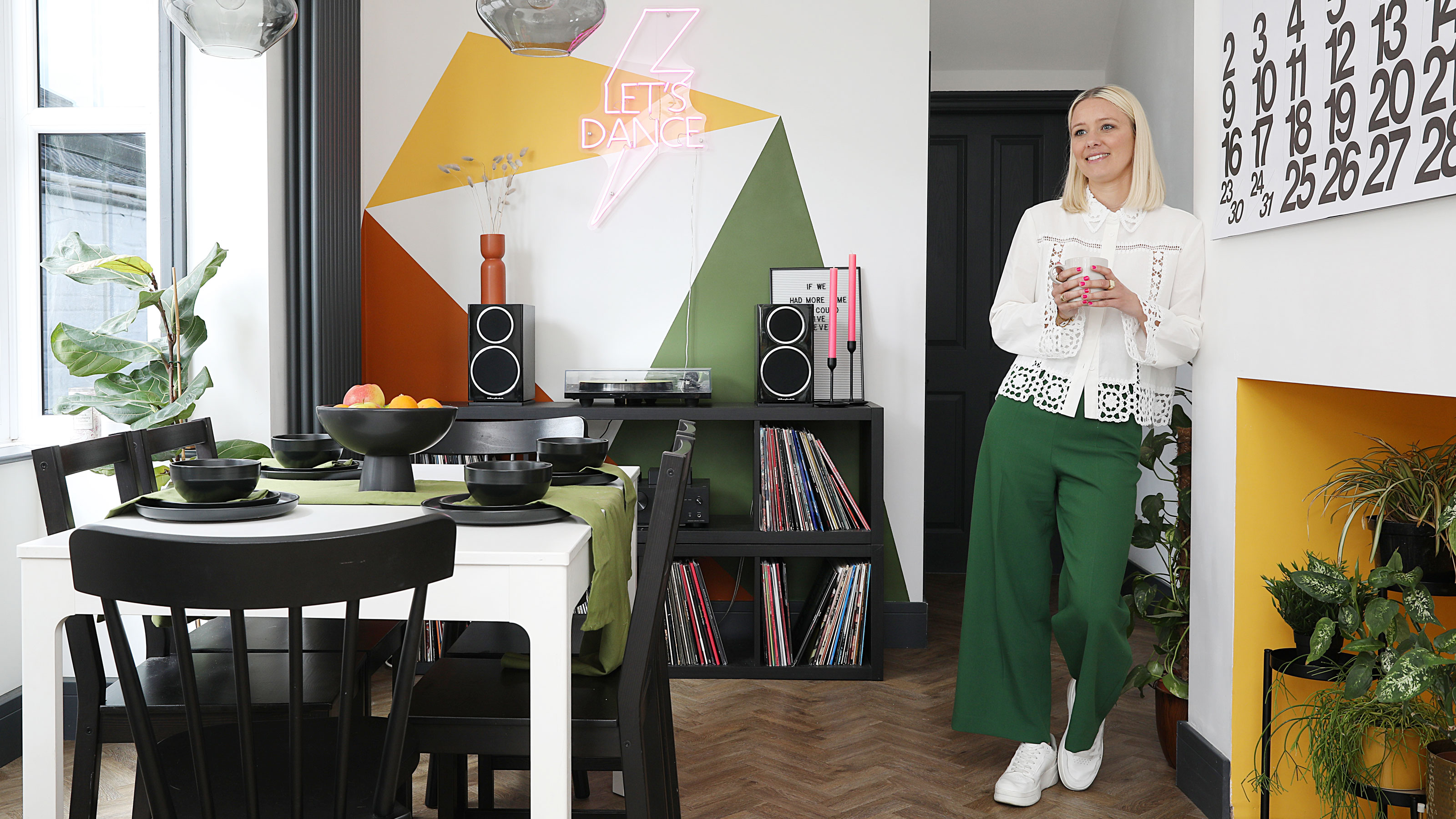 This colourful home makeover has space for kitchen discos
While the front of Leila and Joe's home features dark and moody chill-out spaces, the rest is light and bright and made for socialising
-
 How to paint a door and refresh your home instantly
Painting doors is easy with our expert advice. This is how to get professional results on front and internal doors.
-
 DIY transforms 1930s house into dream home
With several renovations behind them, Mary and Paul had creative expertise to draw on when it came to transforming their 1930s house
-
 12 easy ways to add curb appeal on a budget with DIY
You can give your home curb appeal at low cost. These are the DIY ways to boost its style
-
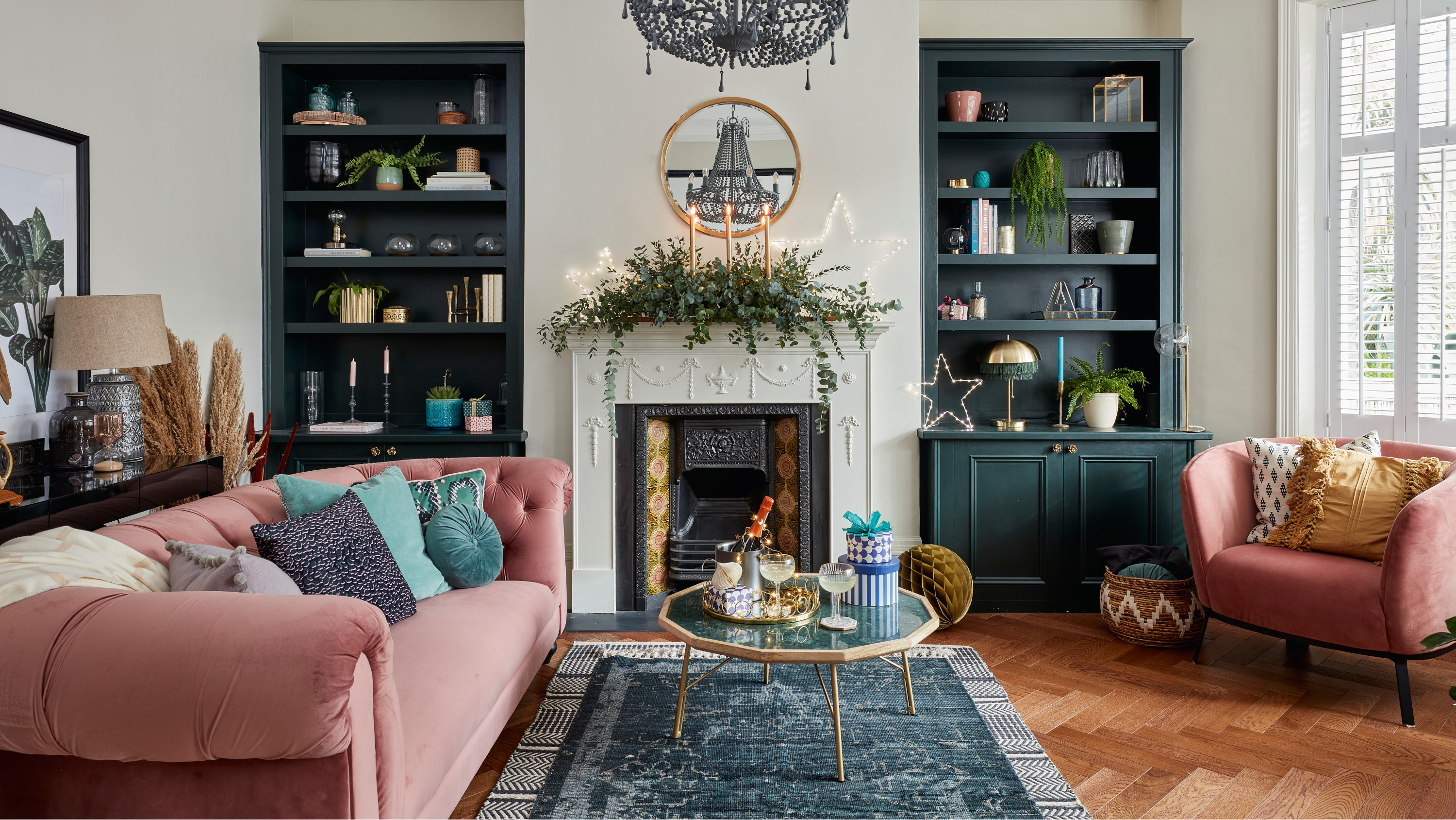 5 invaluable design learnings from a festive Edwardian house renovation
If you're renovating a period property, here are 5 design tips we've picked up from this festive Edwardian renovation
-
 Real home: Glazed side extension creates the perfect garden link
Louise Potter and husband Sean's extension has transformed their Victorian house, now a showcase for their collection of art, vintage finds and Scandinavian pieces
-
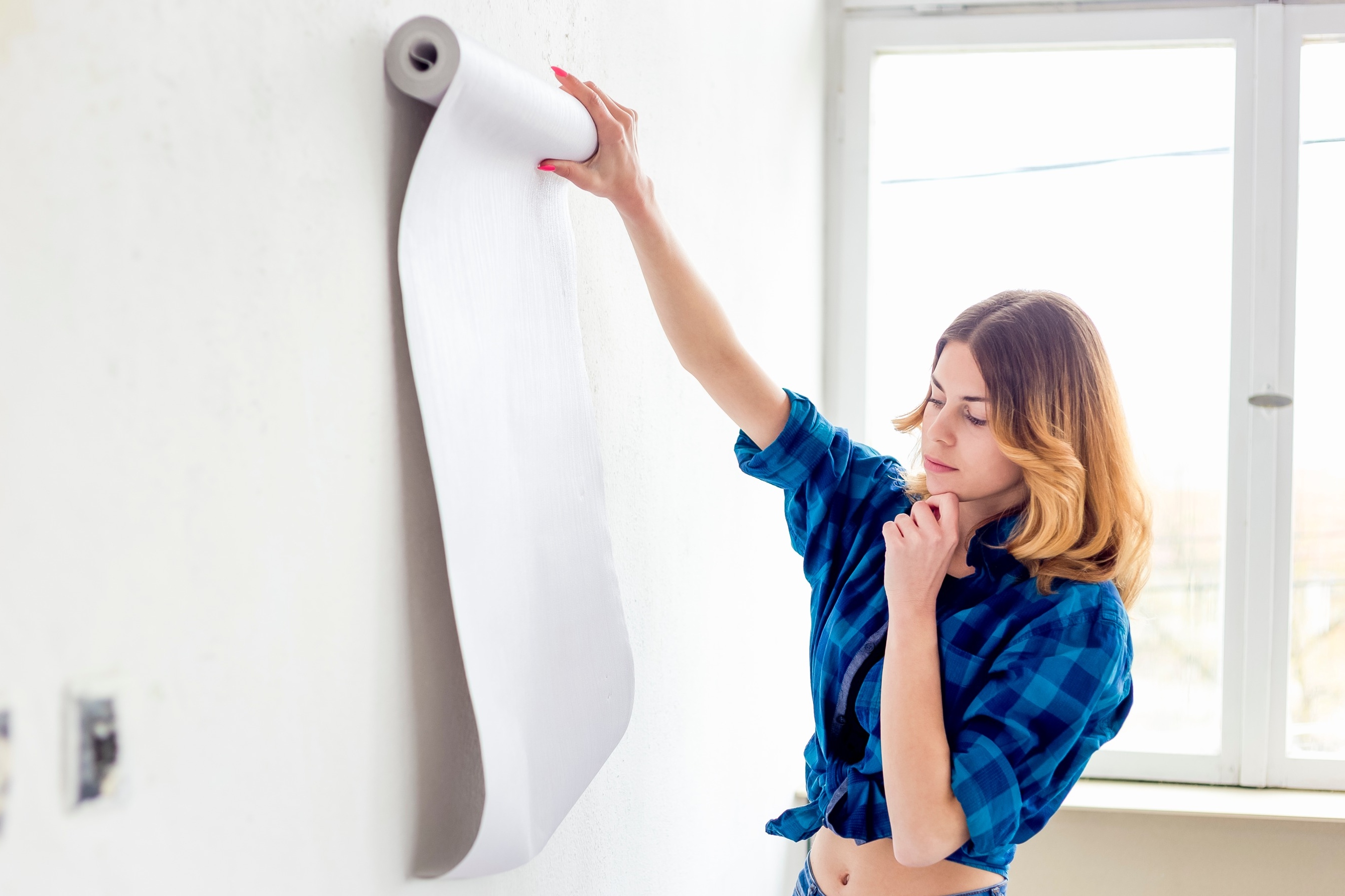 I tried this genius wallpaper hack, and it was perfect for my commitment issues
Beware: once you try this wallpaper hack, you'll never look back.
-
 Drew Barrymore's new FLOWER Home paint collection wants to give your walls a makeover
Drew Barrymore FLOWER drops 27 brand-new paint shades, and every can is made from 100% post-consumer recycled plastic.


