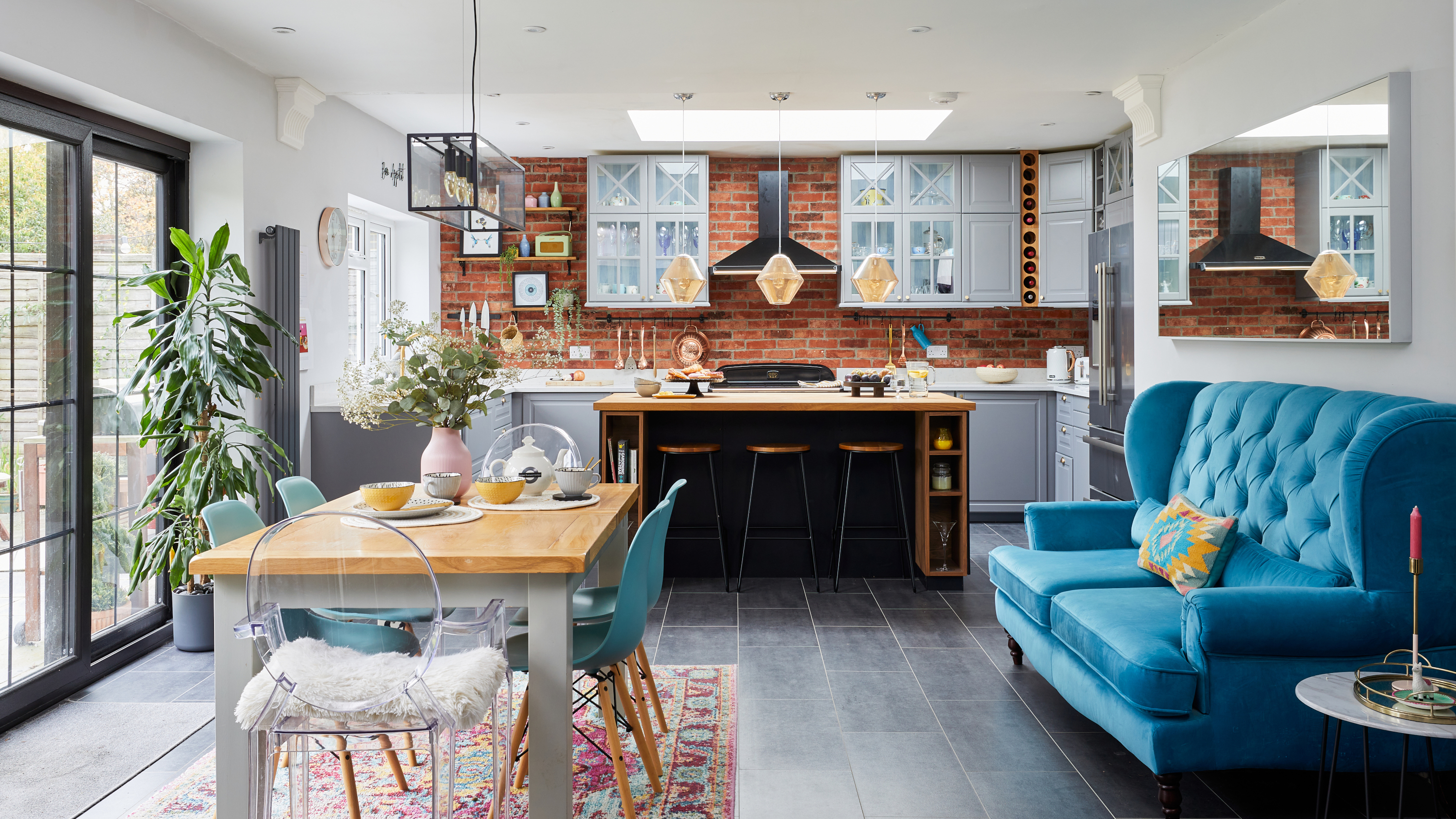

Against a constant tide of new trends, a home with its own unique character is pretty special. As tempting as it is to get on board with what’s hot on Instagram – from dark blue kitchens (arguably closer to a classic these days) to boucle sofas (soft, but not red wine friendly) – the best homes are those that reflect their inhabitants’ personalities, and are filled with treasures and knick knacks from years of memories.
It’s the quirky, one-of-a-kind style that makes Charlotte and Sam’s house renovation so special. They’ve transformed a cramped and dated bungalow, taking an empty shell and adding their stamp to it. 'The actual property looked a little bit like a cottage, and it just wasn’t big enough for us,' Charlotte says. 'I was keen to reconfigure from the start – I love American Hampton-style homes and the rest of the street looks a bit like a scene from Desperate Housewives, so my vision fitted in quite well!
'Ours was the only small house in the road. It was a dormer bungalow with two bedrooms in the attic, built in 1952. The layout was strange – there was a small kitchen in the middle of the house with no room for a table; the dining room was at the back and there was a bedroom downstairs, plus a shared bathroom. Oh, and there was a shower room in the attic, which you couldn’t stand up in!'
Filled with theatrical flair and Charlotte’s love of Art Deco, the couple's renovation is a tribute to designing a house for you, not for a trend – and Charlotte told us how they did it.
1. Go all-out and scale back later
Profile
The owners Charlotte Fisher (@thehousethatcharlottebuilt), a lawyer and actor, her husband Sam, an accountant, and Henry the cavapoo
The property A three-bed 1950s dormer bungalow in Ashtead, Surrey
Project cost £227,000
'Sam had worked on a few houses before with his mum and stepdad, but when we bought this house – the first one we’ve bought together – we were looking for a project. I’m quite picky and wanted to make my mark on a property. My dad is a wheelchair user, so we also wanted to make sure we could create something accessible. If we were doing our own renovation, we could make sure all those amenities were there for him.
'We have a friend who’s an architect, so we worked with him to get some designs drawn up, then we gathered loads of quotes from builders. We had to get planning permission, so we scaled our plans back in size before putting them in – which, in hindsight, was a mistake. You should just go for it and scale back if they get rejected instead!'
2. Take on the work yourself to save money
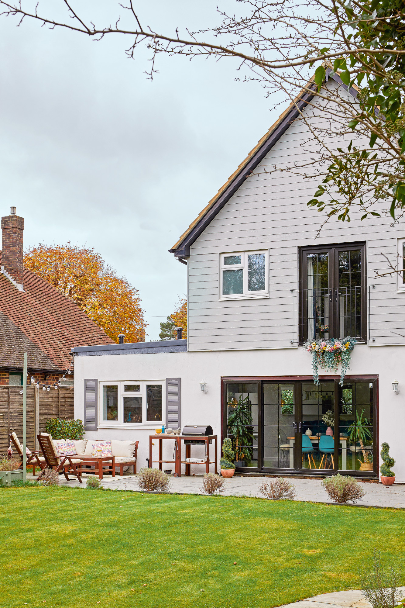
'Because it was an extensive renovation – we had to take the roof off to add a storey – everything was gutted first. We decided to project manage the build ourselves: I’d source items and Sam would be there on site to make decisions day-to-day. To save money, we asked the builders to take us up to the shell – literally just walls and a roof – and we’d do the rest. We worked on the bedroom and en suite first, temporarily moving back to my parents’ house until it was in a liveable state. That was our little den while the rest of the work was done. We lived off a microwave in the corner for the rest of the build.'
3. Inspiration can come from anywhere
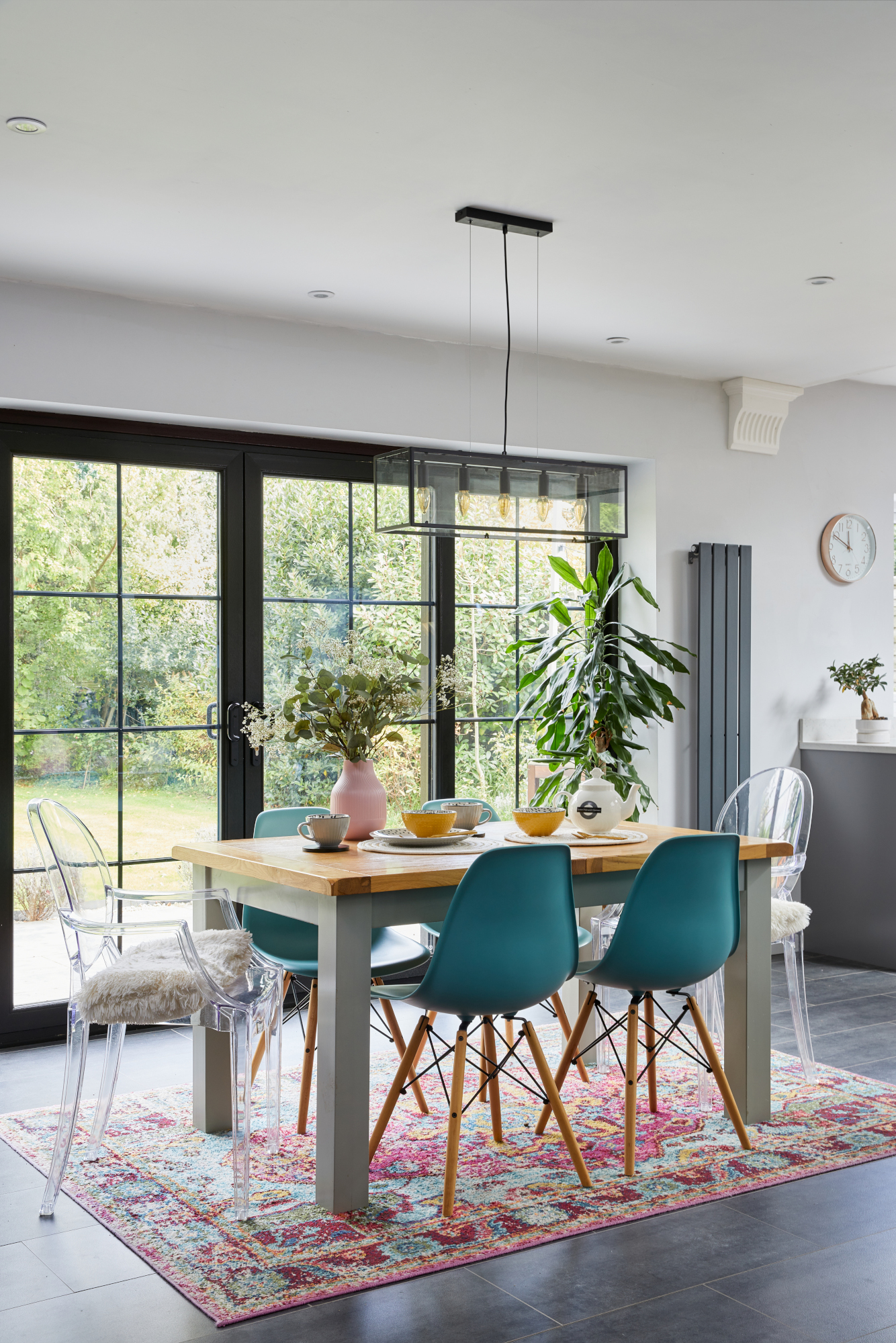
Clear dining chairs, John Lewis & Partners. For a similar dining table, try Dunelm. Pendant light, Wayfair. Doors, Modern uPVC Windows
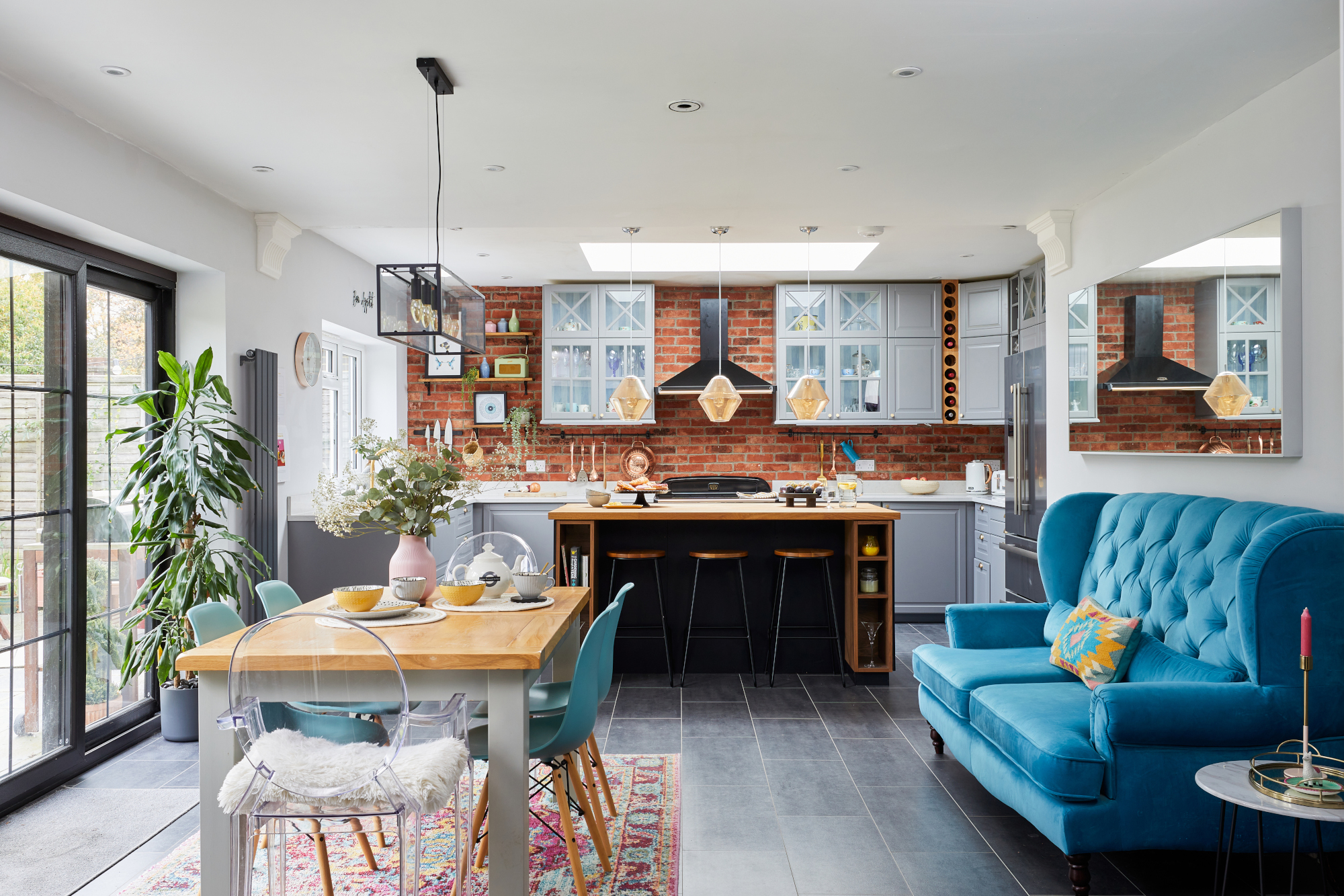
'We mostly worked within the footprint of the original house, so the kitchen is the only bit with a new foundation – we added about 4x2m. Our architect advised us on the layout and told us to put the actual kitchen under skylights; it makes a huge difference when you’re cooking or sitting at the island. We got the kitchen from Ikea, which saved us money but took three long weekends of planning with the in-house planner. The goal was a sociable space where we can host parties and gather around the island. There’s also a study/dining/bedroom off this room, which we keep as a flexible space; there’s a sofa bed so Dad can stay.
'It was a scene from the TV show Doctor Foster that inspired the brick wall. I found the still online and added it to my Pinterest board. I was set on having one, so when I saw the builders putting in breeze blocks, I was like, “Where’s the brick?” We used brick slips in the end, which are about two centimetres thick and go on like tiles, except you have to be more careful with the grouting. I like the fact that it ties in with the original brick-built house.'
4. Use a colour wheel to nail your scheme…
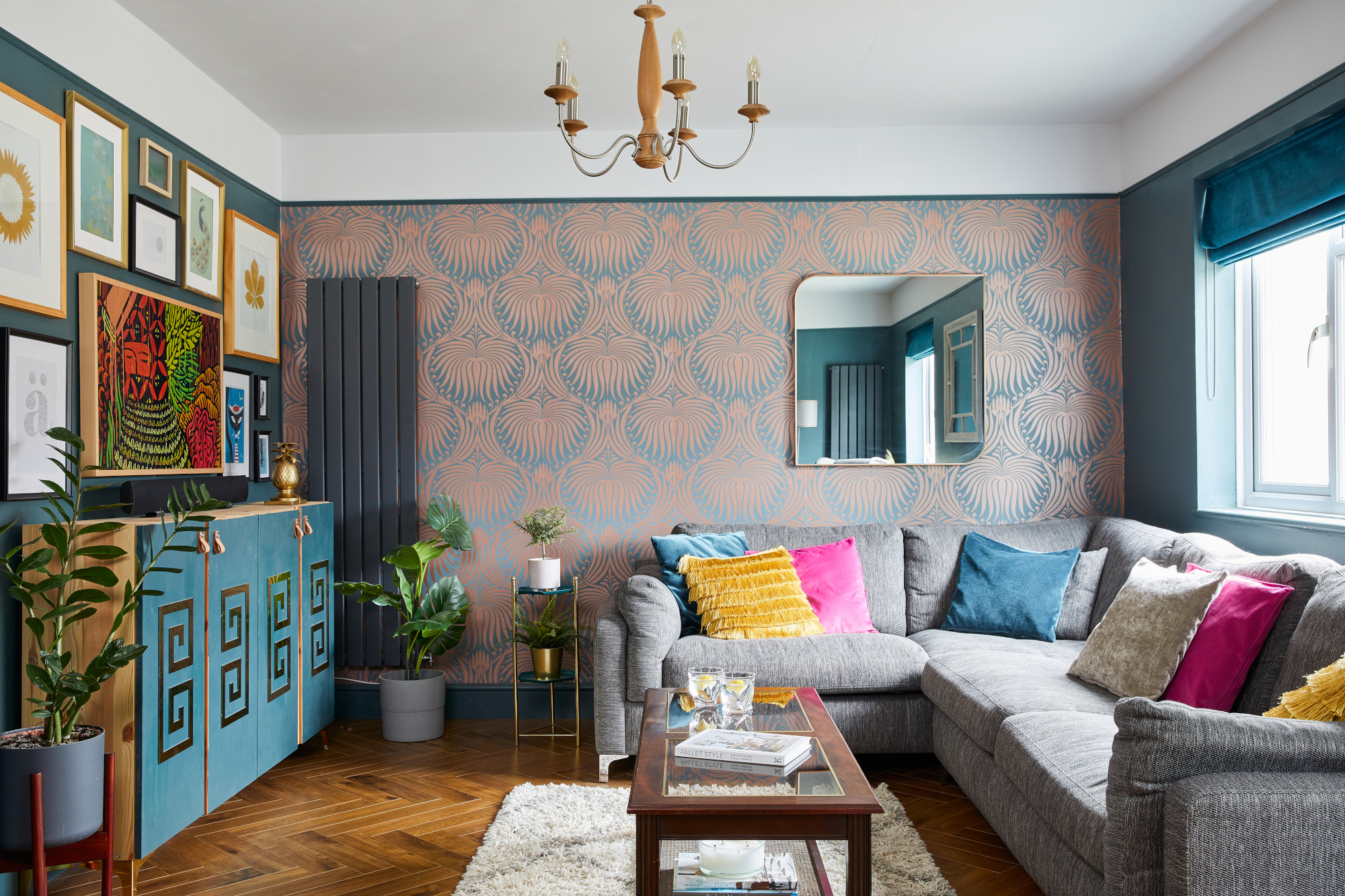
Flooring, Floor Monster. Wallpaper and Inchyra Blue wall paint, Farrow & Ball. Sofa, Sofology. Ceiling light, Dunelm. Coffee table and sideboard, vintage
'I’m a massive fan of Pinterest and had a mood board for each room. Being quite arty, I tend to pick contrasting hues on a colour wheel for a scheme, like the pink in the lounge against the teal walls. I do a lot of theatre as an actress, which I think influences my home. And a lot of the artwork in our house was donated by one of our friends, who’s South African and uses a lot of colour in their work.'
5. … but don't be afraid to bend the rules!
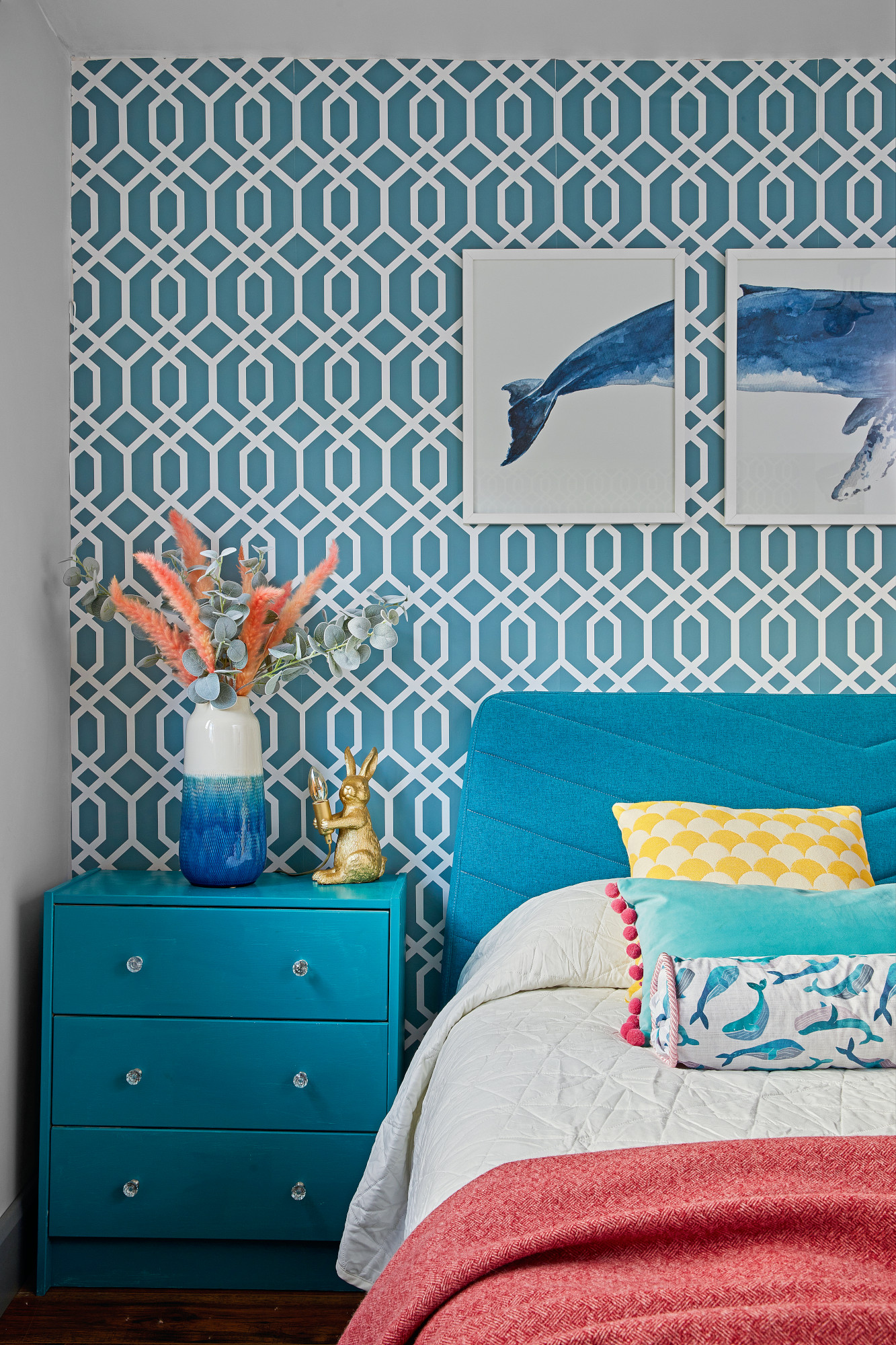
Wallpaper, Dunelm. Whale art prints, Quantum Prints via Etsy. Bed, Made. Bedside table, Ikea. Pom-pom and yellow and white cushions, Amazon. Whale cushion, made with fabric from Myfabrics.co.uk. Rabbit lamp, Iconic Lights
Costs & contacts
Build cost £200,000
Kitchen £12,000
Furniture and décor £6,000
Professional fees £5,000
Bathrooms £4,000
Architect David Balkind of Draw & Plan
'The spare bedroom is nice to have, especially as we have a lot of friends who stay over. The wallpaper is actually adhesive – we wanted a bit of a quirky, bold print and this fit the bill. I love the look of the whale pictures, too.
'I love the 1920s, so there’s a lot of Art Deco in each room, but I wanted a different theme for each space. The living room at the front of the house, for example, doesn’t get much sunlight. I disagree with the idea that you have to use light colours in dark rooms. I went for Farrow & Ball’s Inchyra Blue as I love teal, and got the wallpaper from there to match.'
6. Your home doesn't have to be unified
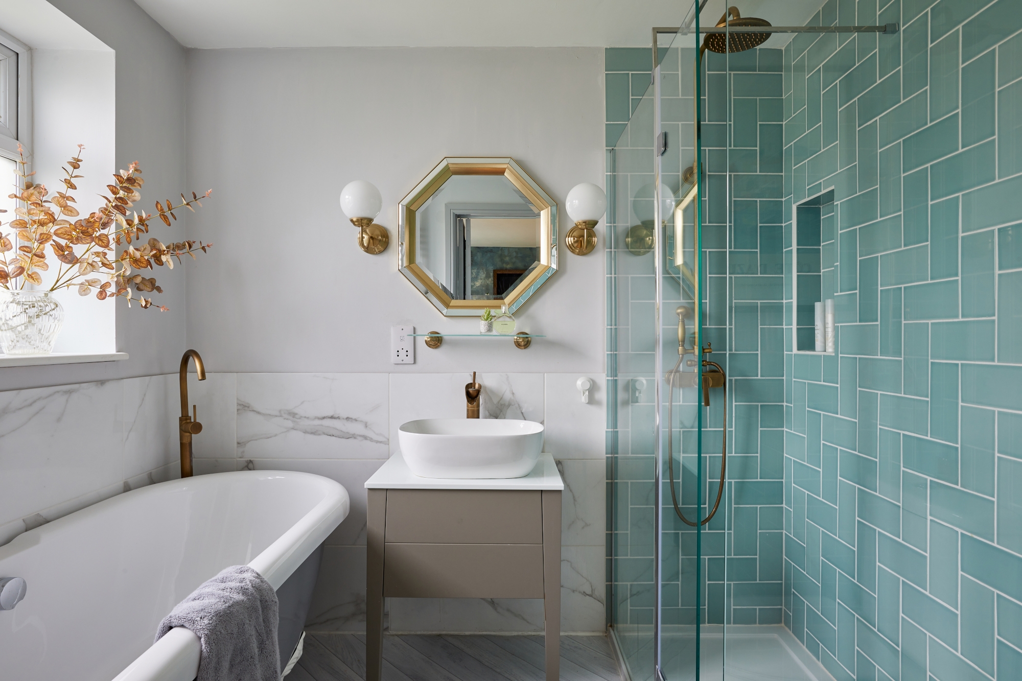
Marble wall tiles, Walls & Floors. Vanity unit and bath, Victoria Plum. Mirror, Exclusive Mirrors. Wall lights, Ikea
'The bathrooms all have a different feel. There’s a wet room downstairs, which is handy for Dad and also for the hot tub in the garden. Our en suite (pictured) has lots of gold and duck egg blue, while the main bathroom has a botanical/jungle theme – wood-effect tiles, bamboo, lots of plants and a leaf-print blind.'
7. Take it room by room to avoid overwhelm
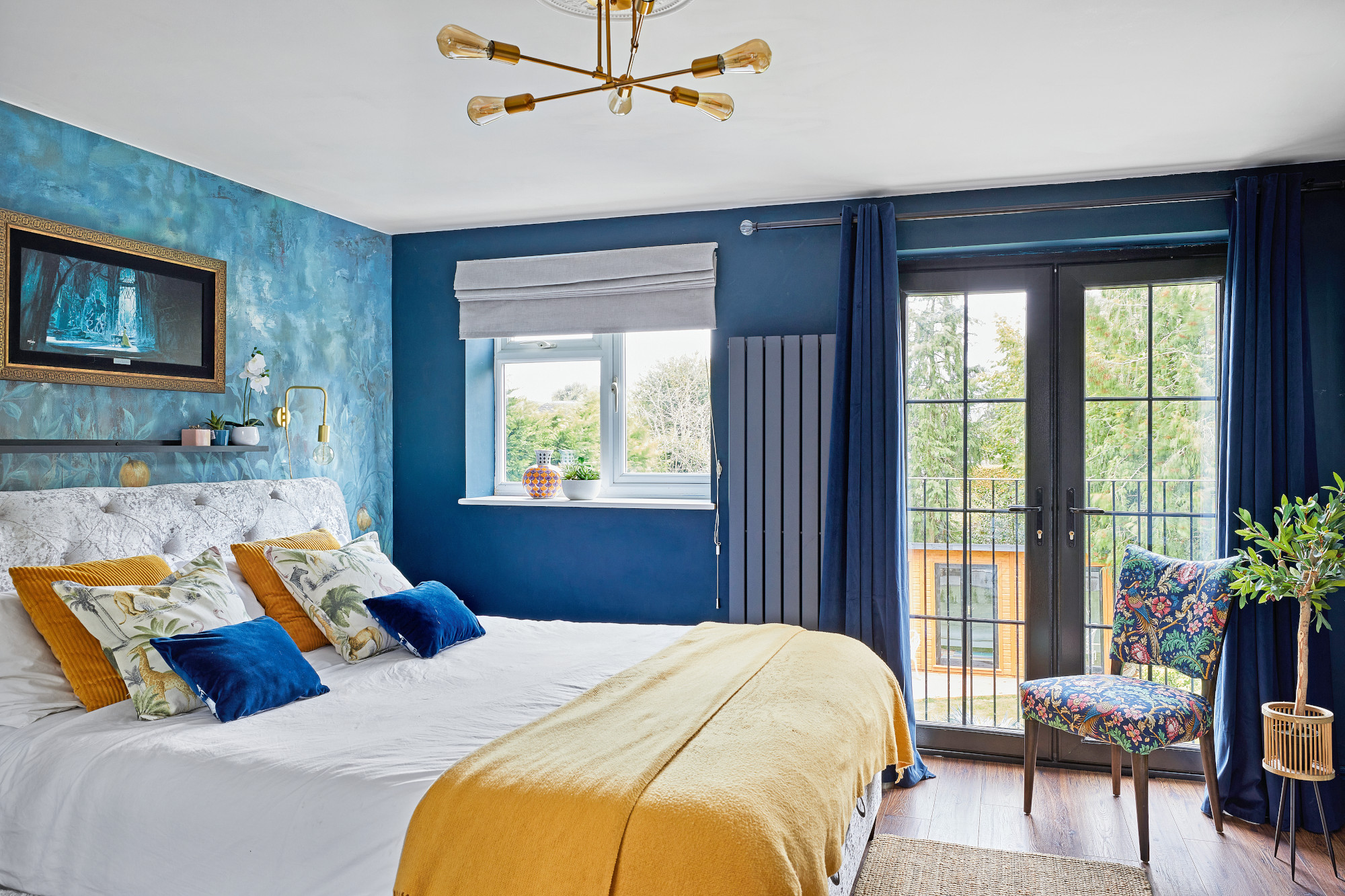
Walls painted in Azure Fusion 2, Dulux. Wallpaper, Hovia. Bed, Happy Beds. Chair, Ebay, upholstered with fabric from Myfabrics.co.uk. Ceiling light, Dunelm. Bedside table, Ikea. Art over bed, Magic of Disney Art
'The project was overwhelming at times because you're making every single choice. It got to the point where the electrician was asking what height we wanted the plug sockets, and my answer to everything was just ‘a normal height’! My advice to anyone taking on a renovation is to take it one room at a time. It might feel slow-going, but it feels like a real accomplishment when you've finished.'
Subscribe to Real Homes magazine
Want even more great ideas for your home from the expert team at Real Homes magazine? Subscribe to Real Homes magazine and get great content delivered straight to your door. From inspiring completed projects to the latest decorating trends and expert advice, you'll find everything you need to create your dream home inside each issue.
Join our newsletter
Get small space home decor ideas, celeb inspiration, DIY tips and more, straight to your inbox!

Formerly deputy editor of Real Homes magazine, Ellen has been lucky enough to spend most of her working life speaking to real people and writing about real homes, from extended Victorian terraces to modest apartments. She's recently bought her own home and has a special interest in sustainable living and clever storage.
-
 Planning makes perfect when designing this dream home
Becks and Martin Huntley spent lots of time on design and layout to get the most out of their space when renovating
By Karen Wilson Published
-
 Interior design enthusiast's converted farm home is a showcase for luxe style
Sam Marlow, the founder of Lime Lace, used all her skills to give the renovated period property a signature look
By Alison Jones Published
-
 Real home: Long-term extension project creates the perfect family space
Kate and Adam’s three-pronged renovation took over a decade – but was well worth the wait
By Karen Wilson Last updated
-
 Real home: knocking through for more space without extending
By knocking together a warren of disjointed rooms, Patsy and Al have created a new hub to their home without needing to extend
By Karen Wilson Last updated
-
 Before and after: an extended 1930s home with quirky creative touches
After a side and rear extension and a full-blown makeover, this house is fit for a family
By Karen Wilson Published
-
 Before and after: a modern kitchen extension with cool industrial touches
We love this contemporary extension – especially that surprise pop of colour…
By Ellen Finch Last updated
-
 Real home: this interior designer's home is a masterclass in layering texture
Notebooks at the ready – this extended terrace is packed with stylish ideas to steal
By Ellen Finch Published
-
 Before and after: this interior designer extended her family home for £50k
All thanks to a combination of skill and imagination
By Ellen Finch Published
