
Unless you have a huge bathroom (lucky you!), designing one of the most functional rooms of the house within a small space makes it one of the trickiest tasks in any renovation. Often, this leads to compromises – choosing a shower over a bath, for example, or forsaking extra storage where you really needed some.
We know bathrooms are hard work, which is why we were amazed by what Barbara Davidson has managed to achieve in her small space. Combining her separate bathroom and WC after 20 years of living in cramped conditions was no easy feat, especially when she was so determined to fit in everything she wanted – but somehow, with a few genius tweaks and a dose of luck, she’s managed to create a quirky sanctuary that nods to her love of maximalism while feeling calm, too.
If you are planning a bathroom revamp, we have lots of bathroom ideas and advice to help you. For more real home transformations, head to our hub page.
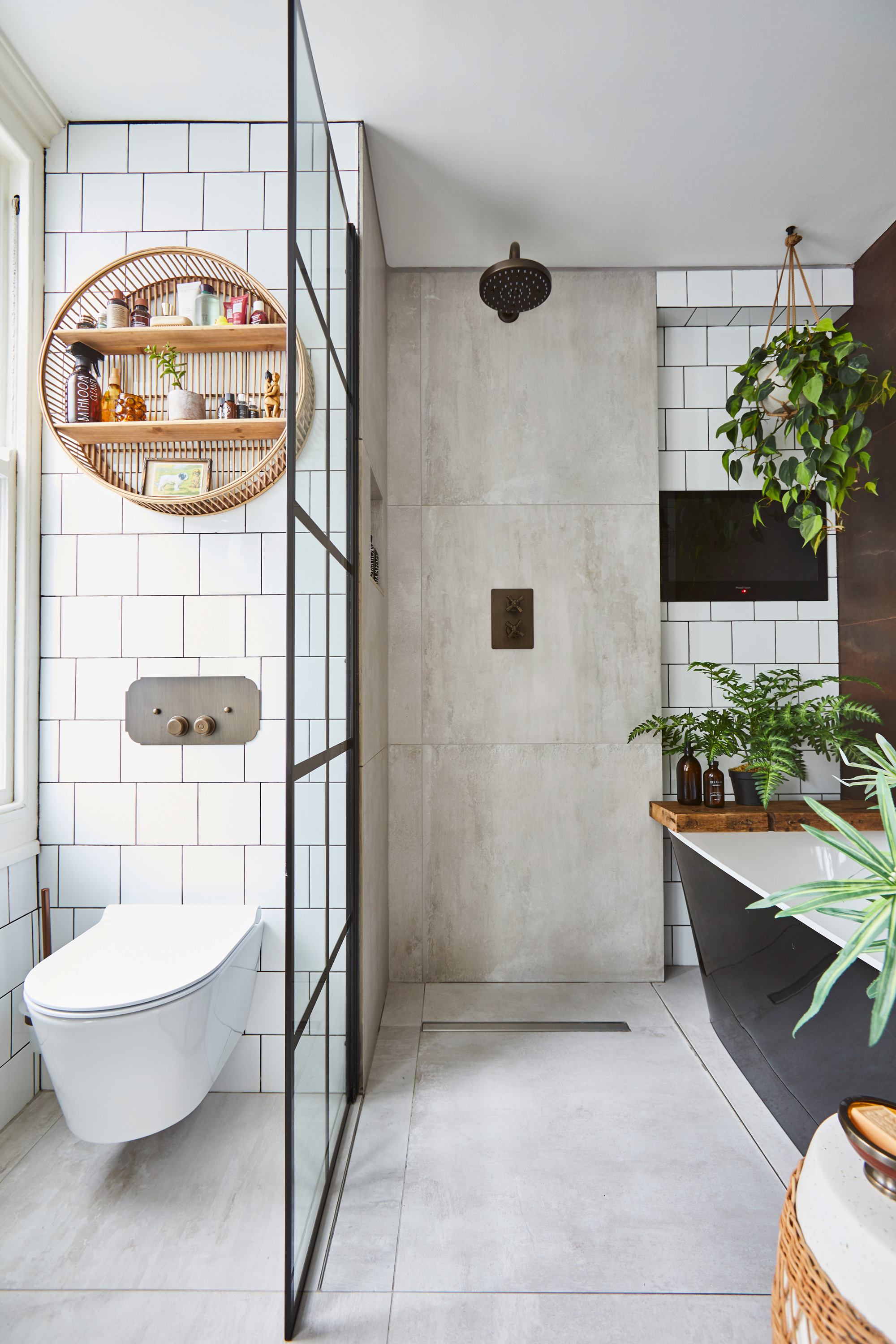
Wall and floor tiles, Walls & Floors. Shower and WC, Parker Bathrooms
Profile
The owners Barbara Davidson, a freelance journalist, her partner, Erwin, who works in IT, and their Tibetan terrier, Humphrey
The property A one-bed flat in a 1900s terrace in Brighton
Total project cost £26,000
‘When I first viewed this flat, I was attracted by the light, spacious rooms – except for the bathroom, which was at the back and split into two rooms,' says Barbara. 'The loo was poky with a tiny sink, and the only thing in the “main” bathroom was a giant hexagonal spa bathtub right in the middle. My sister suggested knocking the two together, but I didn’t have the confidence. Instead, I made the most of what I had, squeezing in a mini bath and a shower and using lots of fancy wallpaper to try and detract from the size. I was always banging my elbows on the shower and had to perch on the edge of the bath to do my makeup, but I loved it.’
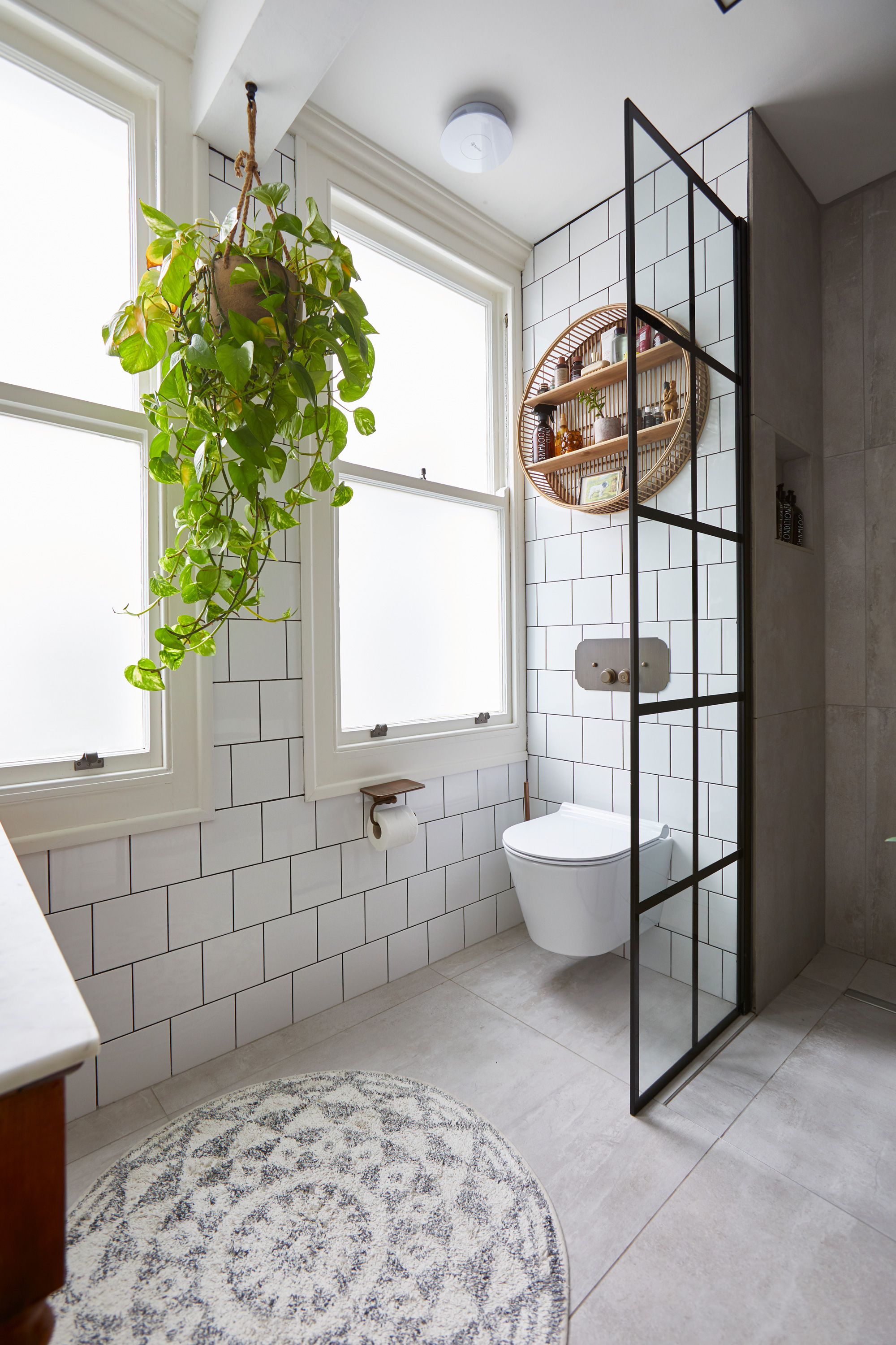
‘I lived with this pretty cramped layout for nearly 20 years until my uncle sadly passed away in 2018. He left me some money, which gave me the budget to overhaul the space. The rooms were so strangely shaped, with angled walls, which made it difficult to see just how much space I had. I asked my friend Jeremy, a builder who later worked on the project with me, to take a look. He told me not to move the loo as it’d cost a fortune, and tried to encourage me to close up a window, but I loved the idea of having two windows – despite the fact that it made the layout even trickier to design!’
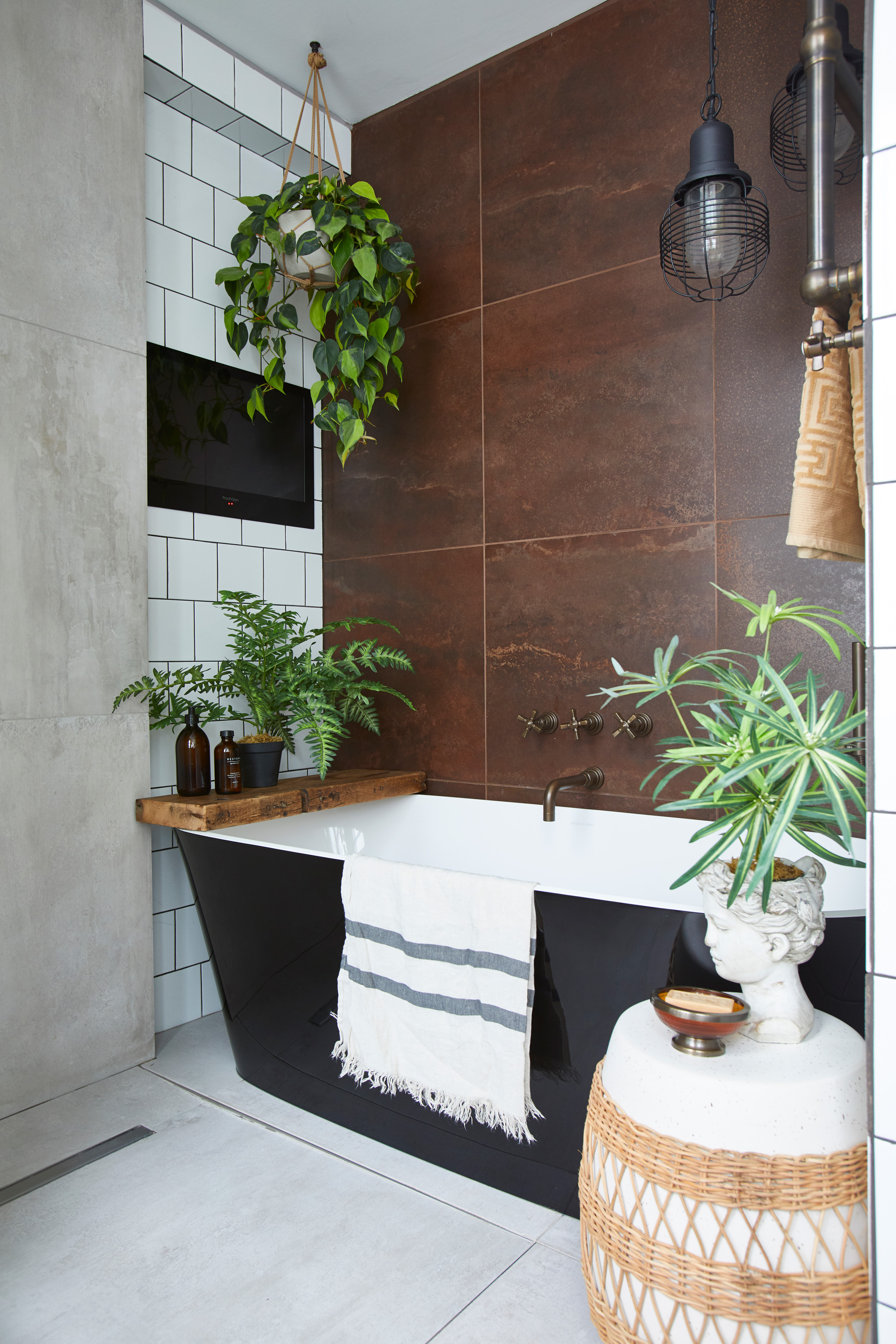
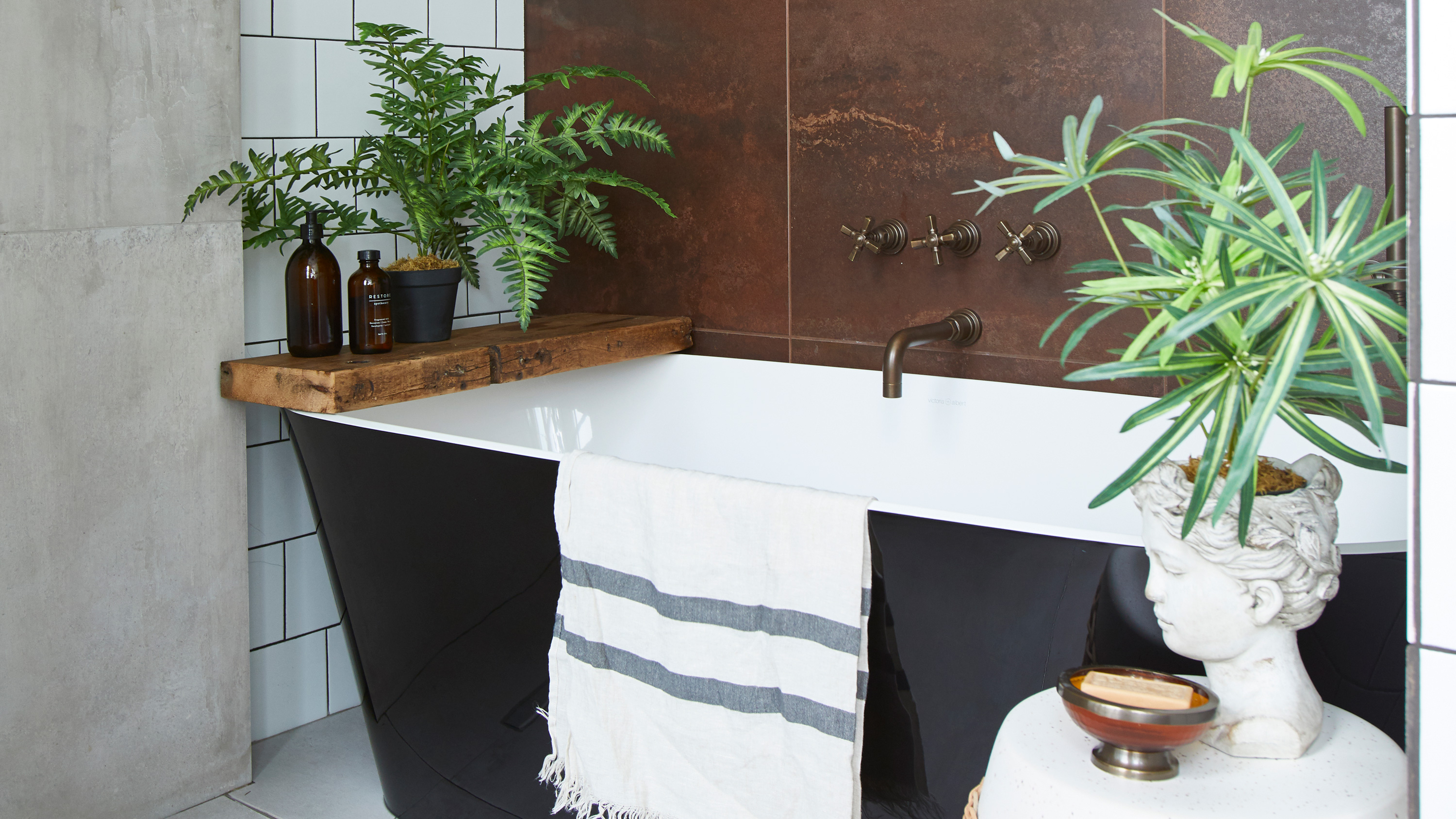
Taps, bath, and copper tiles, Parker Bathrooms. Stool, Anthropologie
‘I’m very much a bath person, but struggled when people told me I had to pick between that or a shower – I wanted both! On Pinterest I’d seen people were having wetroom-style showers next to their baths and it seemed a good solution. I’d also seen an image of a black bath with copper tiles. It was so gorgeous that it stuck with me.
‘The bath was the real extravagance. I was planning to buy one online to save money, but when I spotted this in the bathroom showroom, I fell in love. The rim is really thin, which is helpful for saving space. I was a few millimeters short of having room for it but I ordered it anyway. Jeremy made it fit by removing a row of bricks to make a little alcove.’
- See also: 25 bathroom color ideas we love for 2021
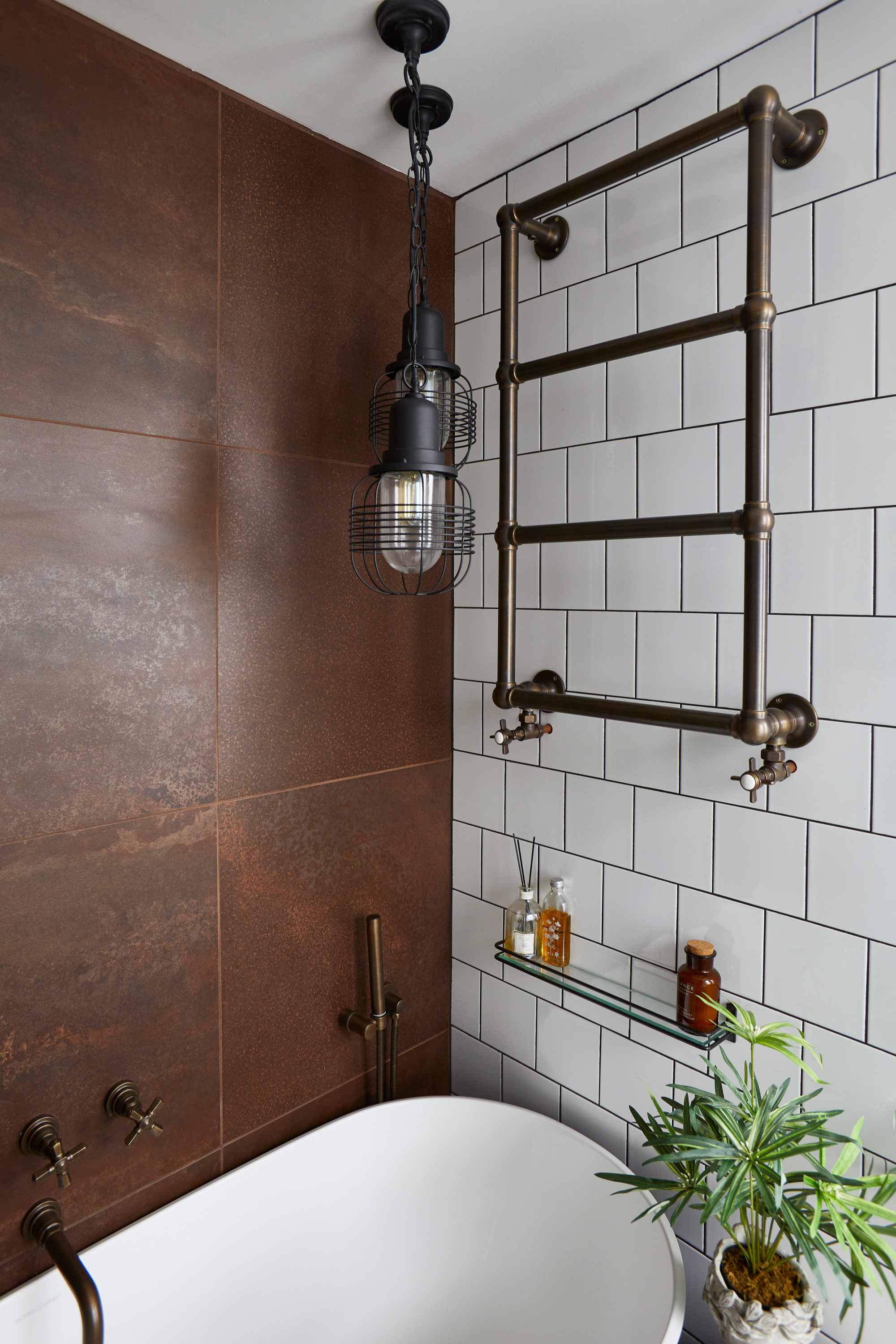
Ceiling lights, Lamp & Light. Radiator, Parker Bathrooms
‘In the end, I had to move the loo – there was no way around it and I didn’t want it to be the first thing you saw when you walked in. Once I did that, things fell into place. I went into the bathroom showroom with my scribblings and had them look at it. They said it was unconventional but should hopefully work. I spent a lot of time working out how much space I needed to leave between this and that, but once the wall came down, I realized there was so much more room than I thought.’
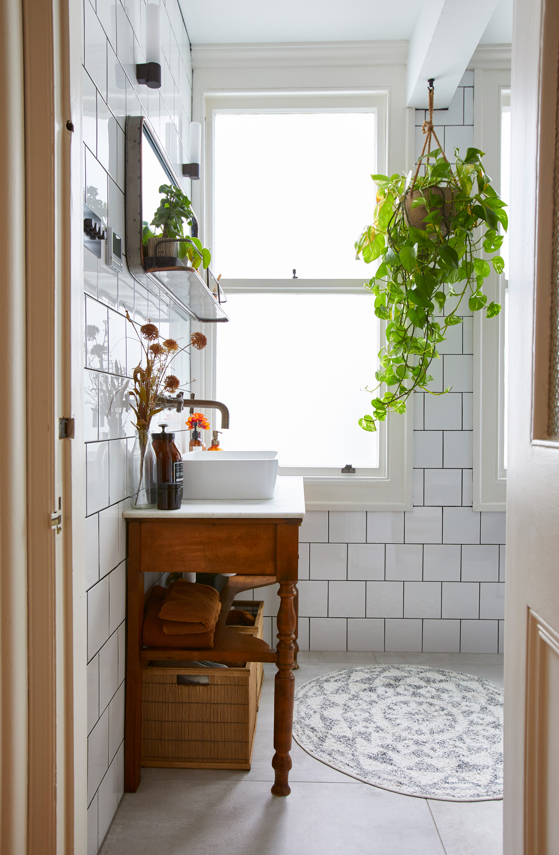
‘The lighting is the most successful thing about the whole bathroom. In the daytime, the two windows bring in so much natural light. In the evening, because I planned in lighting at different levels and put everything on dimmers, there’s such a lovely ambiance in here.
‘The budget ended up going a little over what I expected. We needed to overhaul the electrics for the entire flat to work with the lighting scheme. And when we pulled the flooring up, all the joists were rotten, so the whole thing needed replacing. When the wall was taken down, the remaining beam was supposed to go into the ceiling, but to save money, we boxed it in. It’s become a bit of a feature – I hang plants from it.’
- Find more bathroom lighting ideas in our guide.
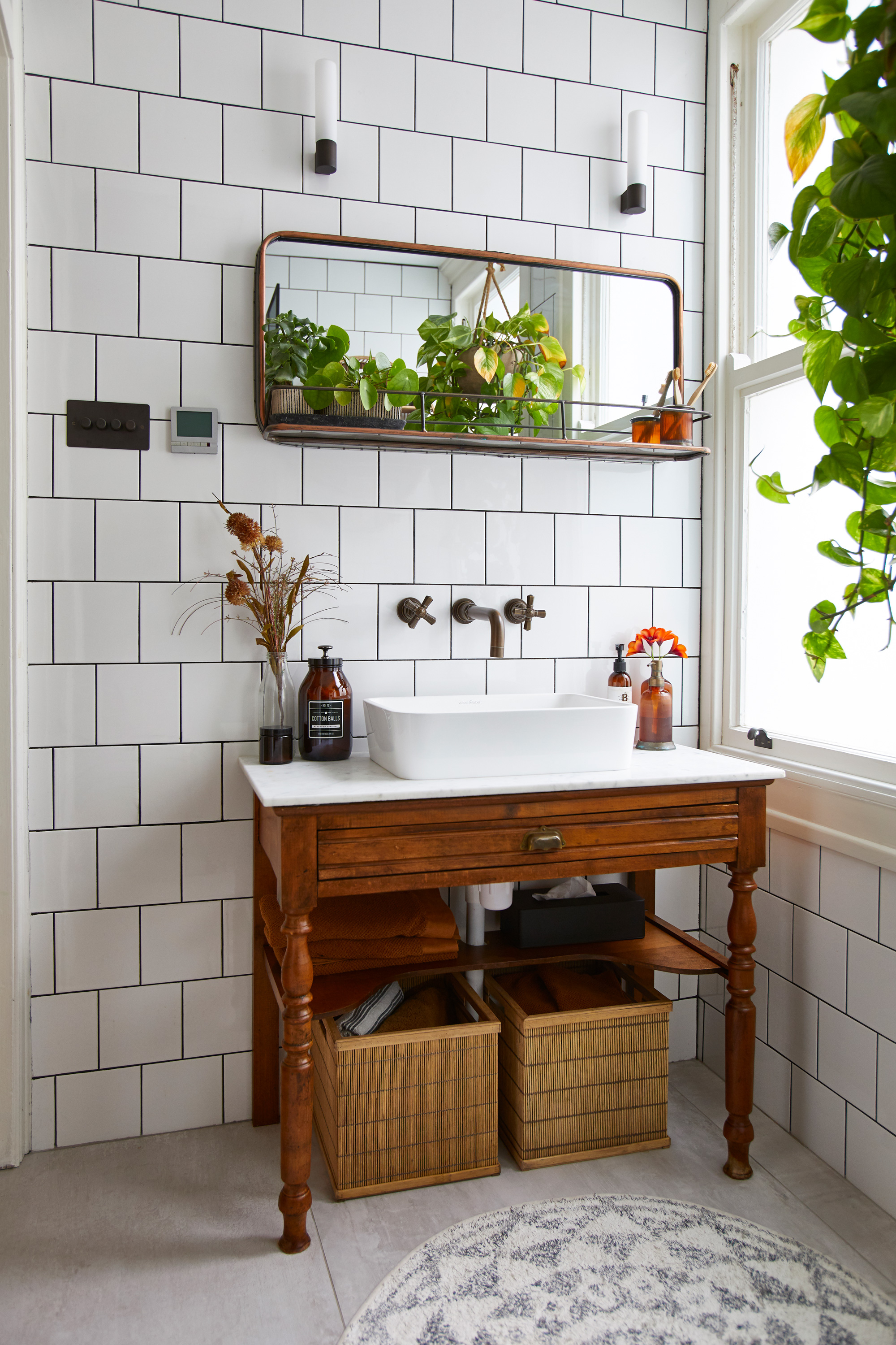
Wall lights, Ocean Lighting. Mirror, Graham & Green. Sink and taps, Parker Bathrooms
Contacts
Builder Jeremy Pugh,
Bathroom supplier Parker Bathrooms of Brighton
‘The rest of the house is full- on color – I’m a maximalist – but I wanted to keep the bathroom calm, especially after those years of floral wallpaper! I liked the idea of a monochrome bathroom but wanted something to warm it up while keeping the room grown-up and sophisticated. I was drawn to copper as it’s warming, but the maintenance would have been nightmarish. Eventually, the bathroom company found these tiles.
'I opted for bronze taps – they’re warm, look lovely with the tiles and feel different to anything else I’ve seen. I spent a large part of my budget on hardware, like people tell you to, and it’s definitely worth it for the look and feel.’
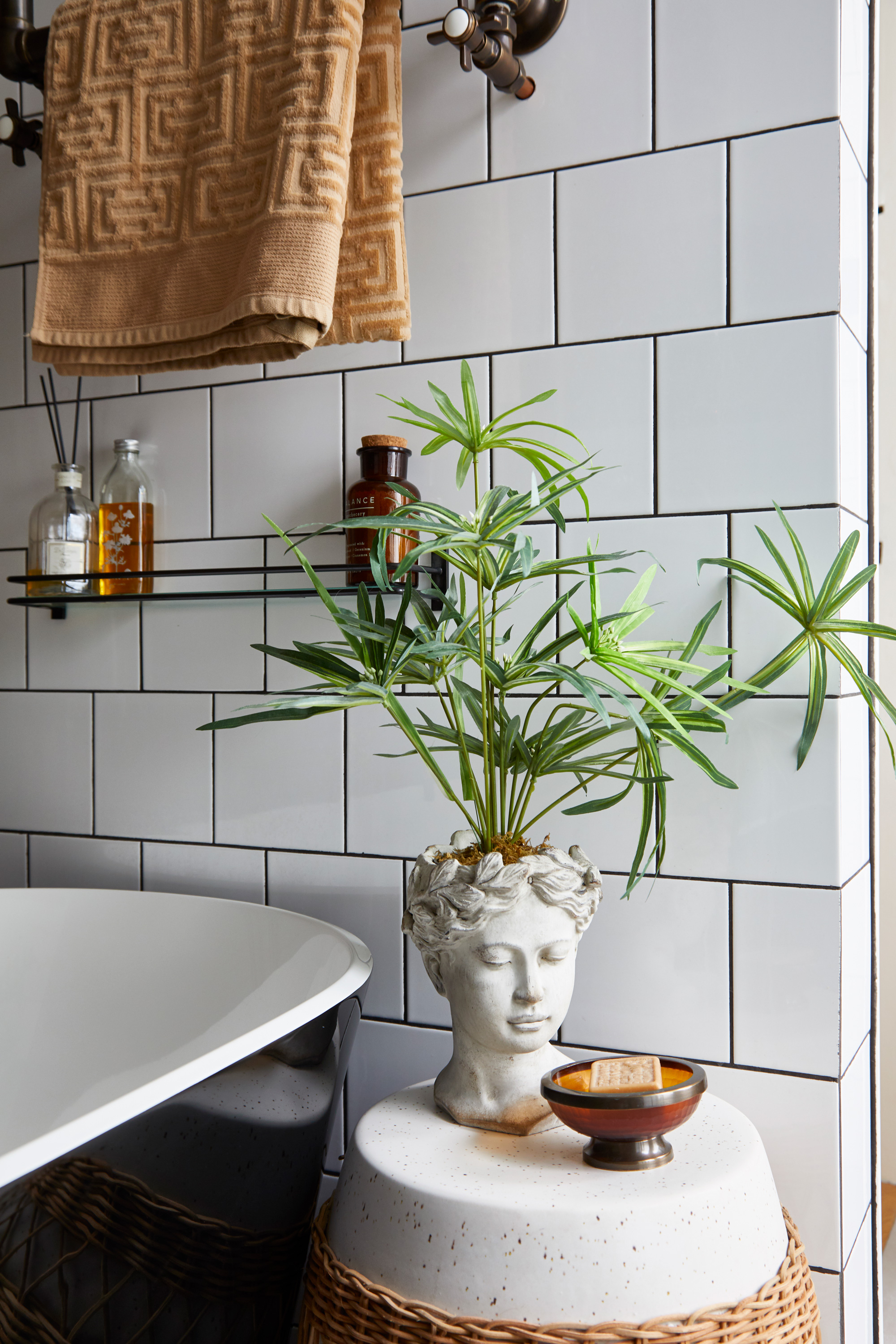
Bust planter, Ebay
Subscribe to Real Homes magazine
Want even more great ideas for your home from the expert team at Real Homes magazine? Subscribe to Real Homes magazine and get great content delivered straight to your door. From inspiring completed projects to the latest decorating trends and expert advice, you'll find everything you need to create your dream home inside each issue.
Join our newsletter
Get small space home decor ideas, celeb inspiration, DIY tips and more, straight to your inbox!

Formerly deputy editor of Real Homes magazine, Ellen has been lucky enough to spend most of her working life speaking to real people and writing about real homes, from extended Victorian terraces to modest apartments. She's recently bought her own home and has a special interest in sustainable living and clever storage.
