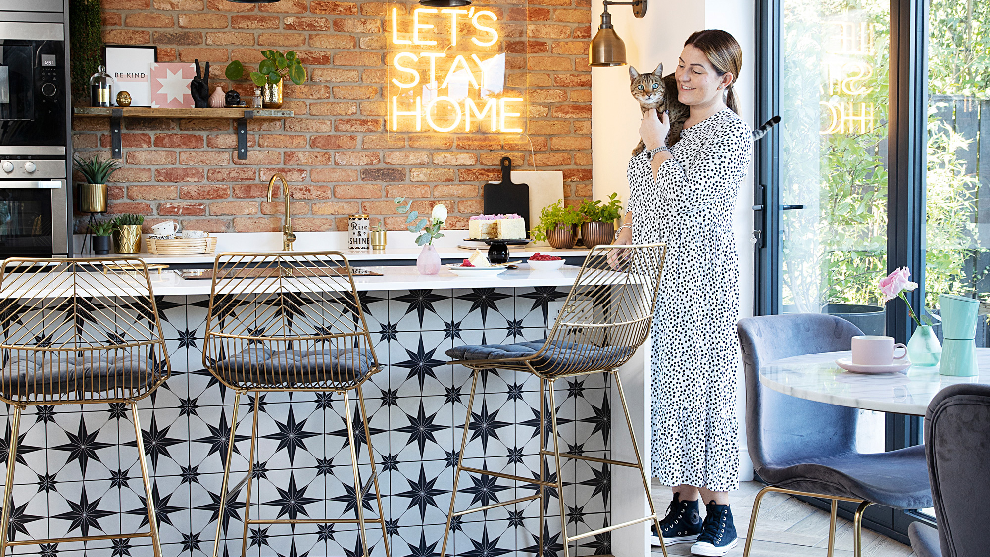
After eight years living with a dark and gloomy kitchen, Helen McLean finally has the sociable open-plan space she’s always dreamed of. Although she’d be the first to admit how stressful it was to go through, the transformation has changed how her family lives – and all without the need for an extension. With a busy family life and several pets, carving a new utility room from the garage has also been a boon and gets used every day.
Here, Helen reveals how knocking two rooms together and reconfiguring the existing space has given her a light-filled industrial-style kitchen-diner and living area, lifted by metallic and neon touches.
If you want to make your dream space, like Helen has, we have lots of ideas and helpful advice on where to start in our feature on house renovation. For more real home transformations, head to our hub page.
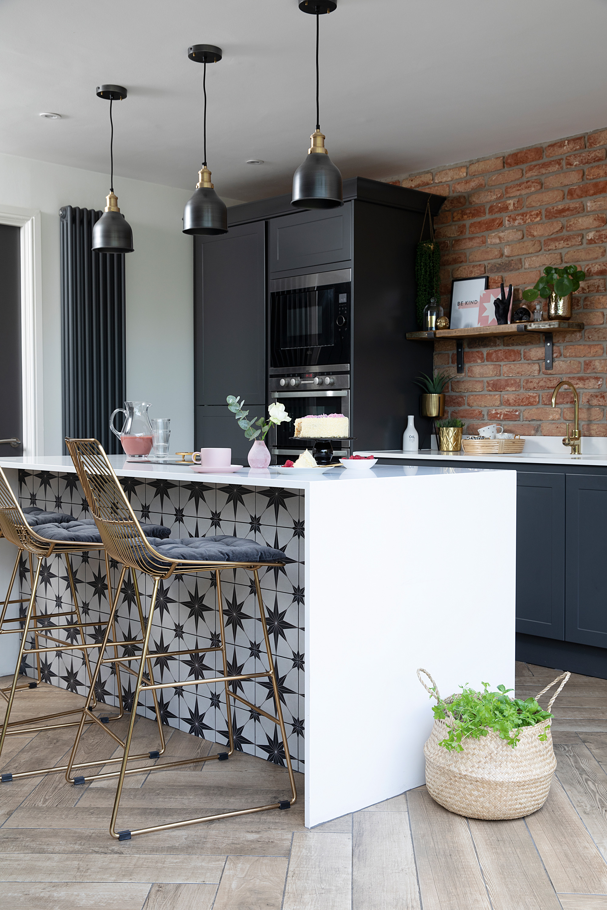
A vertical radiator and tall units housing an oven and fridge-freezer have made the most of the space. ‘We chose handleless doors as the clean lines give the traditional shaker units a contemporary twist,’ says Helen. Ovens, AEG. Radiator, Victorian Plumbing
Profile
The owners Helen McLean (@mamofboys), a beauty salon owner, her husband Stewart, a police officer, and their children Benjamin and Alexander, plus Cocker Spaniels Indie and Finn, Bengal cat Rafferty, and Arlo, the bearded dragon
The property A four-bedroom detached 1990s house in Sunderland
Project cost £25,060
‘After outgrowing our previous home – a three-bedroom house in the next street – we moved up to a four-bedroom detached house with scope for improvement,’ says Helen. ‘Having a separate kitchen, dining room and conservatory at the rear wasn’t ideal. The kitchen felt pretty dark and we needed to put the light on even during the day. I would’ve liked a separate utility room, too. As the birch units we inherited were good quality, I initially painted them using Farrow & Ball’s Pavilion Gray eggshell. This temporary quick fix pacified me for a number of years while we patiently saved up to replace it.’
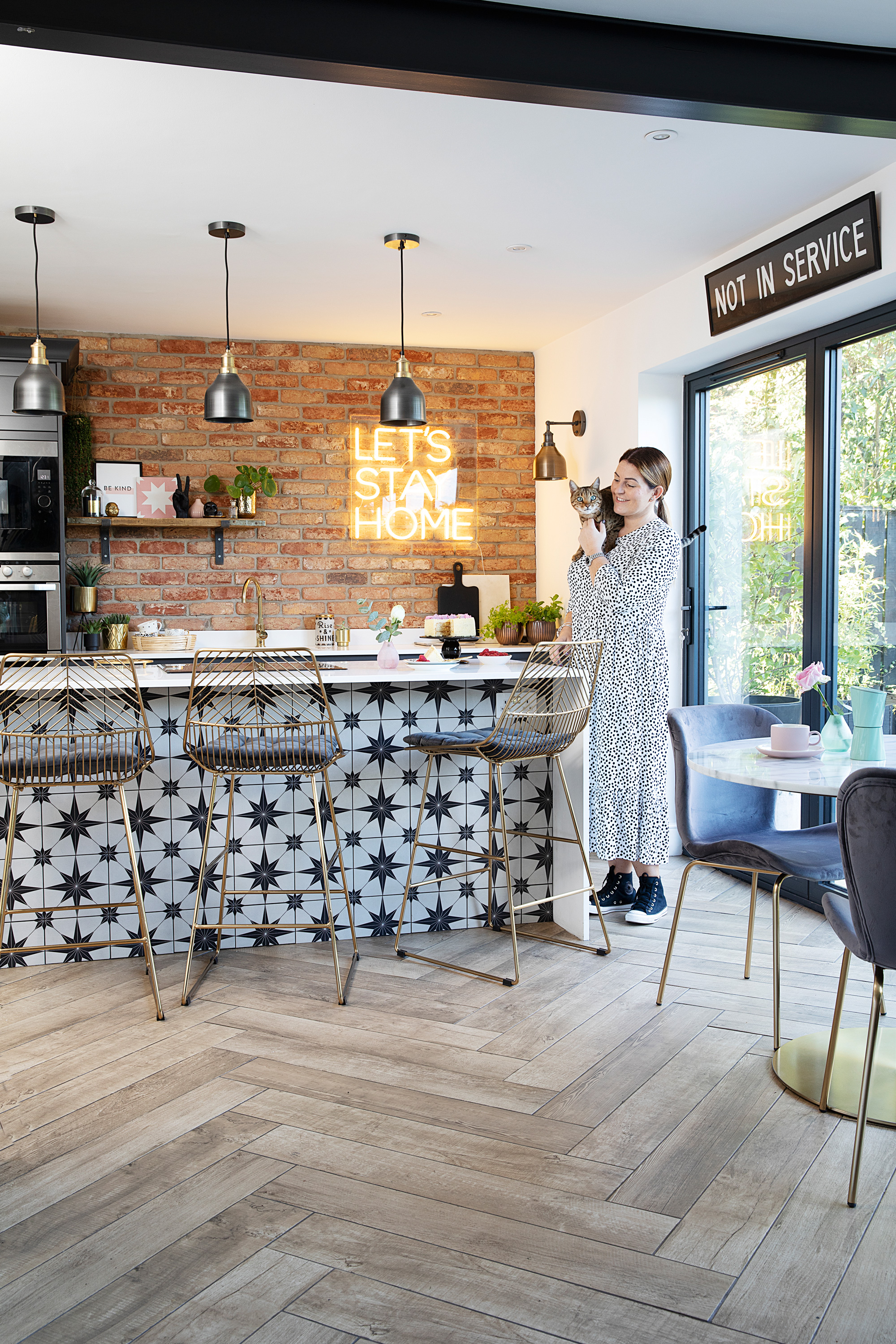
‘Because our colour palette is quite neutral, I try and create interest with texture, pattern and quirky home décor,’ says Helen. ‘The island tiles from Mandarin Stone were a bold decision but they’re one of my favourite features, along with the brick slip wall.’ Kitchen units, Ellerton by Second Nature, painted in slate. Appliances, AEG. Island tiles, Mandarin Stone
‘Eight years after moving in, we decided to remove the wall separating the kitchen and dining room to really open up the space. To resolve the light issue, we planned to knock down our existing conservatory and replace the kitchen window and patio doors with bi-folds. It made sense to utilise the garage space – previously a dumping ground – to create a separate utility room, too. We had to move the back door slightly and work around the existing boiler to save money, but it was worth the extra work. A structural engineer was brought in before making the alterations, but it was much cheaper than an extension.’
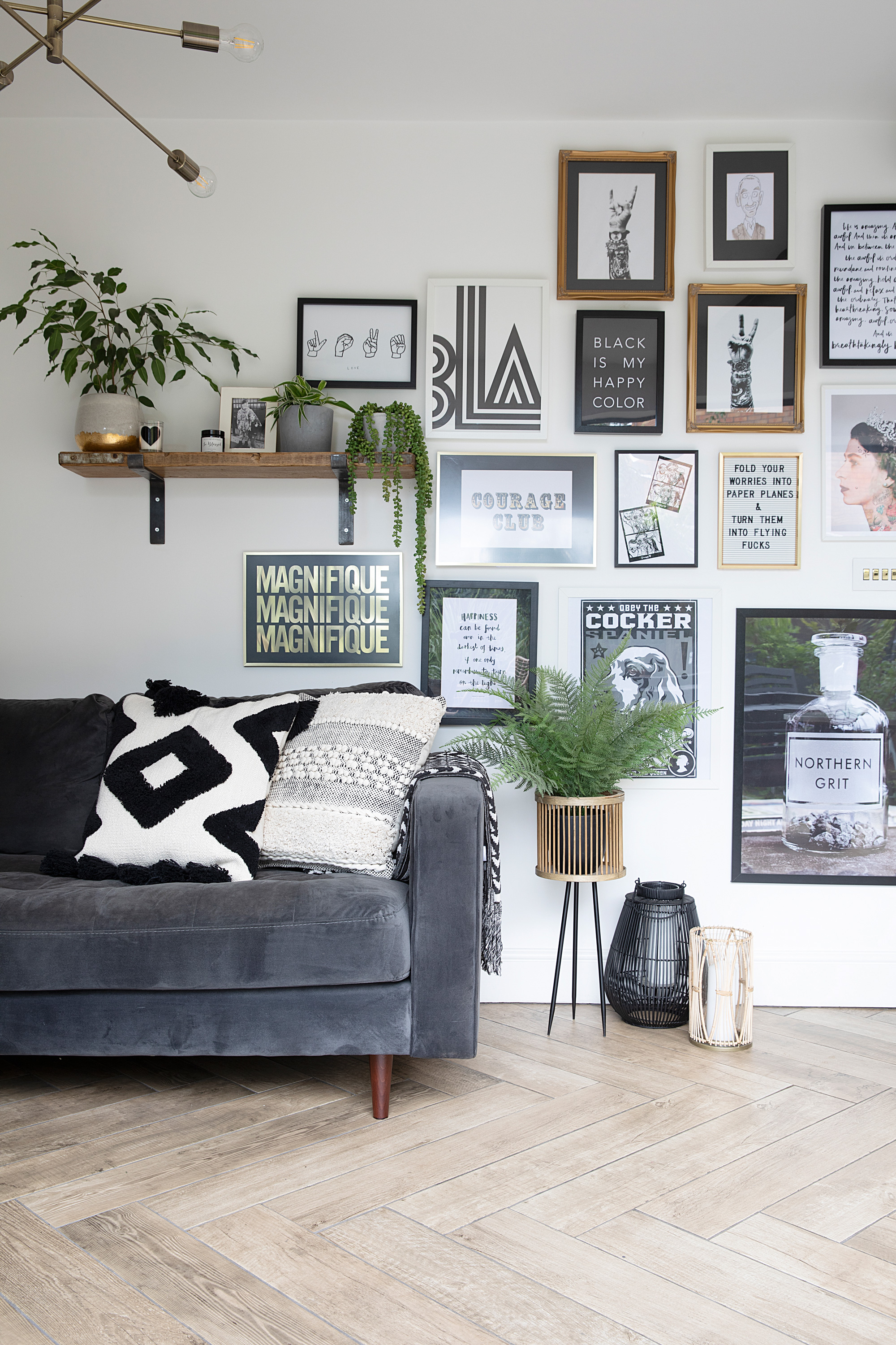
By sticking to black, white and metallic prints, but mixing up the frames, Helen’s quirky gallery wall has a cohesive feel. For a similar sofa, try the Scott, Made. Monochrome cushion, H&M Home. Alana ceiling light, där Lighting. Northern Grit print, Vinegar & Brown Paper. Script prints, Jessie M Design. Photo Booth illustrations, Tiny Bison. Plant stand, Matalan
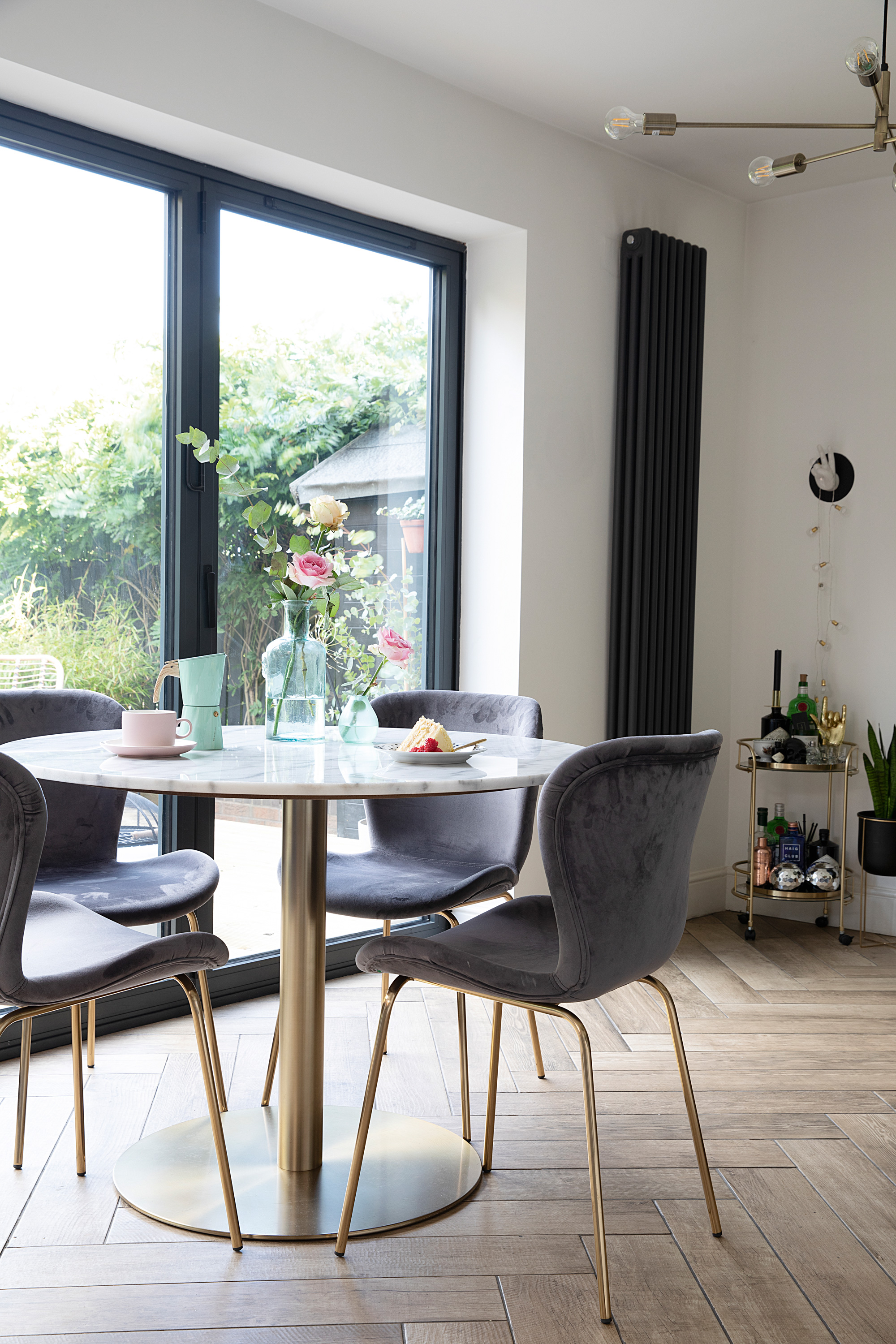
'I’m a bit of an interiors junkie so I got lots of inspiration from Instagram and my long-term addiction to homes magazines. A kitchen island was a must and I envisaged traditional Shaker-style units with a modern edge. Just when I was beginning to think that style of unit didn’t exist, we discovered the Ellerton range by Second Nature Kitchens. I think at first Stewart would’ve preferred a more modern style, but thankfully he’s pretty happy to trust my judgement. It only came in a few standard colour options so we paid extra for a bespoke dark grey to match the anthracite bi-fold doors, with pale grey for the utility where there’s less natural light.’
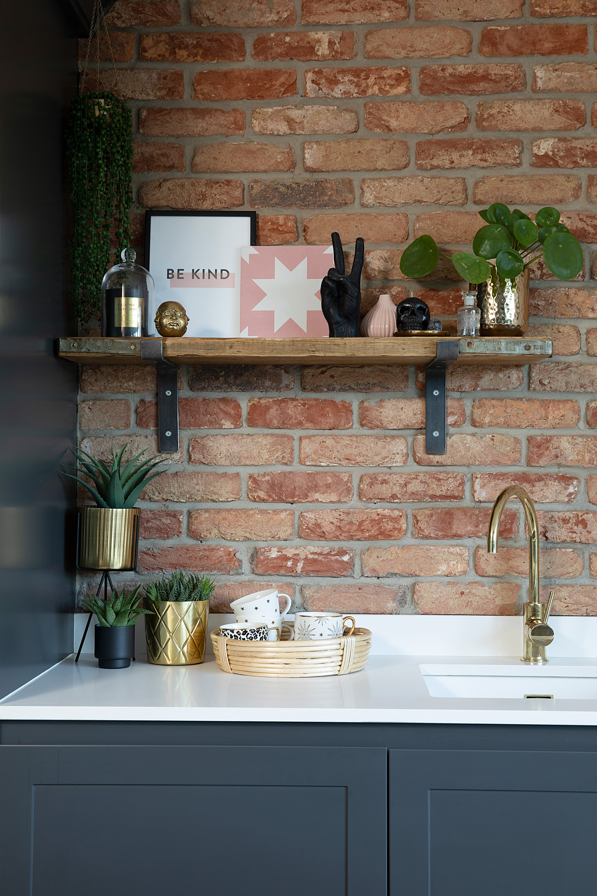
The industrial feel of the brick slip wall and scaffold board shelf is warmed by a bronze tap and accessories. Sink and tap, The 1810 Company. Worktops, Stadium Stone. Shelf, Barrel & Bird. Print, Desenio. Gold planters, TK Maxx. Hand gesture candle, Candlehand
‘We refer to our renovation as “reno hell” since the entire downstairs of our home was in disarray! With the exception of our builders, who were brilliant, we experienced quite a few issues. The kitchen fit was supposed to take a few days but took nearly two months as the wrong colour units were delivered and certain parts were missing. Then our new radiator fell off the recently plastered wall!
‘To save money, Stewart laid the floor tiles and attached the brick slip feature wall. He worked tirelessly between shifts and was nearly a broken man by the end! My electrician brother carried out the electrical work. By the time it was all finished, we were really underwhelmed and it took a number of months to finally appreciate it.’
Contacts
Builder Chris Robson of Robson Property Services, 07789 221330
Structural engineer Christine Smith, 07446 422965
Electrics Fusion Electrical Contractors, 07703 825002, fusion-contractors.co.uk
Plumbing Saved by the Bell Plumbing Services, 07821 106679
‘I believe it’s the small stuff that really makes the difference. I still remember our plumber’s face was when I told him how much we were spending on brass radiator valves. Because we were massively over budget, I had to forgo the brass-coloured boiling water tap I desperately wanted and we had our existing oven professionally cleaned.
‘It’s lovely when people compliment what we’ve achieved. Guests often refer to our “extension” and I remind them that we haven’t actually extended. This space is now the hardest working area in our home, whether it’s laundry in the utility, cooking in the kitchen, homework at the table or lounging in front of the TV. It really brings everyone together.’
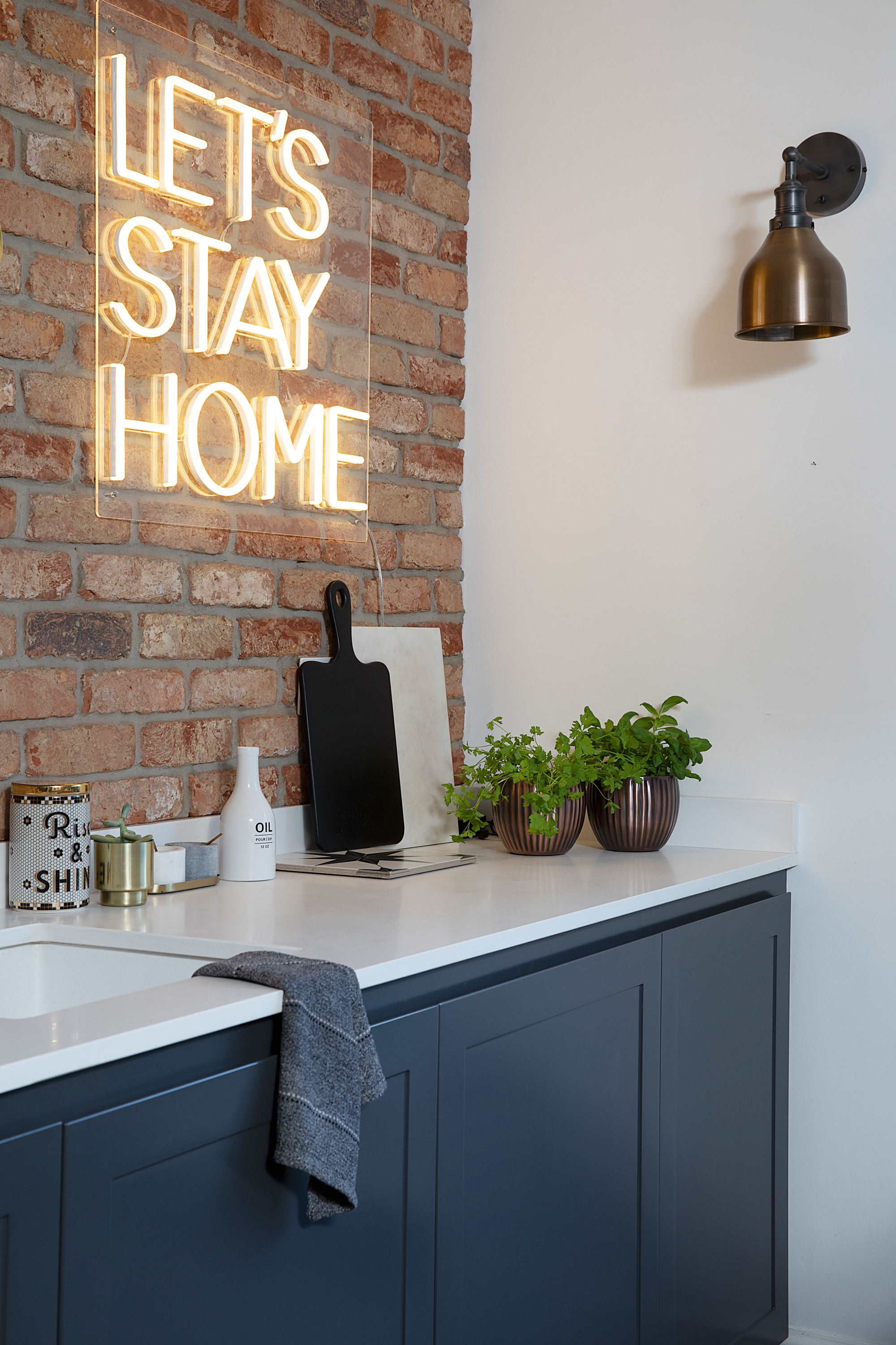
‘The one thing we did splash out on was our neon sign, which I absolutely love,’ says Helen. Neon sign, Bag & Bones. Wall light, Industville. Rise & Shine canister, Anthropologie
Subscribe to Real Homes magazine
Want even more great ideas for your home from the expert team at Real Homes magazine? Subscribe to Real Homes magazine and get great content delivered straight to your door. From inspiring completed projects to the latest decorating trends and expert advice, you'll find everything you need to create your dream home inside each issue.
Join our newsletter
Get small space home decor ideas, celeb inspiration, DIY tips and more, straight to your inbox!
-
 You won't believe this stunning five-bed family home used to be a tiny two-bed
Katie and Stuart went big with a double-story extension to create a dream space for themselves and their daughters
By Ifeoluwa Adedeji
-
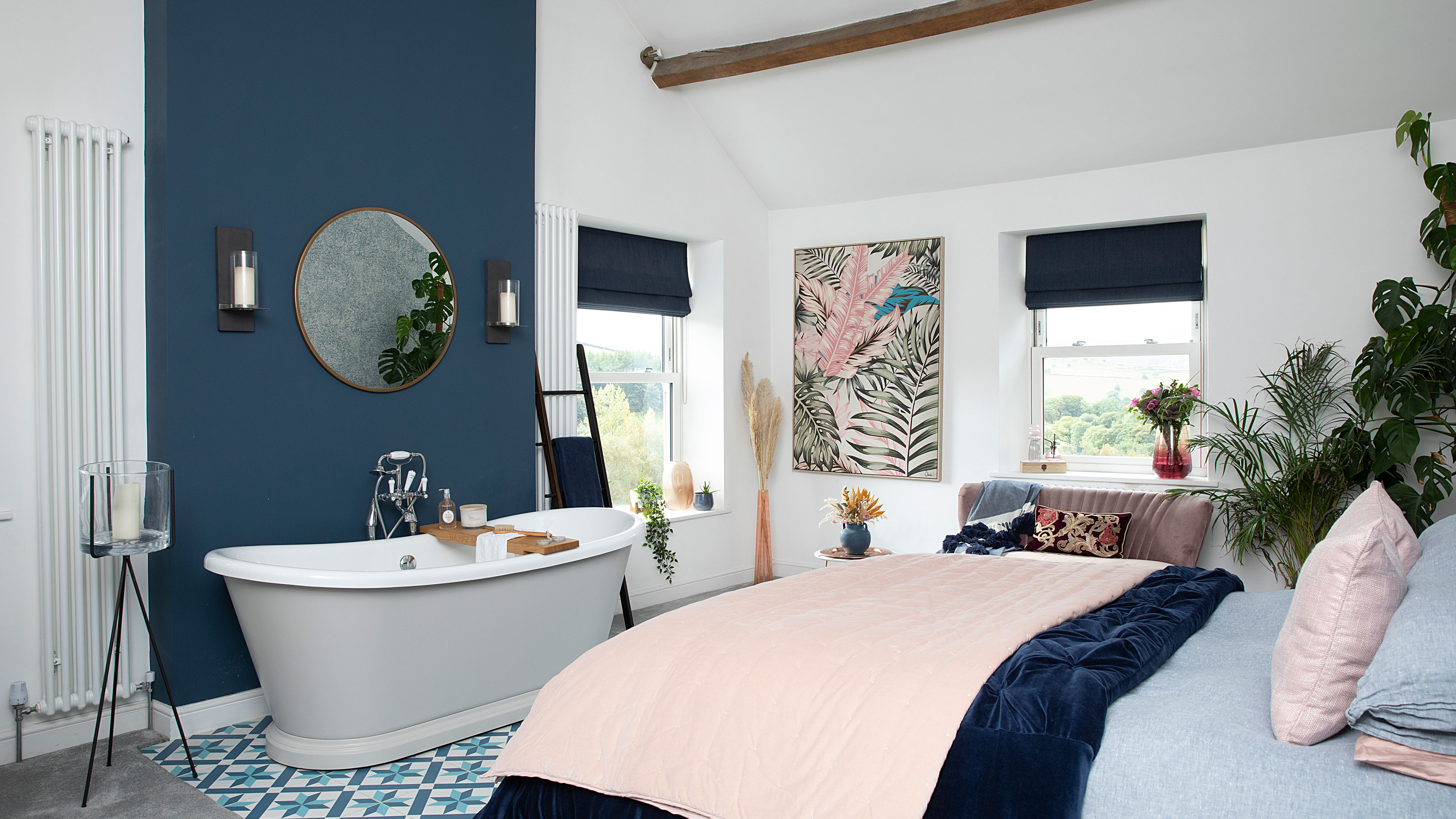 The freestanding bath in this dreamy bedroom is sheer five-star luxury
Emma and Martin wanted a suite just like in an upscale hotel — mission totally accomplished.
By Ellen Finch
-
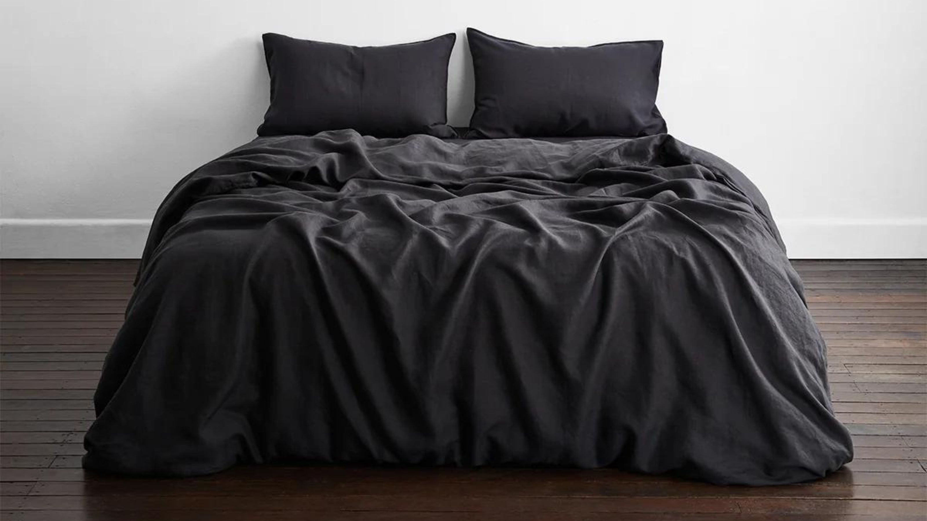 I just know 2023 is going to be all about black bedding sets
White sheets are out, black bedding sets are in — here's everything you need to know about this bedroom decor trend
By Louise Oliphant
-
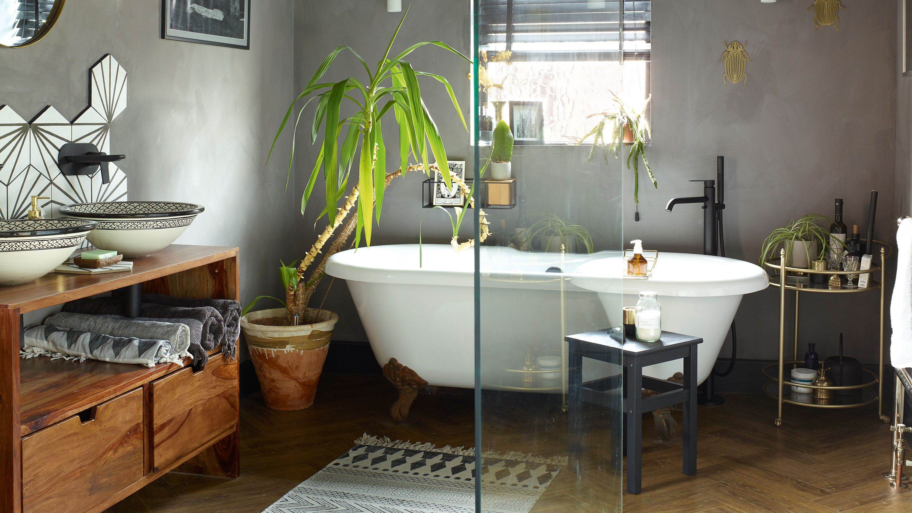 A bland beige bathroom is transformed into a STUNNING contemporary sanctuary
First-time homeowners Ellie and Oliver’s new bathroom is a well-planned fusion of modern pieces and exotic touches
By Ellen Finch
-
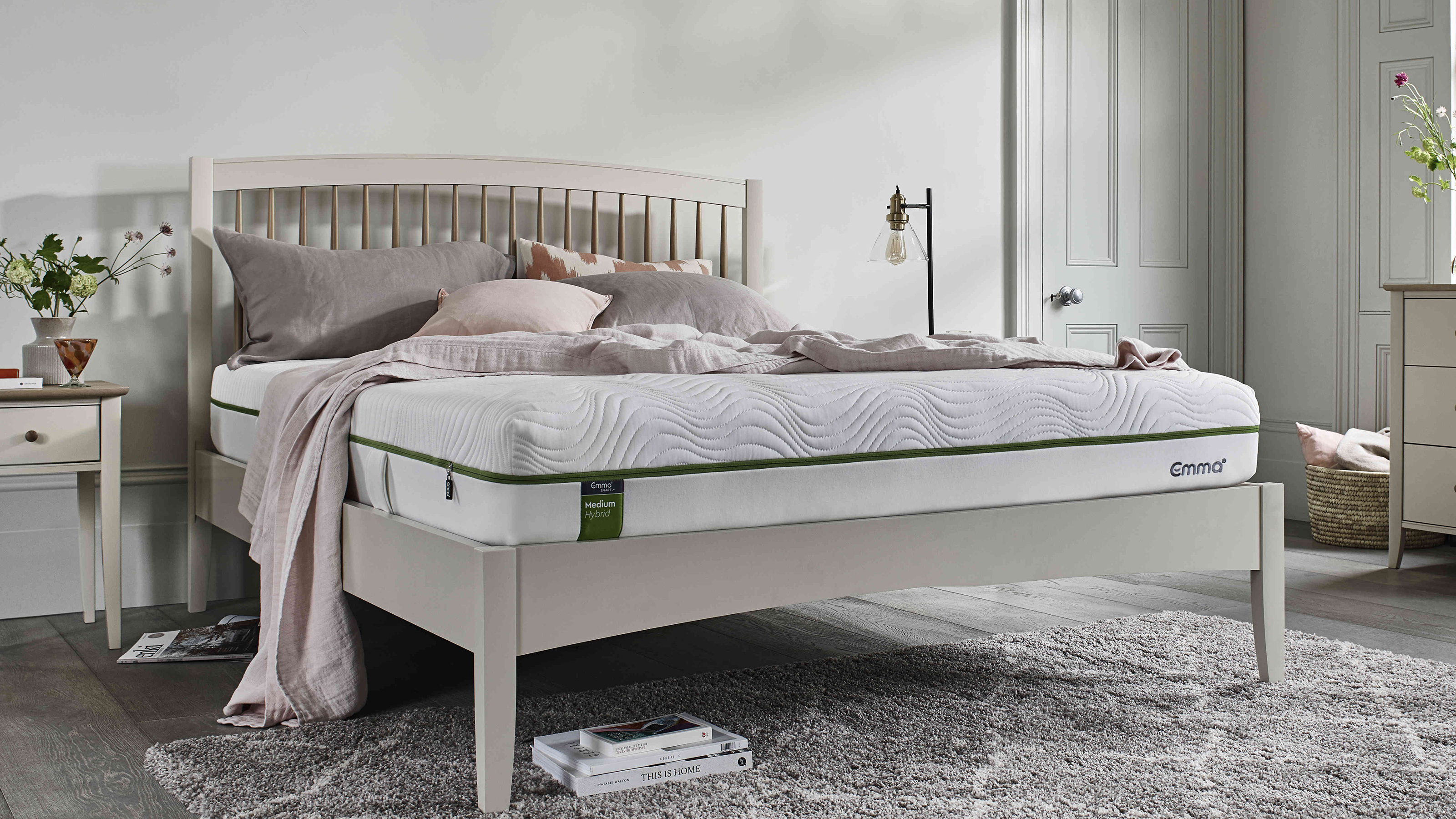 Mattress disposal: how, where, and how much it will cost?
Mattress disposal is tricky. You’ve swapped it for a supportive new design, but how to dispose of the bulky old mattress? Follow our guide to find out...
By Sarah Warwick
-
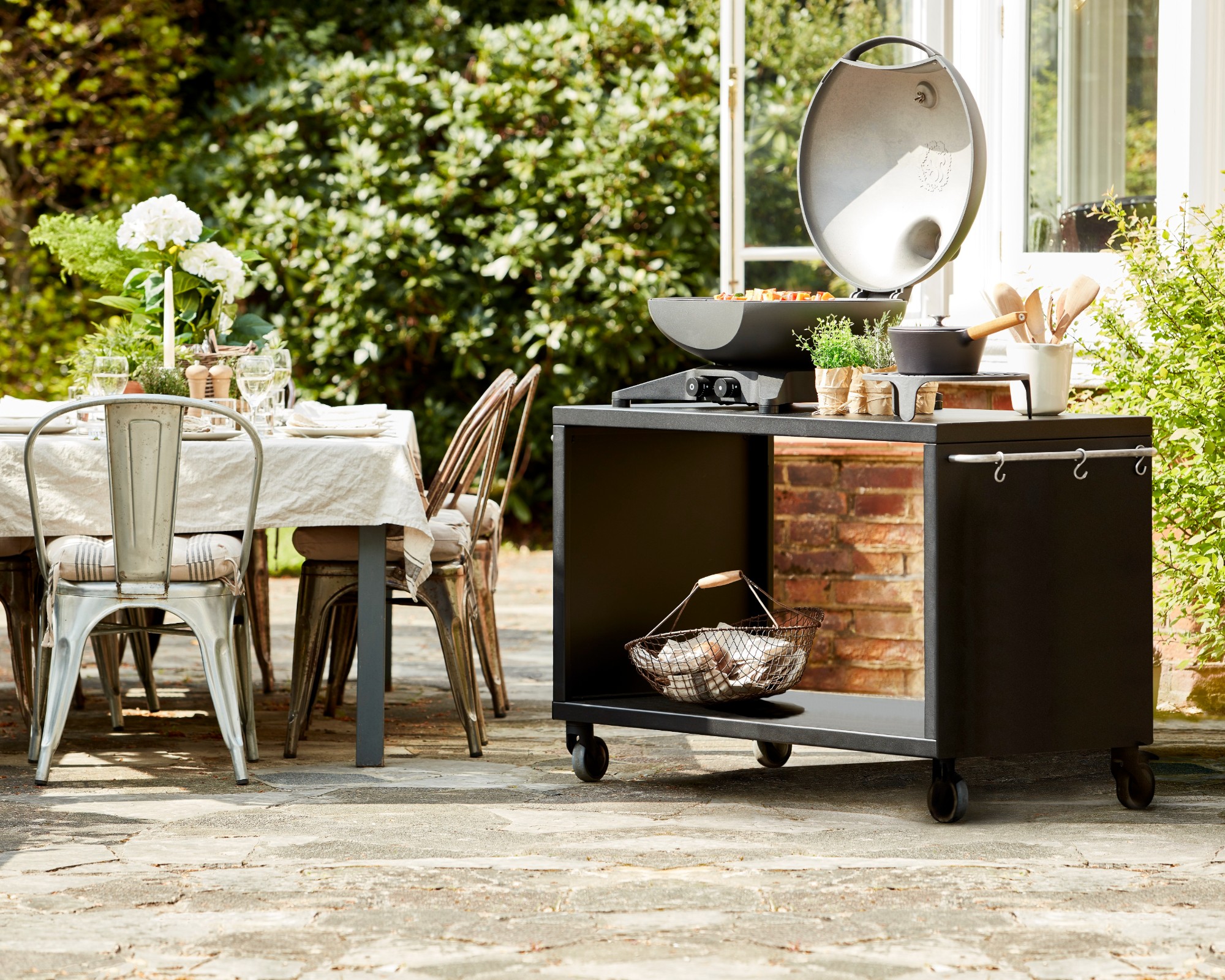 36 outdoor kitchen ideas – enviable and inspiring designs for your backyard
Enjoy alfresco cooking and entertaining all year round with the best outdoor kitchen ideas for every space and budget.
By Sarah Warwick
-
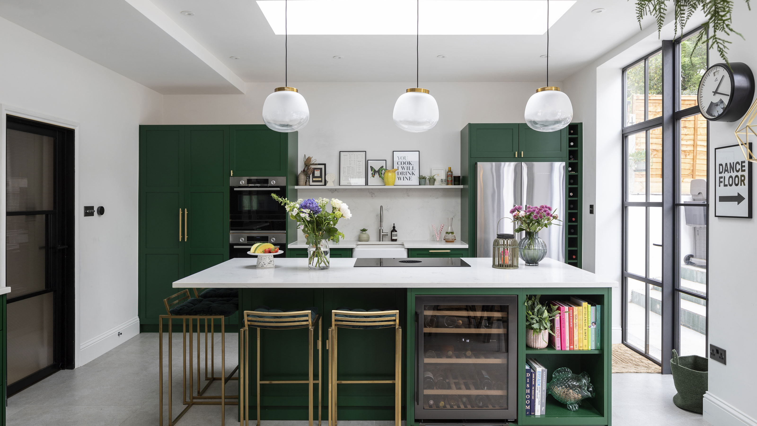 Real home: Gorgeous green kitchen has a fresh feel
A stunning extension and Charley Smith's clear design vision has resulted in a family kitchen-diner that’s ripe for entertaining.
By Ifeoluwa Adedeji
-
 [redirected] Best coffee beans: 12 delicious coffees to start your morning with
Your perfect cup of coffee starts with the coffee bean. We're sharing our best-bagged beans from coffee shop favorites to gourmet roasters.
By Jaclyn Turner
