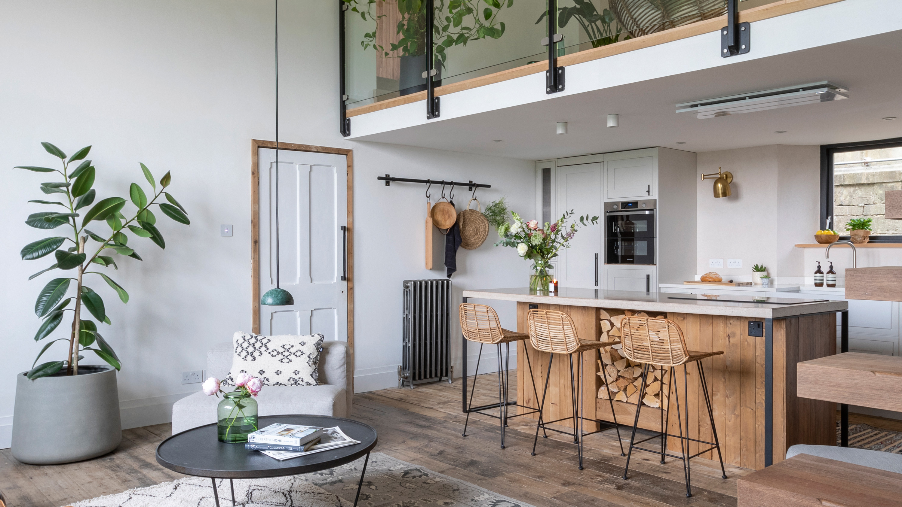

Kate and Mike’s search for a place they could make their mark on led to an old schoolhouse in dire need of some TLC. With a leaking roof, rotten floorboards and an odd layout, it was more work than the couple had bargained for, but having fallen in love with it, they decided to take it on.
Four years on, the place is unrecognizable. The ground floor has been opened up to create a kitchen/dining/living area that makes the most of the double-height space, while the mezzanine has been transformed into a welcoming entrance hall leading to the bedrooms and bathroom. Despite the open-plan nature of the house, the couple have created warmth with a soft palette of white shades complemented by natural wood textures.
Planning your own project to tackle like Mike and Kate have? We have ideas and helpful advice on what to do and where to start in our feature on house renovation. For more real home transformations, head to our hub page.
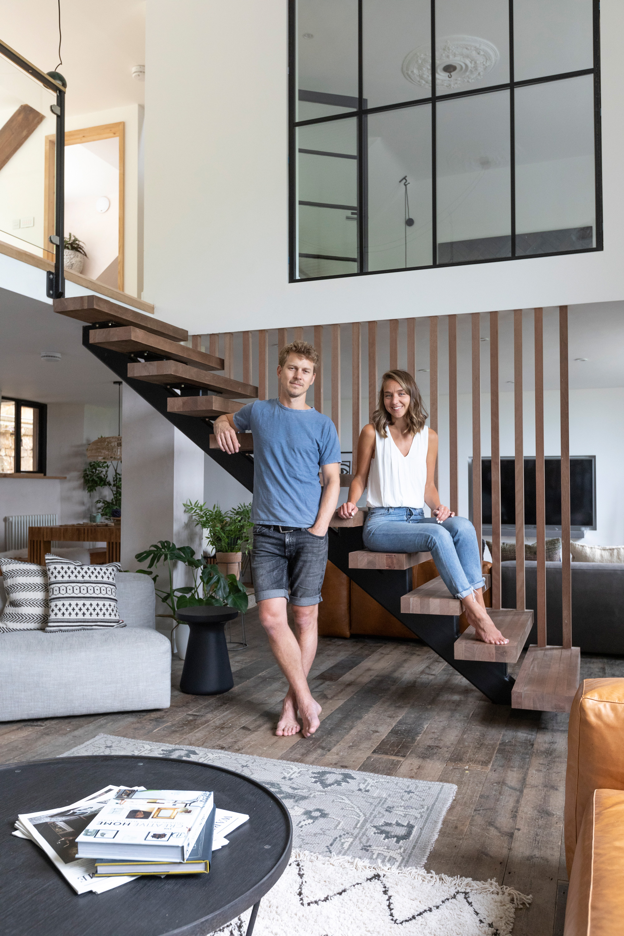
Profile
The owners Kate Lawley, a senior business development manager, and husband Mike, a product designer
The property A three-bed converted Victorian schoolhouse in Corsham, Wiltshire
Project cost £101,000
'Our house before was a Victorian terrace, which we grew out of quite quickly,' says Kate. 'We were looking for a project we could put our own stamp on. It took a year and a half from selling the house to finding this. It was probably a bigger job than we were hoping for, but a construction friend of ours gave us the confidence to take it on.
‘The property was really run-down. No one had lived here for over a year and there were cobwebs everywhere – it really wasn’t in a good state – but we fell in love with it. We just got that feeling you get when you walk in. Once we bought it, we were thrown straight into the work. The first thing we had to do was repair the roof because there was a leak. A lot of the timbers were rotten and one of the lintels supporting the timbers had started to collapse. We had a roofing company in for the first few weeks, as well as a company who specializes in timber preservation. They stripped out damaged timbers and replaced them. Overall, we reroofed around 25 percent of the roof.'
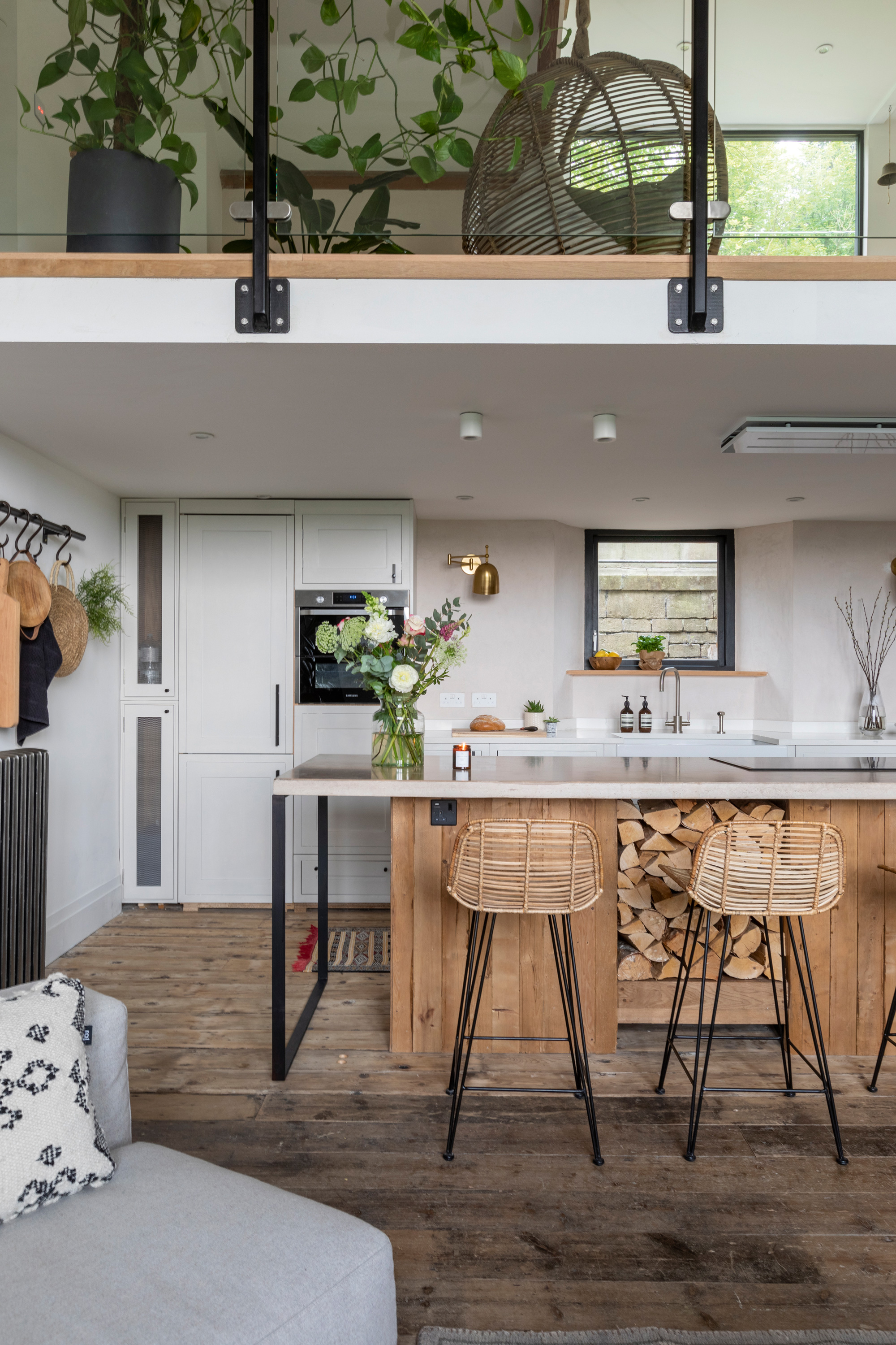
Balustrade glass, Aspire Glass Bristol. Replacement flooring, Frome Reclamation Centre. Kitchen, from Ebay, painted in Ammonite, Farrow & Ball. Handles, Dowsing & Reynolds. Carrera white quartz worktop, Granite & Stone South West. Concrete work surface, handmade. Bar stools, HK Living
‘Meanwhile, we were trying to strip out what we could from the rest of the building. Originally, we weren’t going to reconfigure the house – the layout wasn’t practical, but it was quirky, and we planned to work around it. Then a friend told us to speak to an architect, who said there was so much we could do if we were brave enough. A few days later, she sent over a sketch of an open-plan design, and it developed from there.'
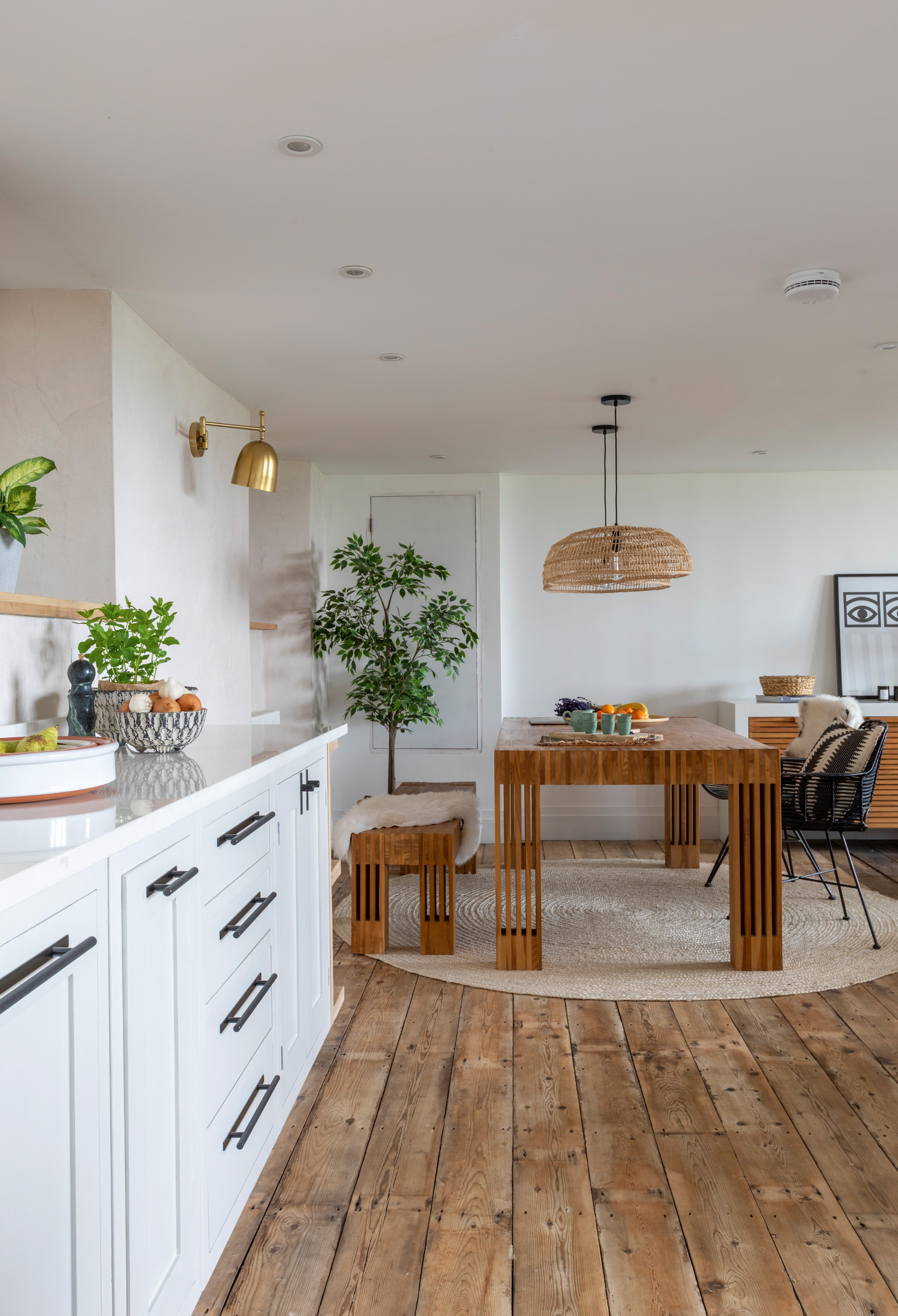
Dining table, bench and side unit, Furniture Village. Chairs, HK Living. Rug, Heal’s. Brass wall lights, Cox & Cox
‘Throughout the build, we tried to reuse and reclaim as much of the original materials as we could. We even rescued parts of the rotten joists we replaced, cutting off the damaged areas and using the remains to make shelves. We made the concrete worktop in the kitchen ourselves, and the oak unit it sits on, as well as the other kitchen units, were second hand – we simply upcycled them with new handles and paint.
'It’s nice to look around and see what we managed to create from unwanted things. We spend a lot of time in this part of the house. Most people with a kitchen island will tell you it’s where people tend to gather when they visit, and that’s definitely true for us.'
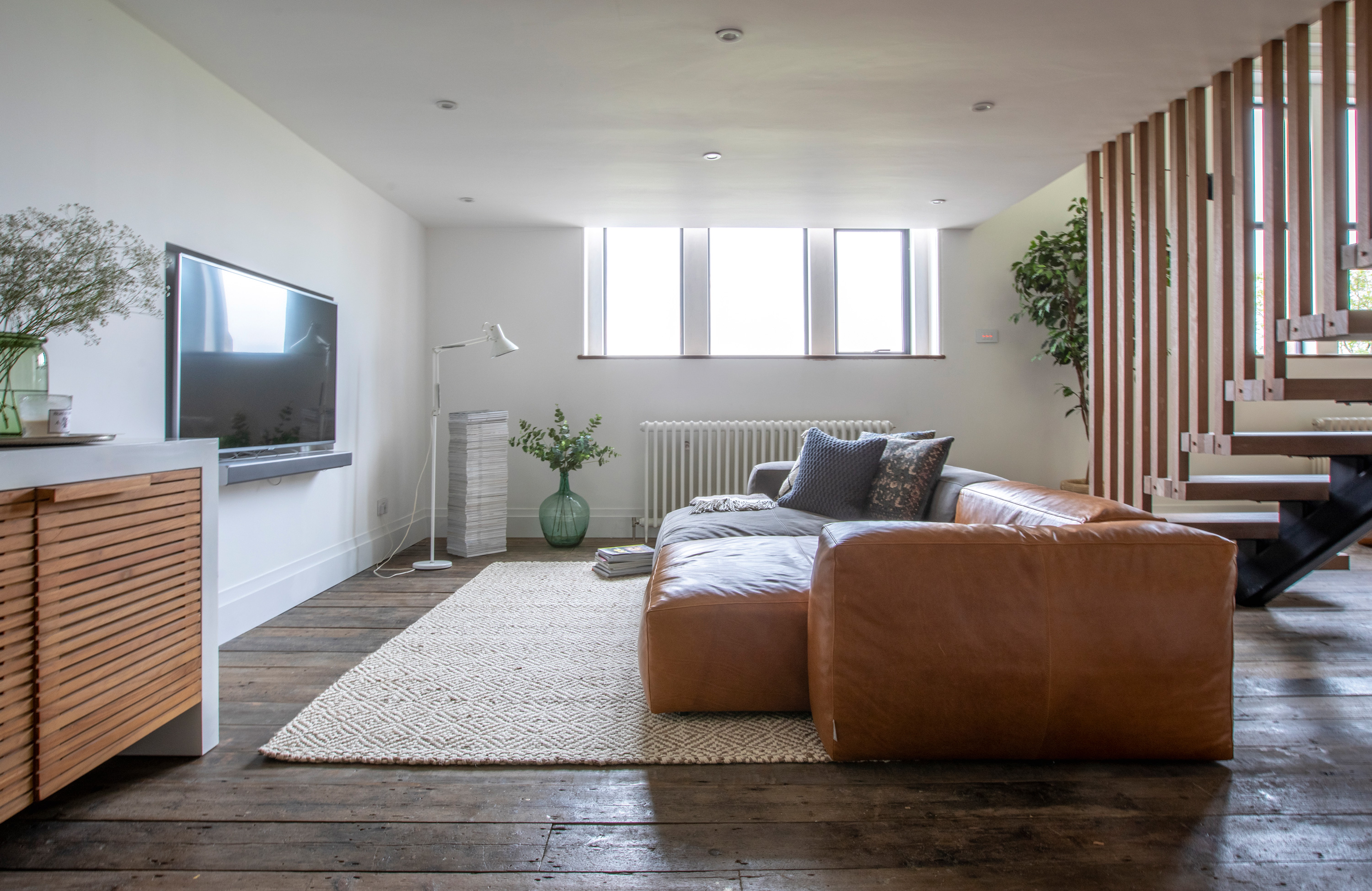
Sofa, Habitat
'We were really clear where we wanted the staircase from quite early on, and we also knew we wanted an internal window,' says Jim. 'Kate’s dad is a carpenter and he helped a lot. He and his colleague relaid the floorboards, did the stud work for the room reconfiguration and made the treads and spindles for the stairs. Having him on hand to offer advice was invaluable, even if he thought we were crazy when we bought the place! Everywhere we look, we see something we designed or he built – it’s a lovely feeling and really rewarding.
'The stairs are the focal point from wherever you are, downstairs or up. They help to zone off this space, which is more like a snug compared to the other living area – it’s tucked away behind the stairs and under the lower part of the ceiling. We definitely don’t go out as much as we used to now we’ve finished this project – we enjoy being in the house too much! It’s so rewarding for us to share what we’ve done with our family and friends, too.'
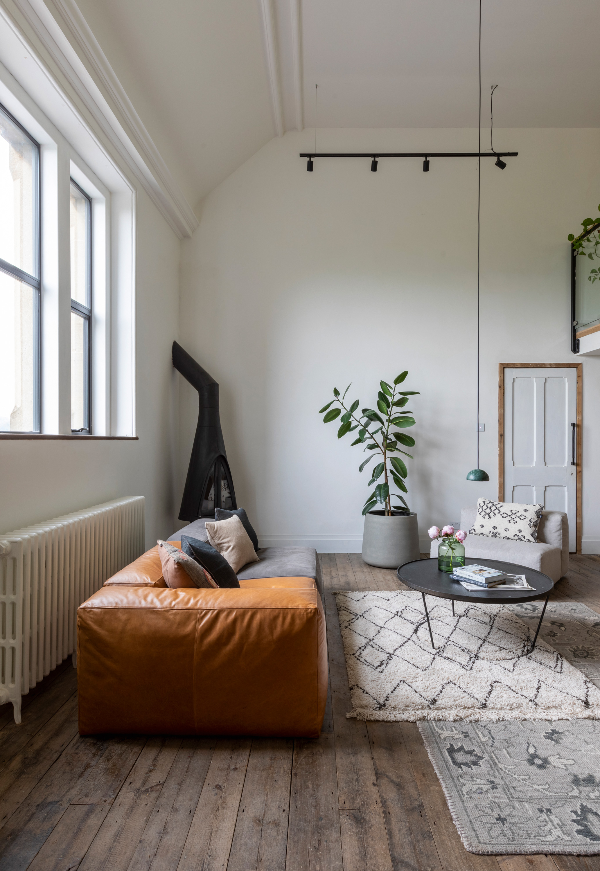
'A lot of people weren’t sure how we’d make the space feel warm and cosy with a full-height ceiling, but the natural materials we’ve used make it feel homely. We were lucky that there was already wooden flooring in place. If it hadn’t been there we might have gone for something harder like concrete, then brought wood in through the décor. This way, we can bring in those industrial touches we love, but they’re softened by the expanse of wood floor.
'There were plenty of moments where we thought, “What have we taken on?” A year into the build, we were still here most evenings stripping things out, and the windows were still boarded up. There were definitely highs and lows. Once a milestone like putting the windows in was reached, it felt like we were moving forwards, but the initial invisible works, like repairing joists and plumbing, were a struggle. Now it’s finished, we couldn’t be prouder.'
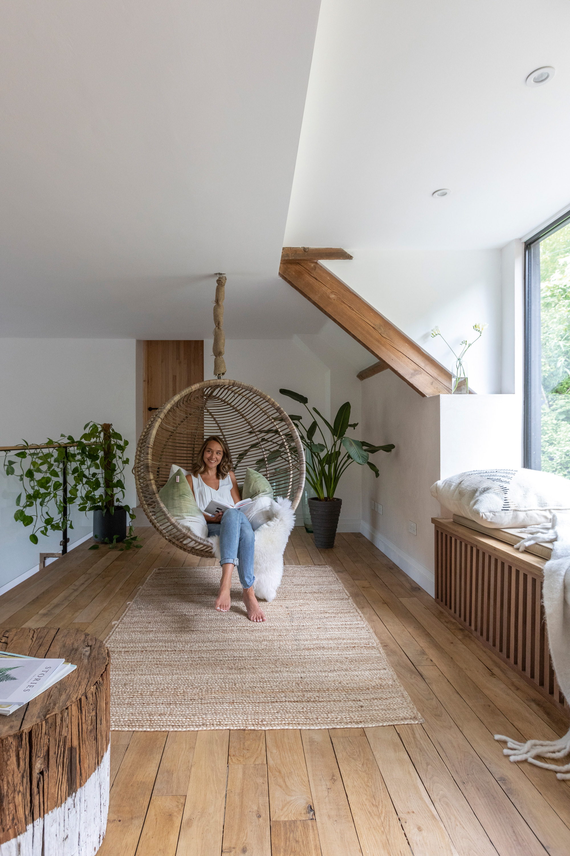
'The mezzanine level was here when we bought the property, but it had the kitchen to the right and the dining room in front of you as you walked in,' says Kate. 'We moved the living spaces downstairs and this level now houses the entrance hall, as well as the bedrooms and bathroom. The window seat was a last-minute decision and one of the best we made. It was the kitchen window and half the size it is now. We don’t have access to the garden from the living area so this is where we can sit to feel connected to the outdoors.'
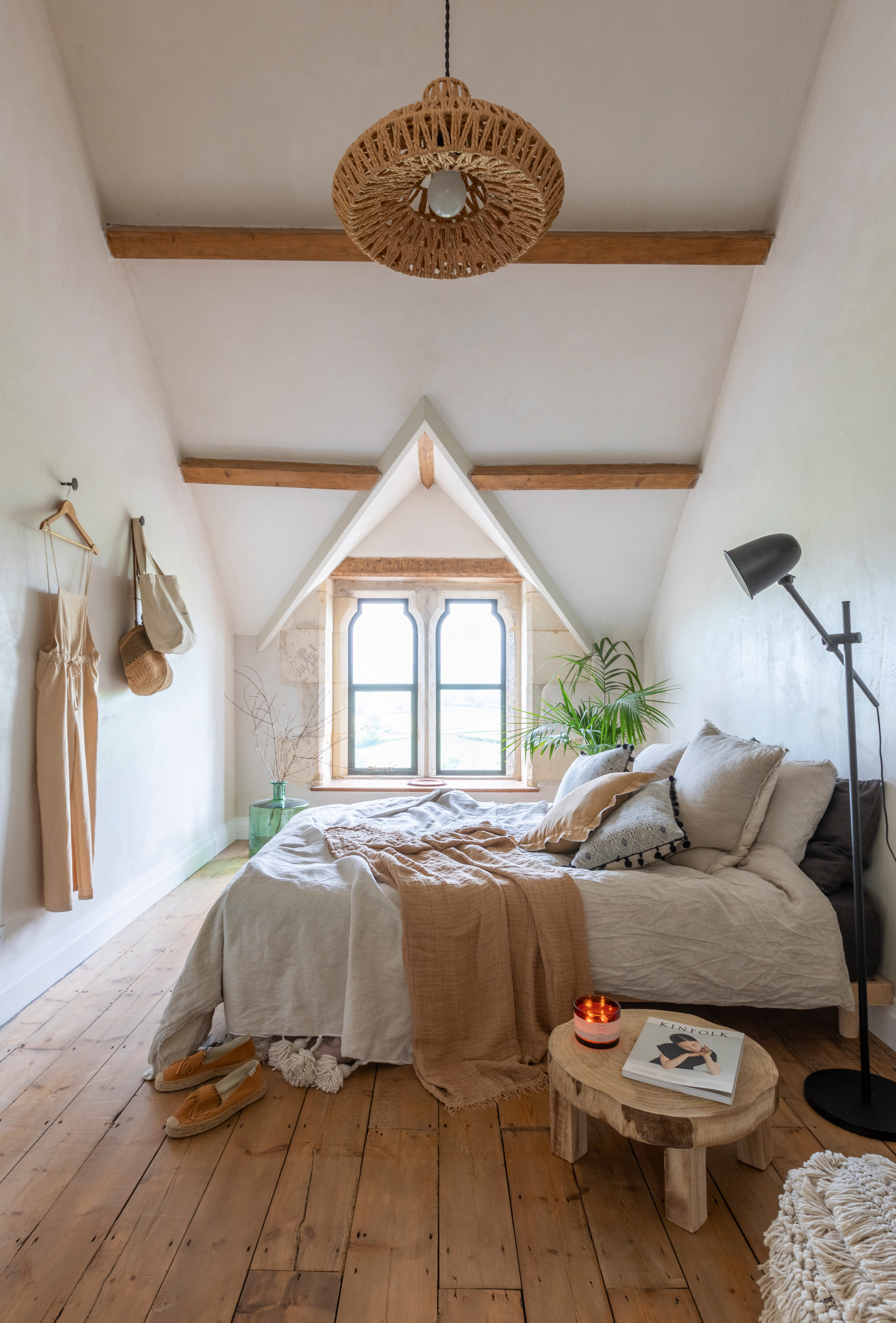
Bed, Futon Company. Ceiling light, Ebay. Black floor lamp, Ikea. Side table, Vinegar Hill. Green vase, Homesense
'We’ve traveled a lot and one of the biggest influences was our honeymoon in Mexico. At that stage, we knew we were looking for a project, so from there on in we had more of an eye on the interiors of the places we visited. The foundations of the rooms are neutral, minimal and light, and we brought in natural materials like wood and rattan, plus the concrete, to warm up the scheme and add interest.'
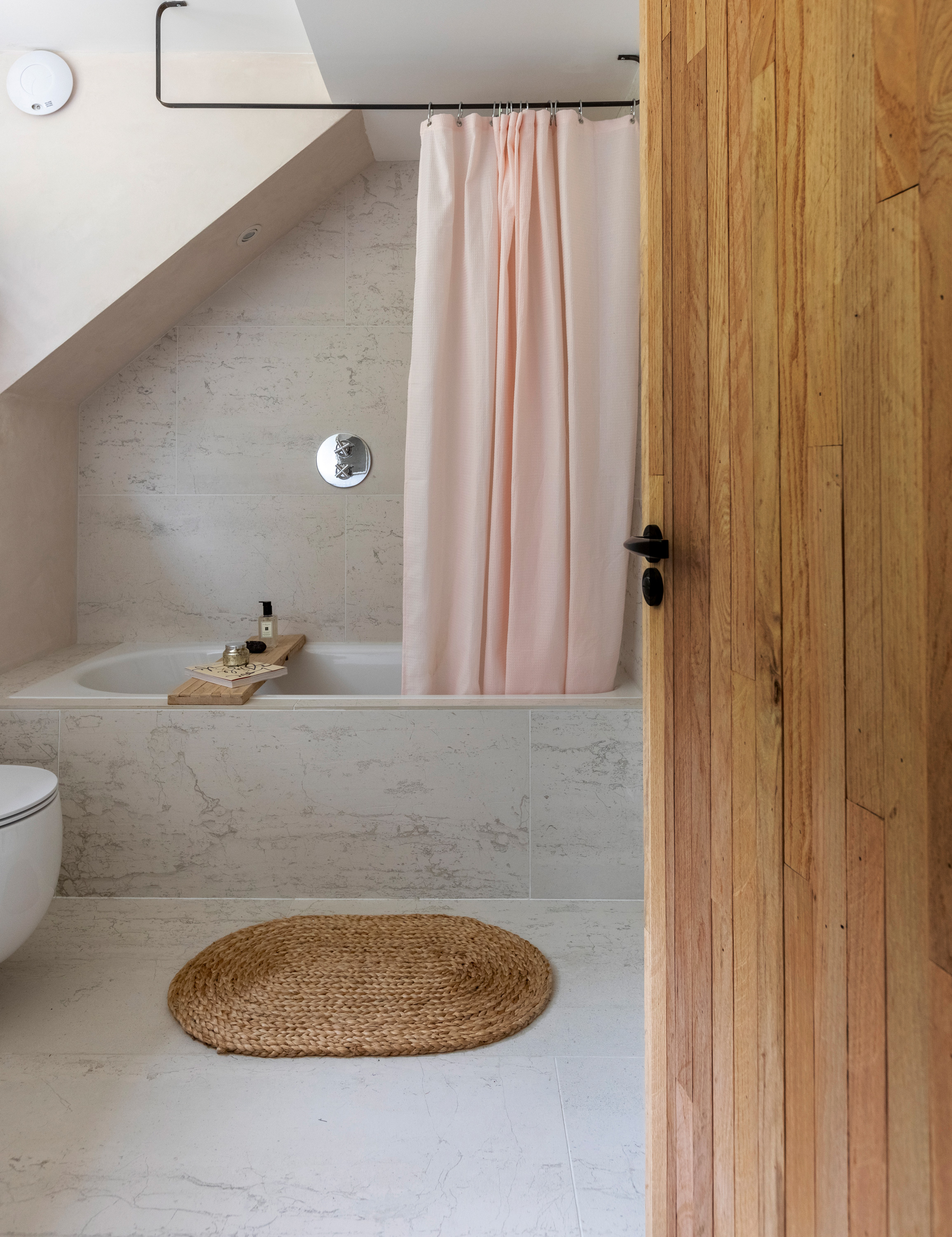
Wall and floor tiles, Dimensions Bathrooms of Frome and UK Bathrooms. MDesign shower curtain, Amazon. Bath mat, Zara
Contacts
Windows Panoramic Windows
Balustrade glass Aspire Glass
'Because Mike comes from a design background, he was able to visualize how the house might look on some 3D software – we could play around with the layout. The bathroom is slightly different to the rest of the house in the materials we’ve used. The large-format tiles are timeless, and the wall behind the basin is Travertine plaster by Oiko.'
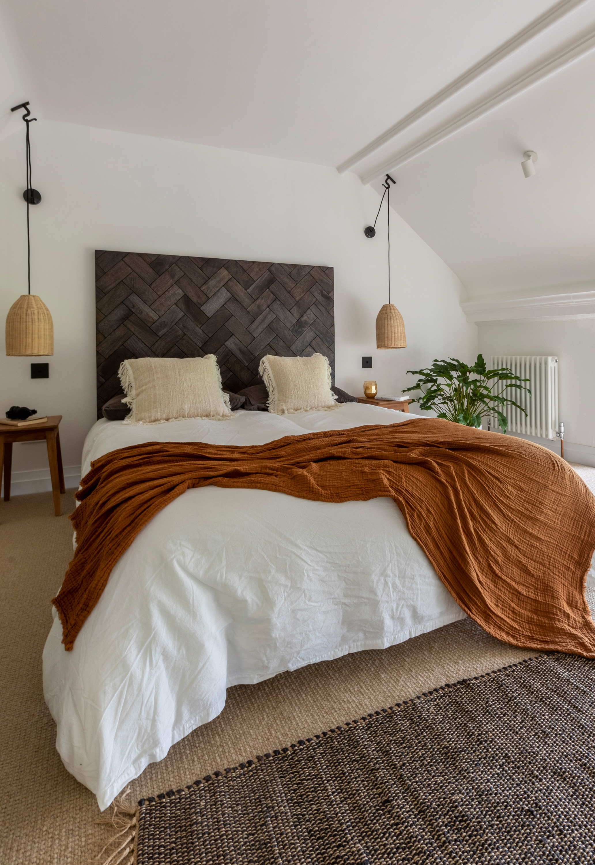
Headboard, French Connection. Rug and rust throw, H&M Home. Bedside tables, HomeSense. Pendant lights, Iconic Lights
'Every decision we made has been well considered, from the initial plans to the accessories we’ve picked up. Everything made its way home with us because we fell in love with it. We’ve never thought, “Oh, we need to buy a light – let’s go out and get one now.” The process has taken a little longer but that extra time allowed us to think about those smaller decisions and find things as we went along.'
Subscribe to Real Homes magazine
Want even more great ideas for your home from the expert team at Real Homes magazine? Subscribe to Real Homes magazine and get great content delivered straight to your door. From inspiring completed projects to the latest decorating trends and expert advice, you'll find everything you need to create your dream home inside each issue.
Join our newsletter
Get small space home decor ideas, celeb inspiration, DIY tips and more, straight to your inbox!

Formerly deputy editor of Real Homes magazine, Ellen has been lucky enough to spend most of her working life speaking to real people and writing about real homes, from extended Victorian terraces to modest apartments. She's recently bought her own home and has a special interest in sustainable living and clever storage.
-
 This colourful home makeover has space for kitchen discos
While the front of Leila and Joe's home features dark and moody chill-out spaces, the rest is light and bright and made for socialising
By Karen Wilson
-
 How to paint a door and refresh your home instantly
Painting doors is easy with our expert advice. This is how to get professional results on front and internal doors.
By Claire Douglas
-
 DIY transforms 1930s house into dream home
With several renovations behind them, Mary and Paul had creative expertise to draw on when it came to transforming their 1930s house
By Alison Jones
-
 12 easy ways to add curb appeal on a budget with DIY
You can give your home curb appeal at low cost. These are the DIY ways to boost its style
By Lucy Searle
-
 5 invaluable design learnings from a festive Edwardian house renovation
If you're renovating a period property, here are 5 design tips we've picked up from this festive Edwardian renovation
By Ellen Finch
-
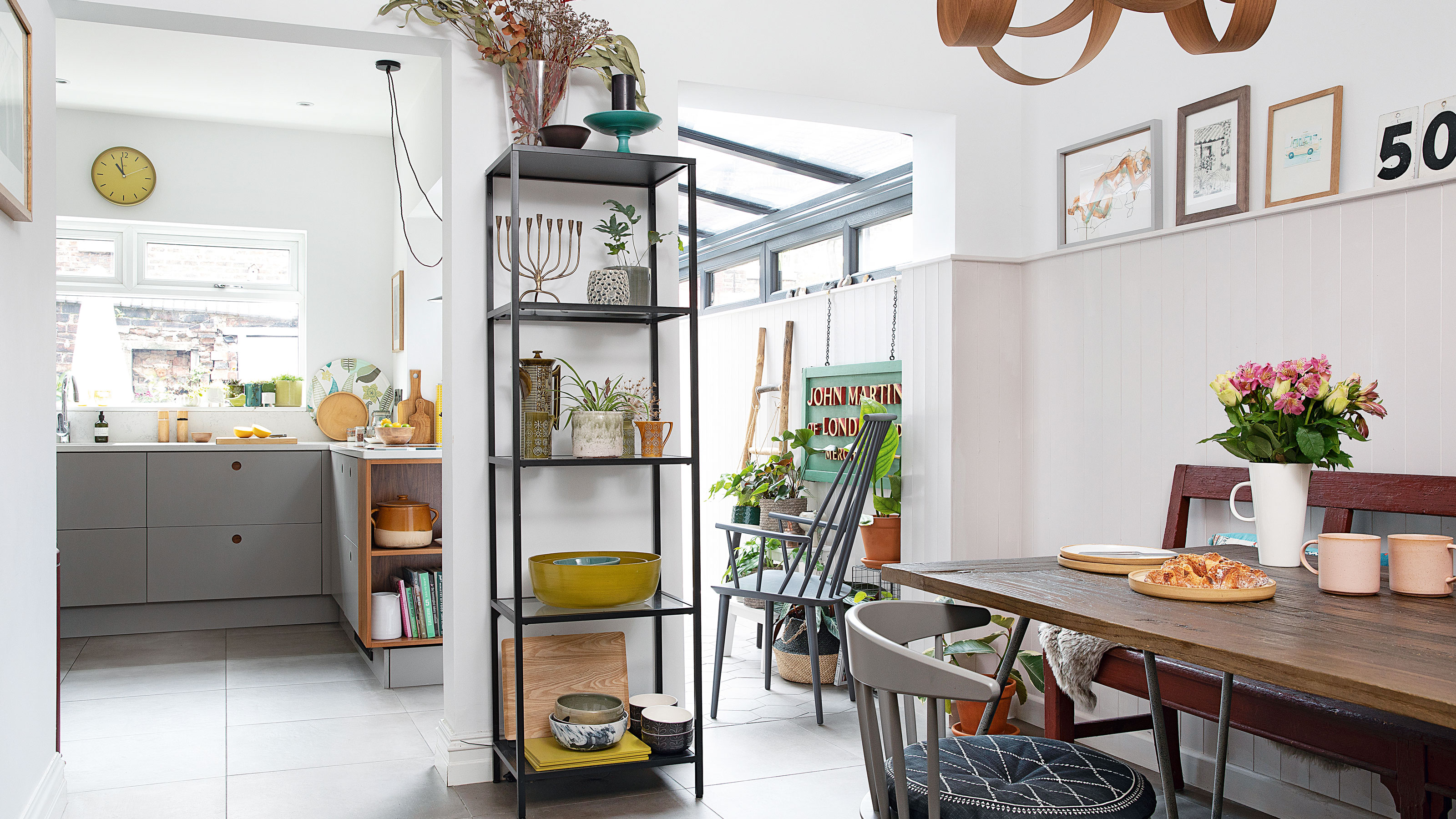 Real home: Glazed side extension creates the perfect garden link
Louise Potter and husband Sean's extension has transformed their Victorian house, now a showcase for their collection of art, vintage finds and Scandinavian pieces
By Laurie Davidson
-
 I tried this genius wallpaper hack, and it was perfect for my commitment issues
Beware: once you try this wallpaper hack, you'll never look back.
By Brittany Romano
-
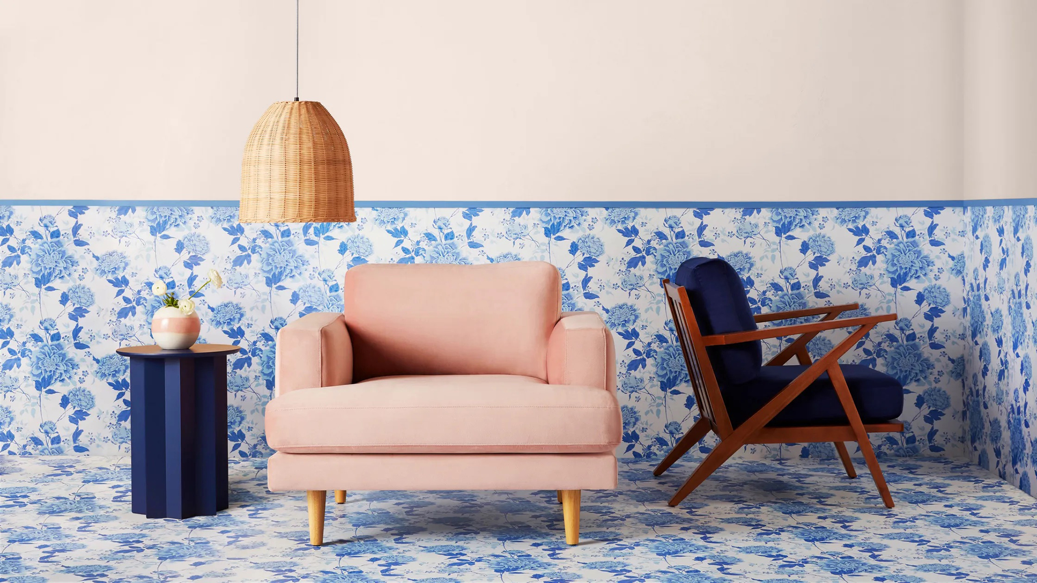 Drew Barrymore's new FLOWER Home paint collection wants to give your walls a makeover
Drew Barrymore FLOWER drops 27 brand-new paint shades, and every can is made from 100% post-consumer recycled plastic.
By Brittany Romano
