
The decisions you make when you go through a renovation are always, without exception, difficult. Everything you do, from choosing the builders to entrust with your home to picking out the perfect paint color, is incredibly important – after all, you’ll be living with the results for years.
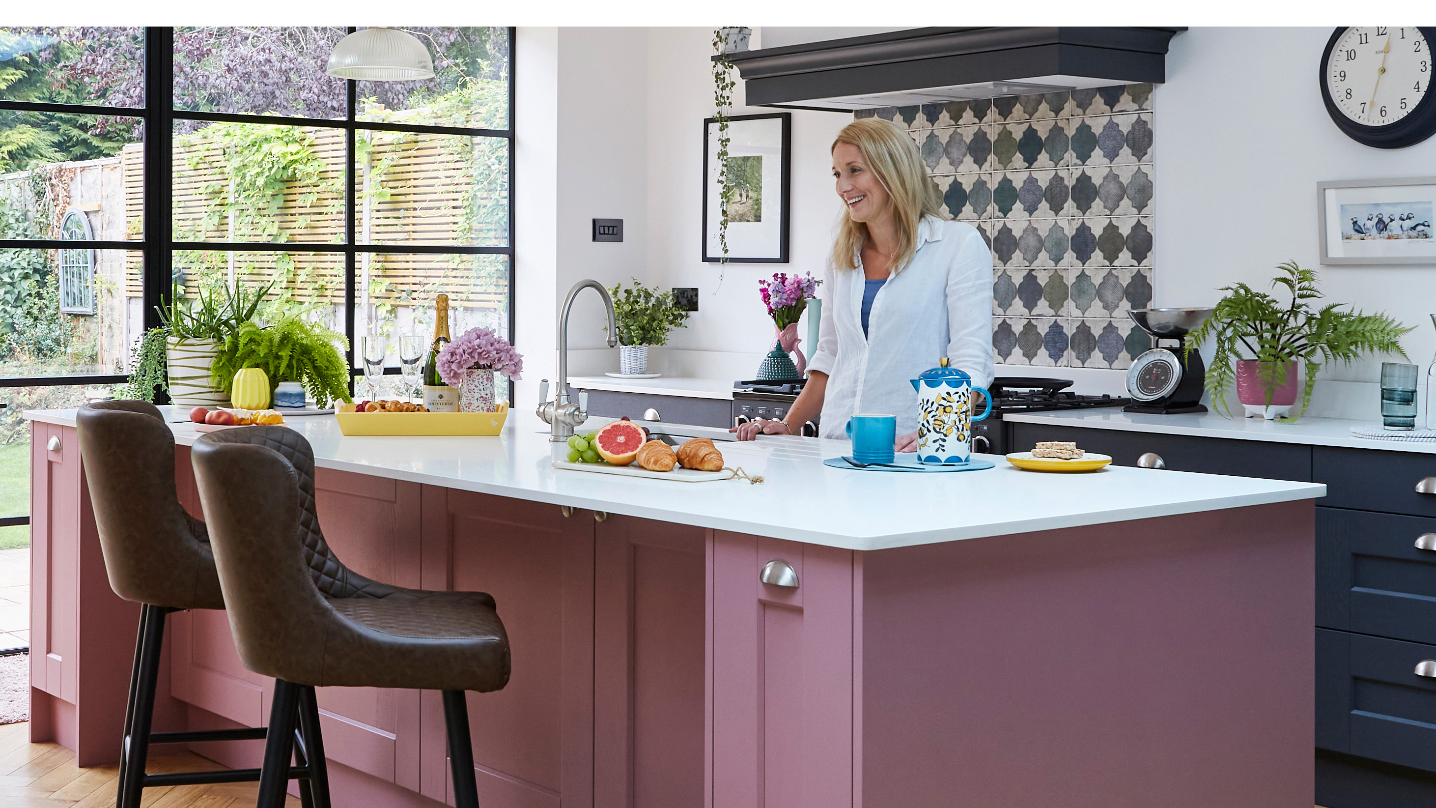
Lucy Kirwan’s stunning pink and grey kitchen fits seamlessly into her bright and modern extension, but the design was one she sat with for months while she decided whether she was brave enough to go ahead. She did, and the result is a spacious, sociable family room that played host to plenty of parties before Covid 19 – and will see many more to come, we’re sure. Lucy reveals how she combined bold style and thoughtful touches to create a beautiful space.
- For more real home transformations, head to our hub page.
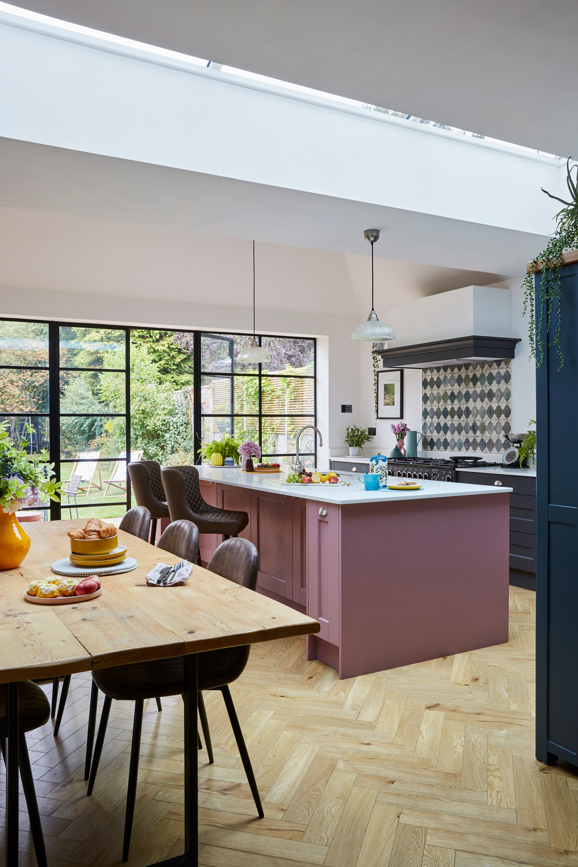
Kitchen, Masterclass Kitchens via Studio 62 Kitchens, painted in Vintage Rose. Bar stools, Dunelm. Flooring, Monster Flooring. Try Pooky for pendant lights
Profile
The owners Lucy Kirwan, detective inspector on a child protection unit, her husband, Craig, a police officer, their children, Charlie, Matilda and Woody, and dog Benji
The property A five-bed Edwardian semi in Stourbridge, West Midlands
Project cost £95,000
'We had such a specific idea of what we wanted from our house when we started looking. Having three kids, bedrooms were a big issue,' says Lucy. 'We’ve only ever lived in period houses and we love the old features. And we love Stourbridge – the schools were a big pull for us. I spotted this house at seven o’clock one evening, then waited in the rain outside the estate agent’s the next day until they opened so I could see it '
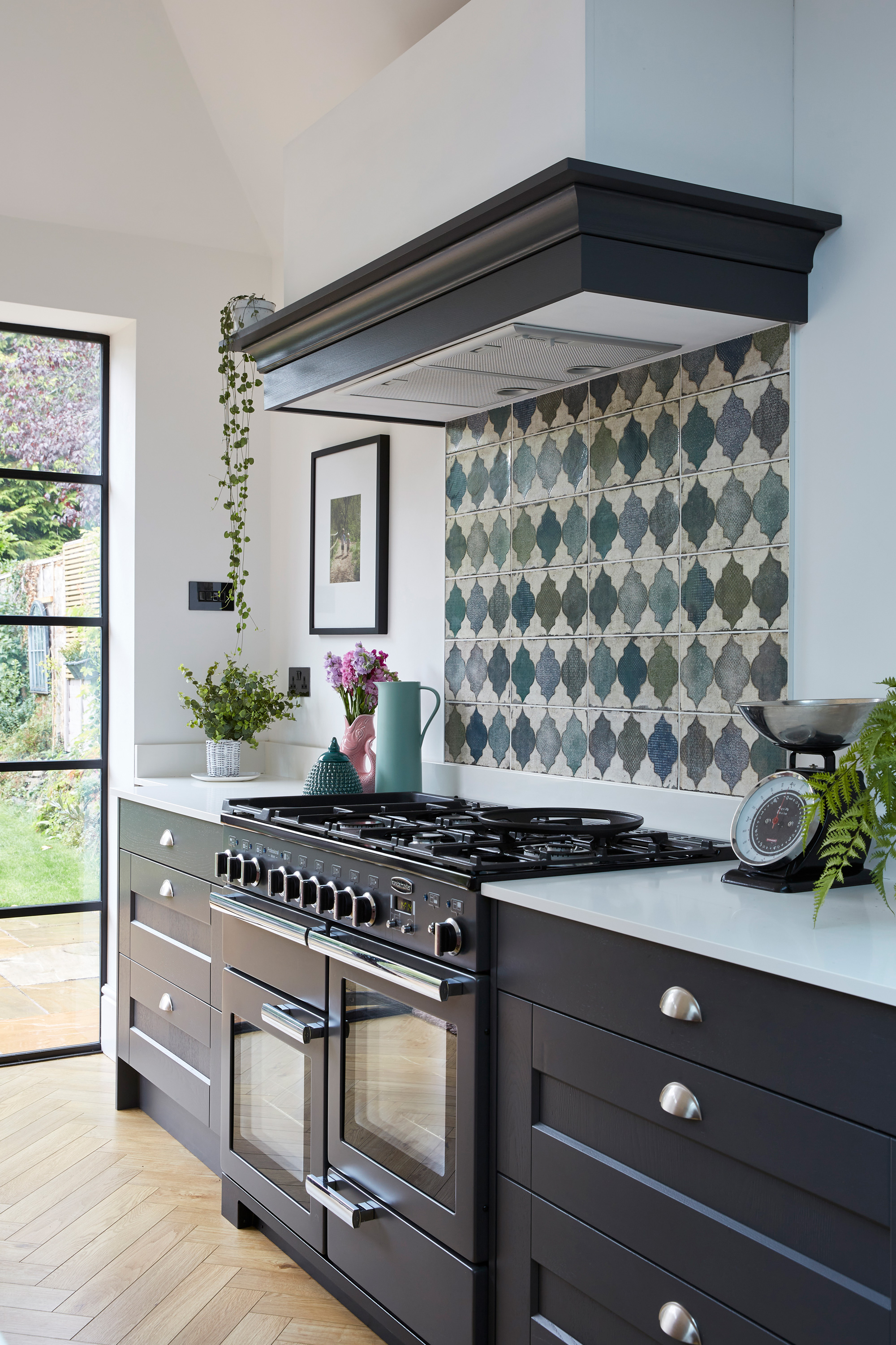
Tile splashback, Tile Mountain. Kitchens, painted in Graphite Grey
‘The house is a purpose-built five-bedroom property, which was a real draw. We liked that we wouldn’t have to take on a loft conversion, though we knew we’d need to do the kitchen. Our budget for the house was more than what we paid for it, so we had a little more to play with for the project itself.'
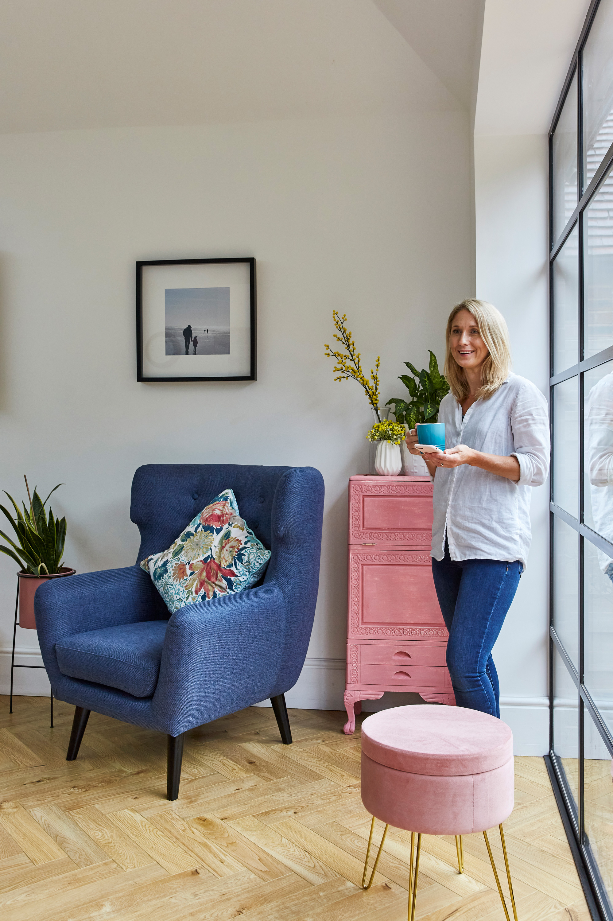
'Originally, the kitchen was a galley-style design separate to the dining room, which had French doors out to the garden. We decided to build out the width of the house to incorporate a combined kitchen-diner, and block off the original kitchen and turn it into a utility room. To keep the project under permitted development, we extended by the maximum six meters – still shy of next door’s extension.
‘We shopped around for quotes but decided to go with our friend, Jon, who’s a builder. Because he drew up the plans and did the design work, it saved us money on hiring a separate architect. He had some great suggestions, too. Originally we wanted to come into the space through the original kitchen, but Jon pointed out that it would be far more impactful to open out from the larger dining room instead. It’s a bigger, brighter, more effective way to see the extension.'
- Thinking of starting your own project? Check out our guide to kitchen extensions.
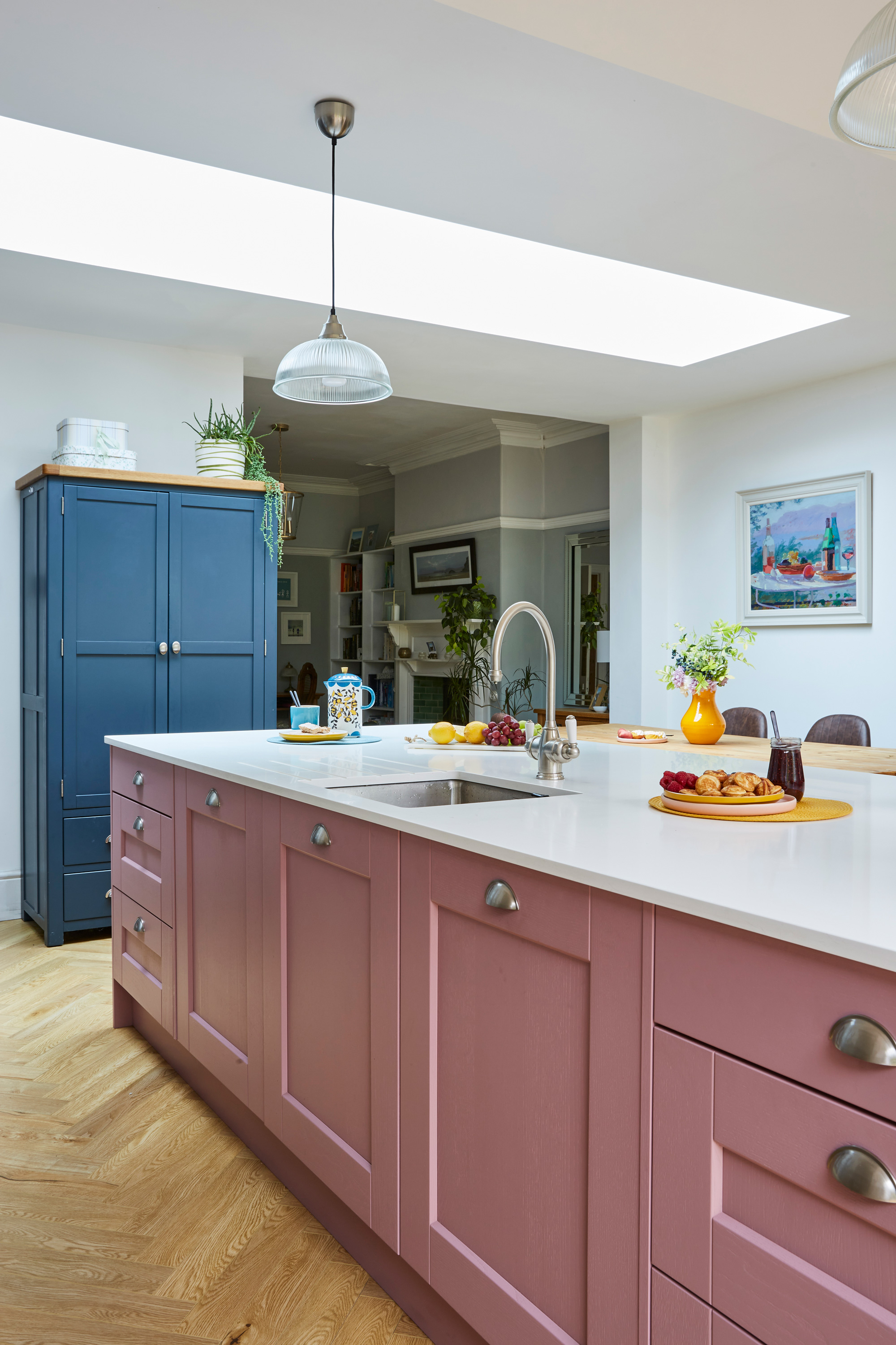
Island, Masterclass Kitchens via Studio 62 Kitchens, painted in Vintage Rose. Tap, Perrin & Rowe
'We did the rounds when deciding on a kitchen, but I just wasn’t getting excited by what we saw. Some friends had a quote from Joe at Studio 62 Kitchens. I called and asked him to take a look for us, too. I wasn’t sold on the navy kitchens I kept seeing, so when he asked if we’d thought about going for a completely different colour, I was keen.
‘He suggested pink. My husband Craig was like, “No way,” but I loved it. I wasn’t sure if I was brave enough and ummed and ahhed for months before going for it – pink and graphite grey isn’t your usual colour combination – but the second we unpeeled it, I knew we’d made the right decision.'
- Find more pink kitchen ideas in our gallery.
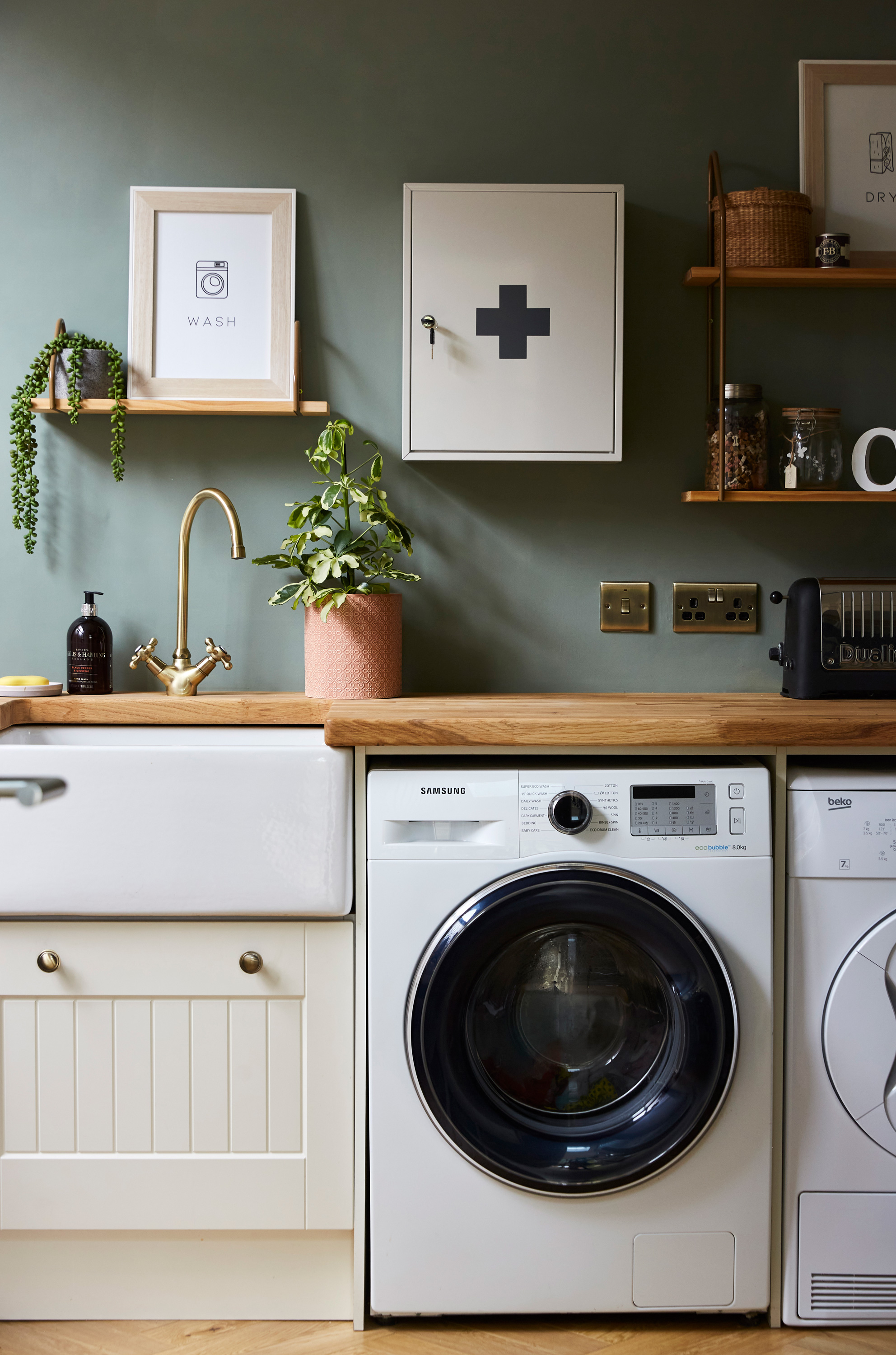
Walls painted in Card Room Green, Farrow & Ball. Cabinets and sink, salvaged from old kitchen. Worktop, Worktop Express. Shelves, La Redoute. First aid cabinet, Garden Trading. ‘Wash’ and ‘Dry’ prints, Etsy
'We bought things like appliances using our savings before the build started, which I wouldn’t recommend – we had to store them somewhere, and at one stage I was down in the unfinished extension at six in the morning lifting the washing machine off the floor because the rain was flooding in.
‘We took out a second mortgage for the build itself, and we did go over by about £10,000. We had a nightmare with the kitchen floor. The original was built on soil with no real foundations, so we had to dig it all out and lay some – a cost we hadn’t factored in. We also had a lot of carpentry work done – the utility works and bespoke skirting to link to the original dining room, for example. Joe, our kitchen fitter, also made us a bespoke extractor fan. They were all extra hidden costs – but they were worth it for the higher-quality finish.'
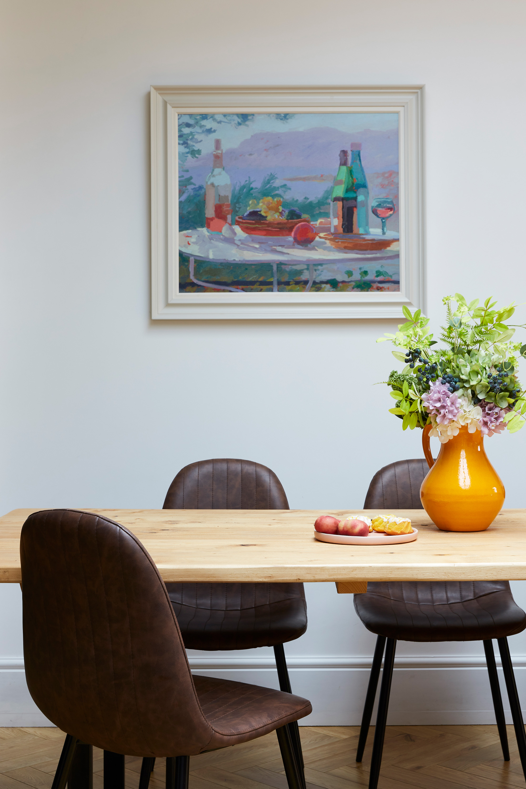
Dining table, made from scaffold boards. Chairs, bought at auction. Orange jug, Oliver Bonas
'A big question was how we were going to incorporate the older part of the house into the addition. We retained a lot of the original dining room features, including the cornicing, picture rails and the fireplace, but opening out into the modern space means it’s a bit of a mixture of old and new. From the back, the pitched roof we designed for the extension looks like the original – plus you can’t see the rooflight – and the black steel doors have a traditional feel.'
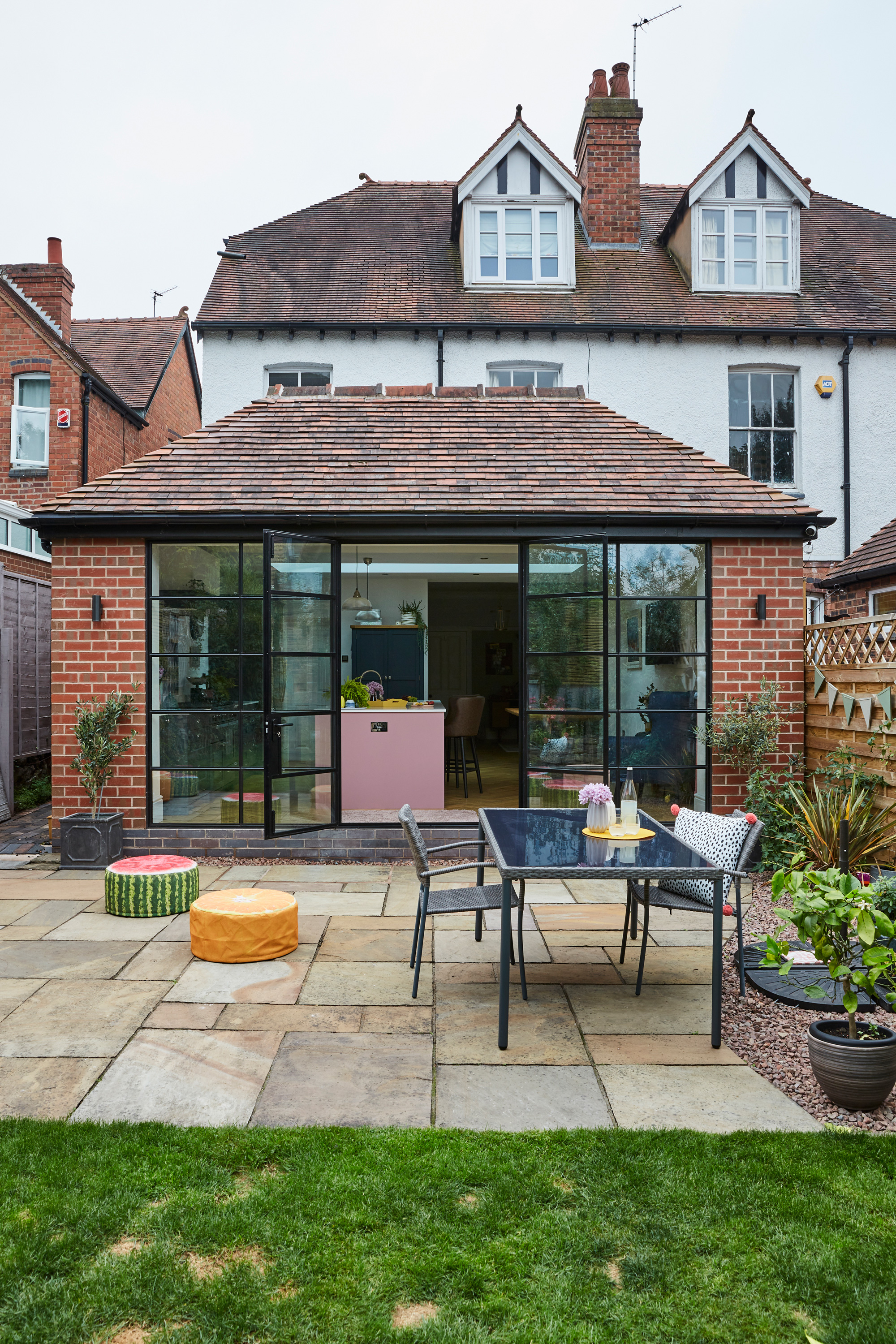
Bespoke steel doors, Drury Casement Co. For an outdoor table and chairs, try Beliani. Fruit stools, Fallen Fruits
'I love period properties and I quite like traditional colors, but Instagram was a real eye-opener for me. I’ve always enjoyed interior design and know what I think looks nice, but seeing what’s out there on Instagram made me realize that anything goes when it comes to your home. I definitely went against the grain with the kitchen, and that’s given me the confidence to step outside of the box for the rest of the house – I now shy away from creams and whites in favor of bolder looks.'
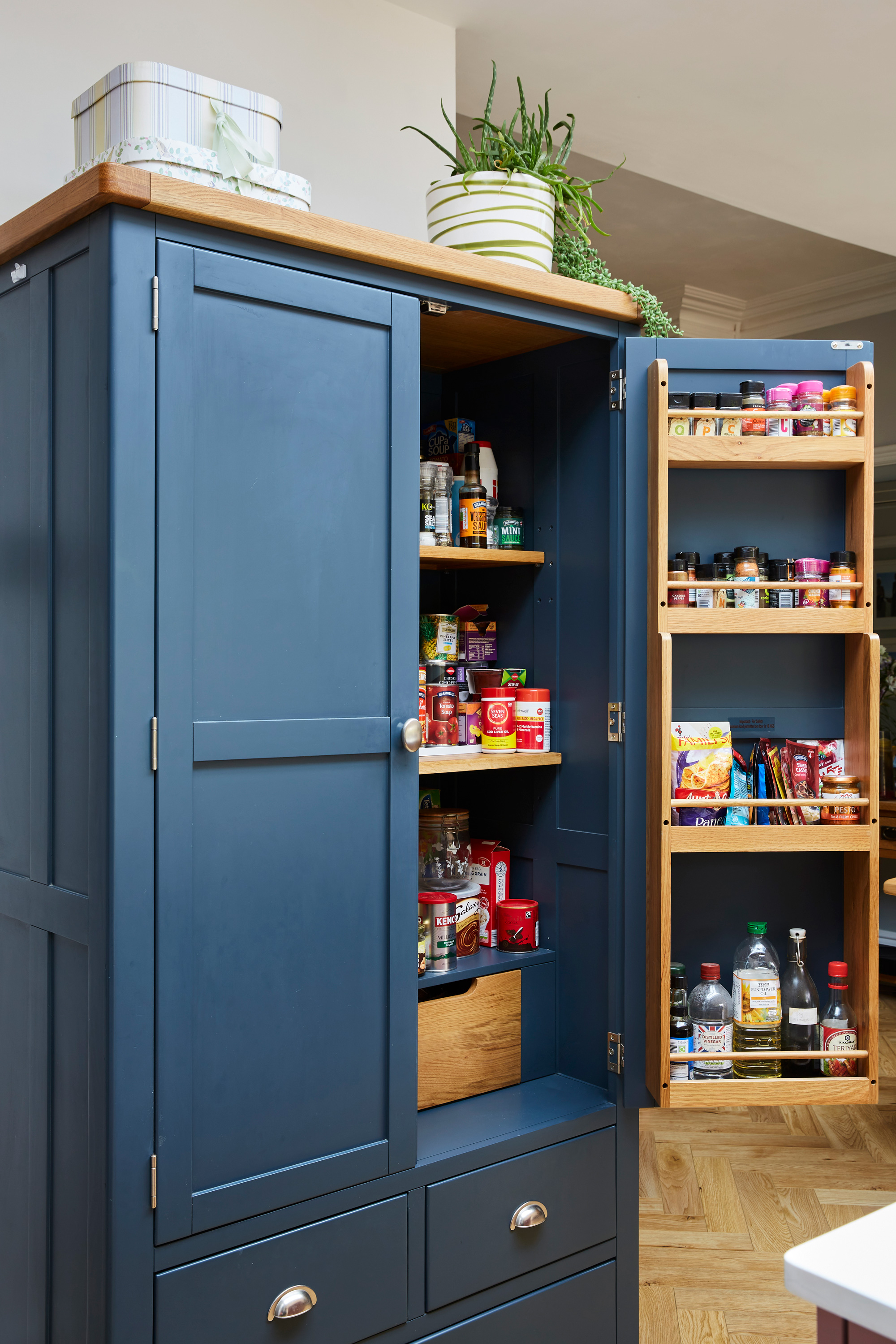
Larder, The Cotswold Company
- See more pantry storage ideas in our gallery.
Subscribe to Real Homes magazine
Want even more great ideas for your home from the expert team at Real Homes magazine? Subscribe to Real Homes magazine and get great content delivered straight to your door. From inspiring completed projects to the latest decorating trends and expert advice, you'll find everything you need to create your dream home inside each issue.
Join our newsletter
Get small space home decor ideas, celeb inspiration, DIY tips and more, straight to your inbox!

Formerly deputy editor of Real Homes magazine, Ellen has been lucky enough to spend most of her working life speaking to real people and writing about real homes, from extended Victorian terraces to modest apartments. She's recently bought her own home and has a special interest in sustainable living and clever storage.
