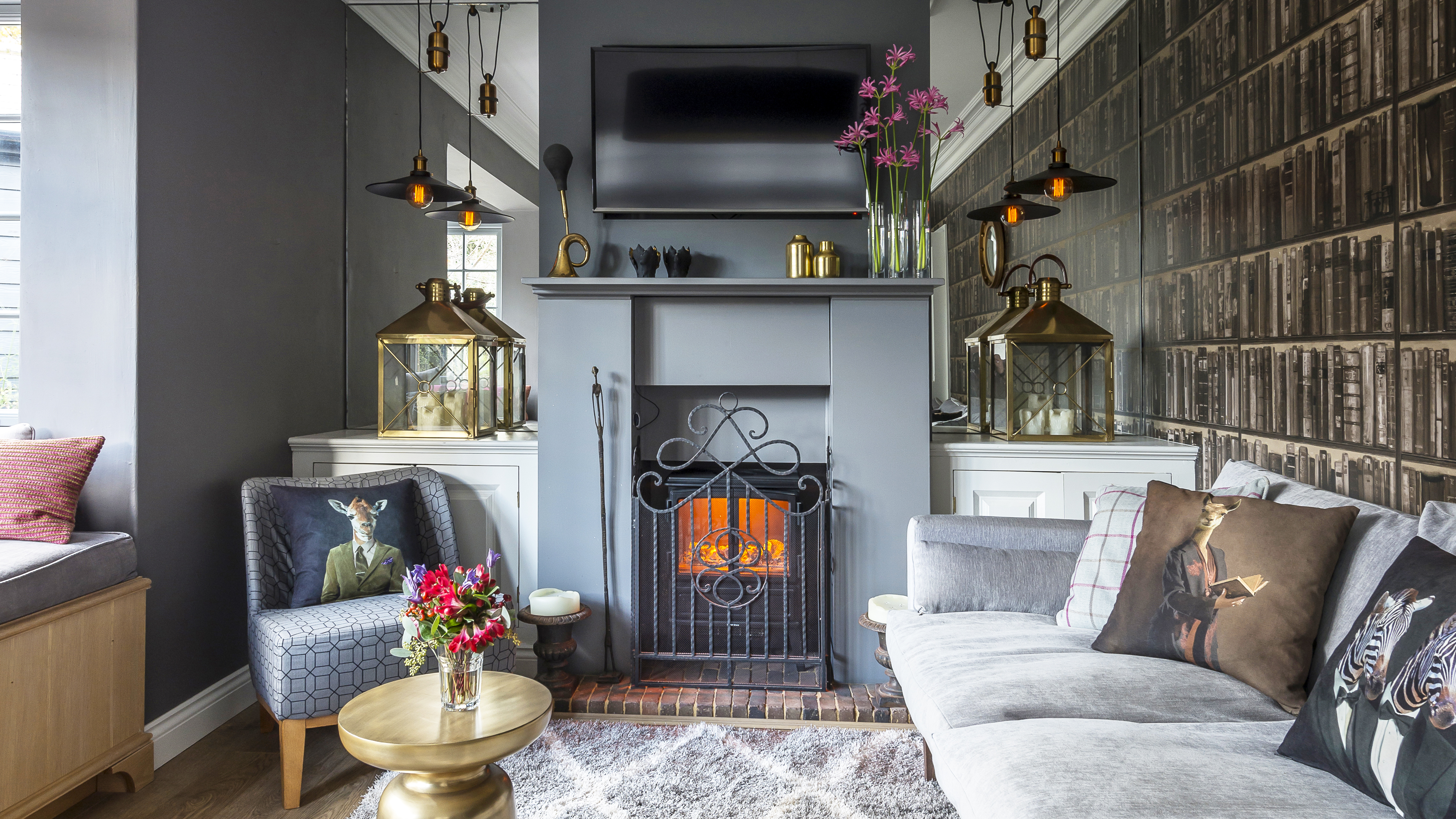

You could say it was fate that led Nic to buy and renovate this three-bedroom cottage in Surrey.
Project notes
The owners: Nic Howard, a garden designer, lives here with his two Basset Fauve de Bretagne dogs, Otis
and Henry
The property: A three-bedroom, detached Edwardian house built between 1905 and 1910 in Outwood, Surrey
Total project cost: £180,000
He wasn’t even looking for a new home when he spotted it in the window of an estate agent’s shop while out shopping with his mum.
‘I was browsing mindlessly when I saw this place and thought I’d pick up the details, more out of interest than any intention to buy,’ he recalls.
It was in a ‘pretty grim’ condition, having not been renovated since the 1980s, but something about it struck a cord with him. ‘I loved the fact it had so much potential, and when the house next door came on the market my Mum bought that one, so we now have the perfect set up,’ he adds.

The brick wall is painted in bright Dulux Moroccan Velvet 3 masonry paint. A large mirror is fitted into the wall where a door to the snug once stood, making the room feel wider than it is. The floor tiles are from CTD Tiles. Pendant lights and leaning mirror, Ardingly International Antiques & Collectors Fair. Dining table, Made.com, and pink chairs, No.44 Furniture
As a garden designer by trade, Nic is used to coming up with layouts for clients, albeit for outdoor living rather than indoor. ‘I decided to give the place a lick of paint and move in for a while to see how the space worked for me,’ he says. ‘It wasn’t the nicest experience, but it was invaluable in working out how the layout could be improved.’
Nic’s plans included replacing a glazed conservatory roof with a proper ceiling and then extending above it to make a large dressing room.
The first-floor bathroom would also be divided into two shower rooms.
Downstairs, another extension would be added to create a new utility room, the kitchen ceiling raised to give a feeling of space, and a sliding door installed between the kitchen and utility to keep wet dogs out of the kitchen.
‘I was conscious that by stripping everything back to its bare bones we might lose some of the building’s charm, so I was careful to enhance the cottage feel and add period features, such as the Edwardian coving,’
Nic Howard
With his ideas formulated, Nic asked an architect friend to draw up the plans, and then applied for planning permission, which was required as the house sits within Green Belt land.
He then moved in with his mum so the extensions could be added, the layout changed, and new heating, wiring, insulation and windows fitted.

The second living room leads off the kitchen, creating an open-plan feel. The sideboard is a family heirloom that has been repainted and the mirror is from John Lewis. For a similar personalised destination wall sign, try Not On The High Street
The work was due to take four months, but, inevitably, with a project of this size, it overran. ‘I think it was a much bigger job than either the builder or I expected, and in the end it took 10 months,’ recalls Nic, who found his contractor through a recommendation.
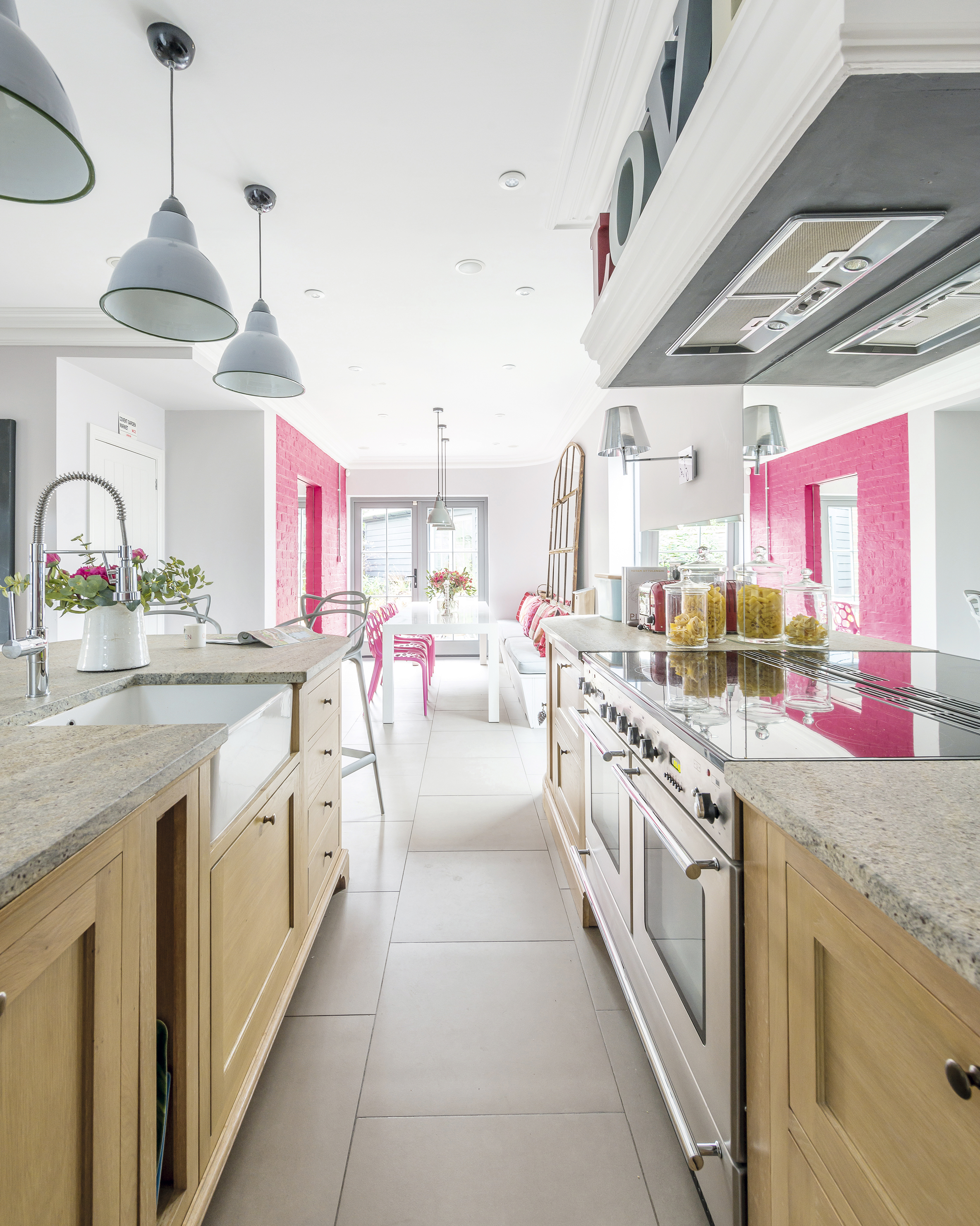
The ceiling was raised to improve the sense of space, and a barn-style sliding door was fitted leading to the new utility extension. The kitchen units are from Neptune, with Kashmir granite worktops from Town & Country Marble. Tap and extractor fan, Howdens. The original Aga would have cost £4,000 to refurbish, so Nic opted to replace it with a modern Rangemaster oven. Pendant lights, Ardingly International Antiques & Collectors Fair; for similar, try Cox & Cox. Bar stools, Kartell
Nic describes the finished house as ‘modern but homely’, which is largely thanks to his eye for unique, one-off pieces.
‘I really enjoy shopping around for furniture and accessories, and love finding something for £30 or £40 that you would expect to cost 10 times as much,’ he says.
‘I spend a lot of time at antiques and collectors fairs for work, and then curate the pieces I buy to enhance the interior. Painting old furniture is one of my favourite pastimes.’
Costs
Structural work: £70,000
Kitchen: £20,000
Glazing: £18,000
Bathrooms: £15,000
Decoration and furniture: £8,000
Flooring: £6,000
Professional fees: £3,000
TOTAL: £140,000
The finished kitchen is a classic Shaker style, with plenty of storage and a large, sociable island at its heart. Nic saw the units in a Neptune showroom and fitted them himself to save money.
Flamed and brushed granite worktops were costly, but Nic says they were worth the investment as they’re durable, look great and require zero maintenance.
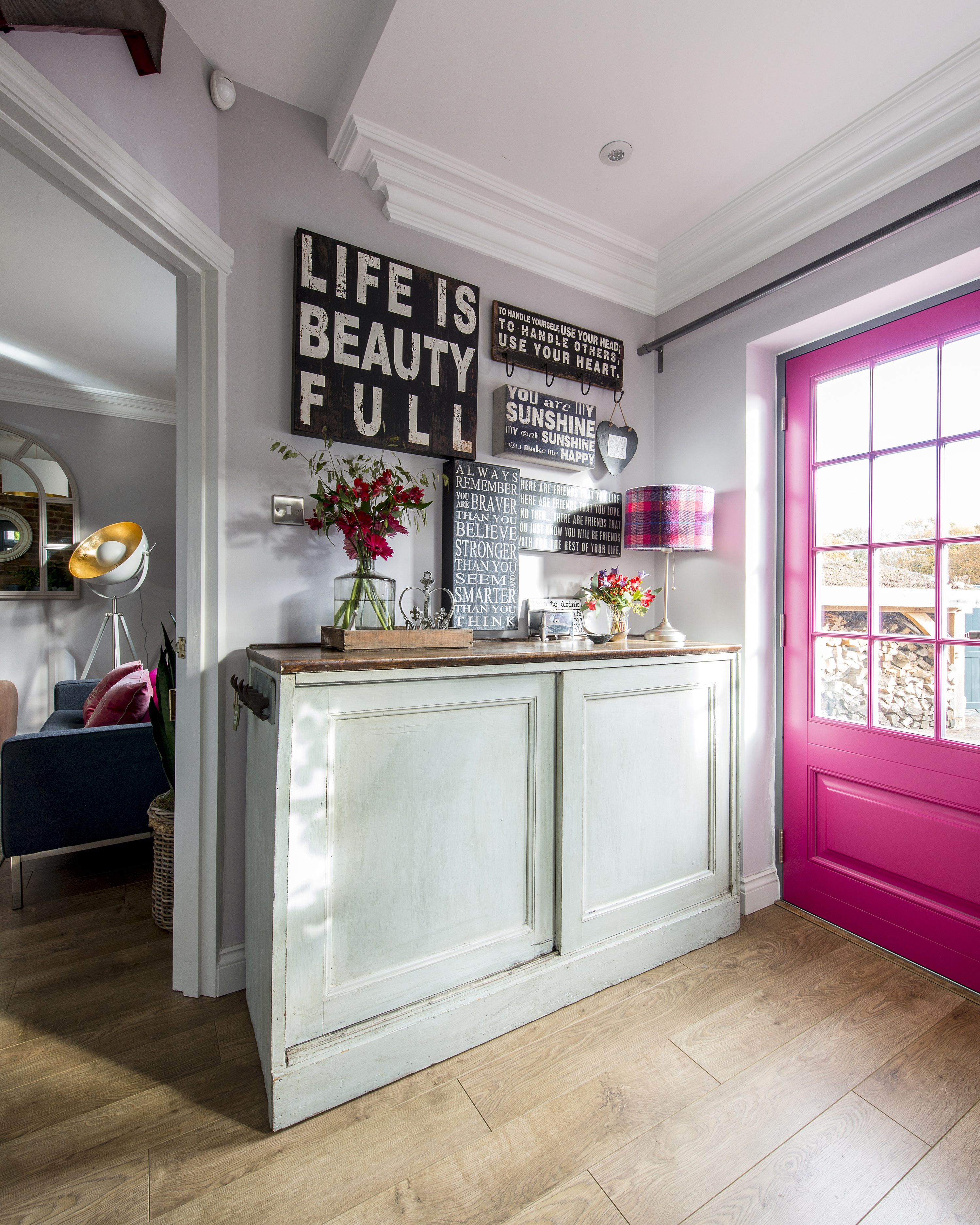
Nic created a raspberry pink theme throughout his house, including the front door

In the second living room, a wood-burning stove from Fires & Flues forms the focal point. The walls are painted in Little Greene’s French Grey Pale. Sofa, Cult Furniture. The pouffe and floor lamp are from Made.com. Ceiling light, Not On The High Street. Antlers, TK Maxx. Rug, Dunelm
Pops of pink are a theme throughout the house, from the feature wall in the dining room to the upcycled chest in Nic’s bedroom. Upstairs, he’s opted for neutral wall colours that can be updated with coloured accessories. The bathrooms, meanwhile, are sleek and contemporary with frosted glass sliding doors.

The grey and pink colour scheme creates a vibrant, sophisticated look in the main bedroom. Nick bought the bed from Ikea and resprayed it cream to suit his scheme. Circular mirror, Furniture Village. Ceiling lightshade, Not On The High Street. For a similar cowhide rug, try City Cows. Throws and cushions from Homesense and John Lewis, along with pink bedside lamps from Habitat, add the finishing touches to the colourful room
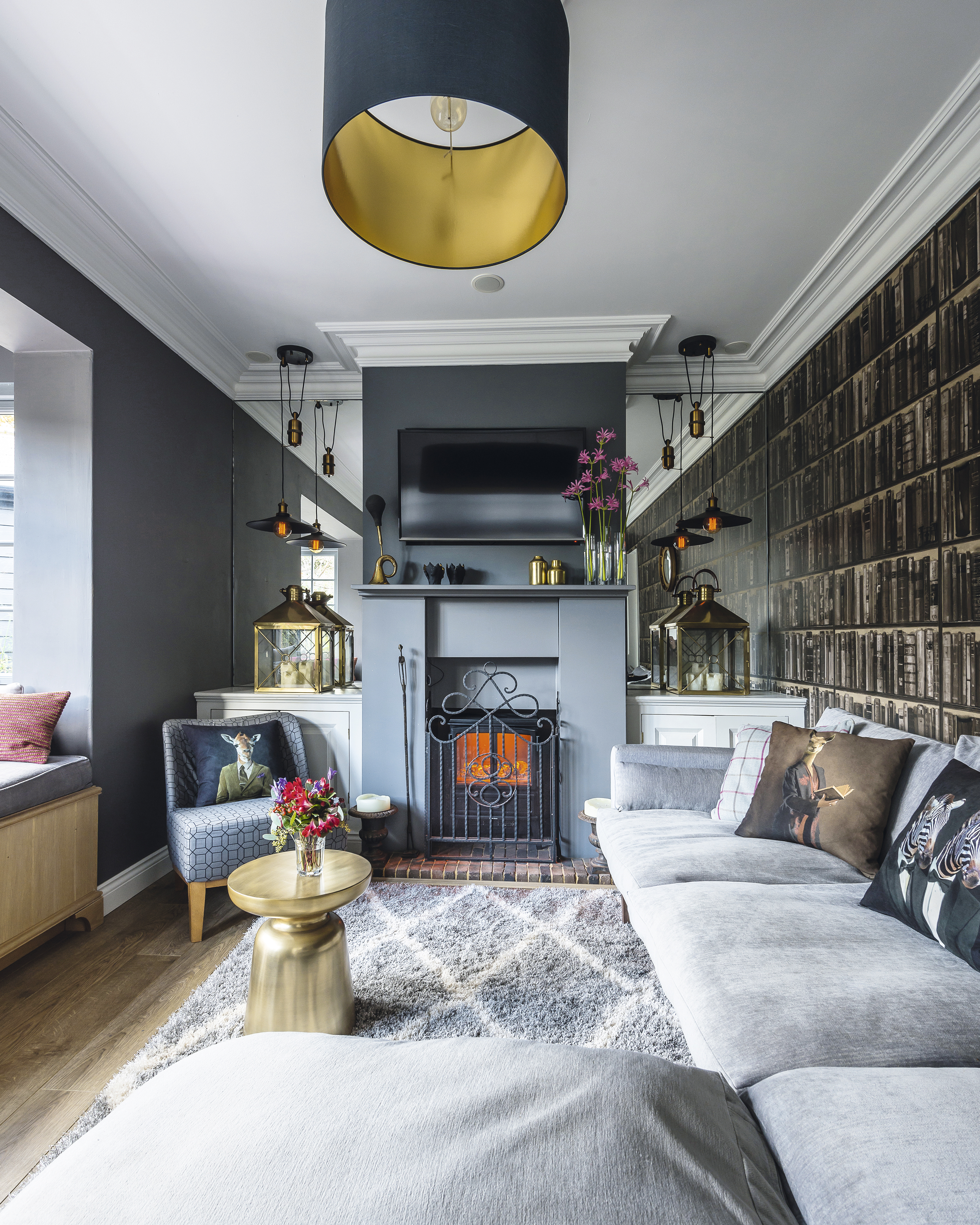
Nic wanted the main living room to have a cosy, gentleman’s club feel so he opted for this Bookshelf wallpaper from Andrew Martin. Grey sofa, Ebay. Gold table, John Lewis. Grey armchair, Ikea. For similar flooring, try The Natural Wood Flooring Co. Ceiling lightshade, Not On The High Street. New glazing from Elwyns has been installed throughout the house
When he was finally able to move back in, Nic felt a huge sense of relief. ‘After 10 months, it was fantastic to have my home back,’ he recalls.
‘It was definitely worth all the time and effort getting the layout just right. It’s funny to think that I wouldn’t be living here if I hadn’t gone shopping that day – it just goes to show how fate can decide where we end up.’
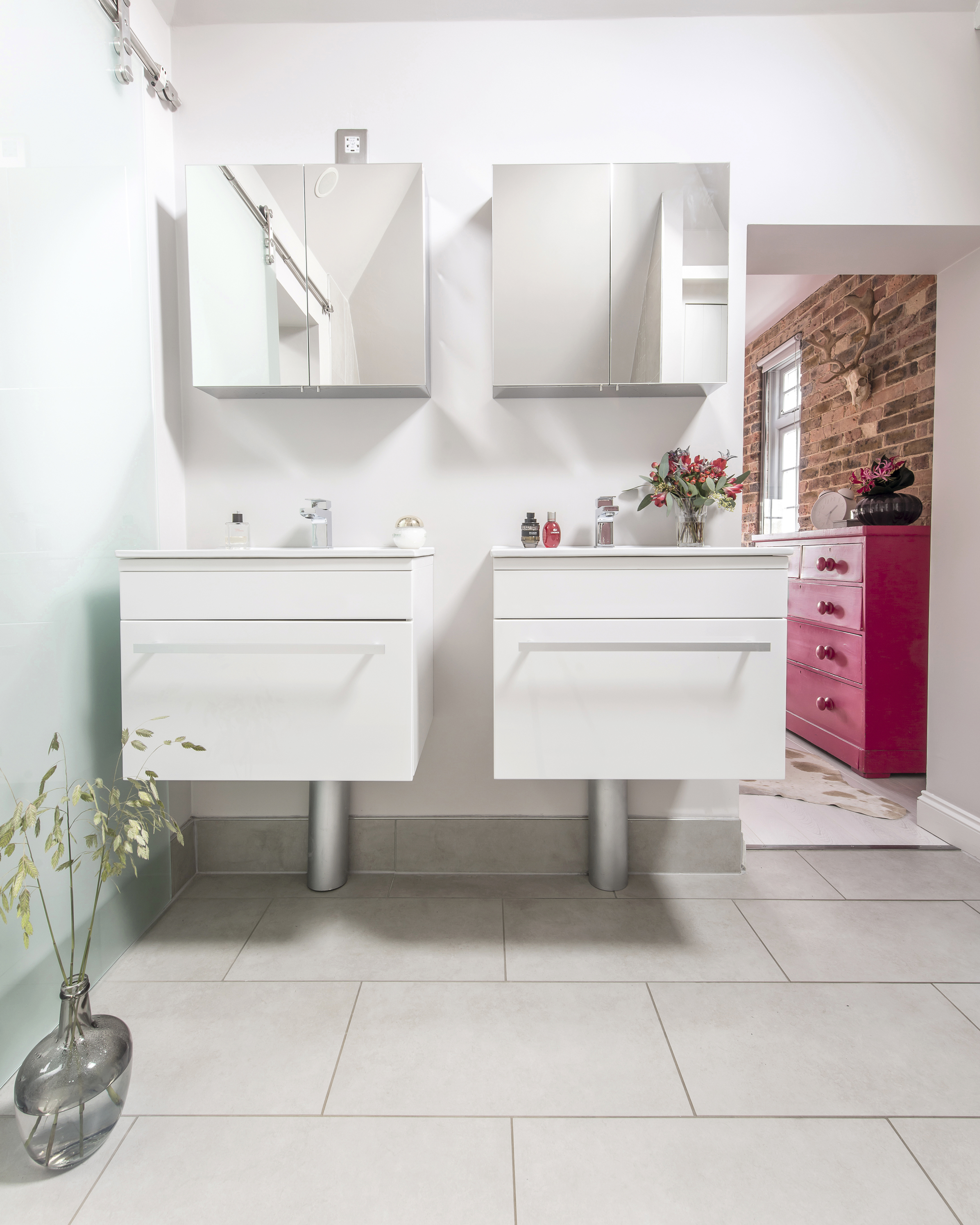
The original bathroom was divided in two to create two en suite shower rooms, including this one off the master bedroom. Double vanity units and shower screen, Victoria Plum. Floor tiles, CTD Tiles. Taps, Howdens
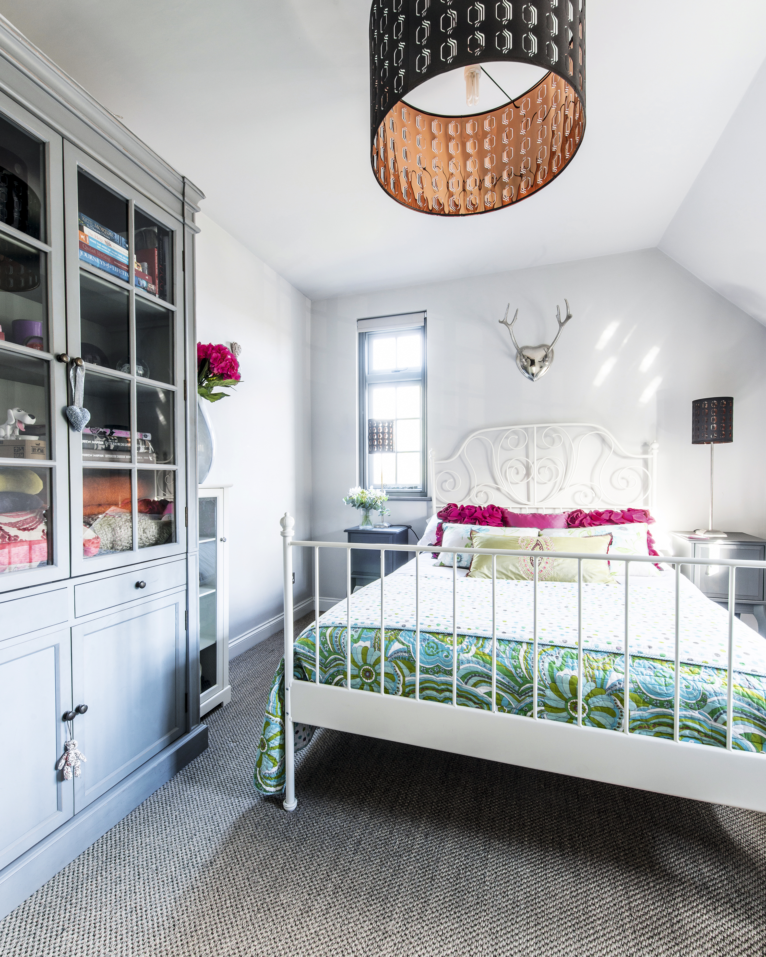
Textured carpet from Period Flooring adds warmth to the space, which is painted in Vitro’s Cloudburst. Ceiling light and bed, Ikea. Bedding, cushions and antlers, Homesense
Contacts
- Glazing: Elwyns
- Floor tiles: CTD Tiles
- Kitchen: Neptune
- Bathrooms: Victoria Plum
Join our newsletter
Get small space home decor ideas, celeb inspiration, DIY tips and more, straight to your inbox!
Laura Crombie is a journalist and TV presenter. She has written about homes and interiors for the last 17 years and was Editor of Real Homes before taking on her current position as Content Director for Country Homes & Interiors, 25 Beautiful Homes Period Living and Style at Home. She's an experienced home renovator and is currently DIY-renovating a 1960s house in Worcestershire. She's been quoted on home design and renovating in The Times, The Guardian, The Metro and more. She's also a TV presenter for QVC and has been a commentator for Channel 4 at Crufts dog show.