Real home: a curved single storey kitchen extension
A curved kitchen extension and a redesigned layout have transformed Vic Grimshaw and Tom Hostler's Victorian property

Life has a funny way of leading us down a different path, and that’s exactly what happened when Vic had to pay a visit to the vets in Wanstead, east London.
Project notes
The owners: Freelance digital editor Vic Grimshaw and her partner Tom Hostler, a managing partner at a digital creative agency, live here with their daughter, and cats Pixel and Felix
The property: A four-bedroom, Victorian end-of-terrace in Wanstead, east London
Total project cost: £104,000
Realising the area offered the same Victorian housing stock as the location she had her heart set on moving to in west London, but for a fraction of the price, she reconsidered her plans. ‘There was a real village quality to the area,’ she says. ‘I was sold on it.’
Vic first saw the house that is now her and her partner Tom’s home when their daughter was just 10 weeks old, but she initially ruled it out. Thankfully, Tom viewed it later and immediately spotted its potential. ‘It didn’t take much to talk me into it this time,’ says Vic. ‘It was a lovely light house with high ceilings and plenty of space.’
Find out how they created they dream home, then explore more real home transformations and extensions.

Vic spotted this Victorian terrace on a trip to the vet's
With Vic now on board, the couple put in an offer for the property, which they financed using savings and the proceeds from the sale of their flat. ‘Buying a dated property meant we could start from scratch and create a space that was tailored to our needs, rather than having to live with other people’s design decisions,’ she adds.
Shortly after moving in, the couple contacted architect Tom Kaneko to redesign their home, giving him a brief that included creating an open-plan kitchen, garden views and a downstairs toilet. ‘We love metal-framed windows, so we wanted to have them somewhere, too,’ says Vic.

Roof windows from Velux ensure the new extension is always a light-filled space. The plywood kitchen units were designed by architect Tom Kaneko and made by the builder. Retro Metro Lime House wall tiles from Fired Earth provide a colourful backdrop to the range cooker from Lacanche. For a similar Belfast sink, try Tap Warehouse
MORE FROM REAL HOMES MAGAZINE

Want to see inside more stunning homes? Each month, Real Homes magazine features everything from modern extensions to cleverly redesigned family spaces. Get the magazine delivered straight to your door with a subscription deal.
Architect Tom drew up several design solutions for the space, before the couple decided to go for a curved kitchen extension and a largely open-plan layout on the ground floor.
Get small space home decor ideas, celeb inspiration, DIY tips and more, straight to your inbox!
As the extension met the guidelines for permitted development, the couple didn’t need planning permission. ‘We did require a Party Wall Agreement as well as a Build Over Agreement, which gave us permission to extend over a pre-existing sewer,’ explains Vic. Both approvals came through in weeks and work was soon underway.
With the building work estimated to take three months, the family decided to live in the property for the duration of the project rather than taking on the extra cost of moving into rented accommodation.
However, part way through the work, Vic and Tom added the renovation of the bathroom to the list, as well as replacing all the uPVC windows with double-glazed wooden sashes. ‘We realised it was better to get all the disruption over in one go,’ explains Vic.
These additional items and some delays meant the project took 10 months. ‘We decamped upstairs for most of the build and made do with a makeshift kitchen in the loft,’ she adds.
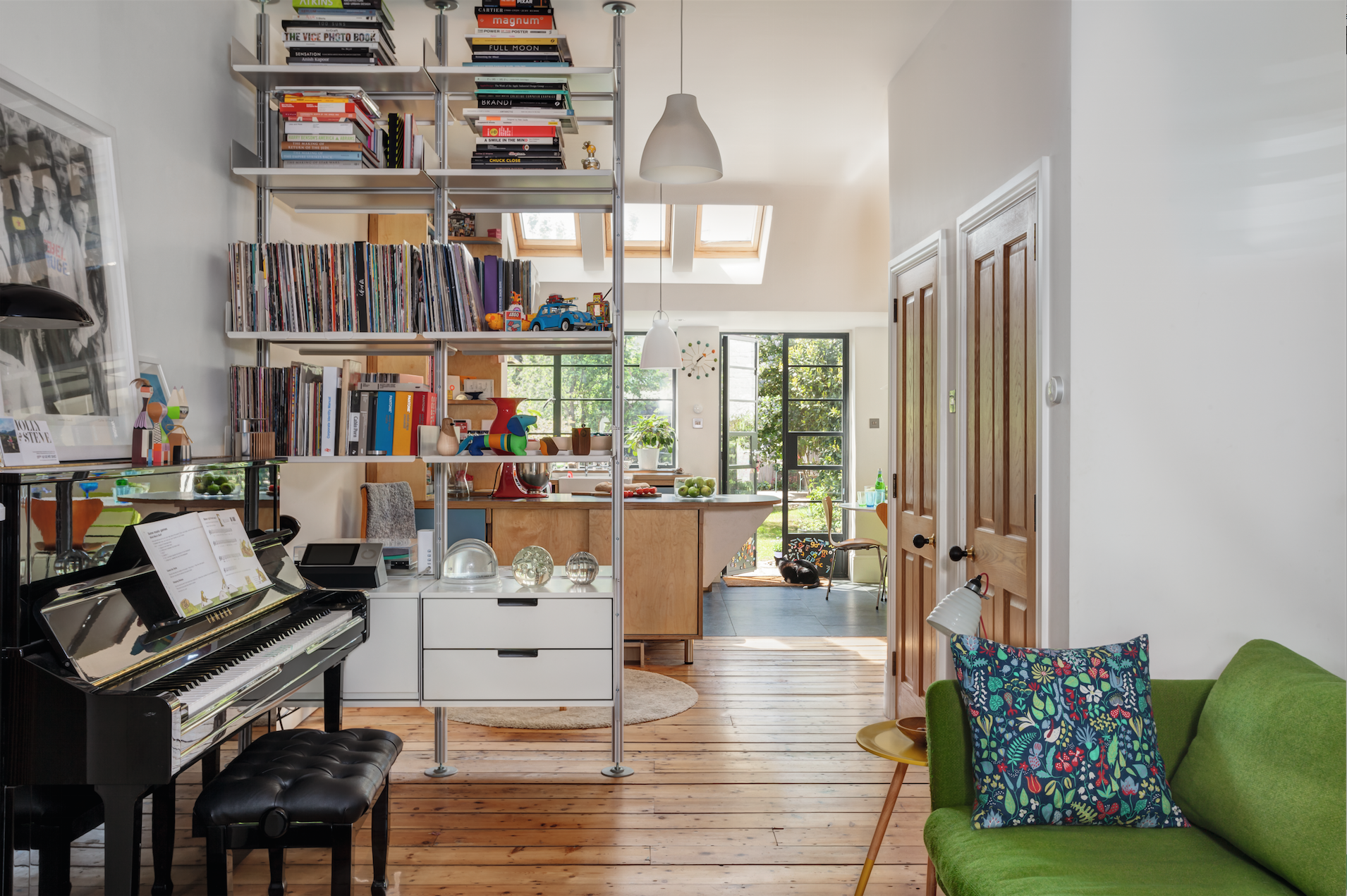
Tom and Vic decided to open up the ground floor to improve the layout. The large shelving unit by Vitsoe is a stylish room divider
It might be a cliché, but the new kitchen is the heart of Vic and Tom’s redesigned home. Walking into their house today, you go through a door to the left of the hallway and you’re straight into a bright, open space leading from the front to the back of the house. Extensive views of the garden draw you through to the modern extension at the rear, which is where the family now spend most of their time.

The curved wall and metal-framed windows ensure the extension has a unique look. The old uPVC windows on the upper floors have been replaced with wooden sash windows from K&D Joinery
The new space is filled with natural light thanks to several rooflights and the wall of Crittall windows and doors that Vic and Tom were so keen to include in their home.
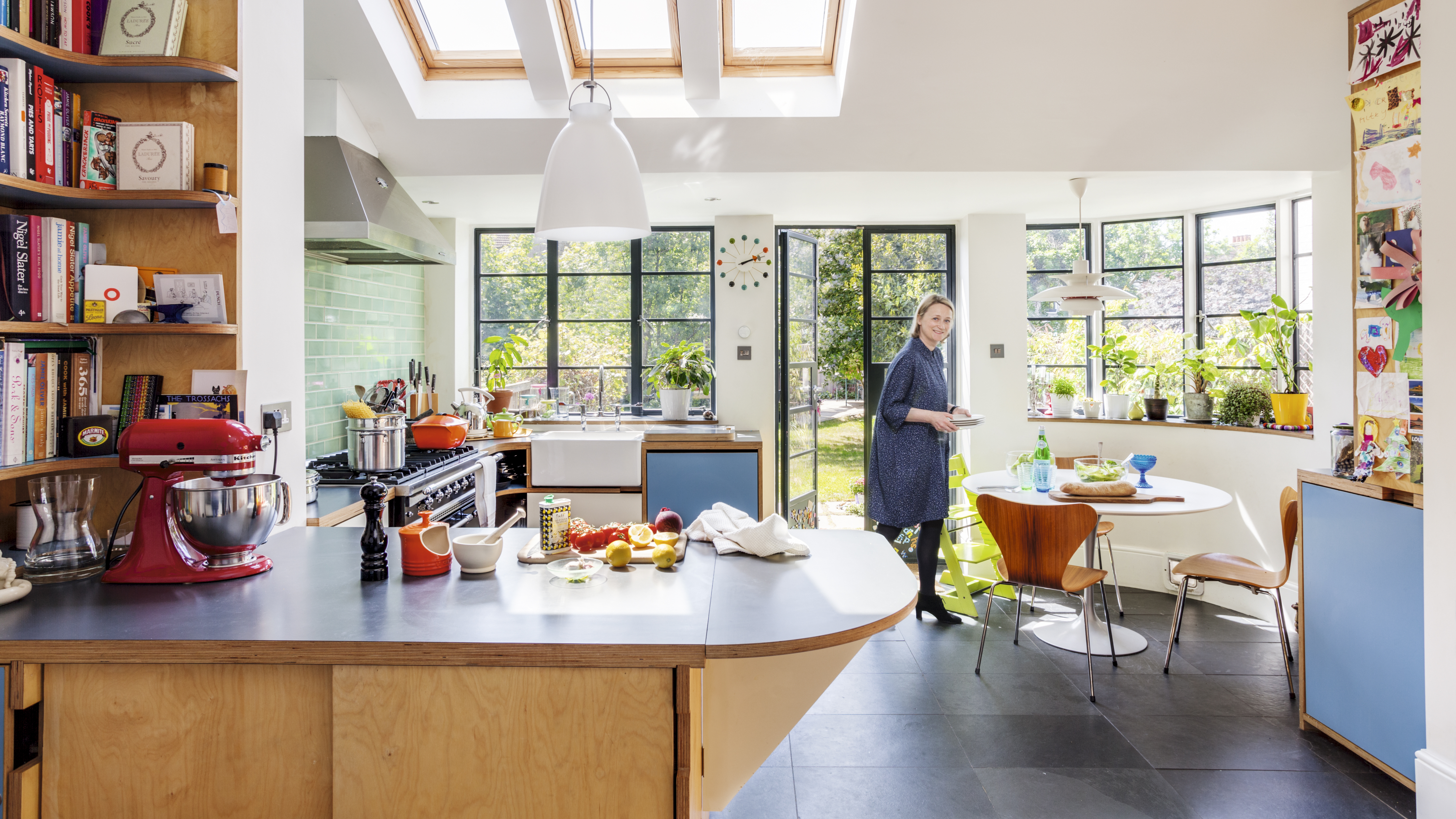
The steel-framed windows and doors from Clement Windows were a key item on the couple's wishlist. The Eero Saarinen Tulip table, Arne Jacobsen chairs and Louis Pouisen pendant light are all design classics; find similar at Nest. The floor tiles are from Fired Earth
To give the kitchen a unique look, the couple opted for a bespoke design rather than off-the-peg units. The CNC-cut plywood kitchen was designed by architect Tom and built by the main contractor, John McGivney, with curved details echoing the curved wall of the extension.
‘Seeing the kitchen take shape was the light at the end of the tunnel,’ says Vic. ‘I remember one sunny day when I could finally see how the space was going to work; it was a lovely moment.’
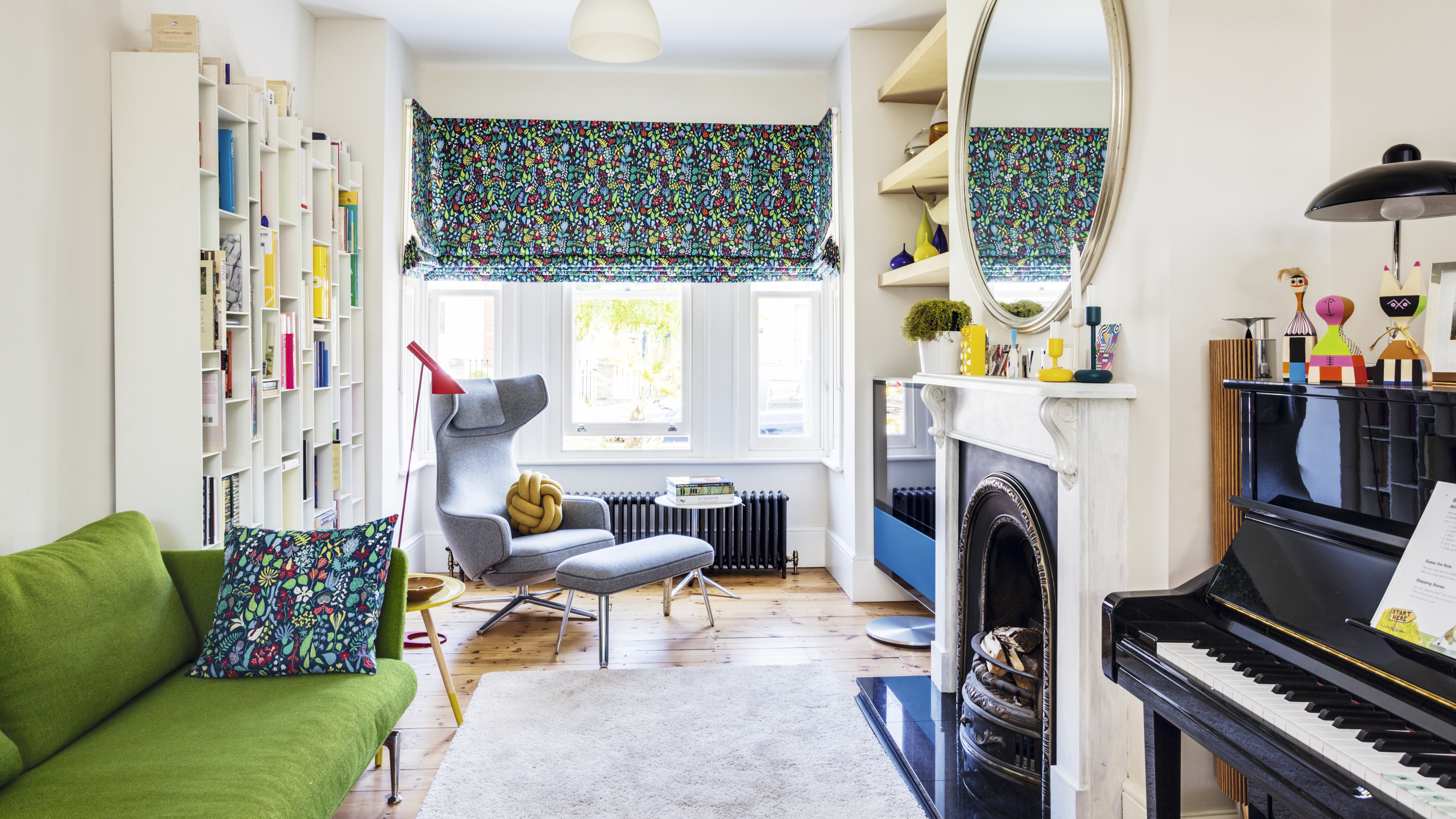
The Suita green sofa from Vitra works well with the blinds and cushions, made by Magic Moo from Stig Lindberg's Herbarium fabric from Shannon. A Vitra Grand Repos chair and footstool from Haus create a comfy reading corner by the Random bookcase by MDF Italia and AJ floor lamp from Skandium. The floorboards are reclaimed; find similar from Lawsons
As a digital editor, Vic has worked for BBC Good Food, Delicious and UKTV Food. ‘Over the years I’ve learned a great deal from my colleagues about what makes a good kitchen,’ she says.
One such solution is the cleverly designed folding leaf that extends the size of the island. ‘When we have people over, we tend to gravitate towards the island and have a drink there before we sit down for dinner,’ she says. ‘The space really works for us as a family, too – we’re always cooking, eating or doing homework in here.’

The couple chose a bold look in this space, combining walls painted in Sinner by Mylands with a black freestanding bath from Victorian Plumbing and East Hampton floor tiles from Fired Earth. The basin is from Aston Matthews, and the mirror and cupboard are Graham & Green
In addition to the main building work, the couple also reconfigured the rest of the space, allowing them to find room for a downstairs bathroom and spacious larder.
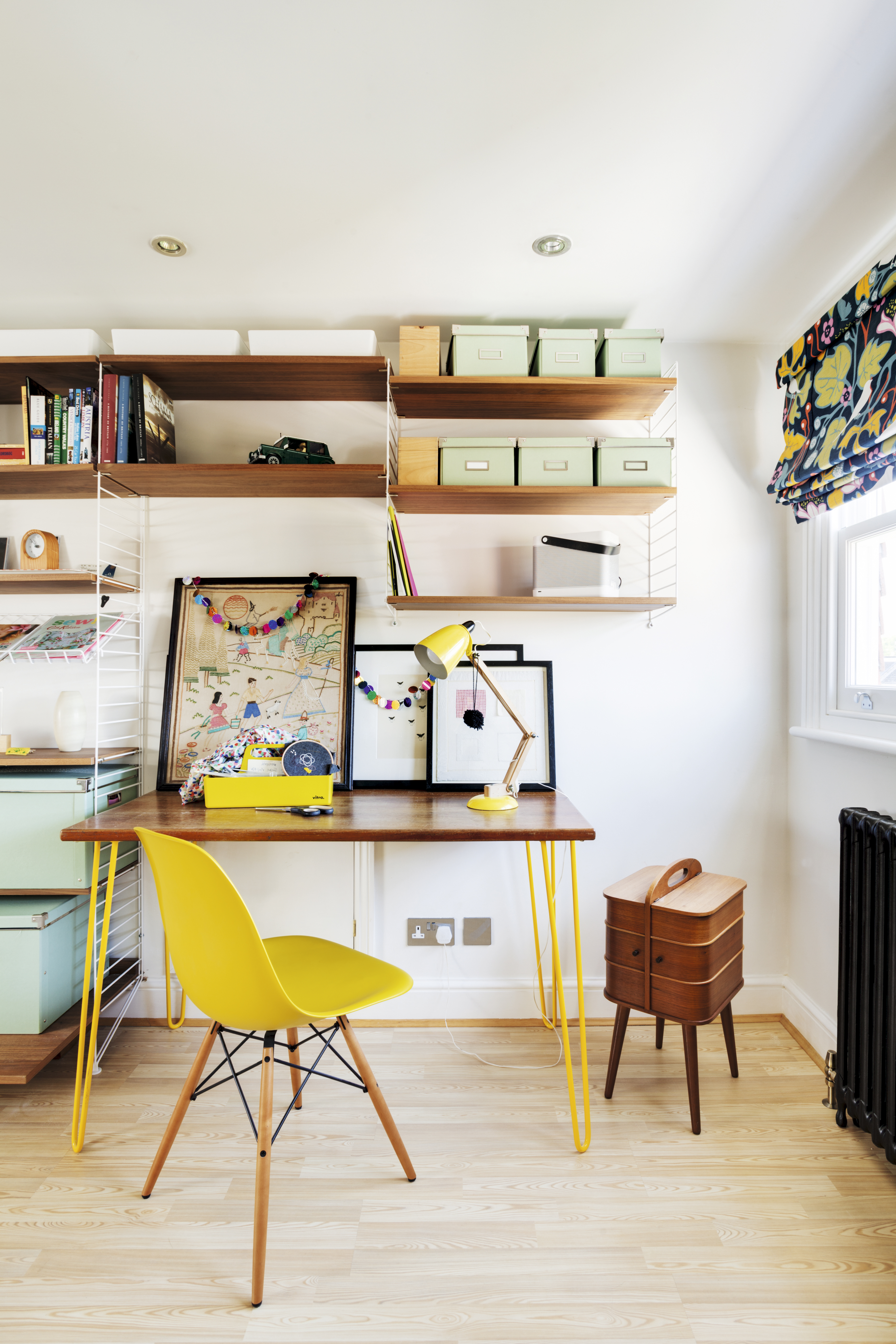
Upstairs, there are two bedrooms, a family bathroom and a colourful home office. Blocking off a connecting door between the master bedroom and office has created a more practical layout, and fitting a sliding door to the family bathroom has maximised the available space. Painted walls and whitewashed floorboards provide a neutral backdrop for the family’s colourful furniture and accessories.

Hannah Werning Wonderland wallpaper from Wallpaper Direct and blue linen blinds from Magic Moo add a bold injection of colour. The elegant bed is from Laura Ashley and the antique chest of drawers were a great find on Ebay. For a similar rug, try Crucial Trading
With the project completed, was it worth all the hard work?
‘Yes, absolutely,’ says Vic. ‘It’s easy to grumble during a project when you’re surrounded by so much dirt and mess, but you have to be grateful that you are in a position to do it at all, so we feel very lucky.’

Vic and Tom chose a colourful palette for their daughter's bedroom. The blinds were made from Marimekko Unikko fabric by Magic Moo. All the radiators in the house were replaced with reclaimed ones from Salvage Doctors. For a similar metal bed, try Dreams
Contacts
- Architect: Tom Kaneko
- Sash windows: K&D Joinery
- Steel windows: Clement Windows
- Sanitaryware: Aston Matthews
- Radiators: Salvage Doctor
- Tiles: Fired Earth