When Lisa O’Hagan and her husband, Jonathan, stumbled across their now home in the heart of East London back in 2018, it was the quirky shape and unconventional layout that caught their eye. This end-of-terrace property used to be a Georgian coach house, which had been converted into a large, ground-floor garage and studio, with a two-bedroom property spanning the two floors above.
‘It seemed to offer more than the average house, with three different outside spaces – a cobbled courtyard, roof terrace and a back garden,’ says Lisa. ‘The end-of-terrace plot was wedge-shaped, narrowing almost to a point at the end of the garden. This gave the layout a unique charm. Rather than extending, we saw the potential to create something very special.’
Profile
The owners Lisa O’Hagan, a senior development manager and owner of vintage clothes company @thehackneywardrobe, lives here with her husband, Jonathan Bishop, an aerospace engineer, and their son, Cillian
The property A four-bed Georgian coach house, built in 1890, in Clapton, East London
Project cost £102,000
Between the two of them, they came up with designs that embraced the asymmetrical shape of the house. The obvious thing to do was to move the first-floor kitchen and living rooms downstairs, and reconfigure the upstairs rooms into two more bedrooms, with a guest and family bathroom on each floor. The large garage and studio space lent itself to being a multifunctional, open-plan room; the ceilings were high and by opening up the hallway and the stairs, the room has a real sense of scale.
‘Jon and I love the creative process and feeling of achievement we get when we complete tasks without help,’ says Lisa. ‘Our starting point with any project is deciding if we need to pay a contractor, or whether we can do the work ourselves. Invariably, we end up getting stuck in!’
Read on to take the full tour.
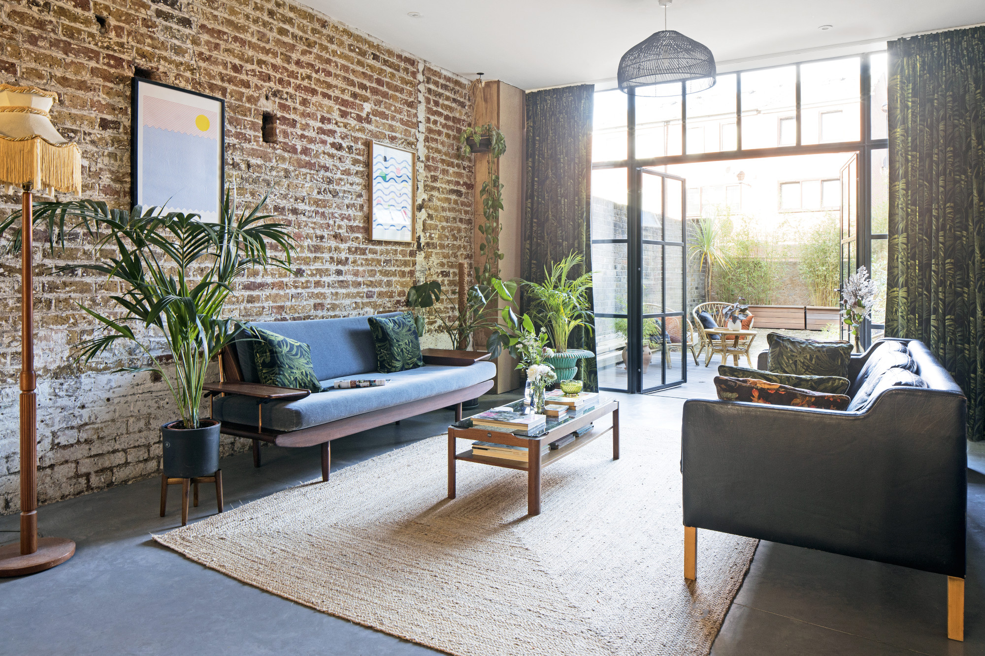
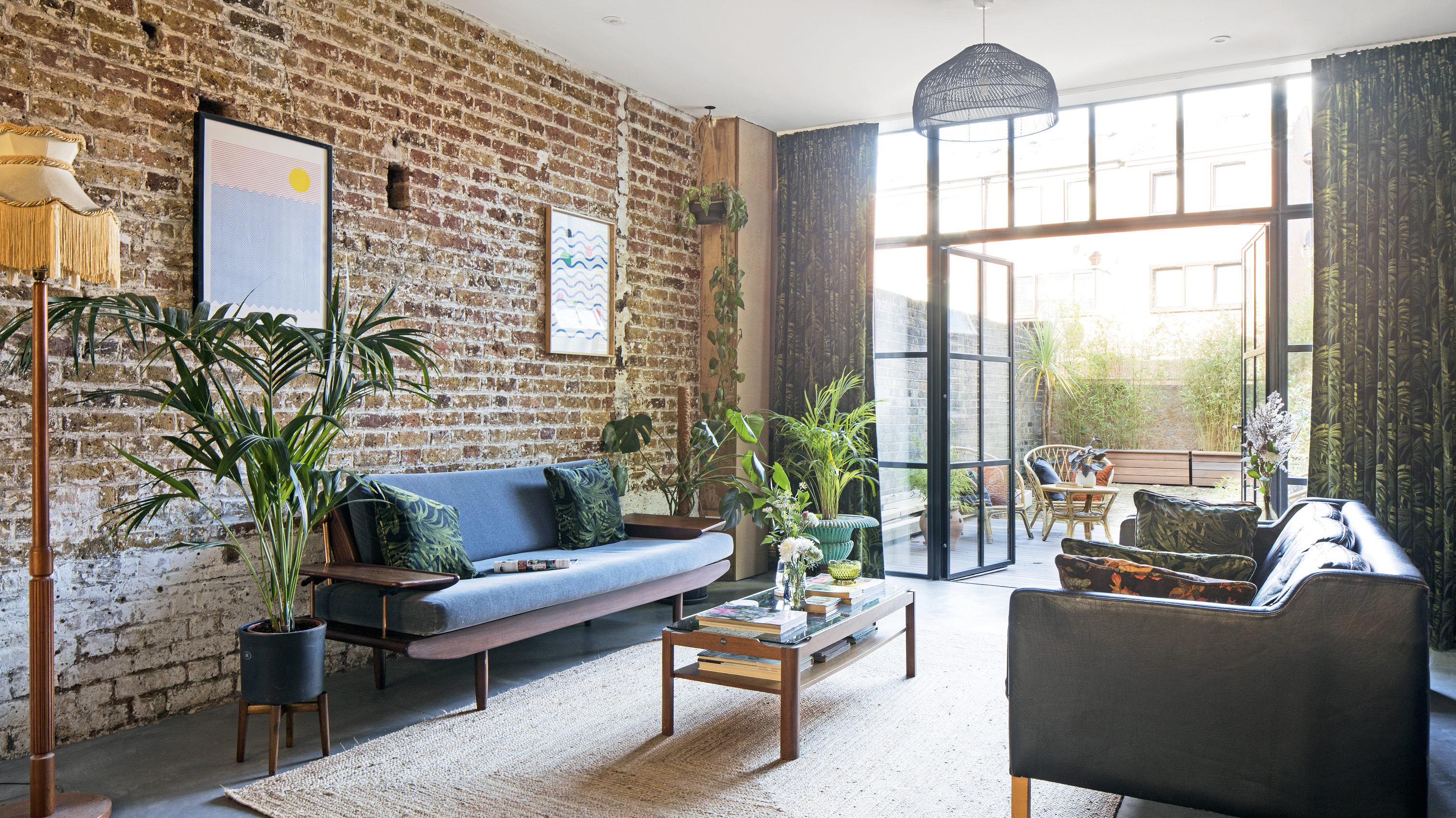
Cushions, made from House of Hackney fabric. Armchair, vintage. Chaise, antique, covered in Barbeline Home fabric. Steel doors, Clement Windows. Velvet sofa, vintage Toothill. Stouby leather sofa, Two Columbia Road of Hackney. Pendant, Made
Over the next five months, and in the lead-up to the birth of their son, Cillian, Lisa and Jon did the majority of the dirty work, pulling down walls, exposing the brickwork, stripping away interior fittings and creating a blank canvas for the new layout. An important part of the couple’s design was to bring more light into the property. With no windows between the old garage doors at the front and the back of the house, downstairs felt dark and oppressive. The front of the house was opened up, and bespoke floor-to-ceiling glass and steel doors were fitted, which flood the space with light and link to the front courtyard.
‘We enjoy the space and gallery feel of downstairs and how unconventional it is,’ says Lisa. ‘I love the simplicity and robustness of the materials used. It’s a great space to entertain and perfect for Cillian to whizz round on his scooter.’ It took Jon two weeks to painstaking remove the paint off the back wall to expose the original brickwork underneath. Bits of paint and plaster remain. ‘I love how it adds to the rustic feel of the room,' adds Lisa.
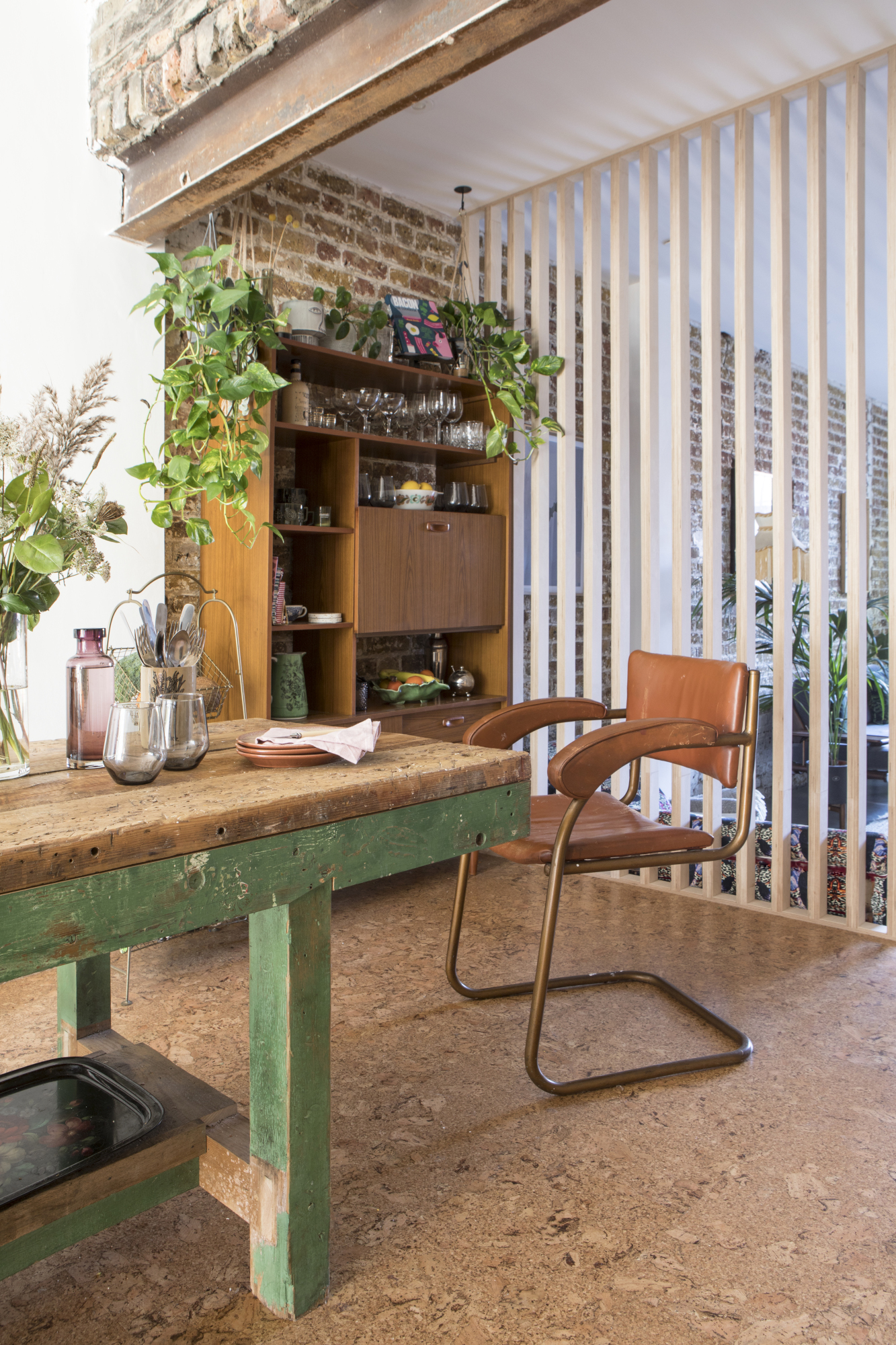
The industrial feel continues with a polished heated concrete floor in the living area, and Jon, a skilled carpenter, built steps up to the kitchen area, along with birch room dividers to define the spaces. ‘We love simple, honest materials and we have tried to apply a simple, robust aesthetic to each area of the house,’ says Lisa.
The kitchen was long enough for a big vintage table with mismatched vintage chairs. ‘The table was a great find,’ says Lisa. ‘We knew the minute we saw it that it’d bring the kitchen to life.’
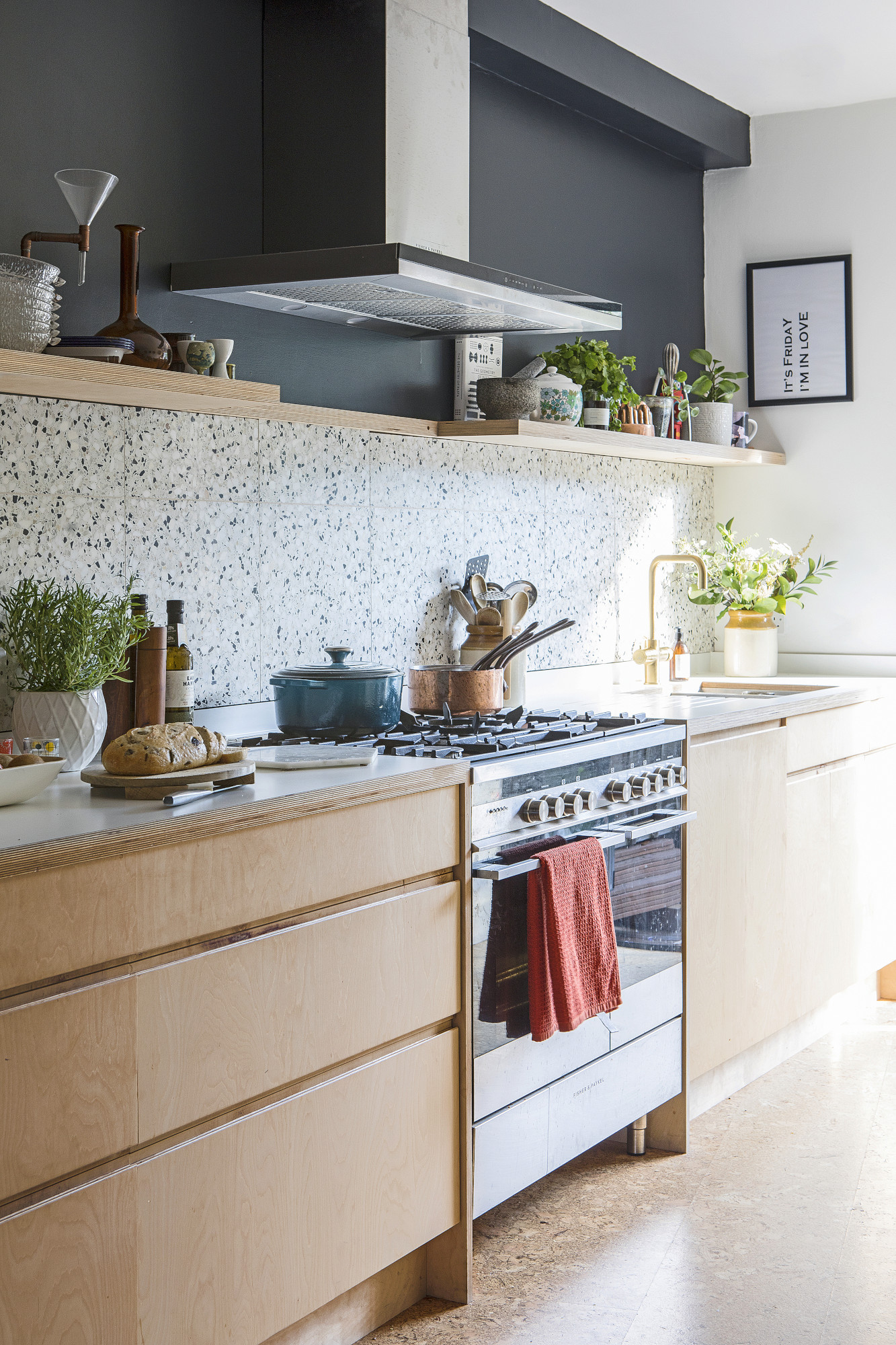
Cork floor tiles, Haro. Terrazzo wall tiles, Otto Tiles
The couple wanted the kitchen to have a utilitarian feel, so Jon designed a single run of fitted units made from the same birch ply with clean lines that make the most of the unusual angles in the room. ‘Terrazzo and cork tiles on the wall and floor add warmth and texture, and a table made from salvaged roof timbers completes the space,’ says Lisa. ‘It has a beautiful, rustic feel, which contrasts with the simple palette of the kitchen.
'The cork floor is something we definitely wanted. I love its warmth, how sustainable it is as a material, and how quiet it is underfoot – which is important in an open-plan space. The terrazzo tiles in the kitchen were left over from the bathroom. They were one of the most expensive materials we bought so having the right amount left over for our kitchen was amazing – zero wastage!’
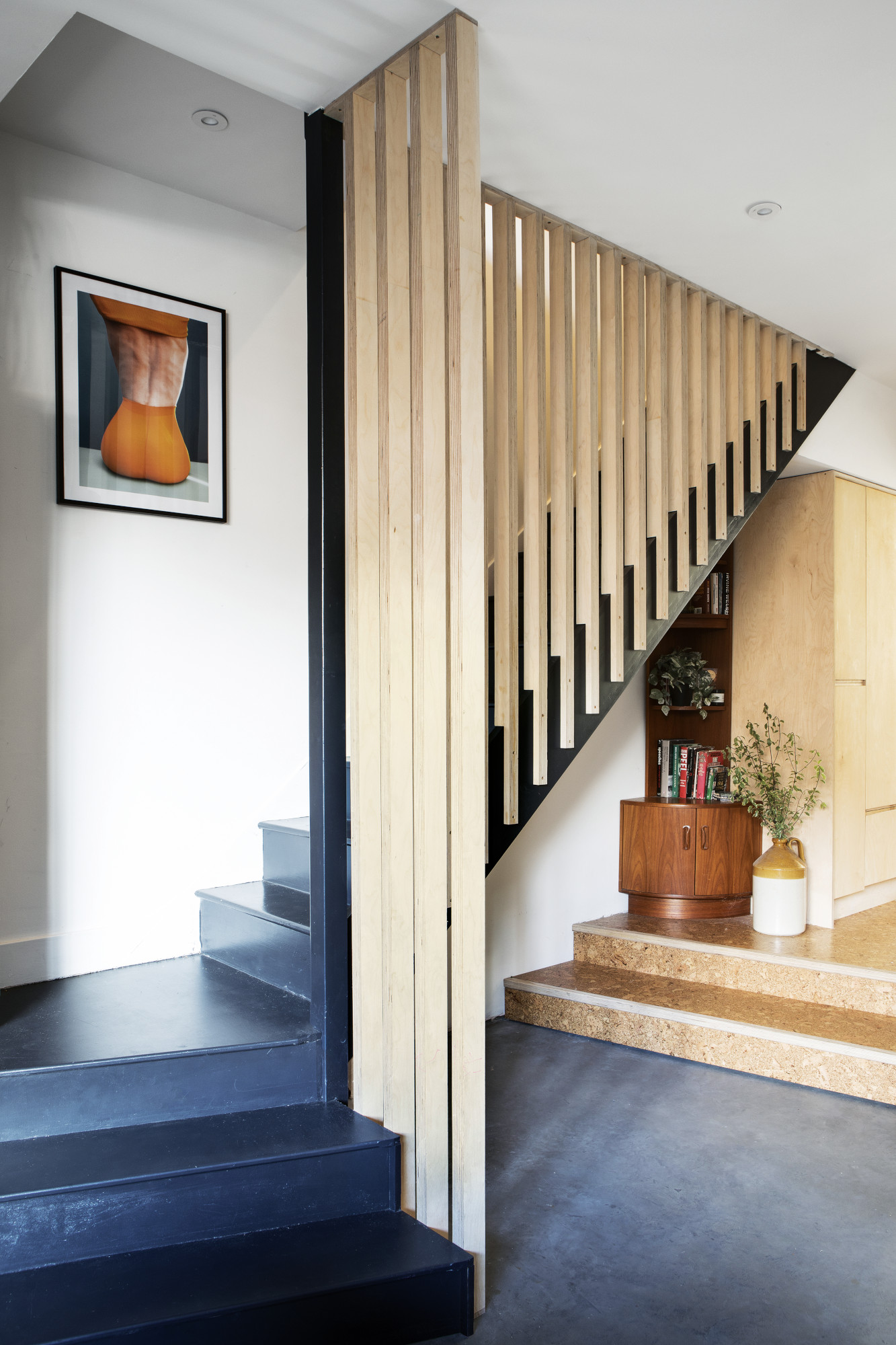
The stylish stair spindles are a safety feature that creates separation without impacting the light, open-plan feel of the living area.
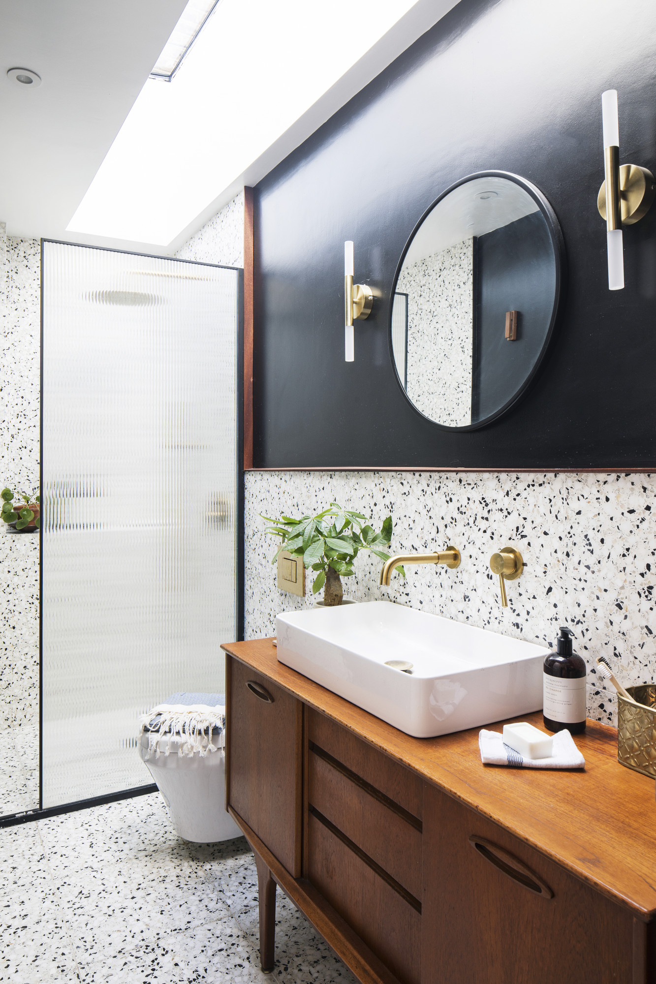
Door, Aqata Luxury Showers. Terrazzo wall tiles, Otto Tiles
Costs & contacts
Building work and materials £48,000
Glazing £15,000
Concrete floor £9,000
Furnishing and finishes £8,000
Kitchen, fitting and appliances £9,000
Bathroom tiling and fittings £4,000
Painting £3,000
Professional fees £3,000
Decking £3,000
Builders GB Construction
Concrete floors Woody’s Concrete Company
Steel windows Clement Windows
Upstairs, space has been taken from the two top rooms to make a modern bathroom, with a skylight and a walk-in shower. The mid-century style bathroom has been fitted with a reed glass door, with a vintage sideboard from @vintiquelondon repurposed into a sink unit. Terrazzo tiles and black paint tie the scheme together and a full-length skylight floods the room with light. ‘You can see the sky when you're showering,’ says Lisa.
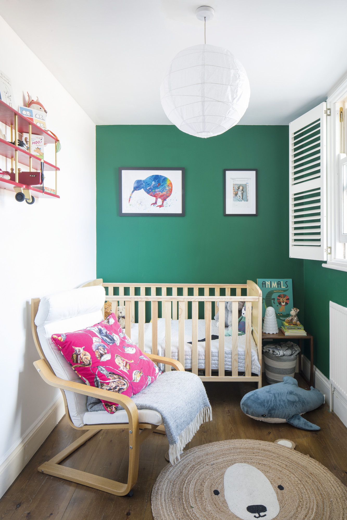
Cot and armchair, Ikea. Jute rug, La Redoute
A simple pine cot and armchair furnish Cillian’s nursery, while a bright green feature wall and vintage aeroplane shelf add interest to the smallest room of the house.
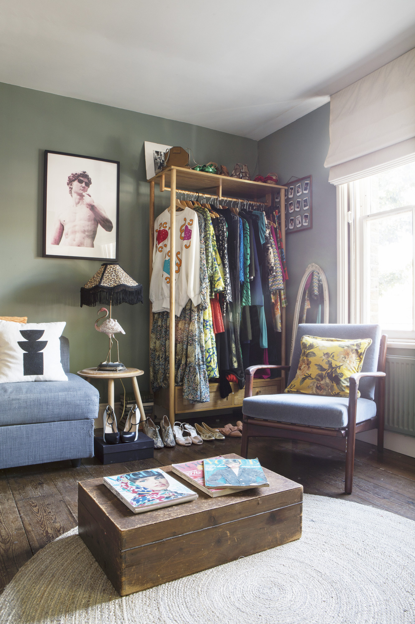
Rooms have been redecorated in a relaxed style and an office/work space has been created in the old first-floor living room for Lisa’s vintage fashion business, @thehackneywardrobe. ‘Luckily, we share a very similar aesthetic and people often remark that it’s a “very Lisa and Jon house”, which we take as a compliment.’
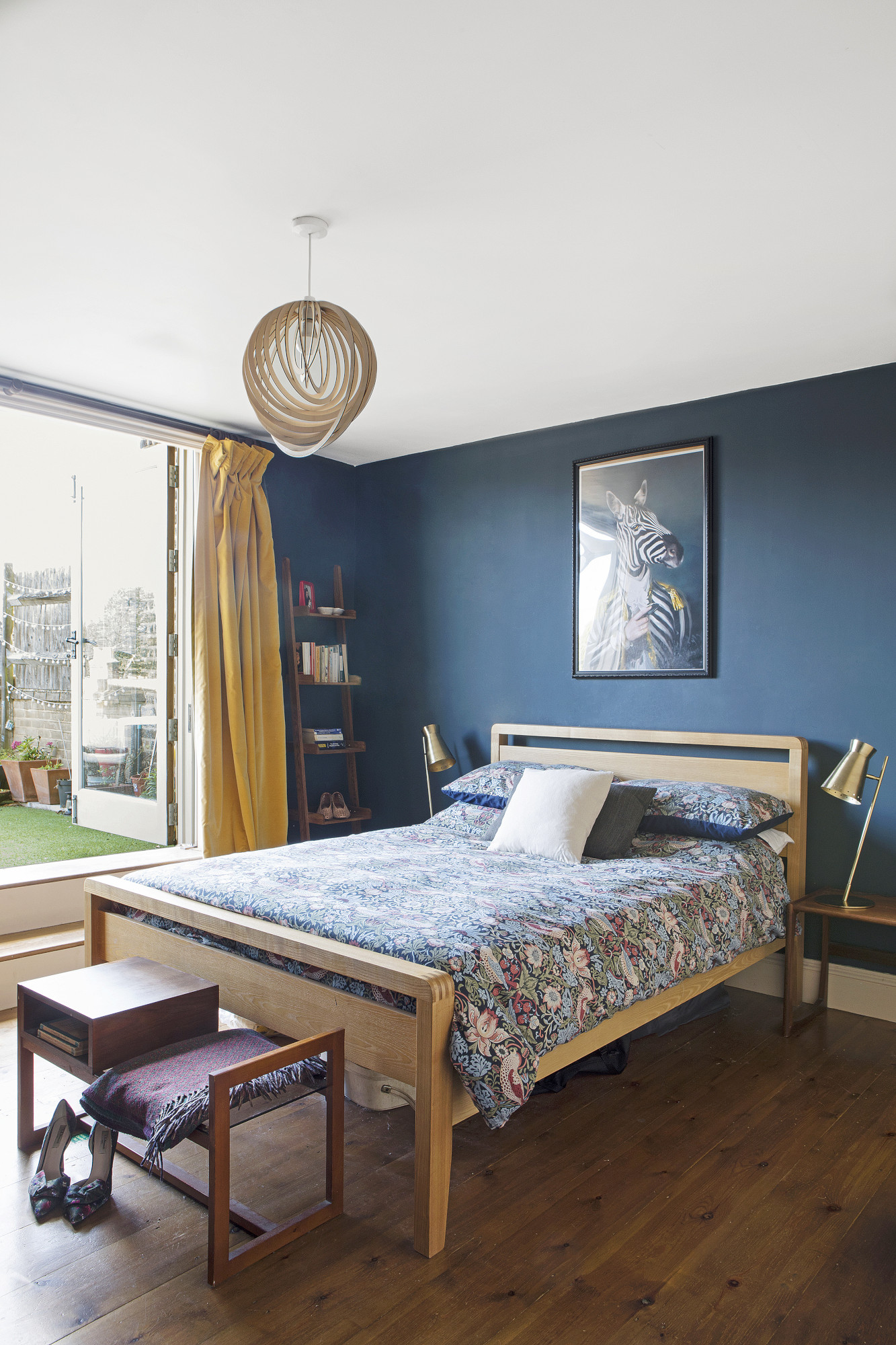
Walls painted in Hague Blue, Farrow & Ball. Bed, Bensons. Bench seat, vintage. Bedside lamps, Cox & Cox. Pendant, John Lewis & Partners
The house has been furnished with furniture and fabrics that reflect the pair’s love of mid-century design and complement the simple, timeless materials used throughout the renovation.
‘Most of it is vintage,’ says Lisa. ‘It’s important to us that finding furniture for our home is an organic process – rather than go out and buy a new sofa or a rug, we like to find interesting pieces when we least expect to.’
The bedroom leads to the sun terrace. ‘The floral print of the William Morris duvet feels nostalgic and is a nod to the textile designer’s East London roots,’ says Lisa.
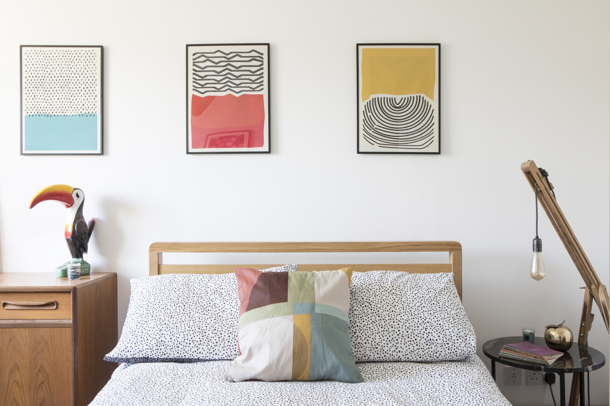
The guest bedroom doubles up as Jon’s office – 'so we wanted the space to feel bright and airy,' says Lisa. The couple have made design decisions that embrace the quirky space and have created a functional and characterful home. ‘It’s been hard work, but our unique family home fills us with pride – we’re delighted with it!’
Subscribe to Real Homes magazine
Want even more great ideas for your home from the expert team at Real Homes magazine? Subscribe to Real Homes magazine and get great content delivered straight to your door. From inspiring completed projects to the latest decorating trends and expert advice, you'll find everything you need to create your dream home inside each issue.
Join our newsletter
Get small space home decor ideas, celeb inspiration, DIY tips and more, straight to your inbox!
