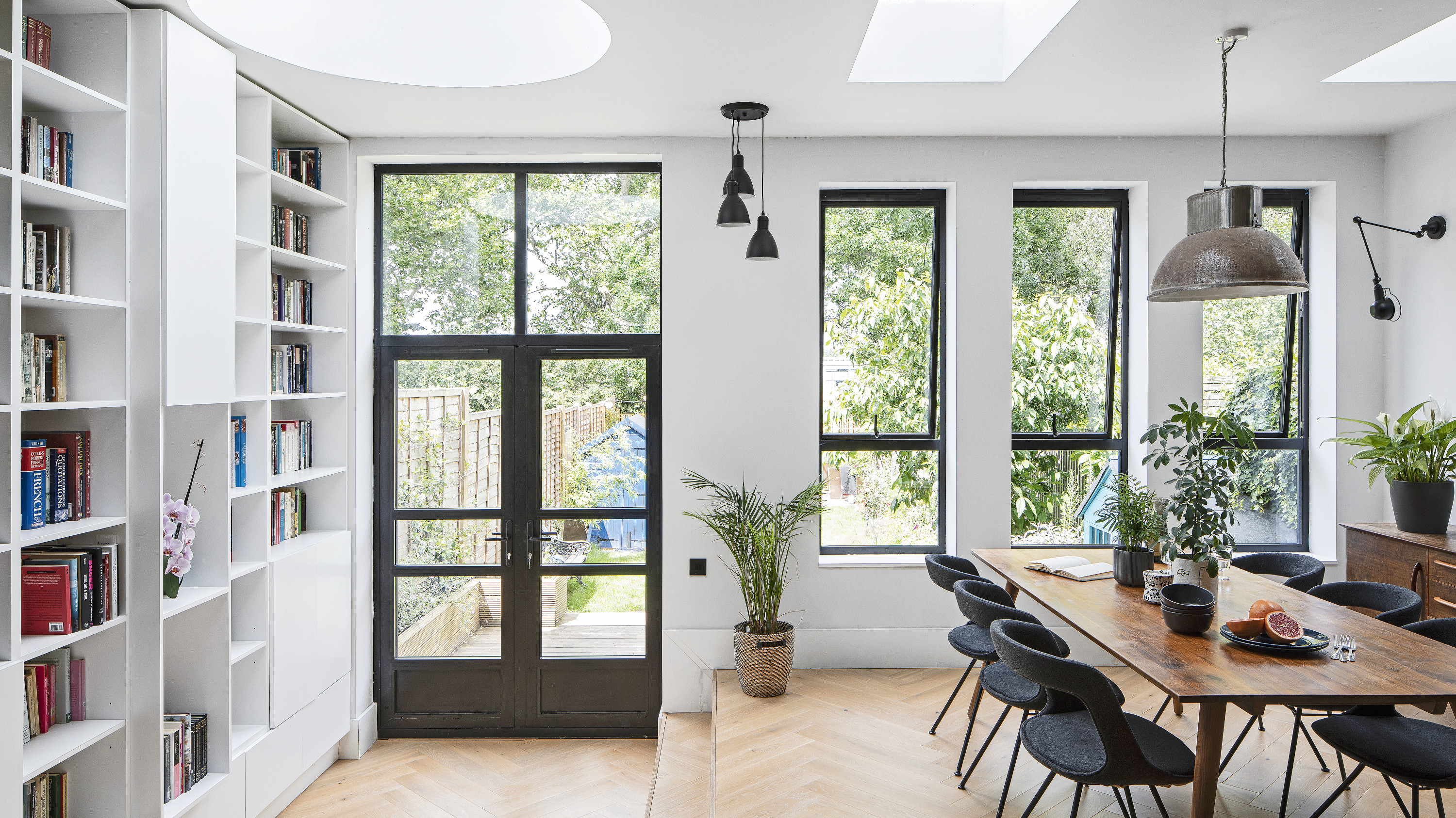
That historians Alison and Mark wanted a home with a story to tell comes as no surprise. At the same time, the couple wanted something that could be transformed into a place where they could create their own memories with their two young children. ‘We originally wanted a Victorian terrace, but they were a bit more expensive in this area,’ says Alison. ‘It worked out perfectly, though. This house was built in the 1920s, so it still has high ceilings and a sense of spaciousness – but it’s also a bit squarer and not as narrow as some period properties, so we didn’t have the problem of dark rooms.’
Having originally lived in north-east London, the couple wanted something closer to work, so moved north west, looking for a property offering more space for their growing family, and that had a lot of appealing original features. This one ticked those boxes, but required some renovation.
'It had been owned by a couple who had lived here for more than 40 years,’ says Alison. ‘They tried to do a few things to improve it, but there was a lot to be done. The living room was to the right of the front door, with a dining room next to the small galley kitchen. At the back were a couple of buildings, marketed as a utility and conservatory. Everything leaked through plastic sheet roofing and the structures stopped loads of light coming into the house.’
However, the property had the proportions they needed and they discovered that the garden backs onto a park. ‘On our second viewing we came towards evening and we saw the sun set,’ says Alison. ‘The sky was filled with beautiful colours; the setting was wonderful.’
Settling in
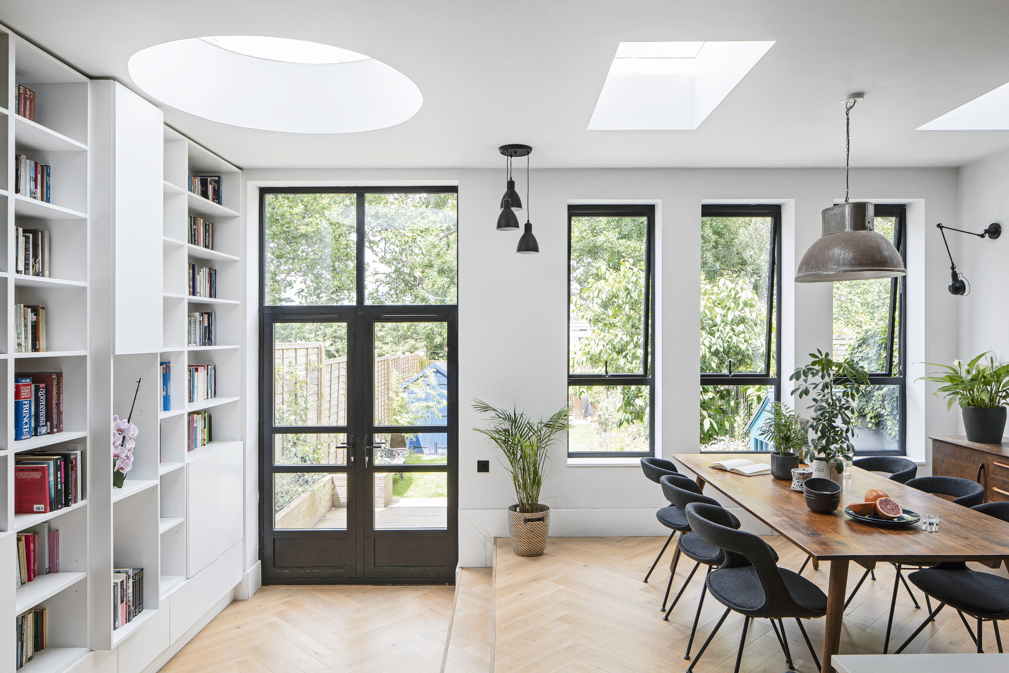
Walls painted in White Mist, Dulux. Rooflight, OM Glazing. Engineered herringbone floor in Grissini, UK Flooring Direct
Profile
The owners Alison Carrol and her partner, Mark, who are both historians, live with their sons, Jack and Ben
The property A 1920s three-bedroom terraced property in north-west London
Project cost £125,000
The young family lived in the property before the renovation began and didn’t unpack items such as their generous book collection because they didn’t think they’d be there for long. ‘We met the architects before we completed the purchase and they came to look at the house, so it felt like things were moving really quickly,’ says Alison. ‘In the end, though, because we needed planning permission, we lived here for seven months before construction started.’
Saving money
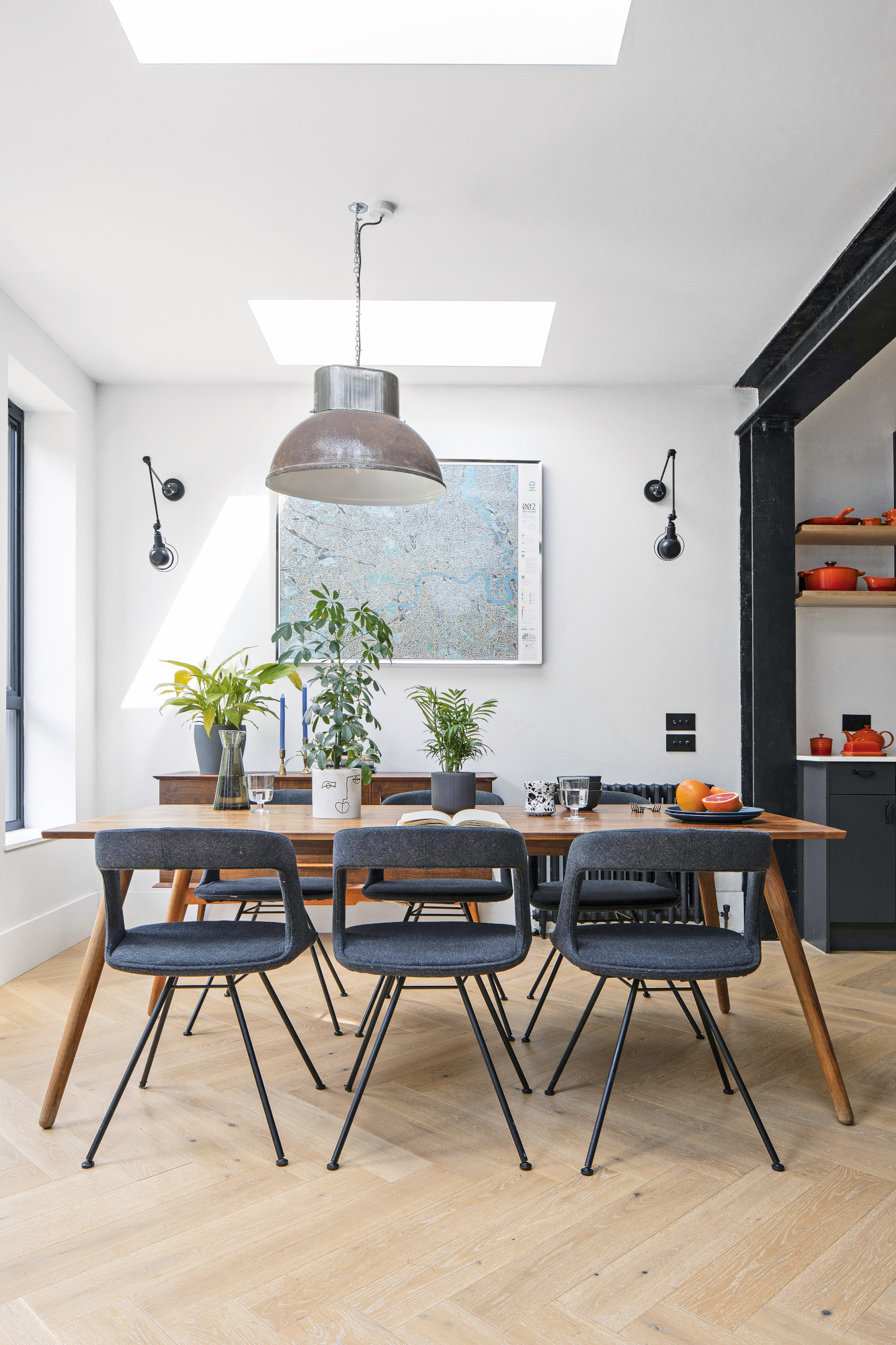
Dining table, Habitat. Chairs, Adventures in Furniture. Sideboard, Ebay. Pendant light, salvage yard. Wall lights, Beautiful Halo
With a tight budget but plans in hand, the family lived with several issues, including a boiler that would never come on. ‘It seemed to only work on a Sunday morning for three hours – it was set to a weird pattern,’ says Alison. ‘Then all of the lights stopped working on the ground floor, and we put off fixing them as we wanted to save all of our money for the renovations. At Christmas it was festive cooking by candlelight; by February the novelty had worn off.’
The couple managed to save money by stripping back their wish list and avoiding some structural changes, such as removing a chimney breast and keeping the old first-floor layout. Mark painted the entire house, which helped the couple stay within budget but took up a lot of the summer of 2019.
Planning the space
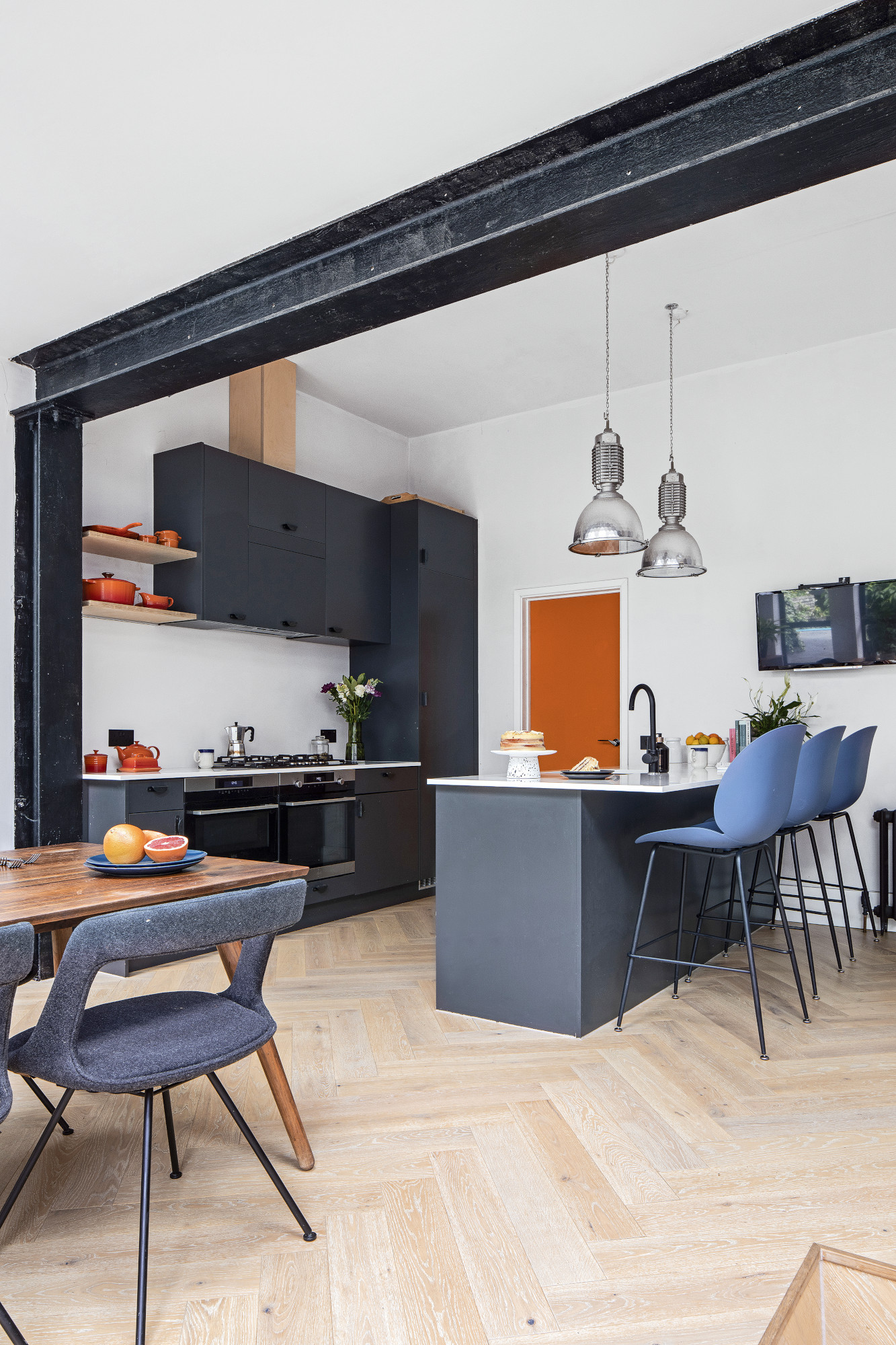
When work finally began to install an extension with a utility and a pantry, plus a downstairs WC, Alison and Mark couldn’t have imagined such an amazing result. Their architects, Ester Corti and Andrew Mitchell, completely reworked the couple’s initial idea. ‘We wanted a big light extension with bi-folds across the back because that’s what we’d seen in other kitchens,’ explains Alison. ‘However, Ester and Andrew suggested that bi-fold doors can make a west-facing room very hot – they recommended something that would still frame the views of the park, yet allow for a gradual transition to the outside as the original layout was very disjointed.'
The architects’ design solution was a step to enter the kitchen, two steps down within the kitchen to create the extra-height bookcase area, and then two further steps from the decking down into the garden. The kitchen units were fitted by their joiner and though they look high-end, they were fairly inexpensive and have been finished with unique handles from Etsy.
Smart storage
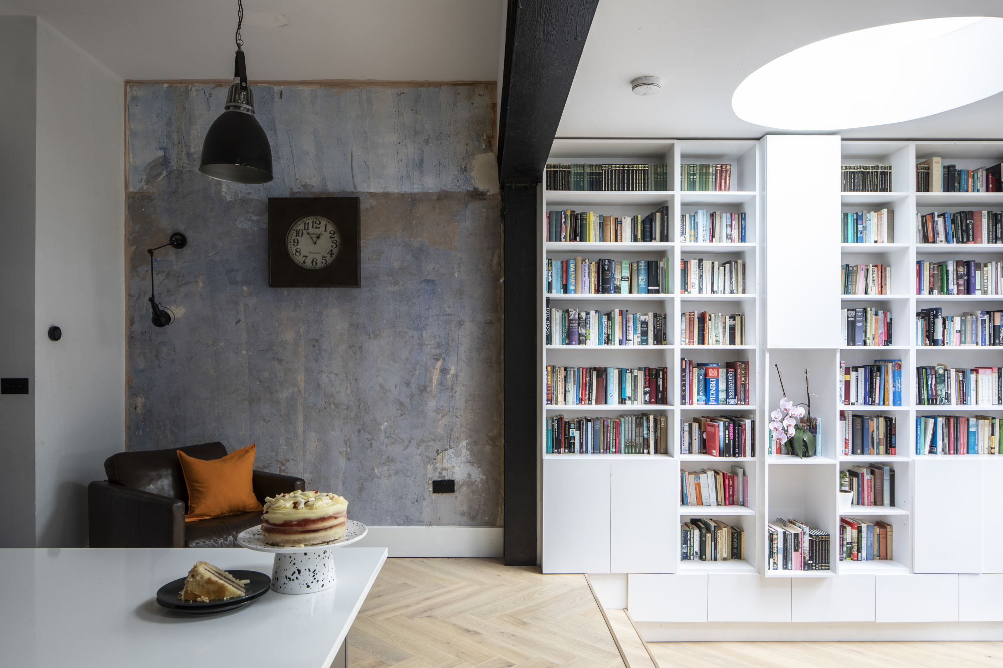
Wall light, Beautiful Halo
Costs & contacts
Building work, fees and decorating £93,000
Glazing £20,000
Kitchen (inc. appliances and worktops) £8,500
Flooring £3,500
Architects Mitchell + Corti
Kitchen DIY Kitchens
Builder Strongbase Construction
The impressive library wall accommodates all the books the couple still had in boxes. ‘We had nowhere to put them, so it triggered the concept for their design with the bespoke bookcase and high ceiling with skylight,’ says Alison. ‘We talked about keeping as many Art Deco features as we could, so that also influenced the circular skylight and bookcase design.’
The bookshelf hides the boiler and provides storage for the children’s toys. The blue wall is actually old plaster that formed part of the original kitchen. When the floor-to-ceiling tiles were removed, the unusual colour was exposed. ‘The architect called us on holiday to tell us about it, suggesting we keep it,’ says Alison. ‘We’re very glad that we did.’
Indoor-outdoor link
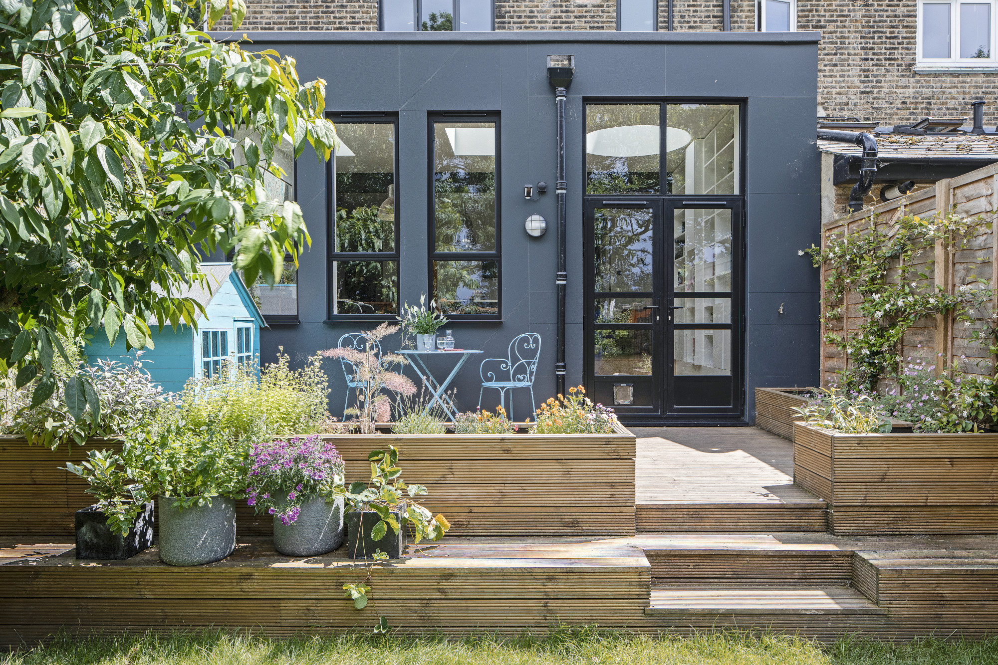
Stepping out onto a decked area, the garden is now perfect for everyday life as well as entertaining. 'There was a really big drop of over a metre from the house to the garden, and our little boy was 18 months old when we moved in,' says Alison. 'We wanted something that would allow him to move between house and garden safely, while bringing the house together.’
Subscribe to Real Homes magazine
Want even more great ideas for your home from the expert team at Real Homes magazine? Subscribe to Real Homes magazine and get great content delivered straight to your door. From inspiring completed projects to the latest decorating trends and expert advice, you'll find everything you need to create your dream home inside each issue.
Join our newsletter
Get small space home decor ideas, celeb inspiration, DIY tips and more, straight to your inbox!
-
 Planning makes perfect when designing this dream home
Becks and Martin Huntley spent lots of time on design and layout to get the most out of their space when renovating
By Karen Wilson Published
-
 Interior design enthusiast's converted farm home is a showcase for luxe style
Sam Marlow, the founder of Lime Lace, used all her skills to give the renovated period property a signature look
By Alison Jones Published
-
 Real home: Long-term extension project creates the perfect family space
Kate and Adam’s three-pronged renovation took over a decade – but was well worth the wait
By Karen Wilson Last updated
-
 Real home: knocking through for more space without extending
By knocking together a warren of disjointed rooms, Patsy and Al have created a new hub to their home without needing to extend
By Karen Wilson Last updated
-
 Before and after: an extended 1930s home with quirky creative touches
After a side and rear extension and a full-blown makeover, this house is fit for a family
By Karen Wilson Published
-
 Before and after: a modern kitchen extension with cool industrial touches
We love this contemporary extension – especially that surprise pop of colour…
By Ellen Finch Last updated
-
 Real home: this interior designer's home is a masterclass in layering texture
Notebooks at the ready – this extended terrace is packed with stylish ideas to steal
By Ellen Finch Published
-
 Before and after: this interior designer extended her family home for £50k
All thanks to a combination of skill and imagination
By Ellen Finch Published
