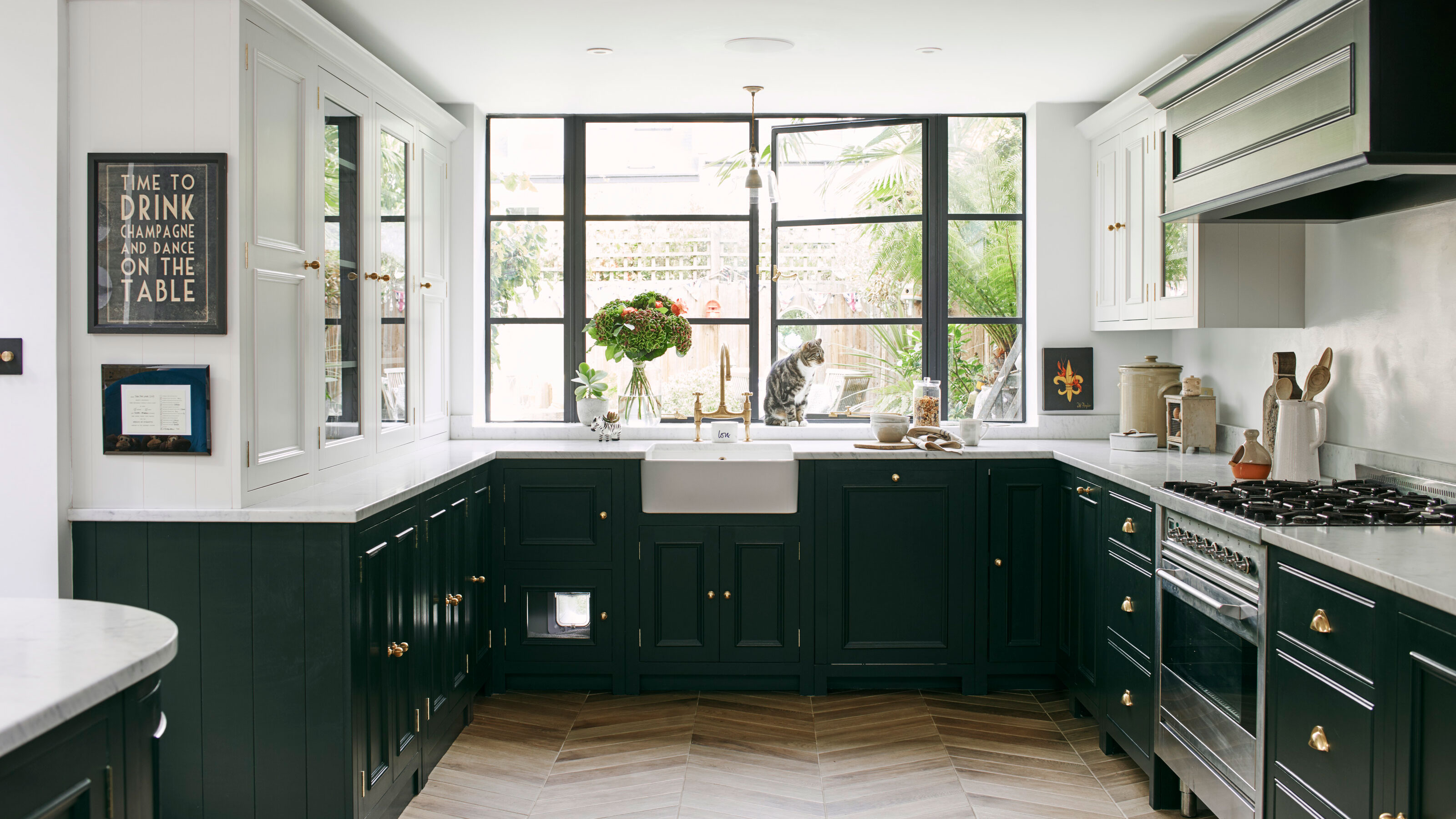

U-shaped kitchens are an increasingly popular layout for modern and trad homes alike, with a plethora of pro features making them a worthy choice for many. They work well in open-plan spaces, but are a practical shape for smaller homes too, as they max out storage and work surface area to create a remarkably efficient cooking space.
If you're starting from scratch and researching different kitchen layout ideas, to understand what will work most efficiently for you, a U-shaped configuration is definitely one to consider. Style yours right and it could be the perfect 'fit' for your household.
U-shaped kitchen ideas to create a seamless space
Experts at Omega kitchens explain, 'The U-shaped layout is generally considered to be the most practical kitchen layout, as it’s ideal for the ‘golden triangle’ concept of positioning your fridge, cooker and sink within reachable distance of each other, while still allowing each appliance its own space.'
1. Adopt the golden triangle approach with an island
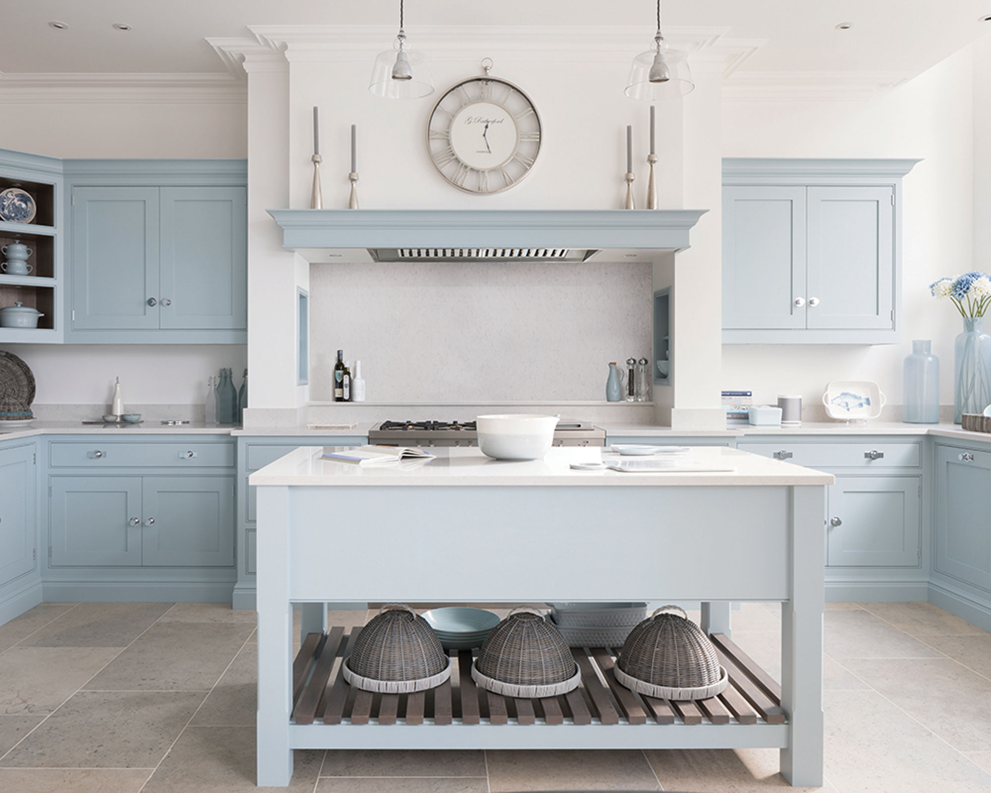
Tom Howley, design director, Tom Howley Kitchens, comments: ‘A U-shaped kitchen allows the space to feel more open plan. Strategically divide the kitchen into zones for optimal functionality. To add more space consider adding an island with the hob positioned overlooking so you can socialize whilst preparing dinner for friends and family.’
Keith Myers of The Myers Touch mentions how the kitchen triangle approach is still a must in U-shaped kitchens. 'According to the rule, these should be laid out to loosely form a triangle, enabling you to perform day to day tasks with ease and without any obstruction. Each side of the triangle should measure no less than four feet and no more than nine feet and, ideally, the perimeter of the triangle should be no less than 13 feet and no more than 26 feet. Not too small and not too large!'
So adding a kitchen island to your space will keep your space functional and gorgeous. 'This will ensure that your working area is practical, comfortable and large enough – but not so large that much of your time is spent walking between one point and another’, continues Myers.
2. Keep the space fresh with light colors
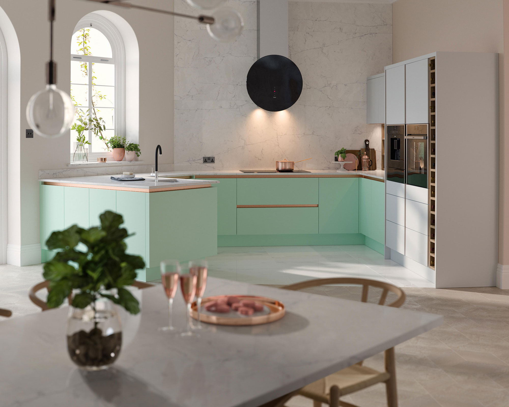
To prevent your U-shaped kitchen from feeling too enclosed or boxy, consider a light kitchen color scheme and bright palette of modern neutrals or soft pastels for a subtle color hit. Soft shades reflect the light in any space, and can be especially effective in smaller kitchens or spaces that lack natural light.
Howley comments: ‘To keep an open feel choose light paint colors and reflective materials such as bright quartz or a mirrored backsplash. Utilize every inch of space from the full height, awkward nooks and the use of islands if you have room.’
3. Create a sociable space with a peninsula
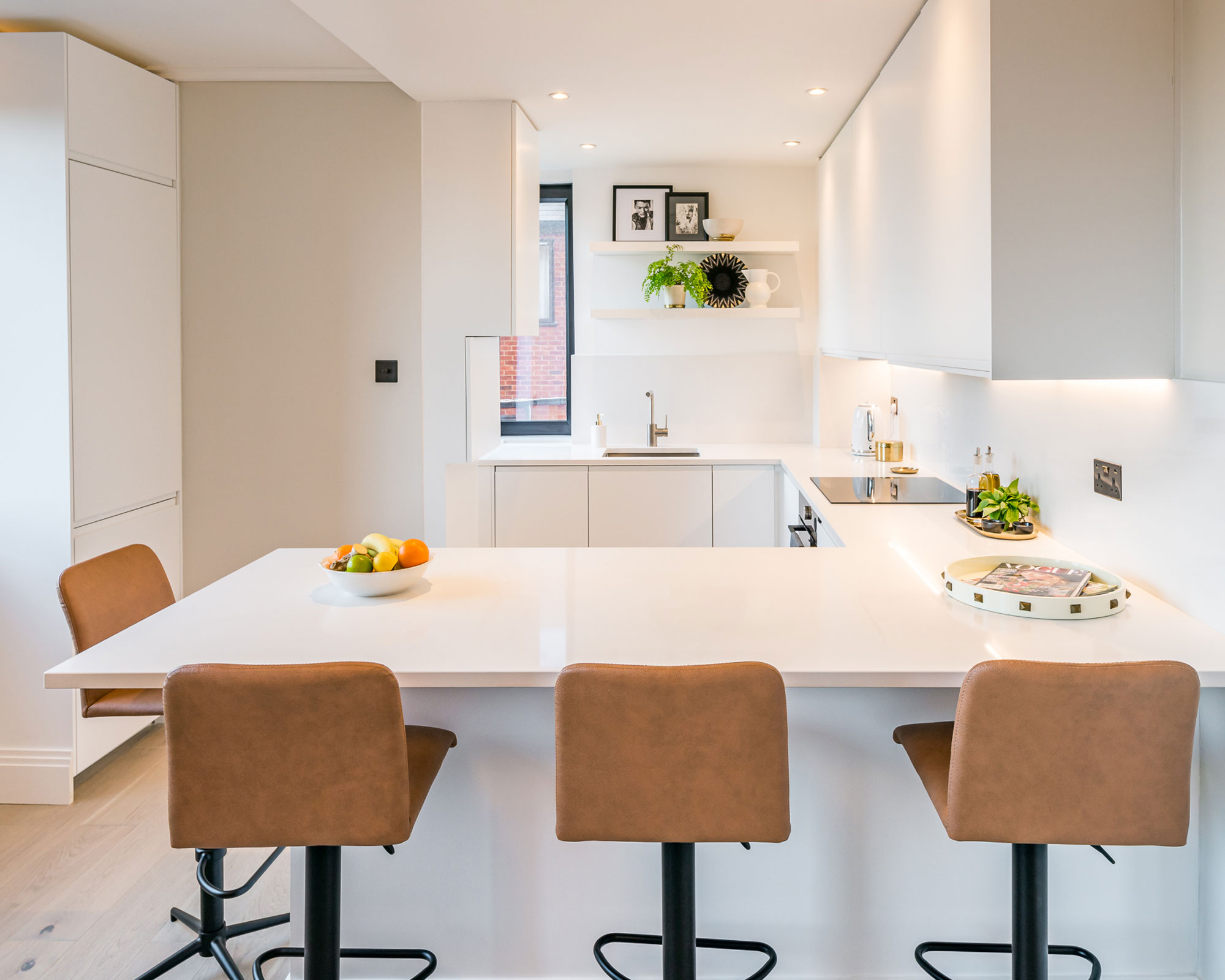
By the nature of its shape, a horseshoe layout creates a cozy space. With kitchens now serving as multi-functioning hubs where families cook, socialize, entertain and work remotely, homeowners are looking to utilize every inch of space in any which way possible. Consider reconfiguring one side of your U-layout as a peninsula with bar stools where friends and visitors can perch at all hours.
Howard Miller of H.Miller Bros, comments: ‘I love one wall kitchen with an island or U shape with one of the arms of the U being a peninsular so that you can look out into the rest of the space from - ideal for engaging with the kids whilst making something for them in the kitchen, or if you've got friends over you can talk to them whilst getting dinner ready.’
Narendra Karnani, managing director, Heritage Brass, agrees: ‘A U-shaped kitchen is ideal for smaller spaces, as it allows for social areas to be integrated into a design where a kitchen island wouldn’t otherwise fit.’ The question is, kitchen peninsula vs island... Which would you choose?
4. Maximize wall storage with taller cabinets
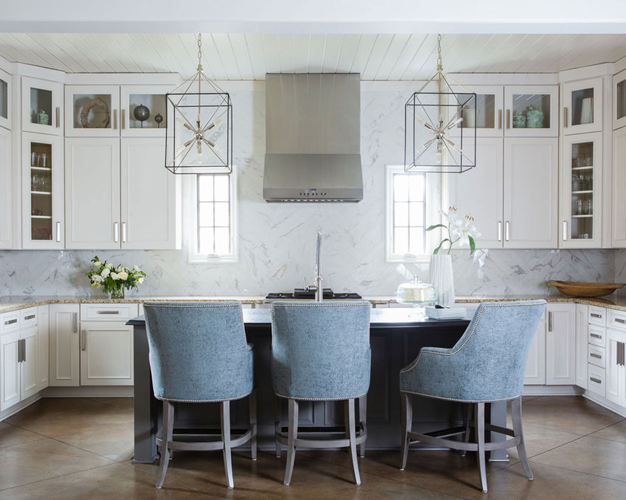
Not only does a U-shape kitchen provide a balanced aesthetic and pleasing flow, but it allows space for storage on all levels with a variety of cabinet options. For a cohesive scheme, choose one style for both base and wall hung storage units, or try open kitchen shelving on higher levels to display a beautiful collection of kitchenalia. Think wooden platters, glass mason jars filled with natural grains, and favorite artisanal crockery all on show rather than hidden away at the back of the cupboard!
Leslie Murphy, CEO and creative director of Murphy Maude Interiors, comments regarding U-shaped kitchens: ‘In this light and airy kitchen, the U-shape provides a ton of kitchen cabinet space and beautifully opens up to the rest of the home for an easy, functional flow. Since the client didn't want to update the cabinets, we creatively decided to modify them by building boxes on the top of the existing ones, adding glass, painting and adding new hardware for a beautiful and affordable option and even more space without compromising the layout.’
5. Elevate a compact U-shaped kitchen with decadent details
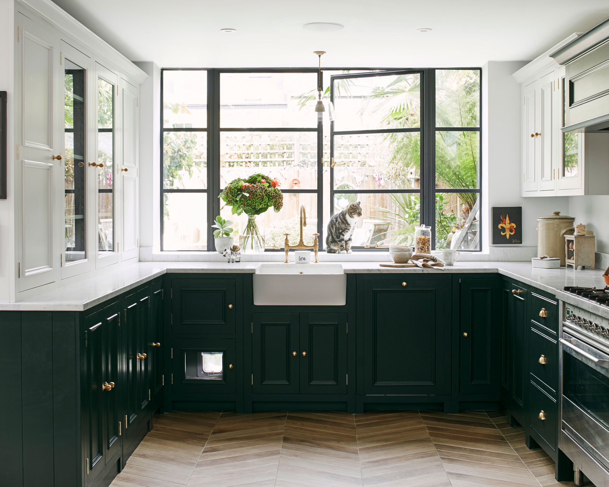
Like a magpie attracted to shiny things, in smaller kitchen spaces, it’s the thoughtful details that really make a difference. Inject some personality into your space, and update your kitchen scheme in a Jaffa Cakes jiffy with extra special hardware that adds a luxe finishing touch. From beautiful brushed metallic drawer pulls, to patterned ceramic door knobs, it really is the little touches that make all the difference!
‘When designing for smaller kitchens the finishing touches such as the power outlets and cabinet handles become even more important. With less space available the eye is naturally drawn to the details within the room. These details can elevate a small room into an opulent space so should not be overlooked,’ advises Narendra Karnani, managing director, Heritage Brass.
6. Zone your space with feature wallpaper
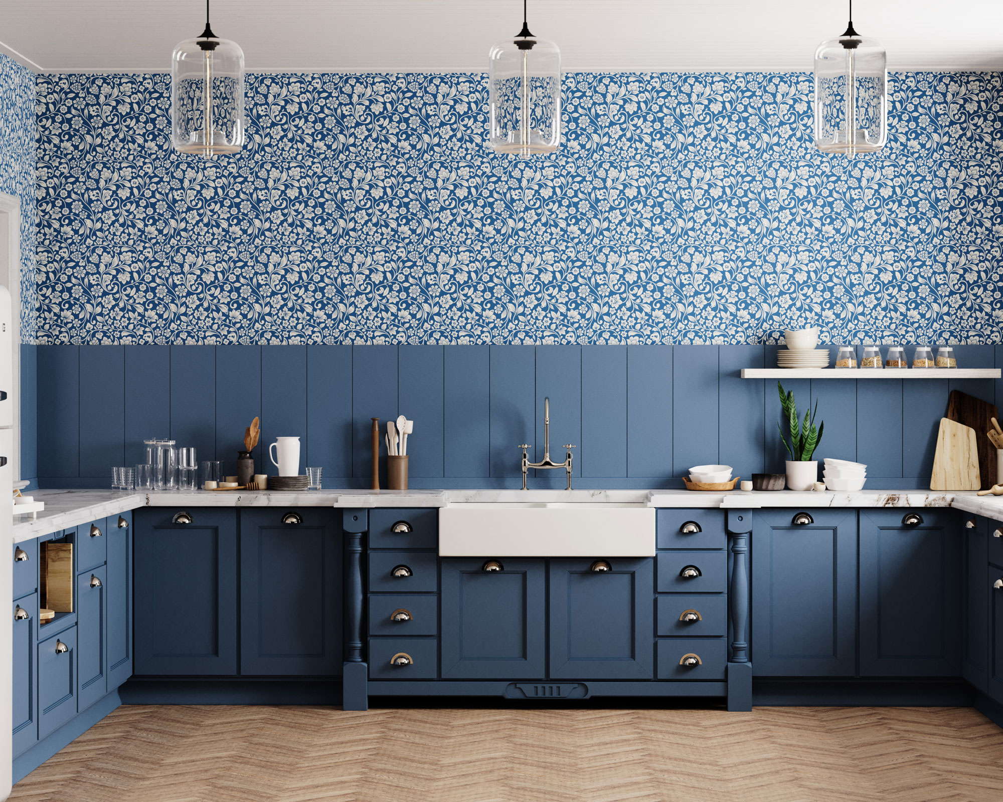
Turn your U-shaped kitchen into a sensory-awakening feature area with a statement kitchen wallpaper design. Depending on style preference, either choose a wallpaper design that picks out a color in your cabinets, for a harmonious look with added depth; or take a two-tone kitchen approach with a contrast shade that wows and dares with color blocking tenacity.
7. Integrate a U-shaped layout into a larger space
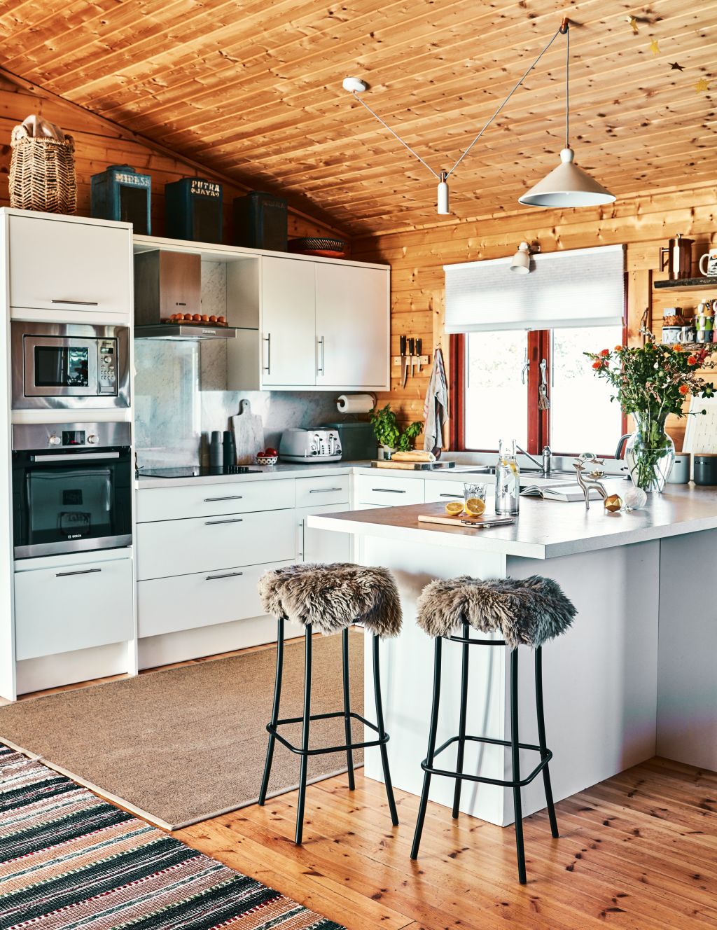
If your home has an open-plan feel (or you want it to), opting for a U-shaped layout in an open plan kitchen space can be an effective means of defining a large square footage. Positioned in a corner with one side of the U forming a peninsular unit, it creates a clear distinction between the kitchen and dining or living areas.
This is achieved effectively with this Fusion White Kitchen from Magnet, which is positioned effectively in the corner of a larger, open plan space. The addition of a breakfast bar and stylish bar stools helps create the link between zones.
8. Maximize the potential of a small space
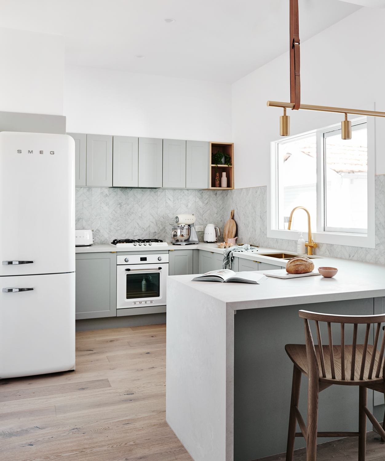
Opting for a U-shaped kitchen layout is effective in making a small space seem larger and lighter, while making the most of storage and work surface opportunities. Choosing flush-fronted, handleless cabinetry dials down the fussy detail to enhance the feeling of space further.
White kitchens, as well as those with grey tones, work a treat if maximizing the light and bright feel of your space is a priority. We love this combination of sleek and contemporary white and grey toned cabinets with retro features – hello Smeg Fridge – and bold brass fittings from Norsu Interiors.
9. Use pendant lighting to create a focal point in a U-shaped kitchen
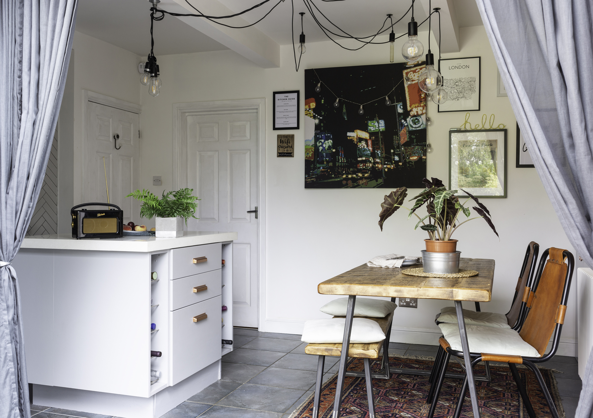
Creating a focal point is an effective means of making a kitchen feel more pulled together.
In a U-shaped space, pendant kitchen lighting lighting is a great option, especially if one side of kitchen cabinets opens out onto an open plan space.
We love the idea of glass pendant lights, which create the design impact required without sacrificing the light and open feel of the kitchen.
10. Open-shelving stops a U-shaped kitchen feeling boxy
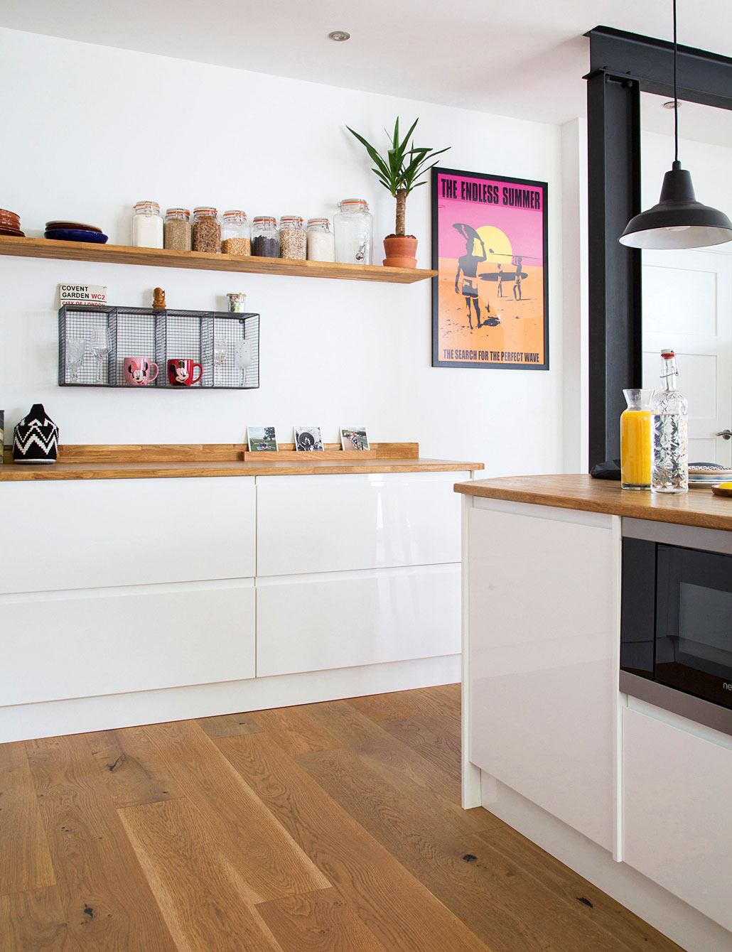
While a major perk of the U-shaped kitchen is its ability to offer abundant kitchen storage potential, opting for kitchen cabinets both above and below counter level can result in the room feeling crowded and therefore smaller, especially if you're working with darker woods or colors.
Experts at Omega explain more, 'If your kitchen is large or wide and you need the cupboard space, it should be fairly straightforward to fit top and bottom cabinets around the whole ‘U’, with just one break at the bottom.'
'However this can make your kitchen feel a little boxed in, so it’s worth maximizing corner cupboards and thinking outside the box a little more to arrange your units.'
To counter this, consider opting for a combination of kitchen cabinets and open shelving units, which will make your space feel larger and more open. Style with your prettiest kitchenware.
11. Keep it uncluttered with corner storage systems
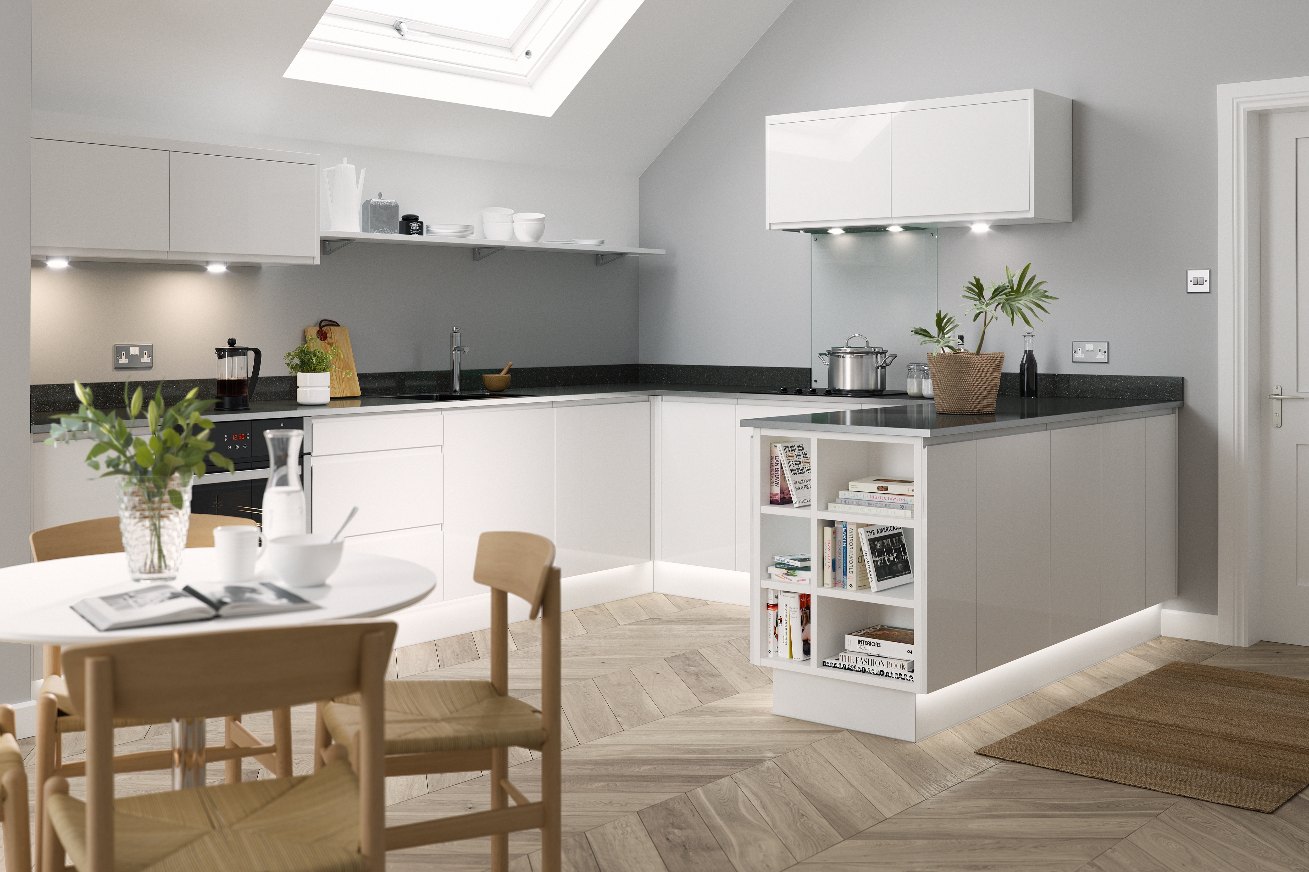
Specially designed corner storage systems are worth the investment in a U-shaped kitchen, while your ratio of deep drawers to cupboards to shelving units should be carefully calculated to suit your storage needs.
We love the way this J Pull Kitchen from Wren Kitchens uses a shelving unit to create extra storage at the end of a row of kitchen cabinets; perfect for storing cook books.
12. Choose tiles carefully for a small U-shaped kitchen
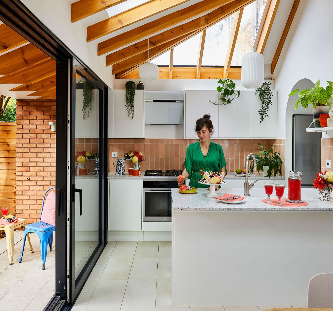
Choosing the best kitchen tiles is an important design aspect and can make all the difference in terms of the final feel of a space. If you're dealing with a small, U-shaped kitchen, working with light colored tiles is a well known design trick that will make the space feel larger and lighter.
Choosing the right size tiles for a small kitchen is easier than you might think. And, a slightly lesser known design trick is to lay tiles diagonally – this take on a herringbone effect is a great example – as it fools the eye into seeing a space as larger than it really is.
13. Channel the maximalist trend in a U-shaped kitchen
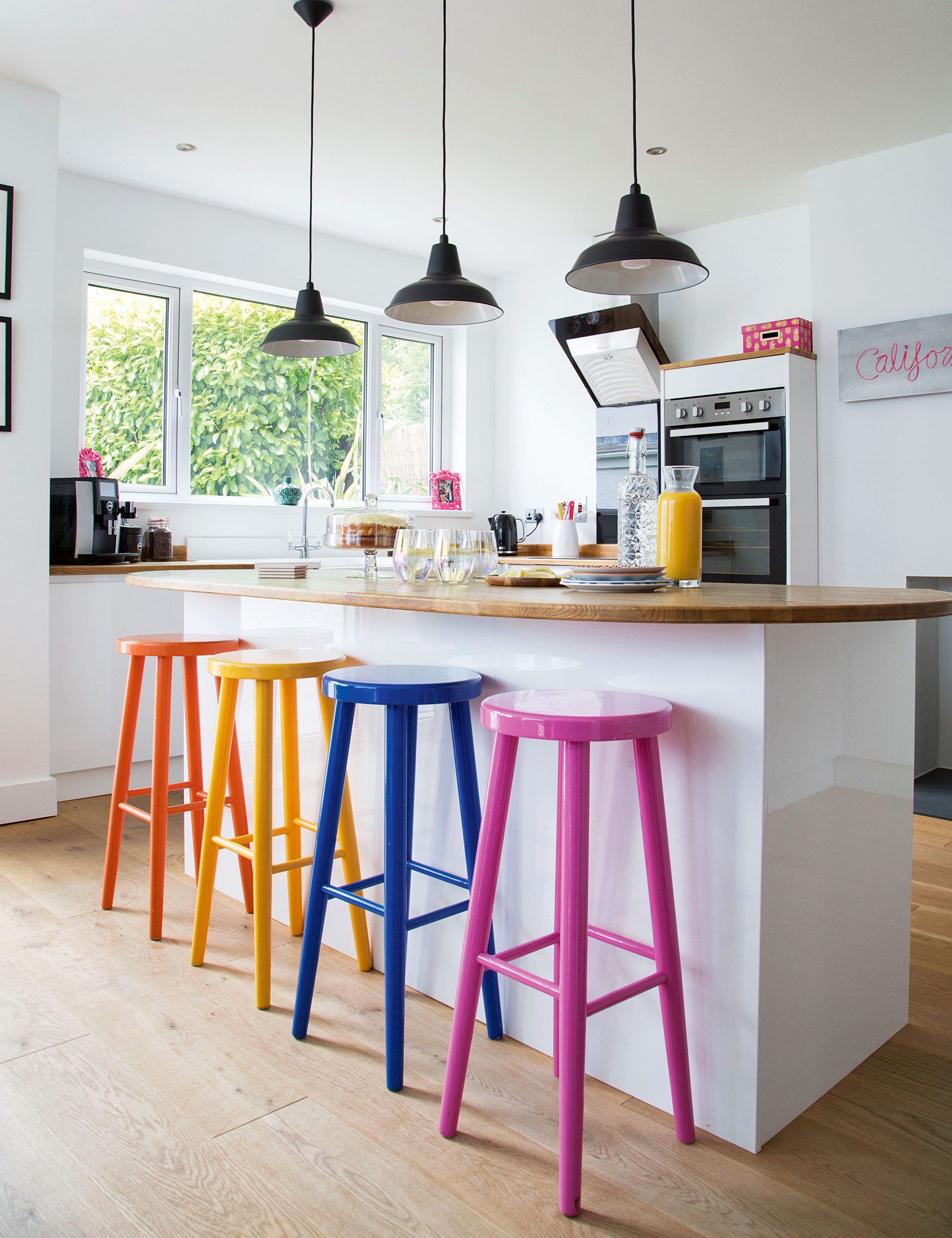
Typically more angular, U-shaped kitchens are perfect for channeling your love of all things, bright, bold and patterned.
Choose a different finish for each surface; we love the idea of botanical wallpapers, bright toned metro tiles and painted cabinets – the bigger and bolder the clashes, the better – to achieve an on-trend, maximalist look.
14. Embrace the dark interiors trend (if light allows)
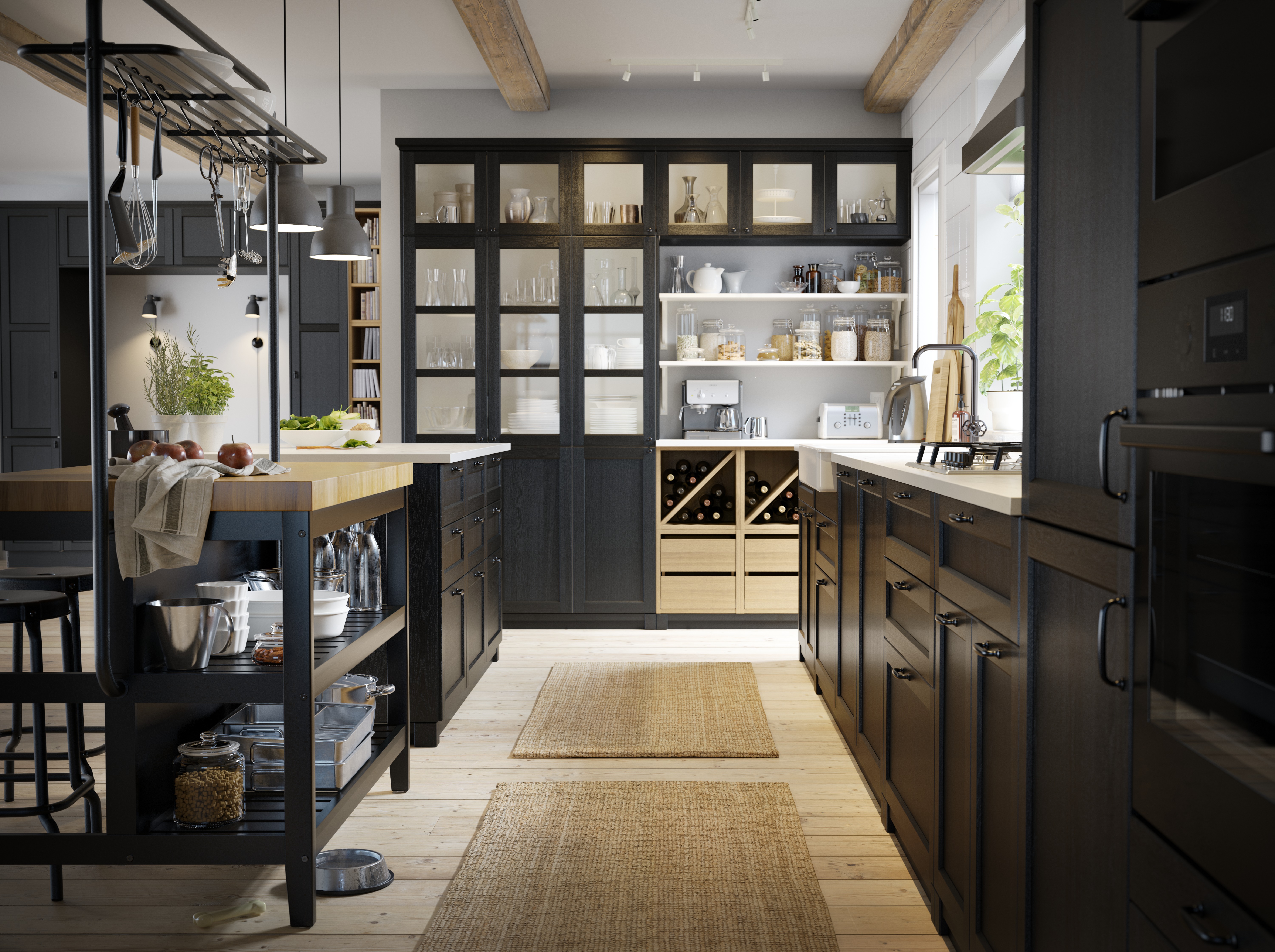
If you're blessed with a large and naturally light space, don't shy away from a U-shaped kitchen inspired by the dark and atmospheric interiors trend.
We love the dark finish of this kitchen. Despite its dark and inky floor to ceiling kitchen cabinets, abundant natural light prevents it from feeling small and boxy.
The use of a freestanding Vadholma Kitchen Island, available at Ikea, also contributes to the kitchen's open feel.
15. Or keep thing bright with a white U-shaped kitchen
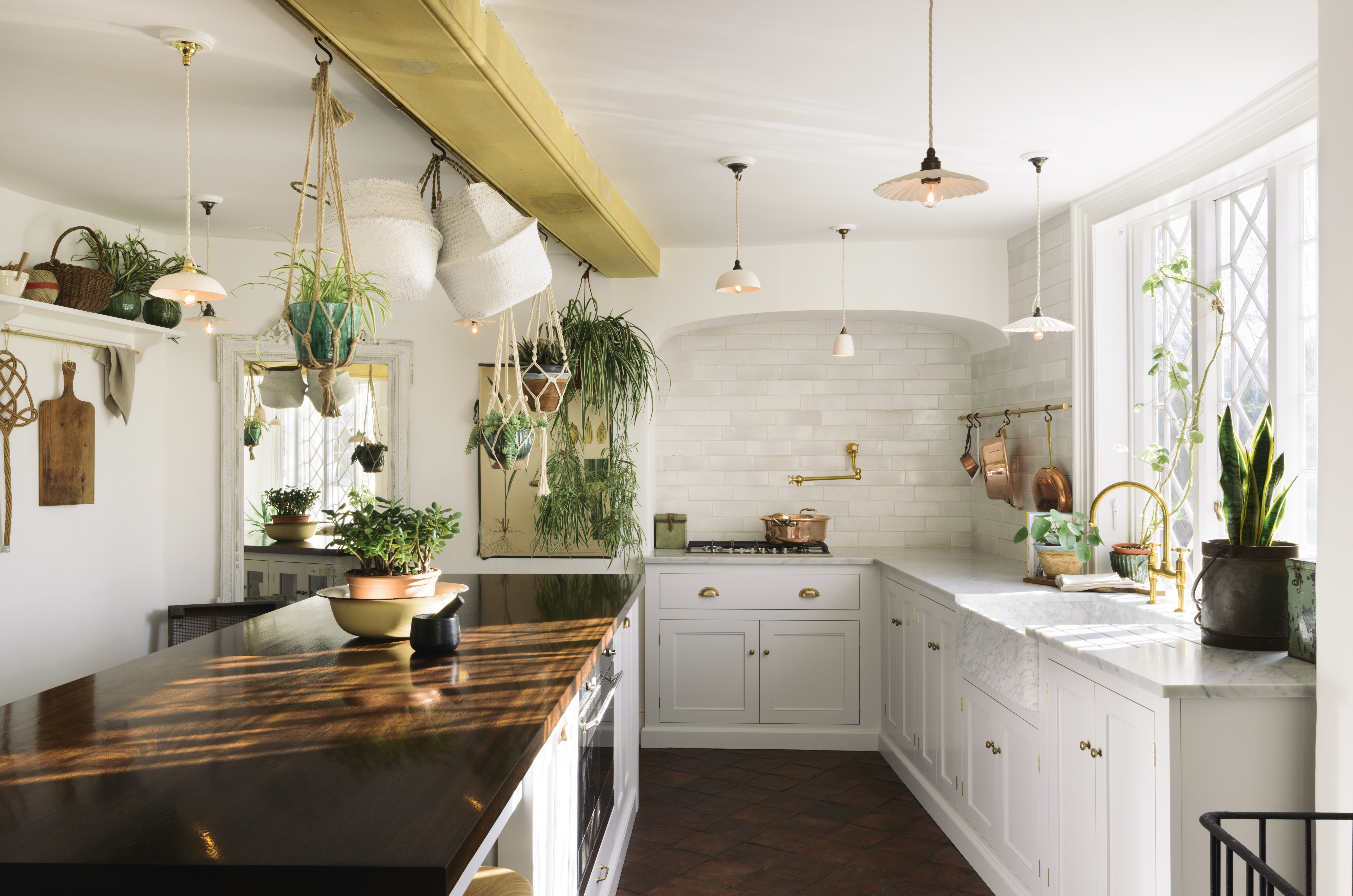
An all white look is just a classic and works so well in U-shaped kitchen as they are often in smaller kitchens that will benefit from later colors or an open plan space where you don't want to kitchen to be too much of the focus.
You can always add color and personality with plants, shelving and decorations also.
16. Consider built-in appliances for a sleek finish
When choosing appliances for a U-shaped kitchen, opting for built-in appliances is a great way to achieve a sleek and contemporary finish.
We love the distinctly contemporary feel of the extractor fan in this kitchen from KreateCube.
What is the disadvantage of the U-shaped kitchen?
James Mellan-Matulewicz, creative director at Bobbi Beck, says: 'If you have a smaller space, U-shaped kitchens can sometimes feel a little claustrophobic, so an L-shaped kitchen may be the way to go. With a larger space, you can take full advantage with a U-shape without the space feeling too cramped. This also allows you the opportunity to leave out top cabinets for more breathing room.'
How does a U-shaped kitchen compare to other layouts?
Make sure you think about your needs and how you use the kitchen when considering a U-layout. There are a few different ways to complement this design configuration and to make the most of your space, which ultimately depends on your personal taste and budget of course.
'We’re all familiar with the five basic kitchen layouts - L-Shape, G-Shape, U-Shape, Galley style kitchens and One-wall kitchens. Islands tend to work best with L-shape and single wall kitchens and peninsulars work best as part of a G-shape plan. It’s important not to fall into the trap of assuming an emerging design for a kitchen belongs to a certain type because there are often eccentricities to the space or the client’s needs that can inspire something that breaks out of these set layout types and makes for something really special,' says Howard Miller of H. Miller Bros.
Get two free tickets to the Homebuilding & Renovating Show!
Visit the experts in home renovation for all the latest inspiration and industry updates, sure to kickstart your own home improvement project.
Plus, register online for entry for 2 people on 25 and 26 June 2022 at Sandown Park Racecourse in Surrey.*
*Terms & Conditions apply.
Join our newsletter
Get small space home decor ideas, celeb inspiration, DIY tips and more, straight to your inbox!
Emily first (temporarily) joined the Real Homes team while interning on her summer break from university. After graduating, she worked on several publications before joining Real Homes as Staff Writer full time in mid-2018. She left the brand in 2020 to pursue another career, but still loves a second-hand bargain and sourcing unique finds to make her rented flat reflect her personality.
-
 Amazon's bestselling Keurig K-Mini Coffee Maker sale is on now with 40% off — here's why 97,000 customers love it
Amazon's bestselling Keurig K-Mini Coffee Maker sale is on now and offers 40% off. Here's why we and thousands of customers love it. Plus, some alternatives
By Punteha van Terheyden Published
-
 Pros reveal the 10 kitchen cabinet design mistakes to avoid, and what to do instead
The 10 common kitchen cabinet design mistakes when choosing and installing kitchen cabinets. Solutions to problems and how to avoid the issues.
By Isabella Charlesworth Published
-
 10 pretty pastel kitchen ideas that are utterly dreamy and delicious
Ice cream sweet pastel kitchen ideas are perfect for adding playfulness. We've asked designers for their favorite ways to bring these in light shades
By Eve Smallman Published
-
 New Beautiful by Drew Barrymore kitchen appliances just dropped, and they'll take your brunch game to new levels
New Beautiful by Drew Barrymore kitchen appliances just dropped — learn all about the waffle maker, espresso maker, electric can opener, and space-saving kitchen island
By Danielle Valente Published
-
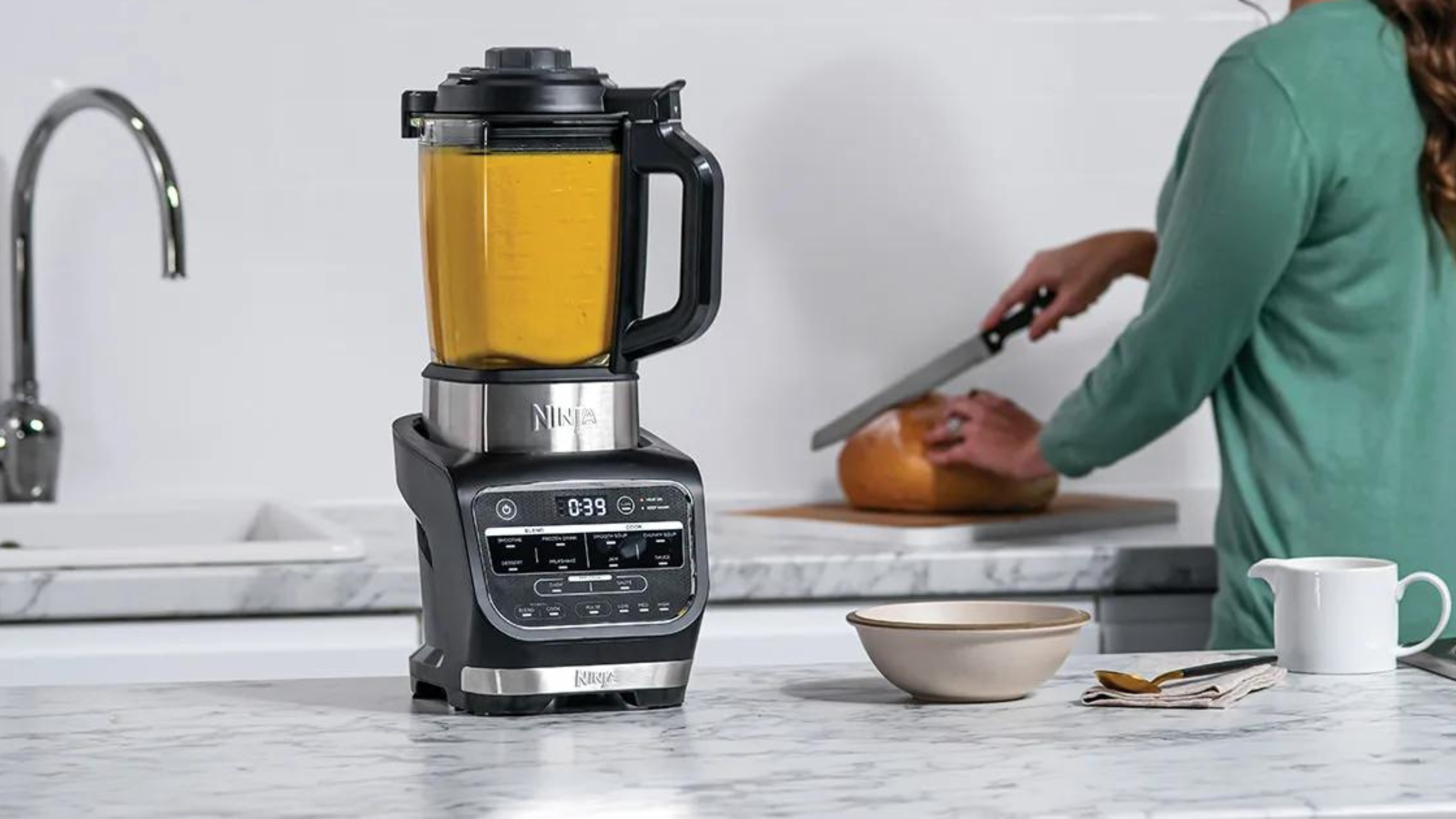
 The Ninja Foodi hot and cold blender has turned my kitchen into a fancy no-waste restaurant
Using the Ninja Foodi cold and hot blender, I've made hearty soups from just 65 cents per serving
By Christina Chrysostomou Published
-
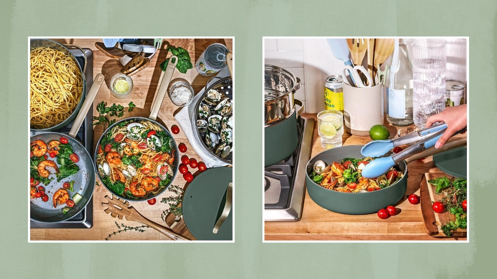 Drew Barrymore drops a new color in her Beautiful kitchen line just in 'thyme' for the holidays
Check out our edit of the Drew Barrymore cookware set and kitchen appliances in the limited-time "thyme green"
By Danielle Valente Published
-
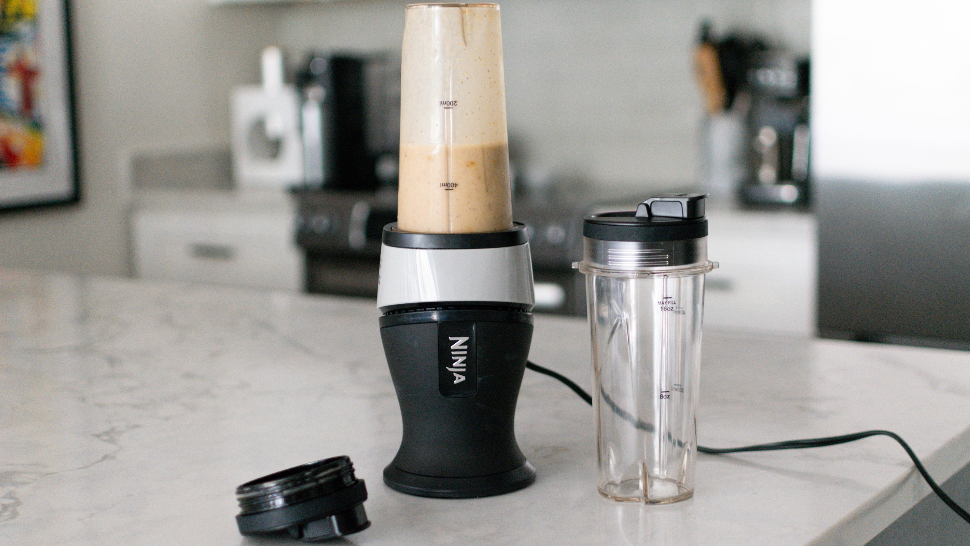
 The Ninja Fit blender is so compact that I no longer dread pulling out this type of appliance
Learn more about the Ninja Fit blender in our comprehensive review after testing the kitchen gadget for several weeks and understanding all of its pros and cons.
By Heather Bien Published
-
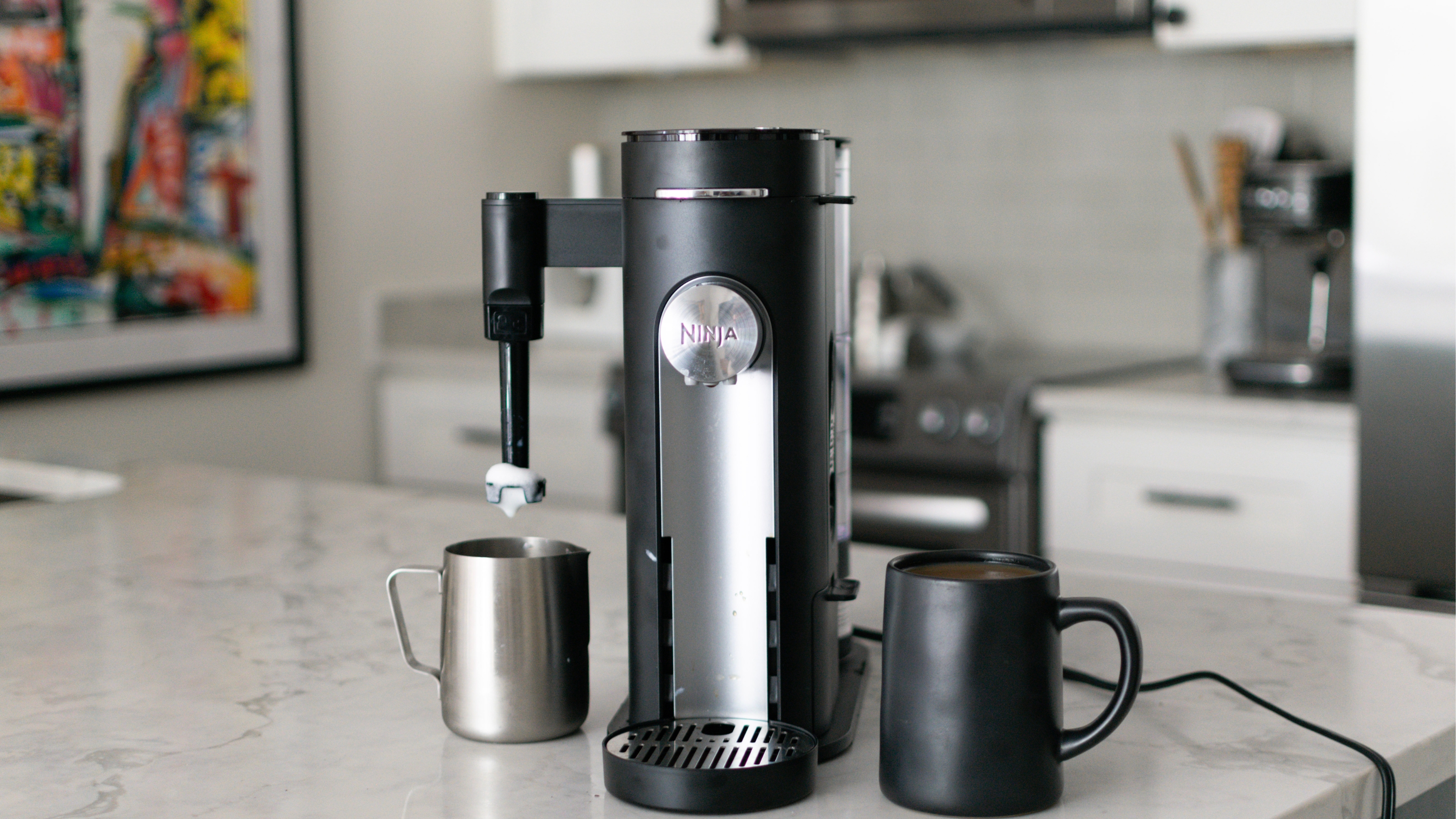
 Review: this Ninja pods and grounds coffee maker has solved our bean debate
The Ninja pods and grounds coffee maker makes everything from hot black coffee to milky brews with a frothed top and even iced drinks. See what else it's capable of in our review.
By Heather Bien Published
