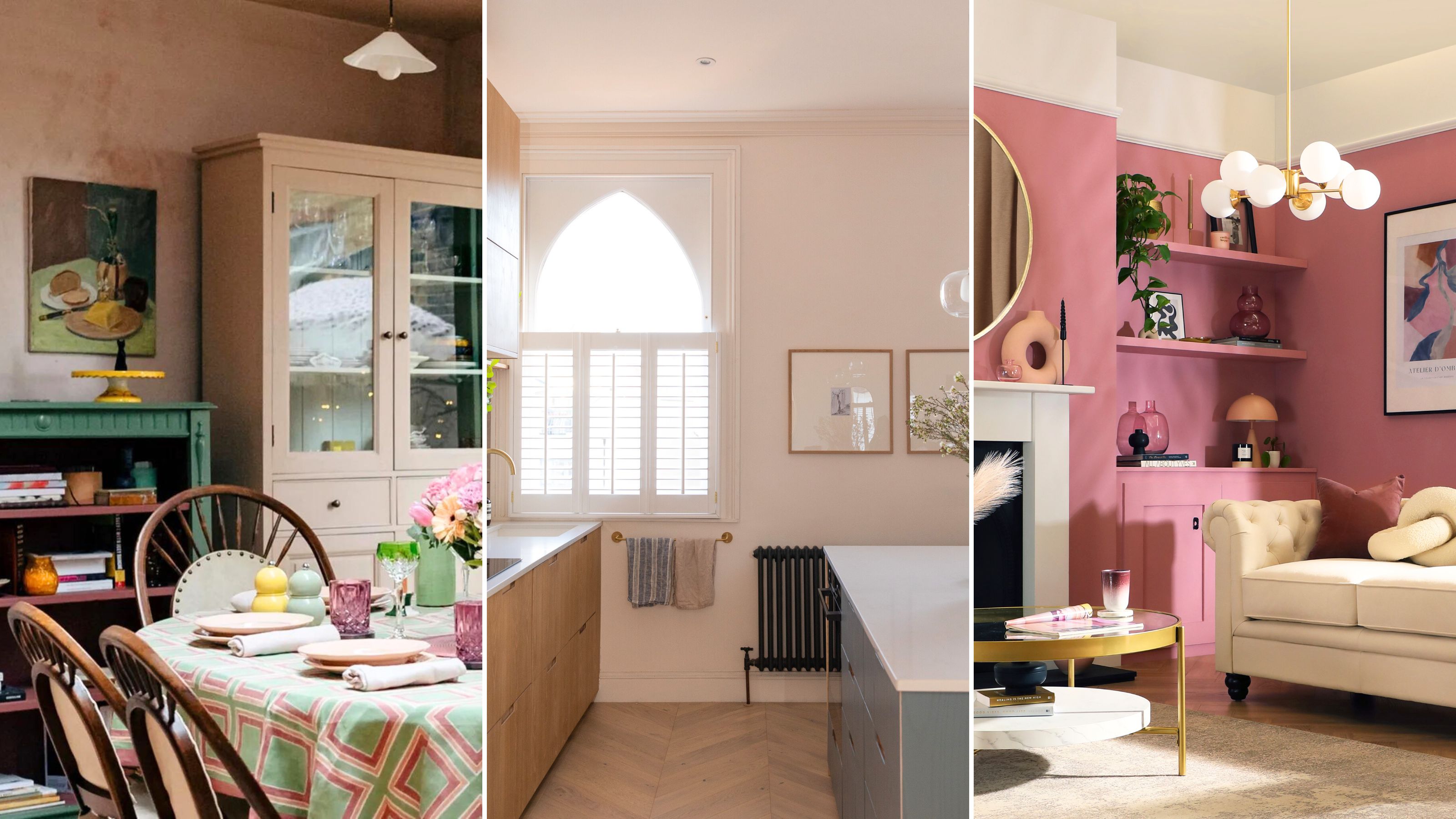

It's useful to find out the outdated paint colors going out of style if you're getting a little tired of your current paint color and considering a change.
I've asked interior designers what shades they've been swerving this year and the colors they've been reaching for instead. Muted grays and millennial pink are officially out, and instead earthy and rich tones are in.
If you're looking for interior paint color trends for the year, knowing what to avoid is just as important as finding out what to try.
The outdated paint colors designers aren't using in 2024
Utilizing color in your home is one of the most impactful ways to bring fresh interior design trends into your space. I'm feeling so inspired to change up my place after chatting with experts, and I just know you're going to feel the same.
The designers I've spoken to have recommended color alternatives for their loathed outdated ones, which I've curated closely matching picks you can easily shop.
The prices below were correct at the time of publishing this article.
1. Ditch greige and go for soft terracotta
I’ll be honest — the name of the color greige has never appealed to me, nor has the color itself. So, I’m pleased to see that it’s firmly becoming an outdated paint color now.
"This is a color that combines the tones of both gray and beige and is pronounced as 'graysh'," explains Priyanshi Jain, interior designer and founder of Pixels & Spaces. "Due to the changes and latest trends in interior design and architecture, greige appears to be one-dimensional and flat in today’s landscape."
Instead, people are now more inclined to try colors that add depth and personality to their homes.
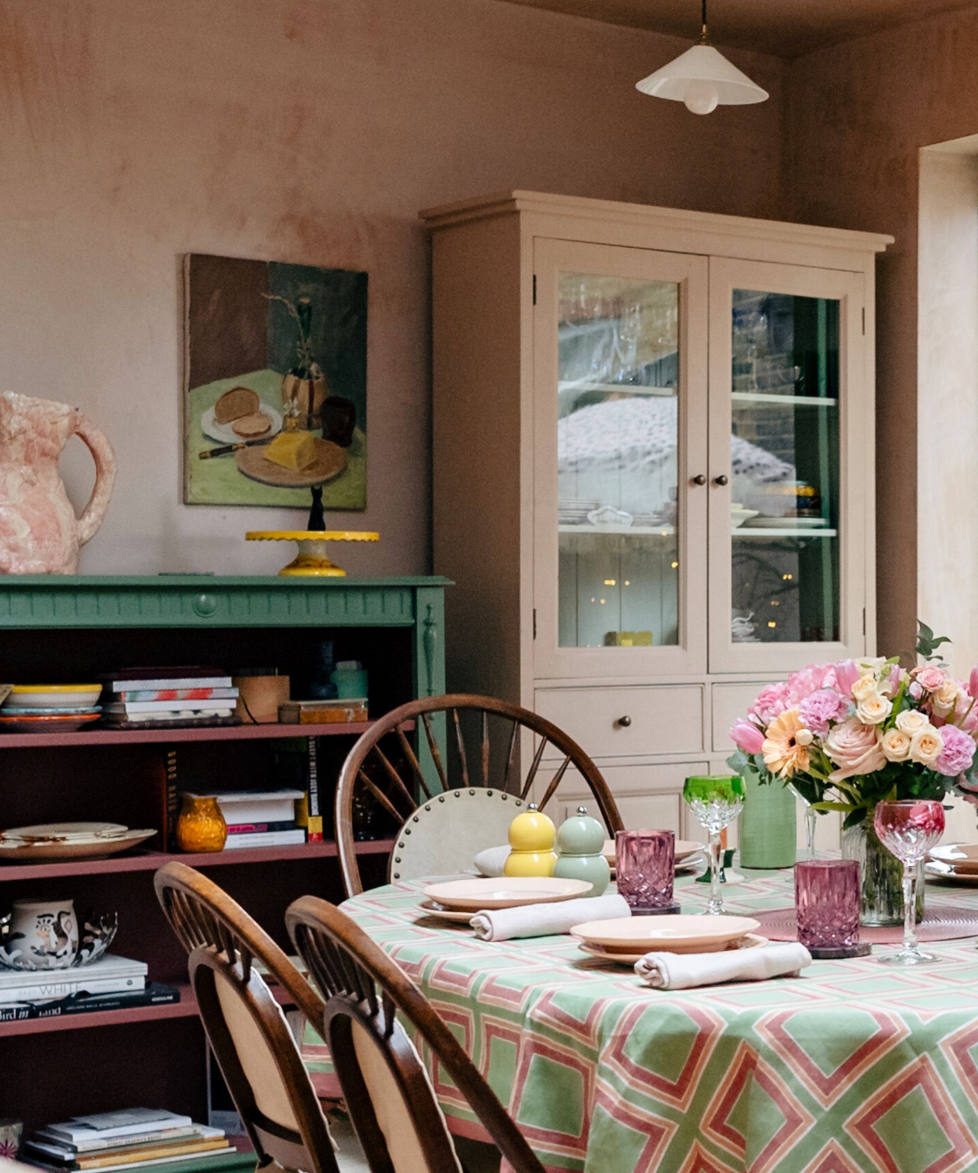
Priyanshi recommends using soft terracotta to add a neutral, calming, and welcoming touch while bringing in a subtle richness. This is also one of my favorite warm kitchen colors that works so well across so many spaces, big and small.
If you want to go for a touch more pigment, try an earthy green such as Lick's Green 18 (available in a handy stick on sample form).

Shape: Rectangular
Made from: Paper
Price: From $2
I've seen terracotta both rich and soft come into play this year, but I have to say that this is the color I'd choose out of the two. This earthy shade is a brilliant choice for smaller spaces, as it will allow light to reflect around your room. If you want to achieve a color wash effect like above, you can dilute your paint with water and dab it onto your walls with a sponge.
2. Swap Ferrari red for maroon
While the unexpected red theory has been one of the biggest TikTok trends this year, using this striking a color in a big way at home has quickly become outdated.
“Truth be told, for me personally, bright primary colors often feel garish and overwhelming. I don't even like them in a daycare center!” says Gaia Guidi Filippi, interior designer and founder of Gaia G Interiors. “They are also particularly un-inventive and flat."
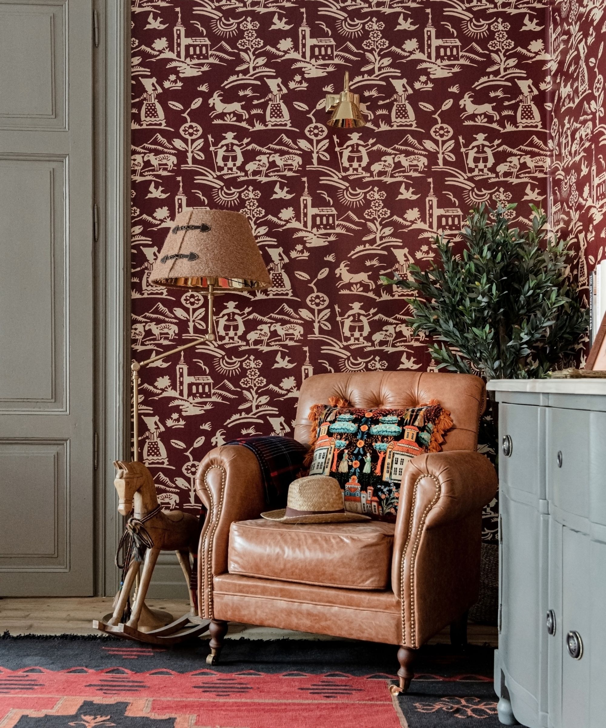
Instead, Gaia advises going for colors with more depth and subtlety. "Try maroon instead of Ferrari red," she says.
Gaia also recommends trying this approach for other outdated paint colors, such as going for terracotta instead of orange (Benjamin Moore's Baked Terracotta has rosy pink undertones) and sage instead of Kelly green (Farrow and Ball's Vert De Terre responds to light beautifully).

Shape: Rectangular
Made from: Paper
Price: From $2
Go for all the sumptuous, luxe vibes with this shade of maroon that oozes sophistication. It looks beautiful in different lights, appearing brighter during the day and transforming into a moody hue when it's dark. Pair this up with creamy whites, glittering golds, and light browns for an elegant finish.
3. Pass on millennial pink and choose mauve pink
I loved Barbiecore and all the fun Barbie Dreamhouse decor that came with it last year — but this doll-like shade is now on the shelf, much like its plastic namesake.
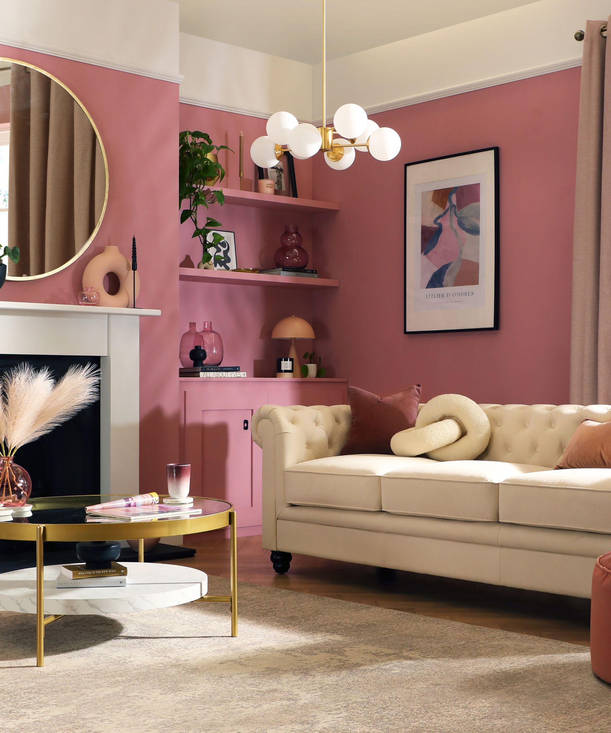
Gaia says, "Though I've yet to meet a pink I don't love, millennial pink has become overused and less appealing. I'm really into more sophisticated shades, like rose and dusty mauves that offer a refined and mature aesthetic."
According to Gaia, these are also amazing for creating moody rooms that are all the rage at the moment.

Shape: Rectangular
Made from: Paper
Price: From $2
The name of this paint color is just as cozy and inviting as the shade itself. It has just a hint of pink in it that makes it feel playful, while still packing much more of a punch than millennial pink. This color speaks for itself, which means you just need to pair it with crisp whites and light blues in order to let it shine.
4. Change cool gray for taupe
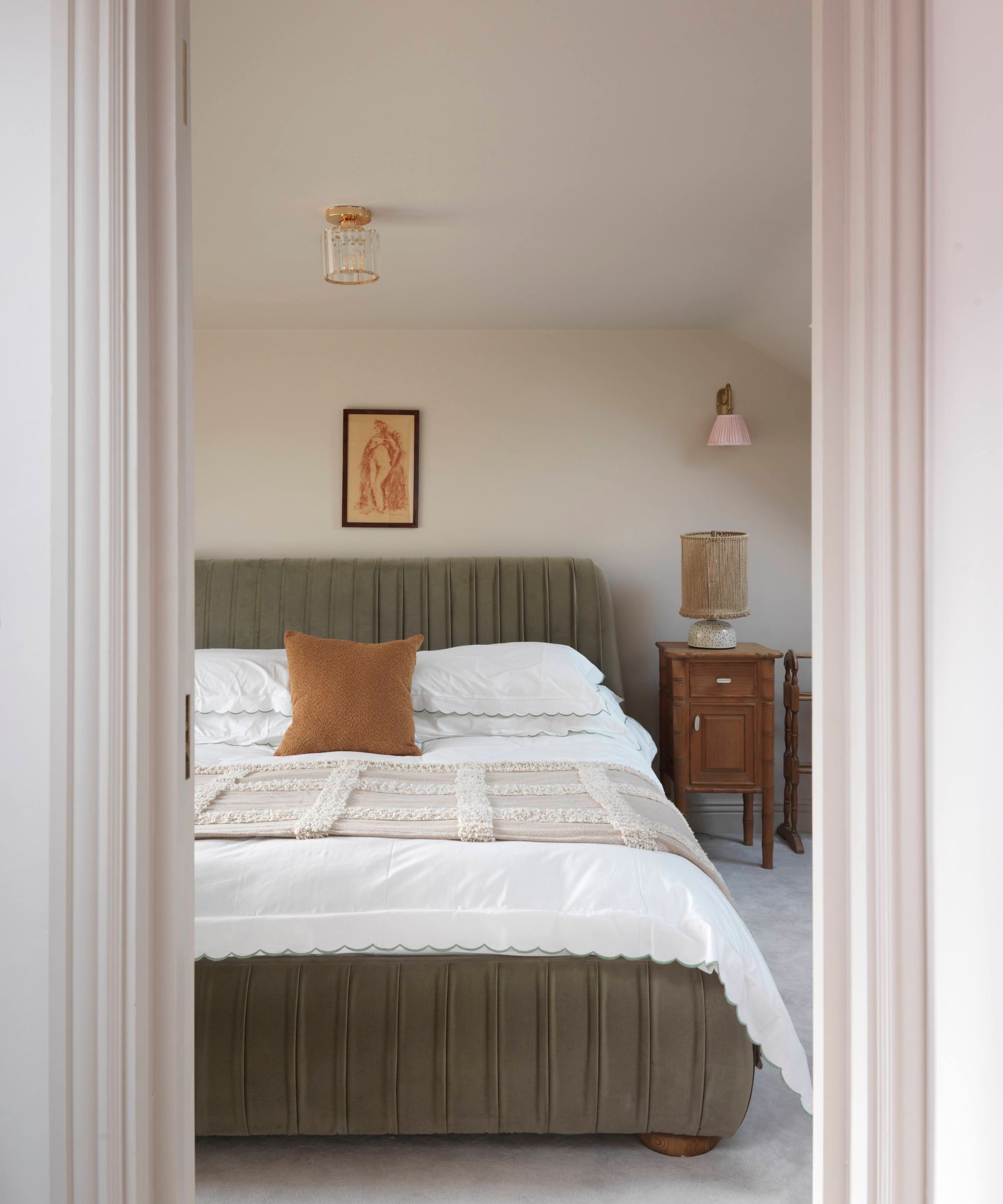
As well as the darker greige being an outdated color, cool gray has also made its way onto our interior designers’ no thank you list. Instead, they're going for the brown trend that's been making waves recently.
“Cool grays were definitely overused in the 2010s, especially in builder-grade homes — so we tired of them and now they just feel cold and impersonal,” Gaia says. “My recommendation to replace them is to opt for softer neutrals in the brown family, such as taupe."
Gaia adds that she’s seen shades such as café au lait (Benjamin Moore's Café au Lait is rich and indulgent) and caramel (Farrow and Ball's Sand is a warm neutral with a touch of red) gain popularity for their warm and inviting feel.

Shape: Square
Made from: Paper
Price: $2
I love how relaxing this taupe shade is, balancing being a warm and neutral tone beautifully. This is from Lick's range with renowned hotel Soho House, making it a brilliant choice if you want to go for a hotel-style look in your bedroom or anywhere else in your home. It's inspired by Soho Roc House in Mykonos, so it will help you channel Mediterranean style, too.
5. Stop using beige and try off-white
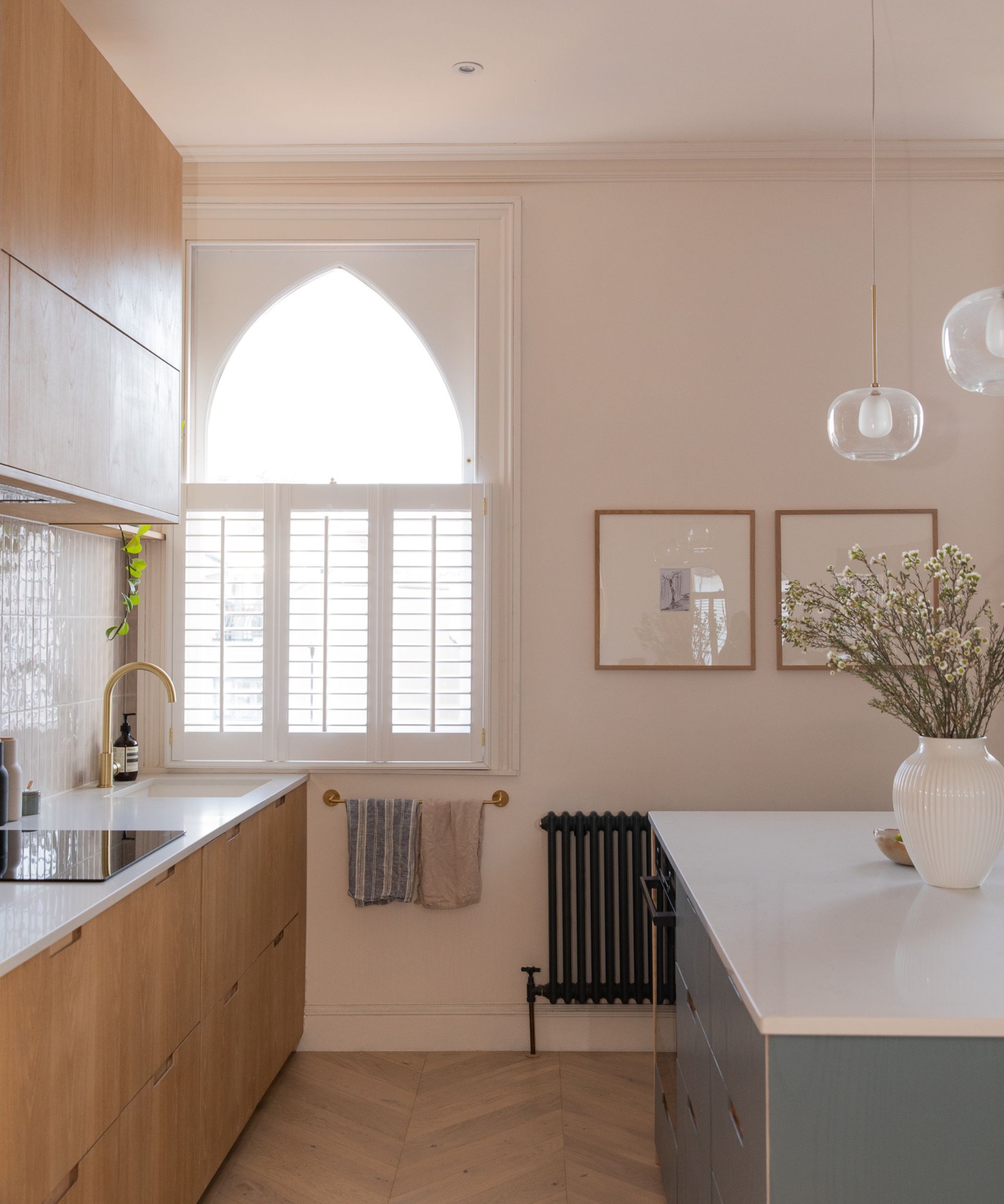
I know — beige is always a safe bet. But, if you want to keep your place on trend, you’re going to need move away from this outdated, uninspiring paint color.
“Beige is a color that is somewhat more flat and bland than greige,” says Priyanshi. “It lacks the character and coziness that many people crave. Instead, try picking off-whites with a hint of lavender to add coolness and sophistication to your home."
You can also try off-whites with pink undertones to inject some warmth into your space. If you’re committed to keeping things beige, Priyanshi suggests using it with hints of pink and yellow to keep it subtle and inviting.
For example, in a neutral living area with beige walls, you could add pink throw pillows such as the washable and soft Deconovo Pink Pillow Covers from Walmart.
Then, you could layer them with a blanket such as the Dakota Fields Halfeti Knitted Throw from Wayfair that is knitted and lightweight. Hey presto — a cute color scheme with minimal effort.

Shape: Square
Made from: Paper
Price: $2
This comforting shade from Lick will create a soothing atmosphere that still feels modern and fresh — unlike beige, which is an outdated paint color. I also like the fact that Lick's peel-and-stick paint samples won't leave marks on your wall and that you can move them around to different rooms in your house to test how they look in different natural lighting and varying times of the day.
As well as paying attention to particular colors, it’s also smart to pay attention to the different sheen and finish applications when it comes to paint trends.
“For example, don't just think of a paint color for a bookshelf — consider doing it in high gloss to make it extra,” Gaia finishes by saying.
If you’re looking for shades specifically for apartments or rentals, it’s also worth looking at small space color trends specifically.
Join our newsletter
Get small space home decor ideas, celeb inspiration, DIY tips and more, straight to your inbox!

Hi there! I’m the former content editor at Real Homes and I'm now a freelance journalist.. I've been a lifestyle journalist for over five years, previously working as an editor across regional magazines. Before this, I graduated from Nottingham Trent University a degree in journalism, along with an NCTJ gold diploma. For Real Homes, I specialized in interior design, trends and finding the best viral buys.
-
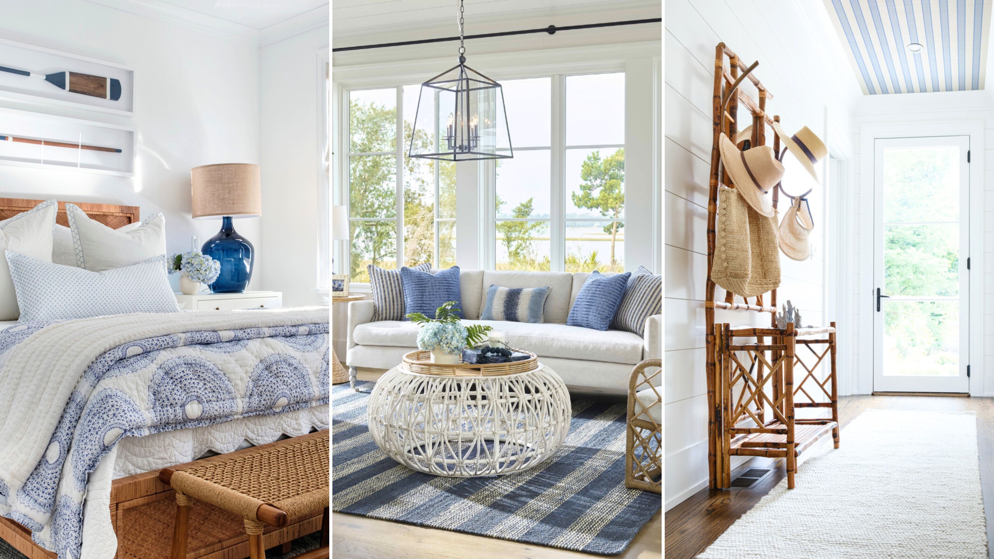 I'm calling chalky blue as the color of the season — and interior designers agree it’s “chic and calming”
Chalky blue is the color designers are all reaching for this season. We've asked pros why it's so popular and curated gorgeous picks to channel the look at home
By Eve Smallman
-
 Freddie Mercury's house has hit the market, and one color reigns supreme. Here's how to use it in your home
Freddie Mercury's house has hit the market, and gold reigns supreme. Here's how to make the color work it in a smaller space, according to pros
By Danielle Valente
-
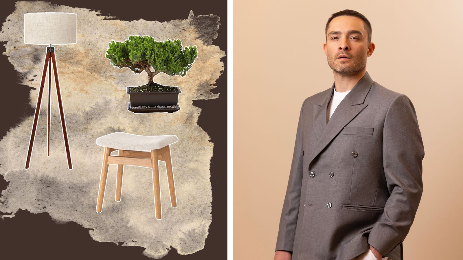 Ed Westwick's house reno is a minimalist dream with all of 2024's most popular trends — here's how to get the look
Ed Westwick's house is a minimalist haven that nails all of 2024's trends — here's what to shop to copy the look
By Danielle Valente