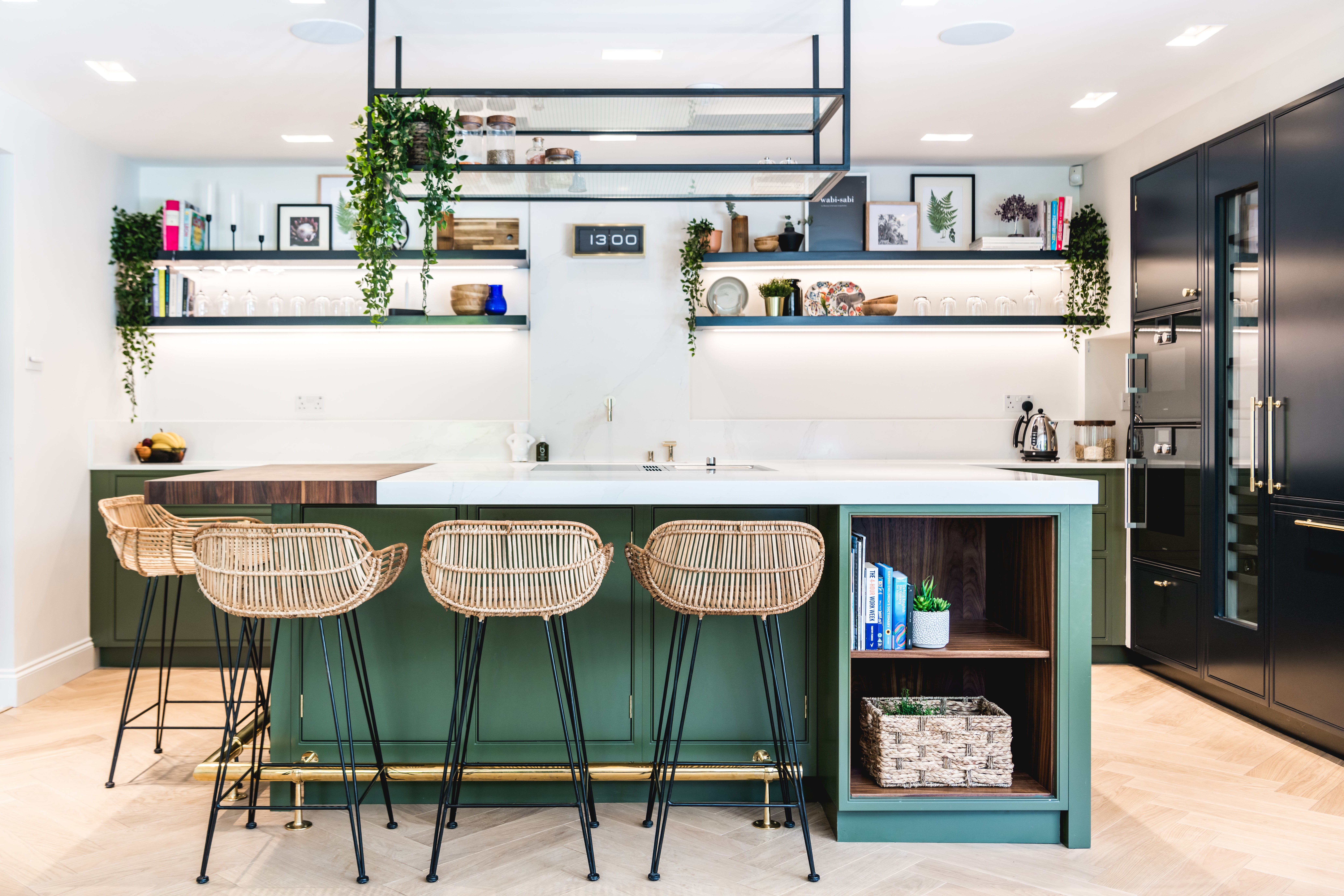
Wall units do have their place – they keep clutter out of sight and of course they are great for storage. However, the newest kitchen design trend is one we love, and that’s to ditch the wall units in favor of a more streamlined, minimalist look that requires no units or, if you still have essentials you want on show then pop up some shelves and style them up. We’ve sourced our fave images below to inspire you!
1. Match your shelves to your worktops
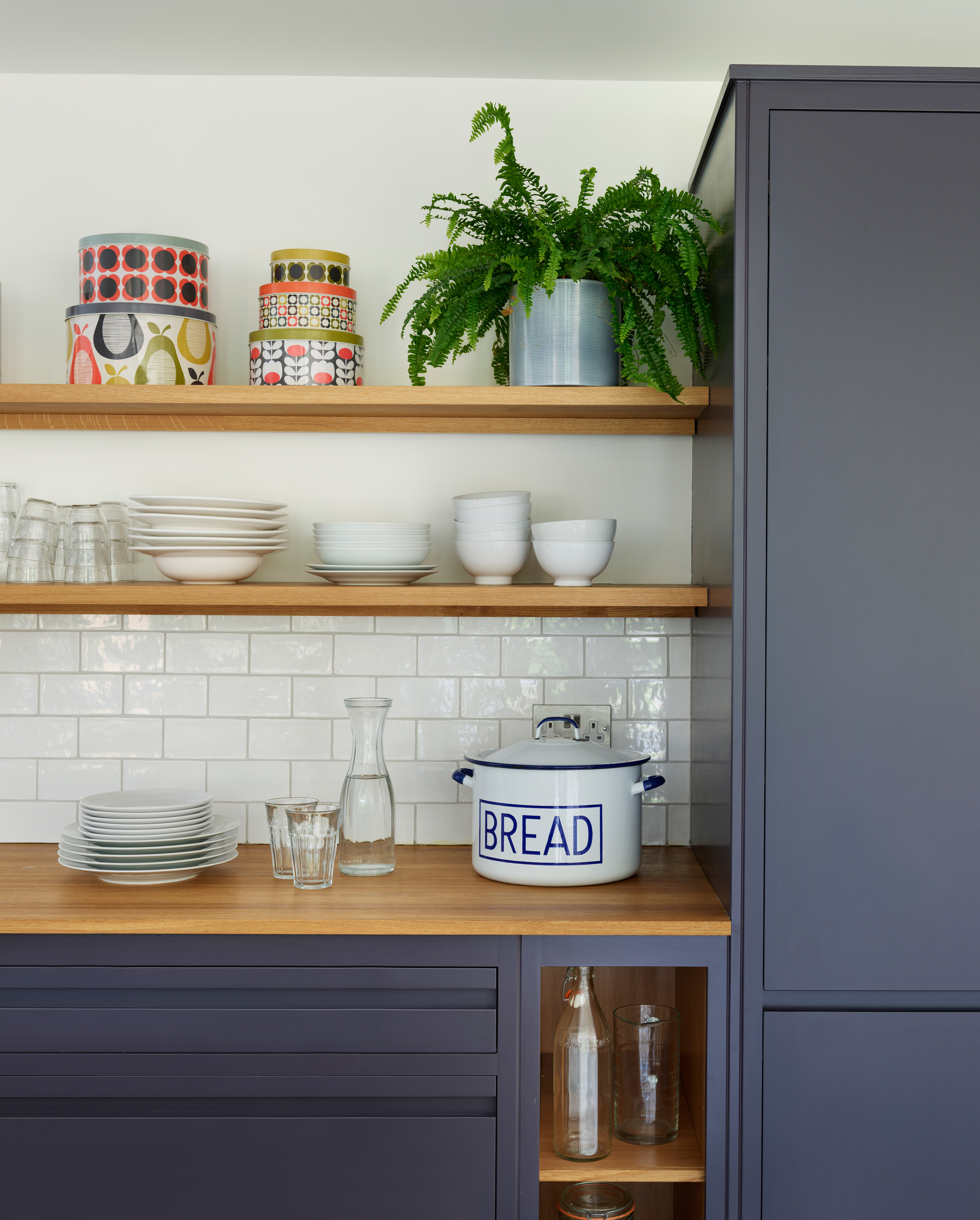
A spot of design cohesivity is a win-win for us which is why this kitchen corner is on our lust list. Now, if you are going to ditch the wall units you may need to ditch some clutter...but that’s a good thing right? Open plan shelving is a good opportunity to get your best wares out on display, style them up and add some color and pattern where you can. Even if you don’t use them often, cheery cake tins bring a touch of decoration to these wooden shelves while the rest of the pieces are plain.
2. Use shelves to make the essentials more aesthetic
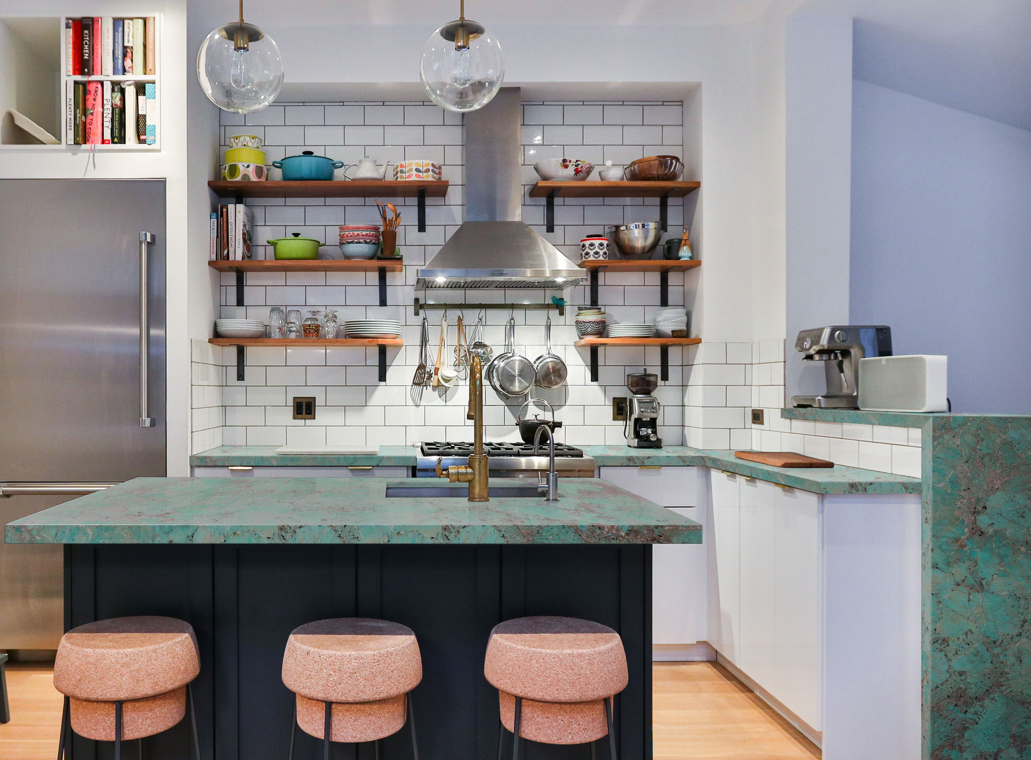
Depending on the shape of your kitchen there might not be room for kitchen units even if you wanted them – an old country cottage kitchen for example or an awkward layout. If this is the case you can use the space to pop up some shelving instead for those essentials you use every day. And why not hang them around an existing item like a cooker hood or window? These certainly make this otherwise plain wall more interesting whilst serving a purpose.
3. Go bespoke
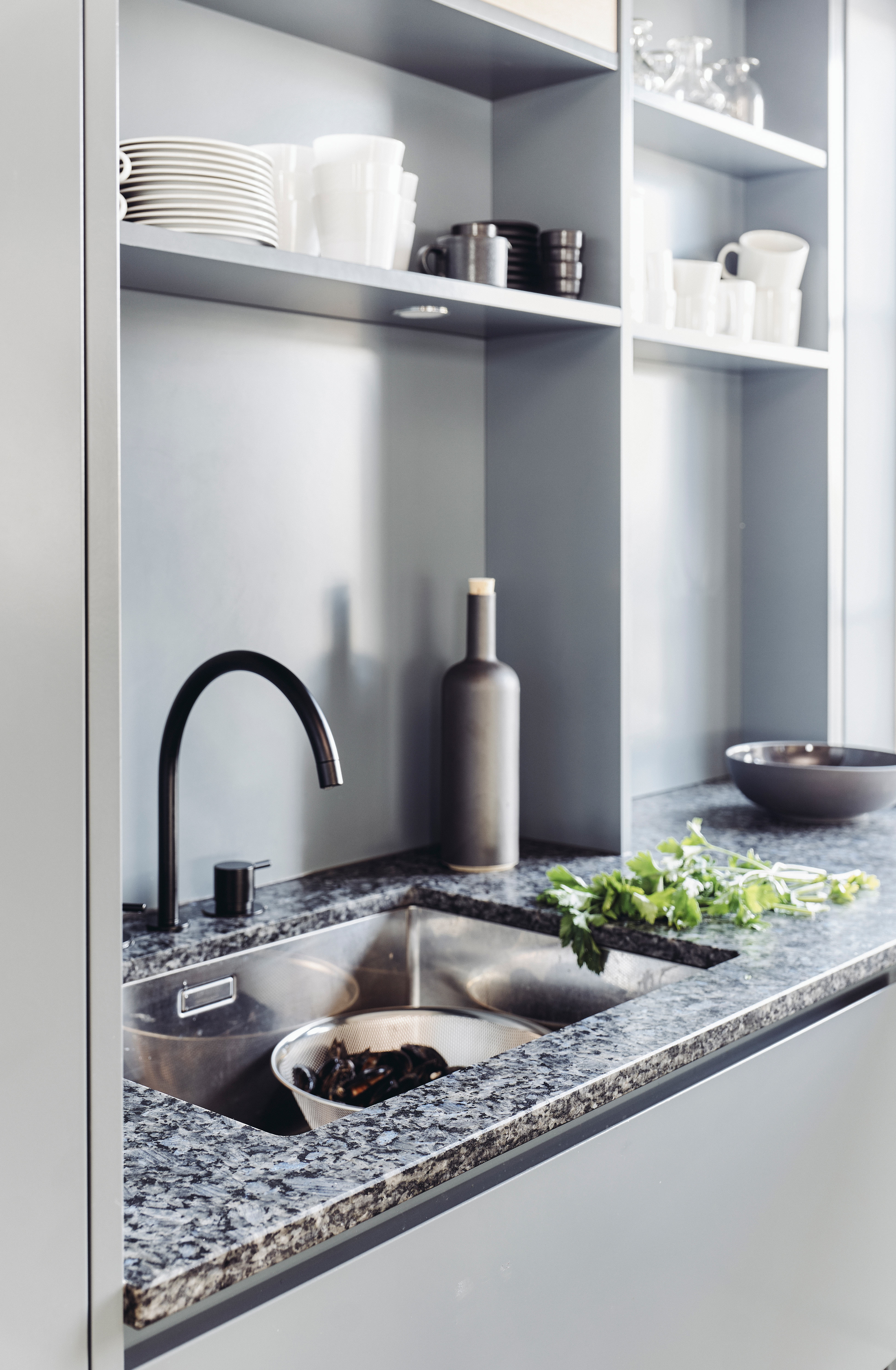
Invariably, the paraphernalia from your old wall units has to go somewhere, so once pared down, why not ask your local joiner to pop in some shelving that totally suits your space? One great advantage of open shelves is that in a small kitchen it allows the light to pour in, which isn’t now being blocked by a heavy-on-the-eye wall unit or two. You could even add in some downlights (as shown here) to the underside of the lower shelves.
4. Play with color
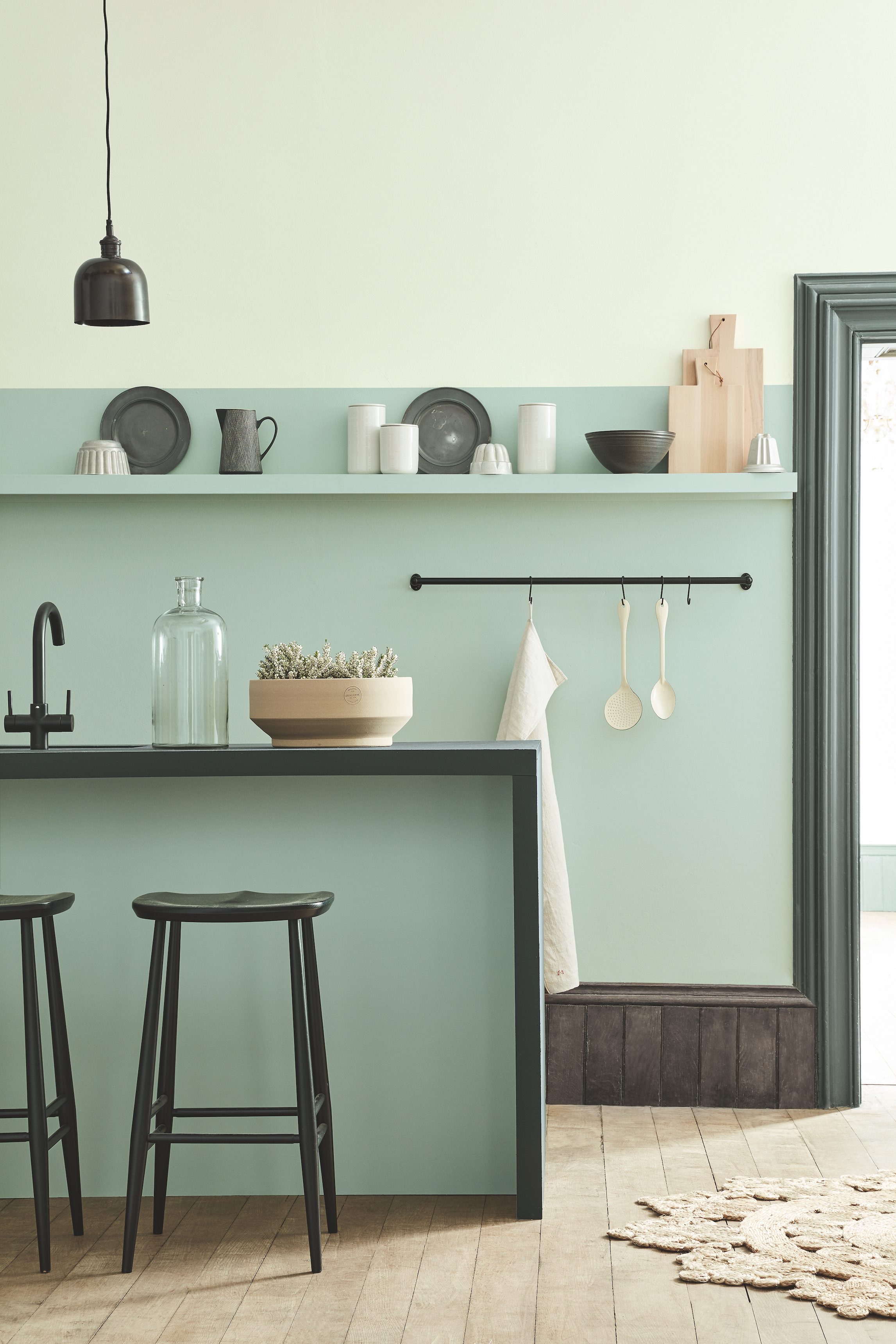
Play with fun kitchen paint ideas to create interest – no wall unit means you have more wall expanse to paint and you can have a bit of fun in the process! We love how the shelving has been incorporated into the paint design and it also zones the bottom half of the wall whilst matching the inner part of the kitchen island. Using two shades of the same color adds contrast and you can accessorize to enhance this too.
5. Run your shelving a long the worktop
Not having wall units makes the wall space much lighter visually, even if you still have some kind of storage to replace it. Here, the open shelving is painted in a pale grey that frames the tableware and other kitchen items perfectly, it also makes them easier to reach. The downside is that you need to keep them neat and tidy!
6. Look out for interest storage ideas
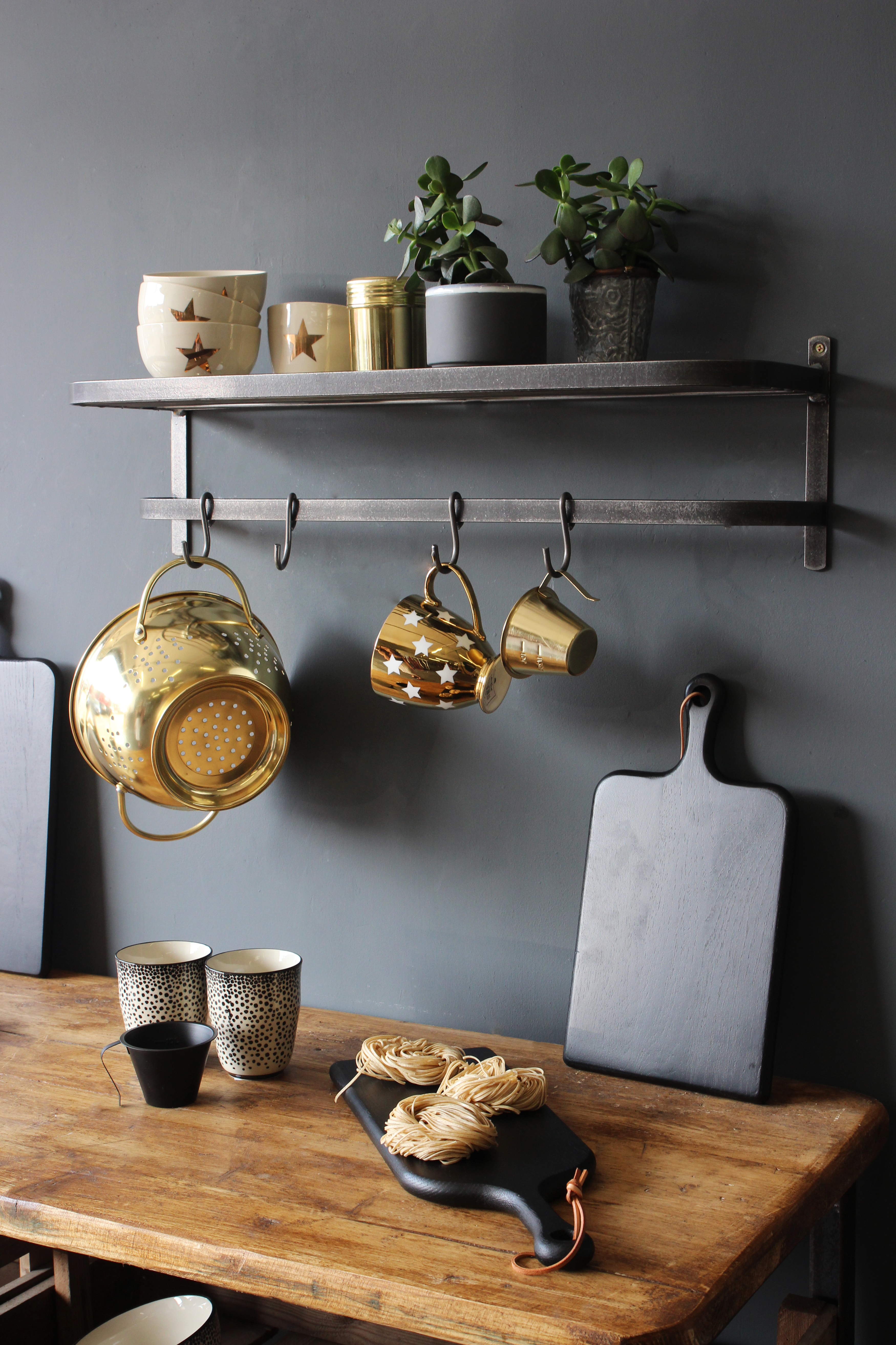
An alternative to the usual style of shelving, this industrial yet versatile iron shelf looks rather like the old luggage racks found on trains. The shelf on top can be used for those essentials and the rail underneath is ideal for hanging mugs, saucepans and colanders from. Its sturdy nature means it can withstand some weight as long as it’s fixed properly to the wall.
Join our newsletter
Get small space home decor ideas, celeb inspiration, DIY tips and more, straight to your inbox!
7. Or if you want a seamless look...
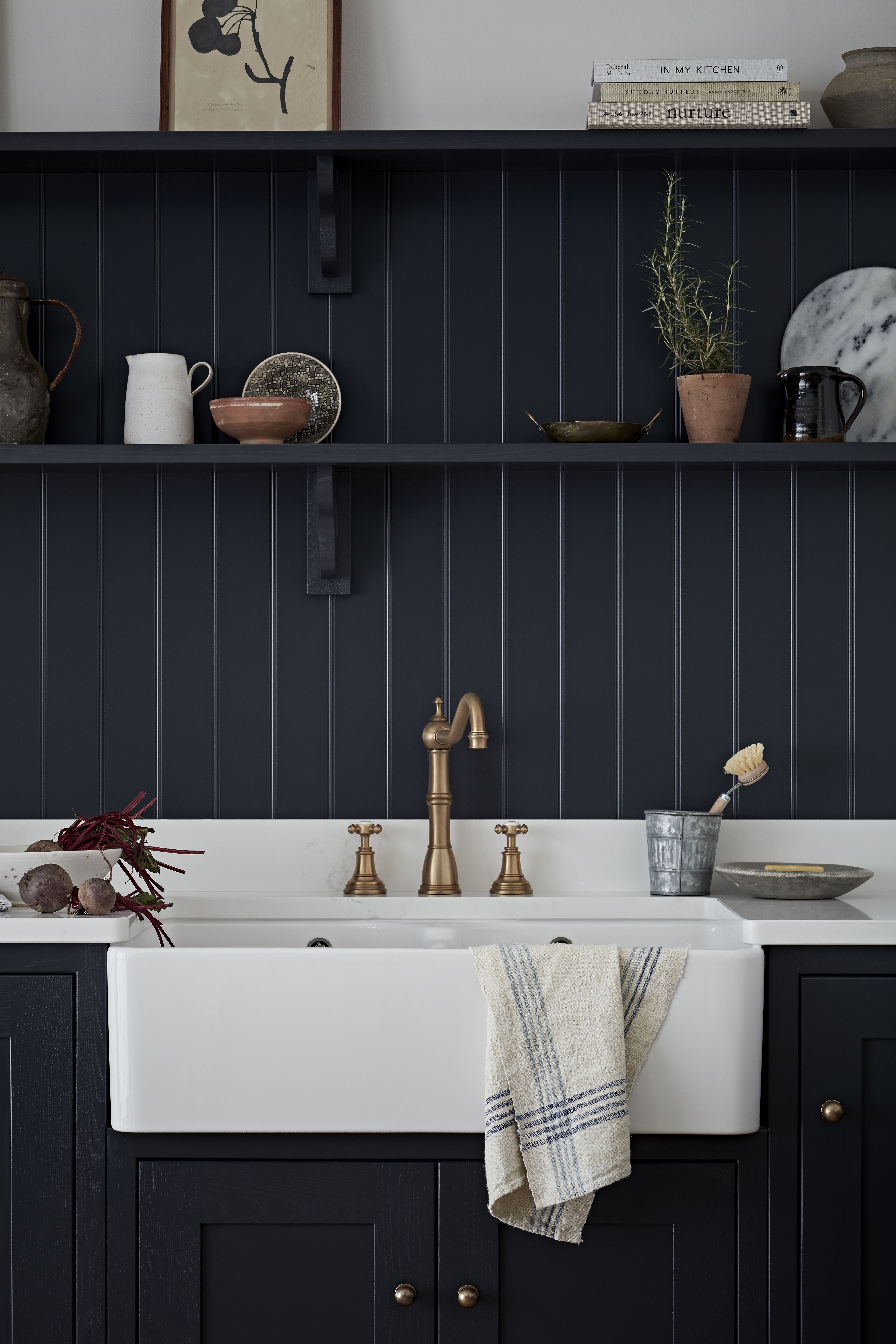
Consider painting your shelves the same color as your base units. This fabulous Shaker style kitchen is easy on the eye and oh-so-stylish, the look is about simplicity and less clutter anyway so it lends itself perfectly to the ‘ditch your kitchen cabinets’ look! Tongue and groove is a great way to add a feature to your wall space too, and then you can copy this idea of having two rows of shelving painted the same color and pop on your most used pieces to contrast against it.
8. Go for bare walls
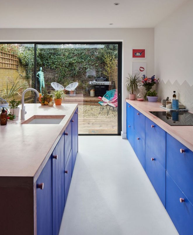
If you can, why not have completely bare walls? No units and no shelving – sounds scary right! But it is possible if you have good storage elsewhere like Nikki and Luke do in the form of their kitchen island or generously sized split drawer base units. The result is a streamlined look that then leaves the walls bare for a tile splashback and wall art to add pops of colour.
9. Use symmetry

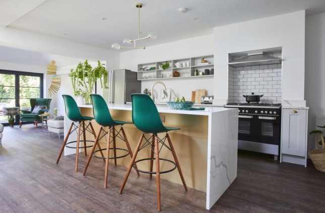
We love this open plan kitchen – a feature has been made of the shelving with the lighting that highlights them and they match the on-trend green through the scheme. If you still feel you need a bit more storage then consider a fixed display area above your kitchen island - rather like the glass storage you find in restaurants - and that’s exactly what you can keep on yours. The result is still a light and airy kitchen without the visual heaviness of wall units.
Sophie has been an interior stylist and journalist for over 22 years and has worked for many of the main interior magazines during that time both in-house and as a freelancer. On the side, as well as being the News Editor of indie magazine, 91, Sophie trained to be a florist in 2019 and launched The Prettiest Posy where she curates beautiful flowers for the modern bride.
-
 You won't believe this stunning five-bed family home used to be a tiny two-bed
Katie and Stuart went big with a double-story extension to create a dream space for themselves and their daughters
By Ifeoluwa Adedeji Published
-
 The freestanding bath in this dreamy bedroom is sheer five-star luxury
Emma and Martin wanted a suite just like in an upscale hotel — mission totally accomplished.
By Ellen Finch Published
-
 I just know 2023 is going to be all about black bedding sets
White sheets are out, black bedding sets are in — here's everything you need to know about this bedroom decor trend
By Louise Oliphant Published
-
 A bland beige bathroom is transformed into a STUNNING contemporary sanctuary
First-time homeowners Ellie and Oliver’s new bathroom is a well-planned fusion of modern pieces and exotic touches
By Ellen Finch Published
-
 Mattress disposal: how, where, and how much it will cost?
Mattress disposal is tricky. You’ve swapped it for a supportive new design, but how to dispose of the bulky old mattress? Follow our guide to find out...
By Sarah Warwick Published
-
 36 outdoor kitchen ideas – enviable and inspiring designs for your backyard
Enjoy alfresco cooking and entertaining all year round with the best outdoor kitchen ideas for every space and budget.
By Sarah Warwick Last updated
-
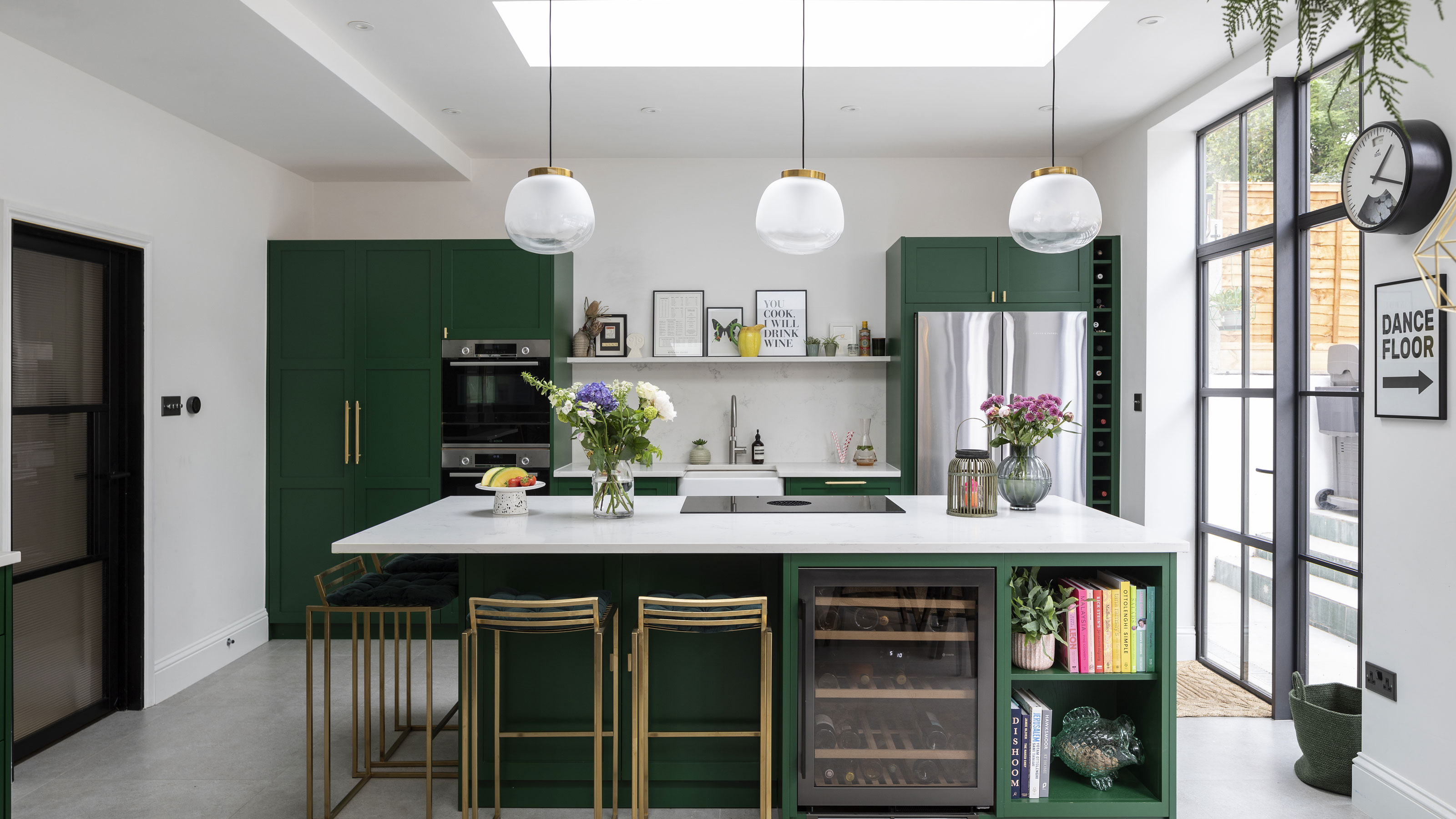 Real home: Gorgeous green kitchen has a fresh feel
A stunning extension and Charley Smith's clear design vision has resulted in a family kitchen-diner that’s ripe for entertaining.
By Ifeoluwa Adedeji Published
-
 [redirected] Best coffee beans: 12 delicious coffees to start your morning with
Your perfect cup of coffee starts with the coffee bean. We're sharing our best-bagged beans from coffee shop favorites to gourmet roasters.
By Jaclyn Turner Published