Feeling a tad overwhelmed by the constant demands of busy-bee living, work mountains, and constantly being 'switched on' with tech? We hear you! All the more reason to channel some zen into your home life with the best paint colors to create a relaxing environment that puts the calm into chaos.
Creating a calming home sanctuary is a lot to do with the color schemes you choose and layering textures. Full-on brights and busy patterns are not conducive to a quiet mind!
"We are investing in our homes as a way to treat ourselves and create a place to relax" says Ashley Banbury, senior color designer, Dutch Boy Paints. Noting how "A calming color palette perfectly balances comfort and elegance as we look to create a retreat in our home."
Whether you're looking for the best paint colors to enhance small spaces, or simply want to tone down the maximalism look, we’ve found some chillaxed looks to inspire you and guide you to creating a calming experience at home.
1. Switch-off with soft gray
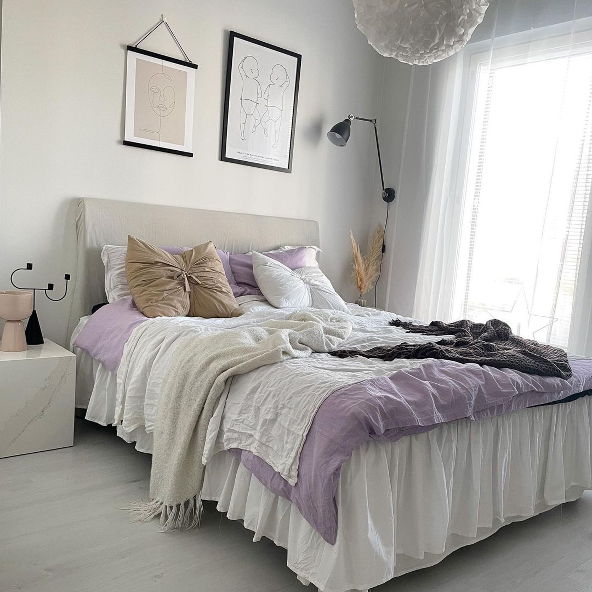
An evergreen favorite in the interiors world, gentle shades of gray provide an effortless, neutral backdrop in modern and trad spaces alike, balancing warm and cool, whilst oozing subtle, pebbly comfort.
For a chic twist on a feminine bedroom idea, choose a soft shade with undertones of lavender like Hint of violet from Benjamin Moore, on walls, and bring to life with on-trend lilac bedlinen, and relaxed layers in gorgeously tactile textures. A few black accents provide stylish contrast between light and dark. Be bewitched as the hue evolves with gradual moodiness with the changing light from morning cuppa to twilight snoozy herbal infusion.
2. Renew with blush
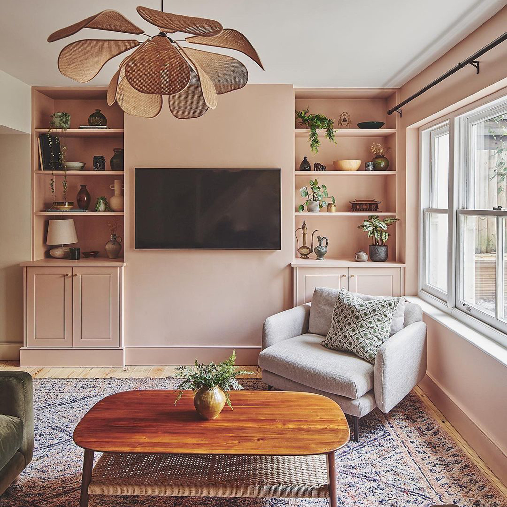
Gey rosy and radiate your apartment living room with a flush of blush for a space-enhancing injection of warming color that doesn't overwhelm you or your space.
Join our newsletter
Get small space home decor ideas, celeb inspiration, DIY tips and more, straight to your inbox!
This trending 'new neutral' offers a fashionable and softer alternative to traditional white or cream, pairing swoonily with natural textures like rattan and warm wood, and comfy boucle upholstery to create a gorgeously laidback interior. Airy and inviting, try continuing a centering shade across walls onto cabinetry and woodwork for a seamless aesthetic.
"In rooms with less natural light, a soft pink paint color on the walls, such as Farrow & Ball's Setting Plaster, will add warmth and softness without overwhelming the space, " says Chloe Weller, interior designer, Topology Interiors. Noting how this hue works as a backdrop for darker wood tones and plush textiles, perfect if you want to create a calm and welcoming space.
3. Reflect with tranquil green
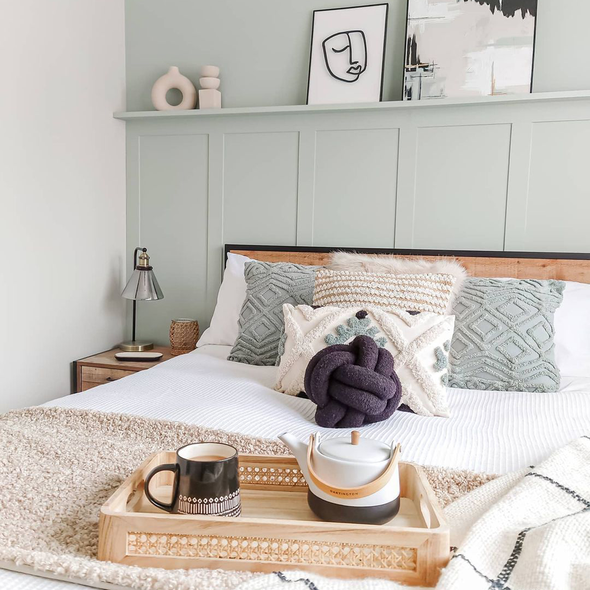
Nothing soothes the soul (or home palette) like a dose of nature. Banbury notes how biophilic design is all about creating that connection to nature within our own environments and how doing so can improve general well-being, sharing that it's "a design approach that is finding its presence in our homes."
Refresh your space and bring the vitality of the outside in with versatile minty tones that revitalize and ground, creating the ultimate mindful home.
"The need to find a connection to the outdoors and nature is getting a direct translation to the color we are bringing into our personal spaces— greens being one of them give us a connection to the outdoors," says Banbury.
4. Take a two-tone approach to color
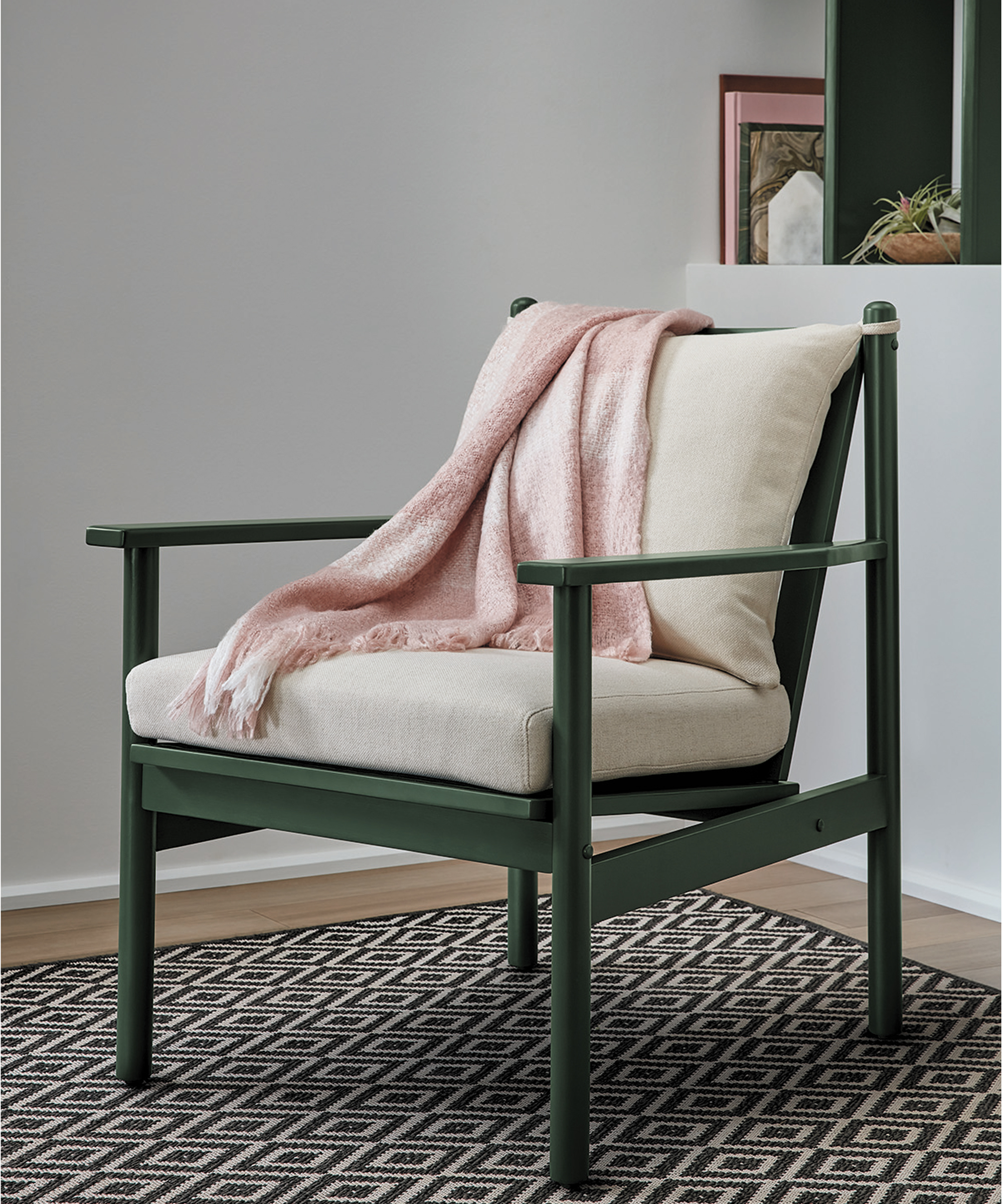
For added depth, adopt a two-tone approach, and combine a tranquil shade on the walls with a darker green on upcycled furniture like a tired chair or DIY upcycled coffee table.
Spanish Moss was carefully chosen by Banbury as Krylon’s color of the year. "Spanish Moss showcases the “power of green” and provokes an organic and restorative feel. At home, there's a renewed perspective on overall wellness, mindfulness, and meditation. The restful ambiance of this plant-based color provides a strong, soothing connection to the richness of nature, delivering authenticity and stability to every space."
5. Opt for coral comfort
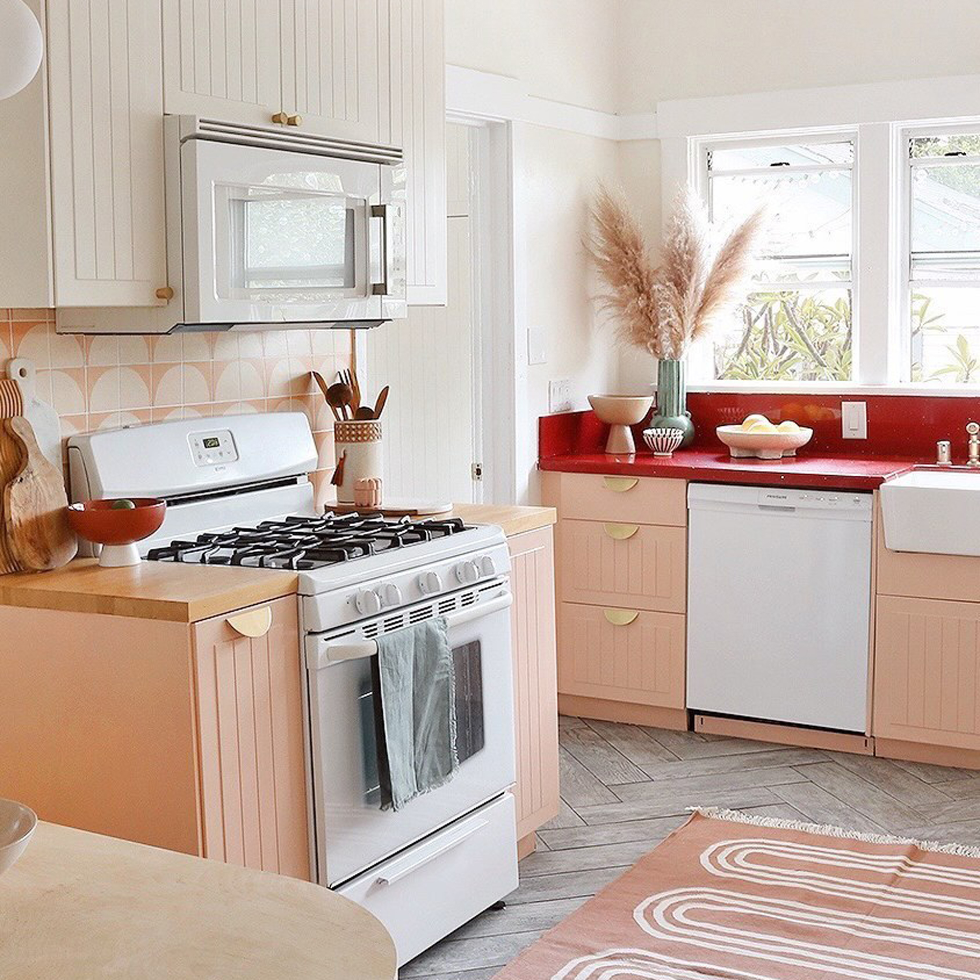
Bring new energy to your eating, socializing, and perhaps even workspace with a modern kitchen design that features a playful yet calming coral palette. Soft sun-baked shades invoke a sense of escapism, transporting your space into a sunny haze of happiness and chilled vibes.
As shown here in this playful kitchen design by @hotpinkpineapples, we love how coral shades across the backsplash, kitchen cabinets and rug have been perfectly partnered with scalloped patterns and details for a contemporary coastal revamp.
Love this look? Take a splash with Benjamin Moore's Coral Buff — a pale coral hue heightened by a tinge of pink — yummy!
6. Channel a Mediterranean odyssey with terracotta
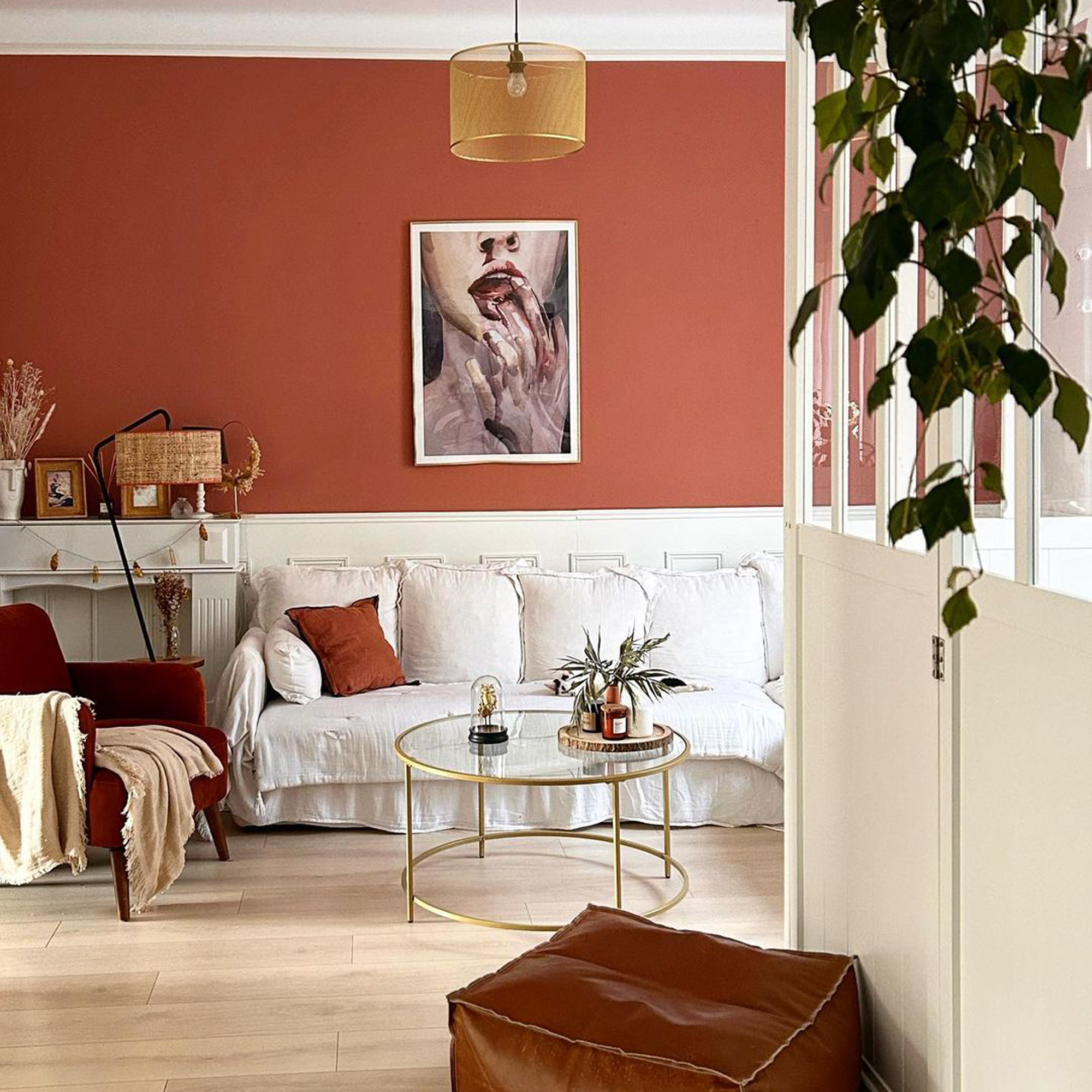
It's earthy, it's evocative, and we're here for it. Settle down for a cup of chai and let your bohemian soul radiate positivity heightened by this restorative hue that can't help but awash any space with cozy, warming energy.
Alluring Clove Bud, from Valspar is the perfect pick for a boho living room and more free-spirited space. Combine with sumptuous textiles, natural textures, and houseplants aplenty to reveal your very own desert rose escape.
7. Unplug with natural neutrals
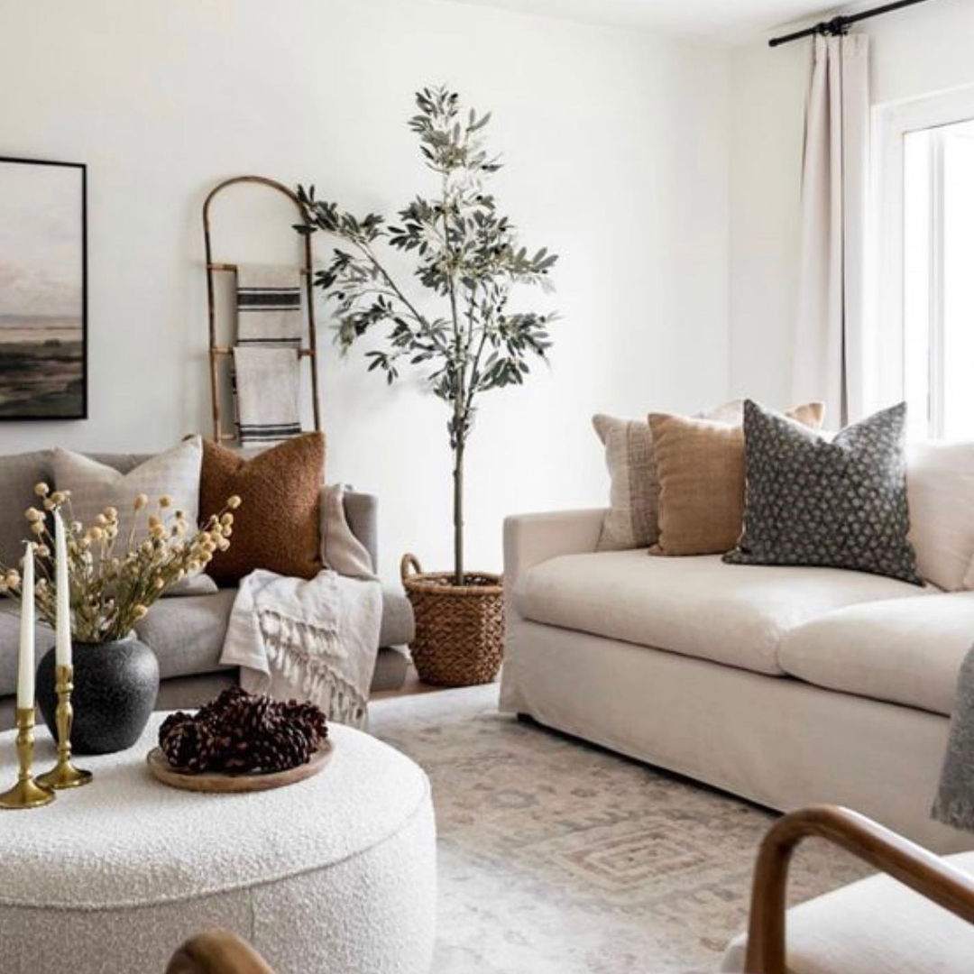
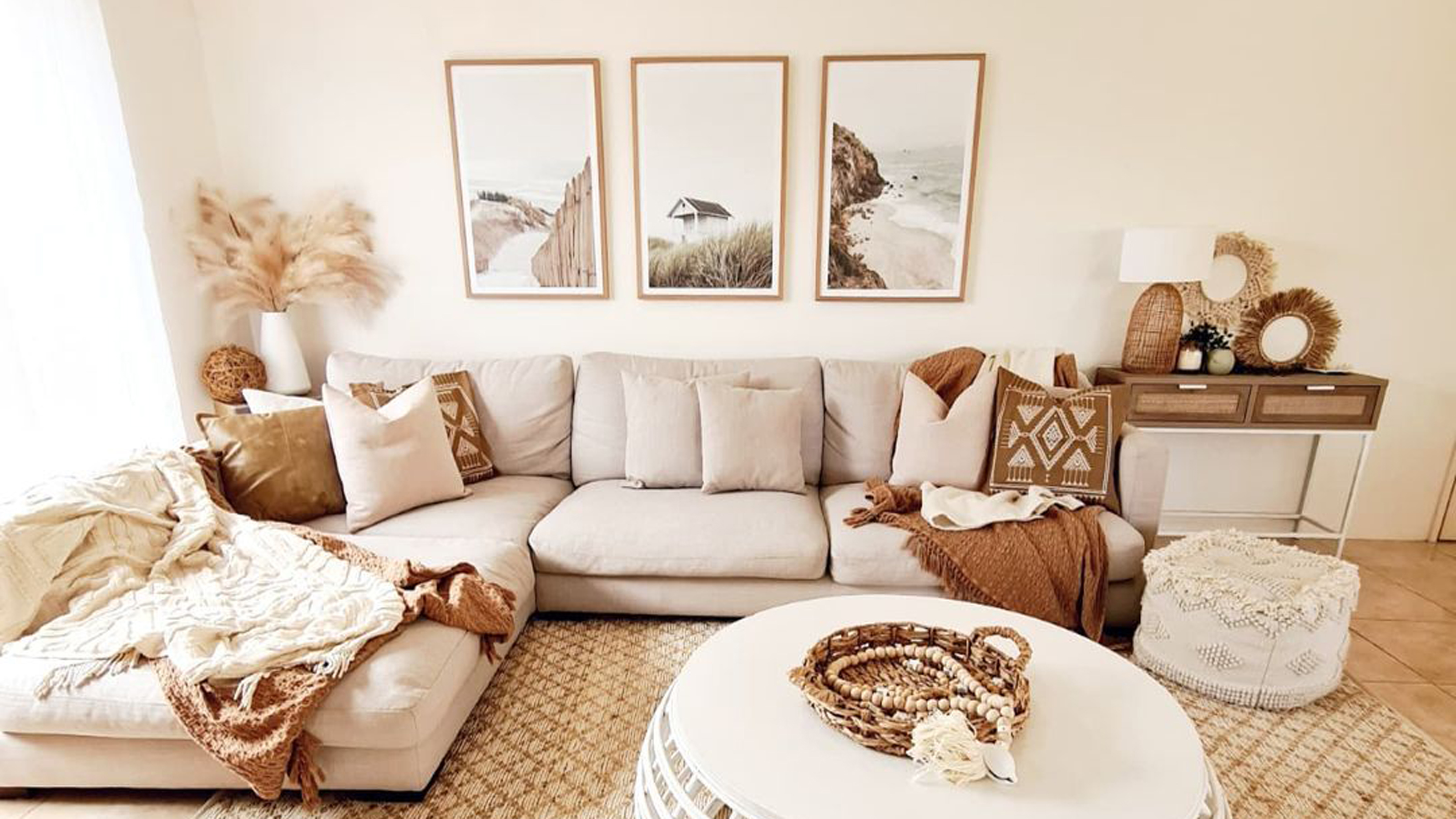
When you're thinking of living room paint ideas, look to nature as a plentiful inspiration board full of colors, textures, and more to play on the senses. Layering naturally warming hues like warm white, sand, stone, and subtle earthy browns lends a down-to-earth aura, that's inviting and interesting, without being too cold or bland.
To recreate this harmonized look, begin with a warm white foundation on walls, before introducing a plethora of boucle furniture and layered relaxed textures, natural woods, woven accessories, and artisan makes — think rooted authenticity all the way.
8. Create an optimistic bolthole with sky blue
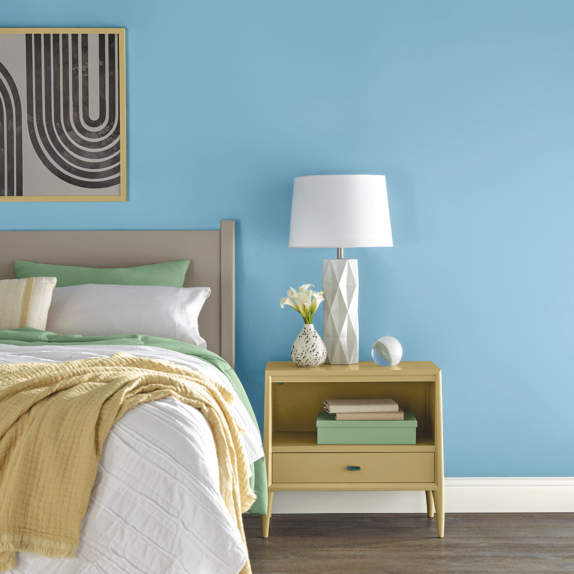
Let soothing sky shades of blue drift into your home, bringing an enlightened focus to recharge, reflect and renew your space.
Shown above, the bold but comforting, organic yet eclectic Wistful 2023 trend palette, from Dutch Boy Paints, melds the energy of retro-bright tones with livable neutrals.
"Enjoying a life of slowing down and having contentment has created an appreciation for traditional colors in a new way," says Banbury. "We are finding comfort in nostalgic design aesthetic; the Wistful color palette celebrates a vintage inspired look in a new modern way."
Sophie has been an interior stylist and journalist for over 22 years and has worked for many of the main interior magazines during that time both in-house and as a freelancer. On the side, as well as being the News Editor of indie magazine, 91, Sophie trained to be a florist in 2019 and launched The Prettiest Posy where she curates beautiful flowers for the modern bride.
-
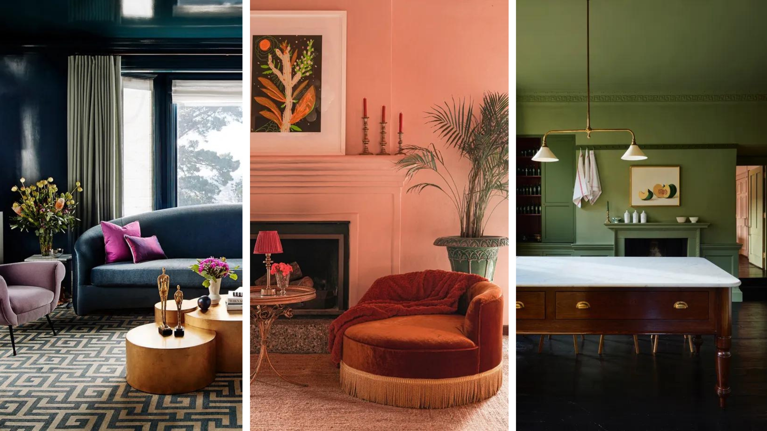 What is color drenching? Interior designers love this bold trend
If you're curious about color drenching, our interior designers explain what it is, how to do it, and what to shop to bring it into your home
By Sophie Warren-Smith Published
-
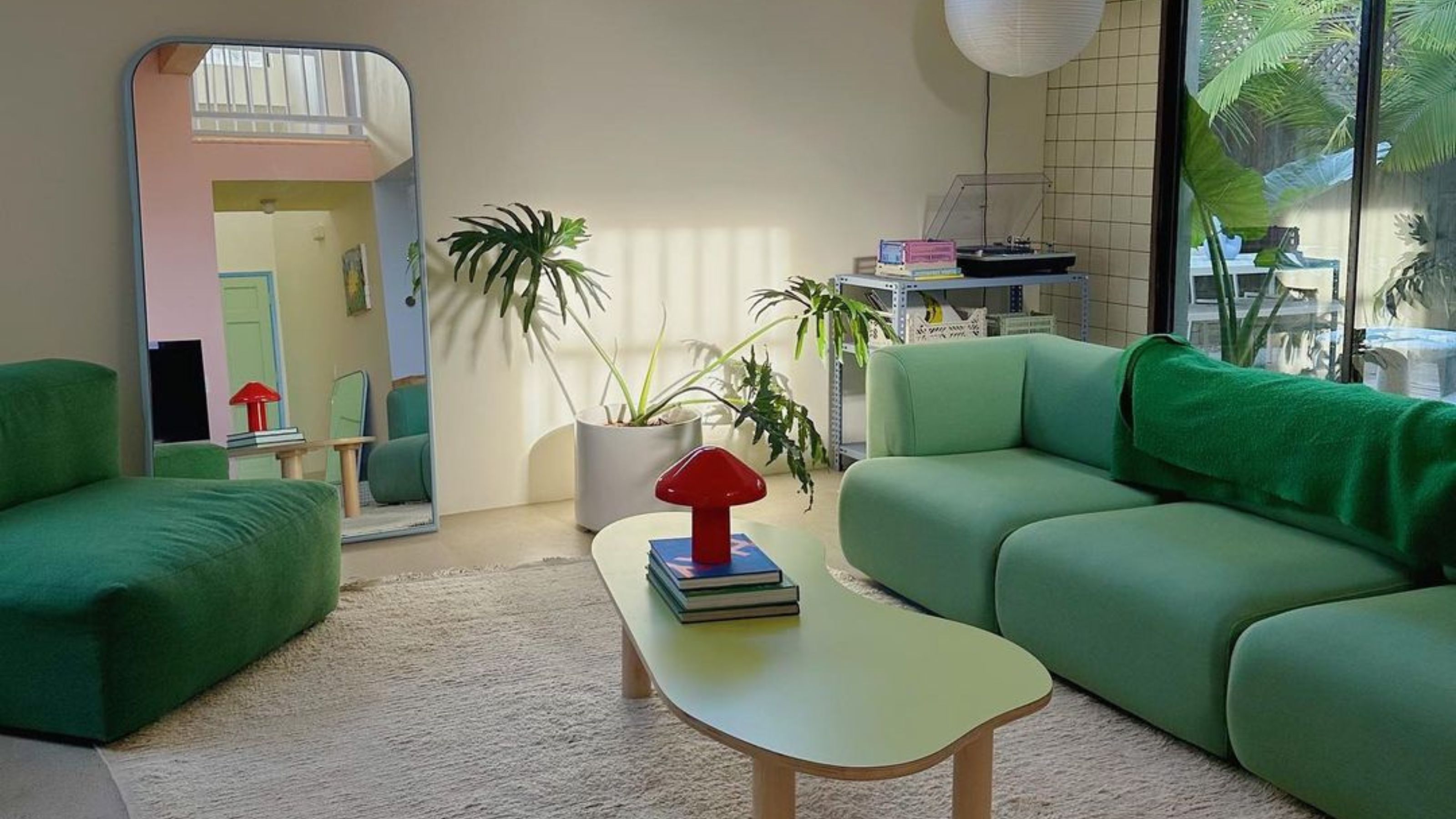 5 Gen Z and millennial influencers to follow for all things homes and interiors
Need some on-trend home and interior inspo? These are the five millennial and Gen Z influencer accounts I can't stop scrolling for small homes and rentals
By Louise Oliphant Published
-
 5 colors you should skip using in a small apartment, according to a designer
An interior designer tells us which five colors to avoid painting a tiny apartment and how to incorporate those out-of-bounds hues instead and avoid small apartment color mistakes
By Kara Thompson Published
-
 10 dorm room ideas to make your place the cutest on campus
Heading to college soon? These dorm room ideas range from sweet styles to savvy solutions...
By Eve Smallman Last updated
-
 Valspar's colors of the year have been curated to match your star sign for 2022
Are you curious to know the best new color for your horoscope?
By Rebecca Knight Published
-
 Alcove ideas: 25 ways to style an awkwardly shaped space
From home offices to cozy reading nooks, copy these alcove ideas to create an inspiring space – with shelving or not...
By Hebe Hatton Published
-
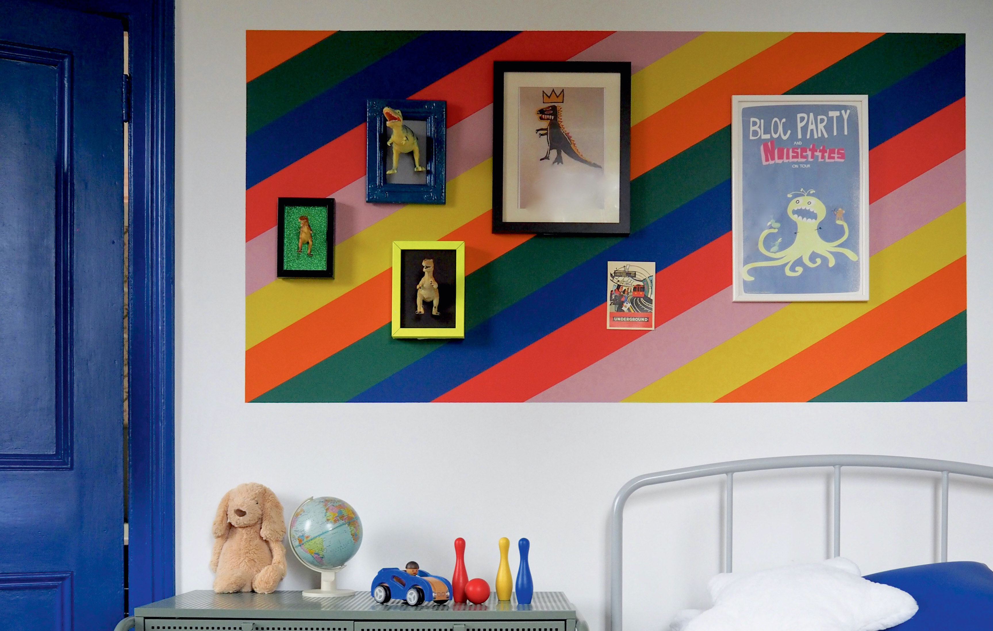 Color blocking walls: 22 clever ideas to add shape and style
Color blocking walls with paint is a great way to add drama, power and oomph to your space. Here's some of the best inspiration around...
By Anna Morley Published
-
 It's true, Target's Studio McGee collection has all of your holiday decorating handled
Target's new Studio McGee installment will deck all of your halls — and so much more!
By Brittany Romano Published