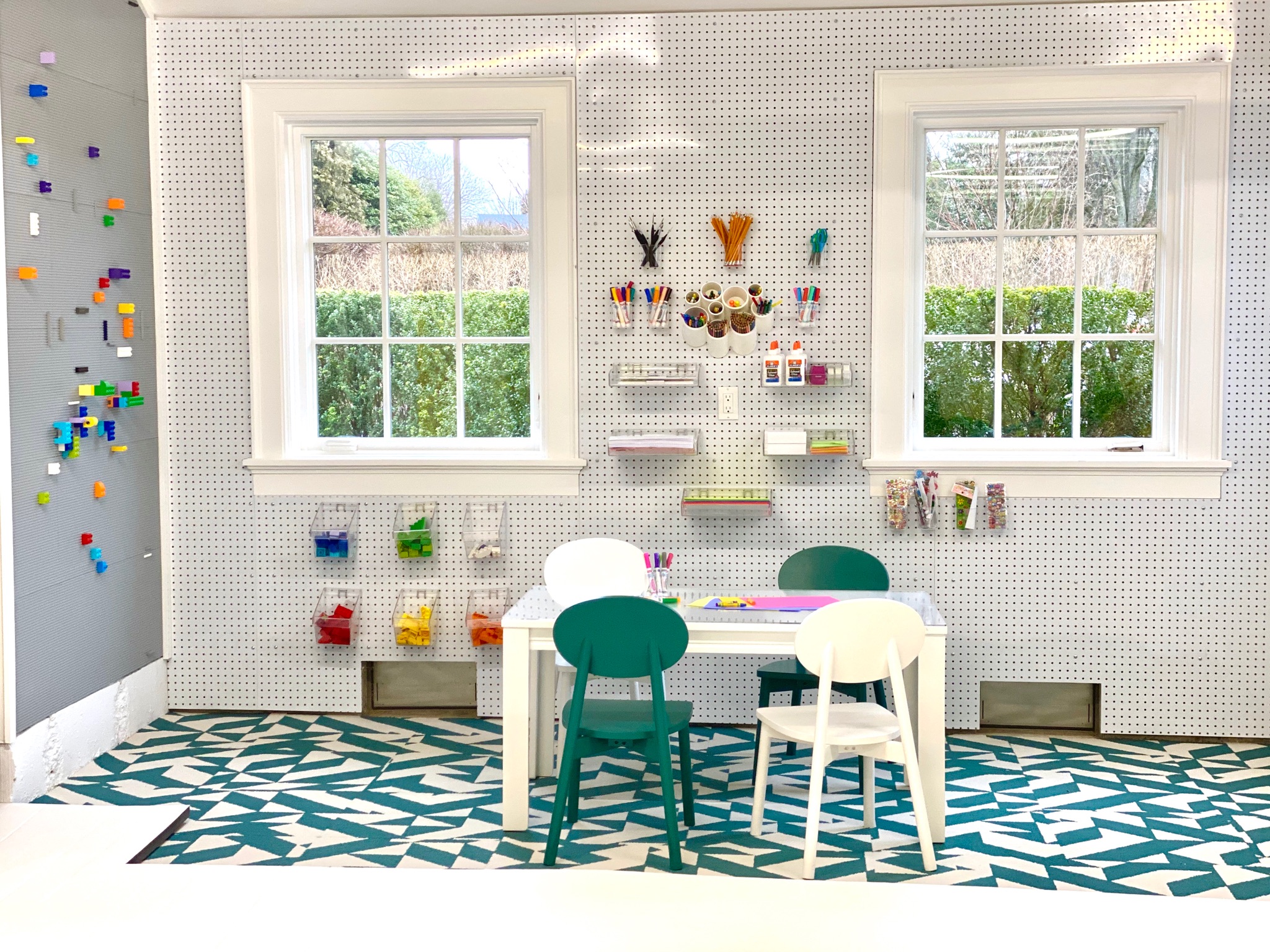

Longtime educator Karri Bowen-Poole was teaching at a local preschool when it occurred to her — “What if I took the systems we use in the classroom and incorporated them into people’s homes?”
So, Bowen-Poole set out to help parents create better play spaces for their children, smart playrooms, if you will, and she tapped D2 Interieurs designer Denise Davies to make them beautiful along the way. Together they founded Smart D2 Playrooms to create spaces customized to kids’ ages, interests and developmental needs.
“Every room deserves good design, including the playroom,” Davies says. “The perfect kids’ play spaces should be enjoyed by the kids and appreciated by the adults. Now more than ever, parents are understanding the need for well-designed educational products for their playroom.”
The duo has created play spaces in swanky Manhattan apartment buildings (with big-name residents like Nikki Hilton) as well as in home garage conversions. Bowen-Poole and Davies have also recently launched a site to sell their “smart” play products direct to consumers online.
Here, the pair shares their secrets for creating a smarter playroom in your own home.
1. Focus on physical play
“A lot of parents don’t understand the educational value of physical play,” Bowen-Poole says. “Swings are incredible for kids, for example. They balance their vestibular system.”
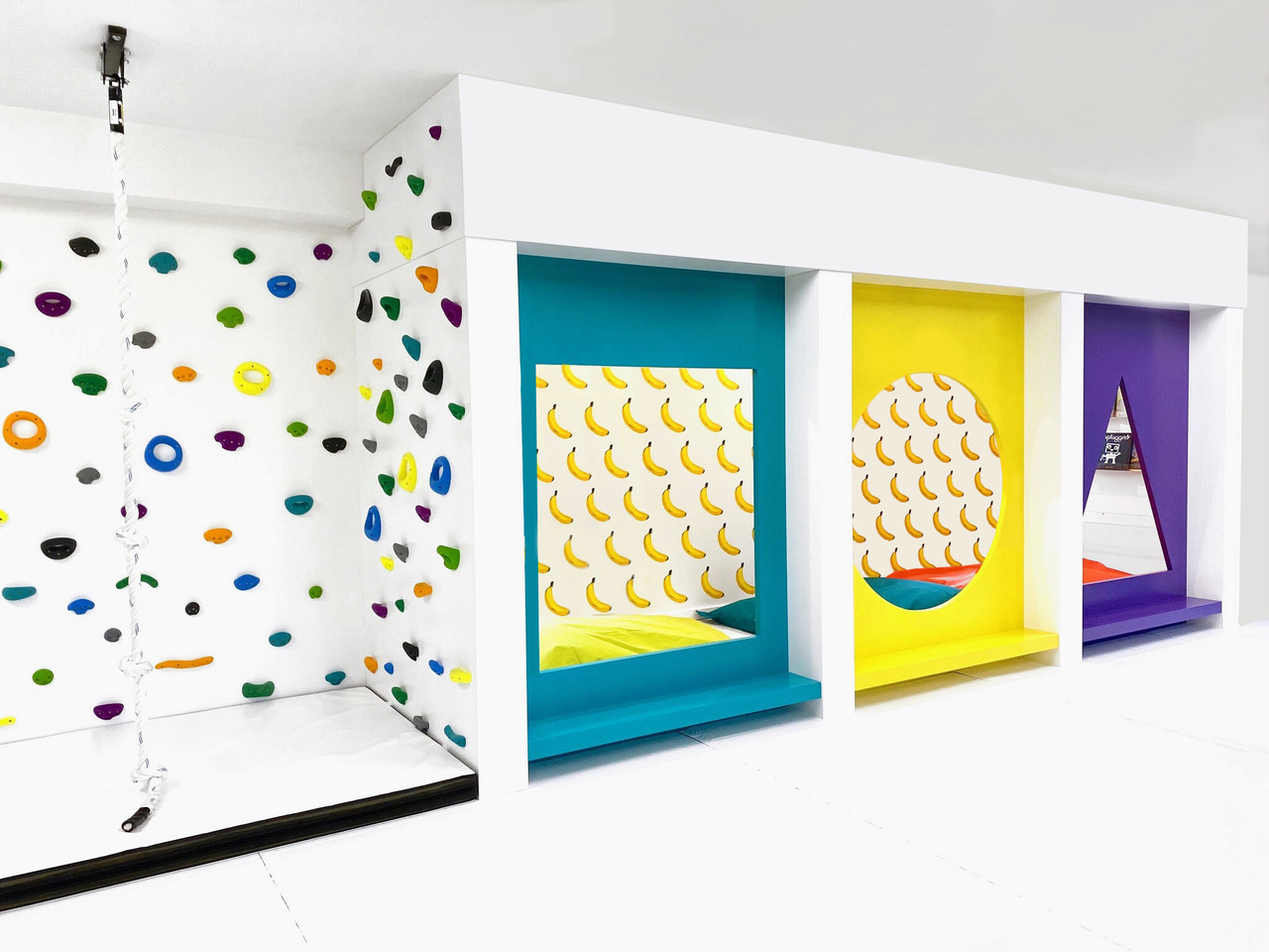
Think monkey bars, ropes, climbing walls or even ball pits for toddlers. For handy homeowners, Smart D2 Playrooms has developed a climbing wall with a reinforced panel that can be mounted onto any interior wall.
Join our newsletter
Get small space home decor ideas, celeb inspiration, DIY tips and more, straight to your inbox!
2. Encourage make believe
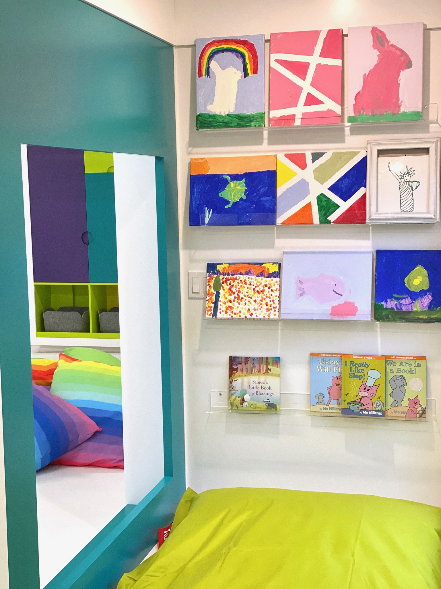
Pretend play is a great way for children to flex their imaginations. Bowen-Poole says to create areas meant for storytelling with books and dress-up clothes. “Don’t make it scripted,” she adds. “The key to longevity is not to make it one type of play. Maybe it’s a market, or maybe it’s a zoo.”
Then, tailor the idea to the child’s age group. Smaller children under three might enjoy a playhouse, while older kids would prefer a cool fort.
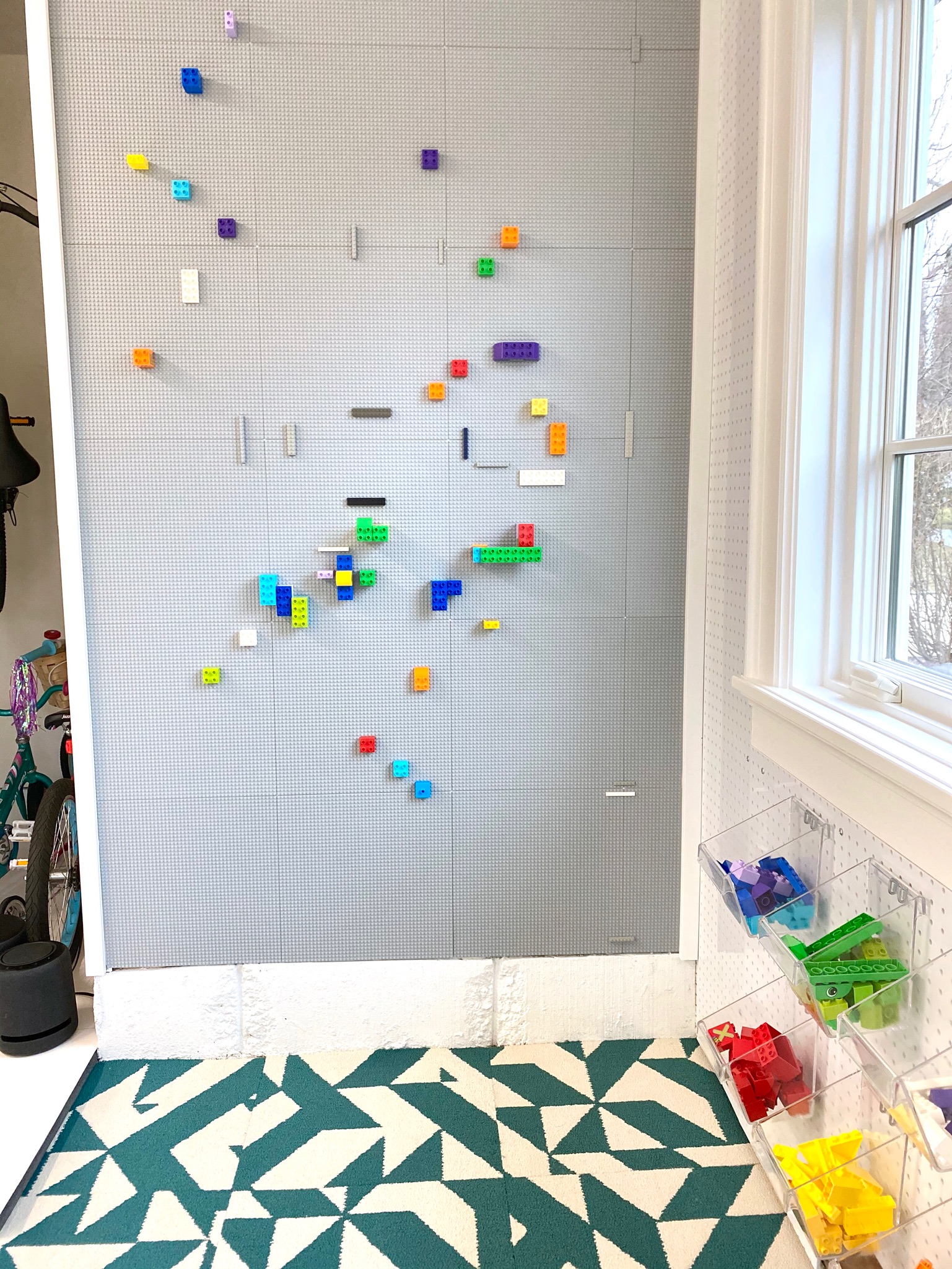
Include lots of open-ended toys like Legos and blocks
3. Think open-ended toys
Today’s market is flooded with battery-powered toys that talk, dance and sing. “These are fun for the kids at first, but they don’t last,” Bowen-Poole says. “If all the toys are doing the talking, the kids aren’t creating.”
She recommends going back to basics. Think floor play, blocks and animals. Unlike talking toys, art sets, Legos and tabletop set-ups encourage problem solving and risk taking. Since there isn’t one end result (like with Tickle-Me-Elmo, for example), kids continue to think of new ways to reimagine these basic toys.
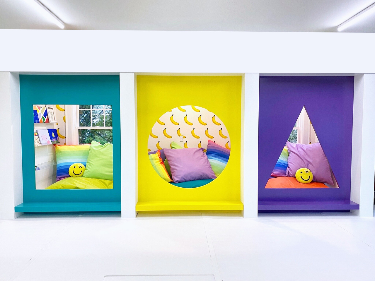
4. Design is important too
“When you think of a kids’ play space, you think of primary colors and bad design,” Davies says. When she consults a client about a Smart D2 Playroom, she approaches it like any other interior. “I get to know the client, who they are, what they like and design the space like I was designing their house. But, I get to go bananas with it and push the envelope because it’s a playspace.”
By “bananas,” Davies is talking about literal banana artwork decals as well as fun touches like neon signs, bright wall murals and playful patterned rugs. Still, these whimsical details can be reflective of a family’s tastes and style.
This way, the room doesn’t have to be reserved for little ones only but can be a space for the whole family. In Bowen-Poole’s “Smart” garage, for example, a handy ceiling hook can clip on a swing or rope for her youngest children or is easily swapped for a punching bag her oldest son enjoys.
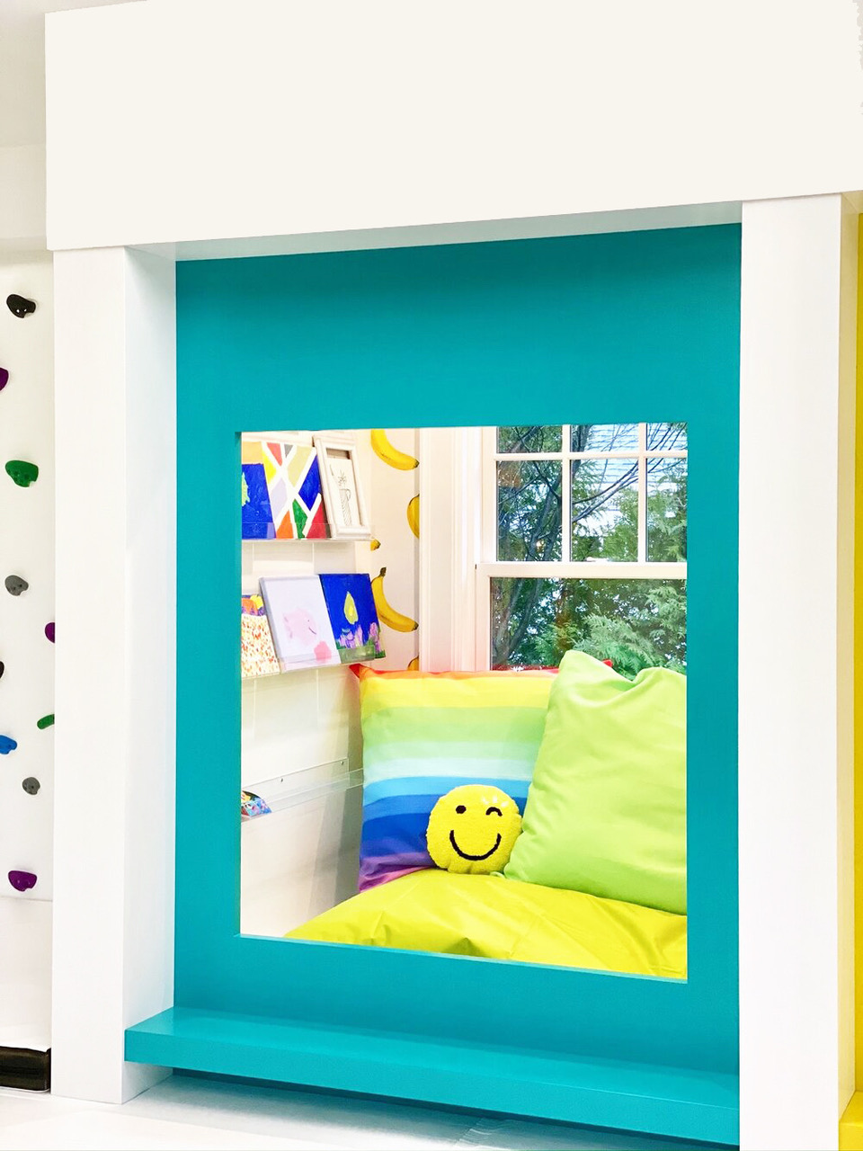
5. Don’t forget finishing touches
Like any other room in the house, a play space should have finishing decorations like throw pillows, accessories and artwork. Davies says after a project is done, D2 always returns for a “last layer,” and playrooms are no exception.
In a client’s garage design, for example, the family initially passed on extra pillows and a wallpaper statement wall. After the room was installed, the homeowner could see the design was flat and opted for some extra accessories to take it to the next level.
Read more:
After serving as an editor for luxury publications for nearly a decade, Ann Loynd Burton struck out on her own as a freelance writer covering design and lifestyle. Along with her work highlighting decor trends for Real Homes, Loynd Burton has covered interiors for such publications as Apartment Therapy, Aspire, Cottages & Gardens, and Galerie.
-
 5 Gen Z and millennial influencers to follow for all things homes and interiors
Need some on-trend home and interior inspo? These are the five millennial and Gen Z influencer accounts I can't stop scrolling for small homes and rentals
By Louise Oliphant Published
-
 8 calming paint colors to create a blissful home sanctuary
Relax, revive and renew with a soothing palette of mindful paint shades.
By Sophie Warren-Smith Published
-
 20 front door ideas: designs for style, function and added curb appeal
The best front door ideas will combine good looks and curb appeal with function and security to enhance your home's appearance from the outside in.
By Emily Shaw Published
-
 10 dorm room ideas to make your place the cutest on campus
Heading to college soon? These dorm room ideas range from sweet styles to savvy solutions...
By Eve Smallman Last updated
-
 Alcove ideas: 25 ways to style an awkwardly shaped space
From home offices to cozy reading nooks, copy these alcove ideas to create an inspiring space – with shelving or not...
By Hebe Hatton Published
-
 It's true, Target's Studio McGee collection has all of your holiday decorating handled
Target's new Studio McGee installment will deck all of your halls — and so much more!
By Brittany Romano Published
-
 Spotted: 9 celebrity home decor brands that will have you living like your favorite A-listers
So many celebrity home decor brands to shop for, so little time.
By Brittany Romano Published
-
 This World Market mirror rivals *that* designer best-seller (at a fraction of the price!)
This World Market mirror is a dead-on doppelganger for Anthropologie's version — but at a fraction of the price.
By Brittany Romano Published