Before & after: A feminine nursery becomes a gender neutral kids room for two
How one design-savvy mom created a boho-inspired shared space for her boy-girl siblings

Get small space home decor ideas, celeb inspiration, DIY tips and more, straight to your inbox!
You are now subscribed
Your newsletter sign-up was successful
Living in a three bedroom home with two children may seem ideal; a room for each child and a room for the parents, right? Well in this day and age, a guest room is essential, as well as extra storage. So converting our guest room/wardrobe room into a nursery for my newborn son wasn’t an option.
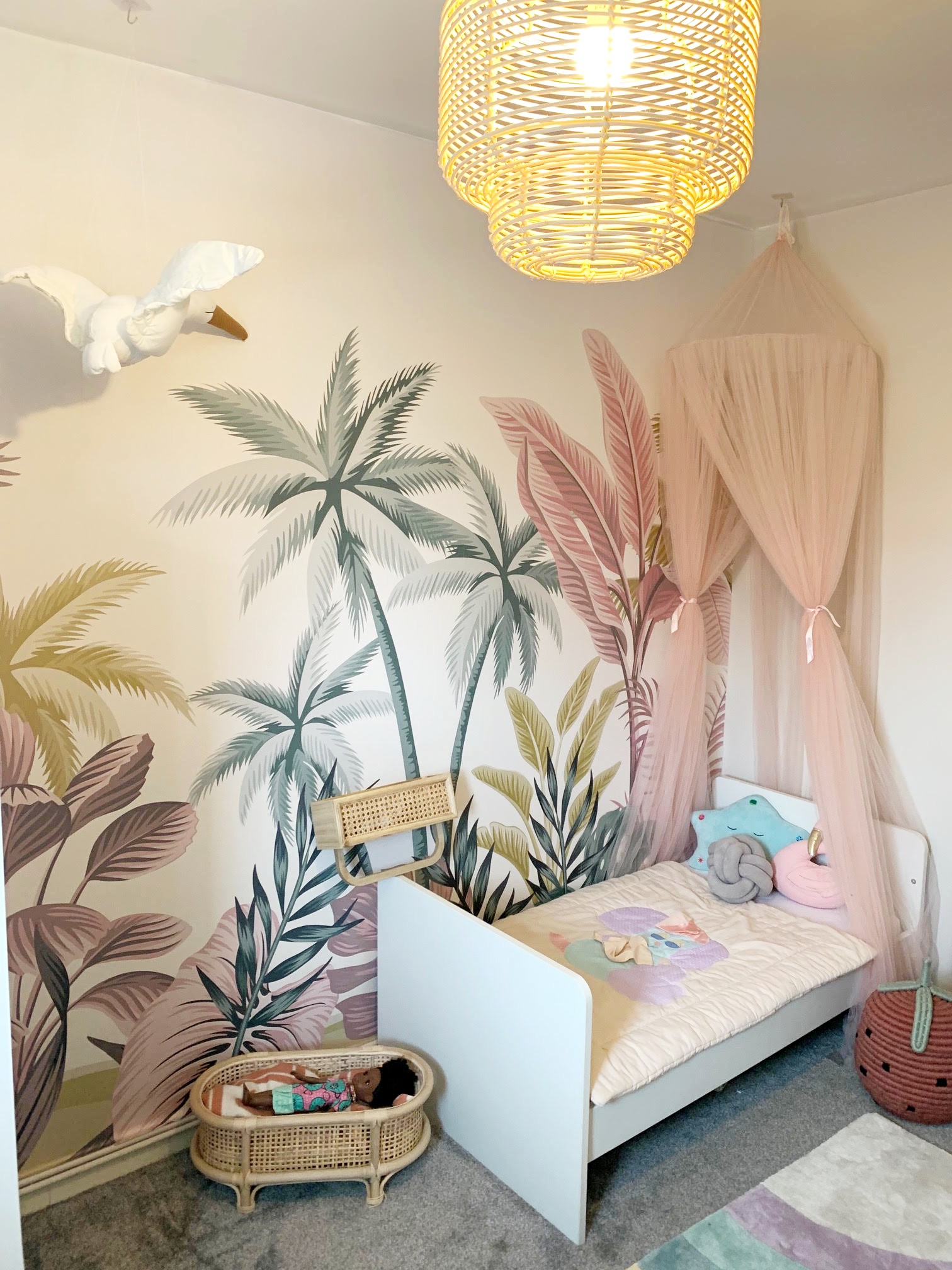
What was an option was converting my now toddler's very pink nursery into a shared bedroom for the two. I wanted a less gender specific kid's room idea, and something more inclusive that also retained characteristics of a girl’s room since my new son won’t be actively using it for some time.
I decided to design a space that would have two distinctive styles that worked together perfectly. I would miss all my DIY projects in the previous room, such as the DIY paper flowers, floral wreath, floral frame and butterfly lampshade, it was time for something new!
Article continues belowHere’s a look at the room before:
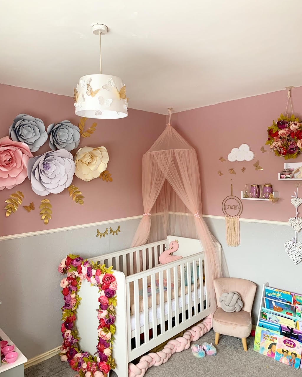
And here is the after:

Usually, when designing a space, most designers, stylists or DIYers aim for one focal wall, point of interest or pop of colour. In bedrooms, it is usually the wall the bed is up against and in living rooms it is often the wall the tv is displayed on. It is often characterised by a pop of colour, striking wallpaper or an elaborate (or simple) display of shelves or art.
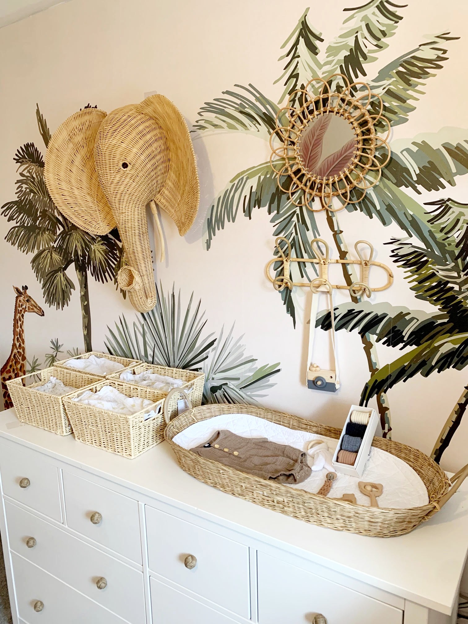
In the interest of fairness and to give each child their own “side” I decided not to create one focal wall, but two. To achieve this, I chose two murals from ilovewallpaper.co.uk with different but very complimentary images. One mural was a bit more feminine with its pink tones, while the other more masculine with its darker and green tones. Murals are a great alternative to traditional wallpaper designs. They are often characterised by an image rather than a pattern and can be adjusted to fit the size of your wall. Unlike wallpaper which is generally designed to repeat across all walls, murals are typically designed to fit on only one focal wall.
Get small space home decor ideas, celeb inspiration, DIY tips and more, straight to your inbox!
I then created two mood boards that would compliment each “side” of the room:
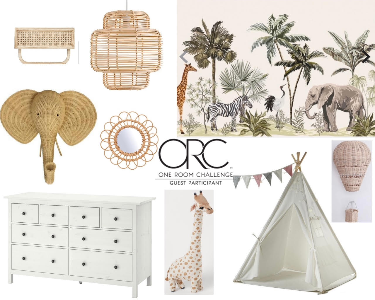
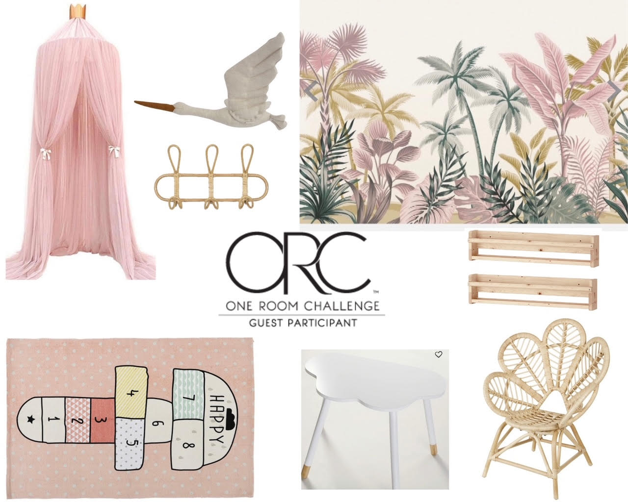
I sourced wood, rattan and bamboo accessories such as the large elephants head, rattan elephant and bamboo mirror. This gives an element of sustainability to the room.
To prepare the room for the new look I had the task of removing the old wallpaper and dado rail. When we bought the house, the room had a very old wood chip wallpaper below the dado rail and thin wallpaper on the top half. To save money, we opted to just paint over the wallpaper with a view to removing and skimming later down the line.
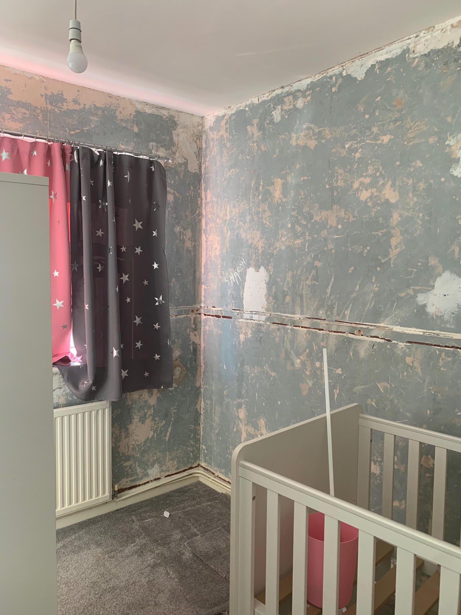
I hired contractors to remove the wallpaper (which was fairly easy to remove using a steamer) and dado rail. Once removed we assessed the walls and concluded that a skim coat (a thin coat of plaster) would be appropriate. After the skimming I then gave the walls a mist coat myself. A mist coat is a thin watered down coat of paint which is brushed onto fresh dry plaster. The point is to create a solid base for the paint. If fresh plaster isn’t mist coated, depending on the moisture of the walls, paint can penetrate into it and may need multiple coats of paint or the colour could be altered.
After the mist coat I painted two walls with two coats of the paint colour.
Then it was time to paper the walls. Fortunately the murals came in a size perfect for the walls without being customised. Each panel is numbered at the bottom and can be cut along the cut line and they are to be placed in the numbered order on the walls.
Note, I find that the easiest way to apply wallpaper is to paste the wall, rather than the paper. That makes it easier to ensure the panels are lined up well before applying to the whole strip.
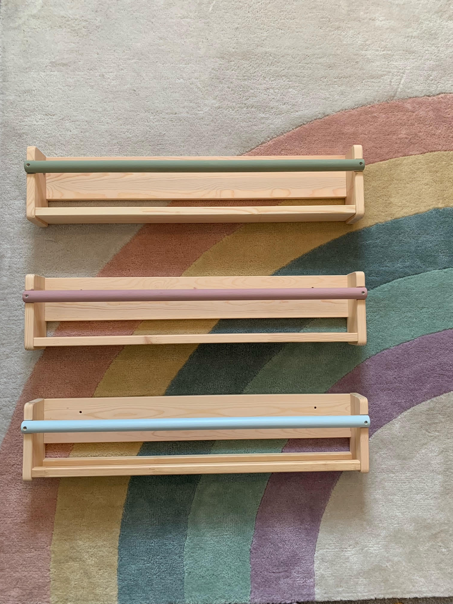
Once complete I focused on dressing the room with pastel colours, including customising Ikea shelves that will be used to store books. I painted each spindle using left over sample paint pots in colours that compliment the Next, rainbow rug in the space.

The elephant head, floating rattan hot air balloon and floating stork create fun 3D elements to give the space a wow factor. The teepee is intended to be a shared play space for both children and the desk area a suitable place for learning, reading and crafts.
I really love how it all turns out and my toddler does to!
Alimah-Shadia Sitta is part of Real Homes' Real Experts panel. She's a UK-based investment banker, designer and DIYer and shares her favourite tips, projects, and ideas with us twice a month.
