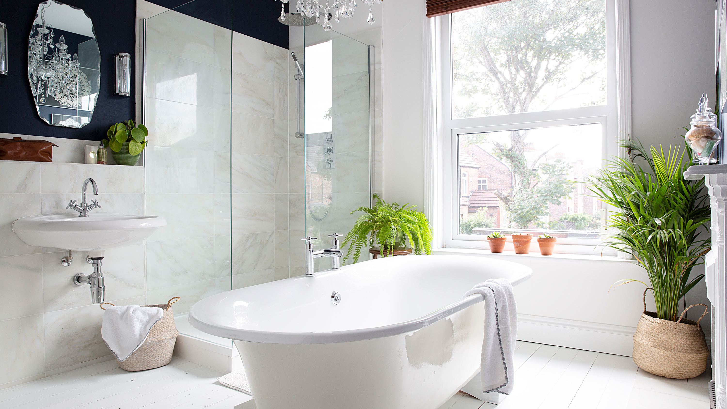
Designing a bathroom can be a minefield. Choosing the best layout for your space, the materials, the hardware, the colours– there are so many decisions involved.
When A&E doctor Peter, and partner solicitor Sam, came to renovate their large bathroom in their late Victorian semi in Cheshire, one decision, at least, was already made for them.
The bath was positioned centrally to the room, giving a real luxurious feel, with a shower in the corner, and a basin to the side. This layout, they decided, would work nicely for them. So Peter set out on the task of designing the space. The challenge allowed him to get his creative juices flowing, as a welcome break from his stressful job.
We chatted to him to share how he curated this light, bright and elegant bathroom.
Head here for more luxury bathroom ideas.
The before
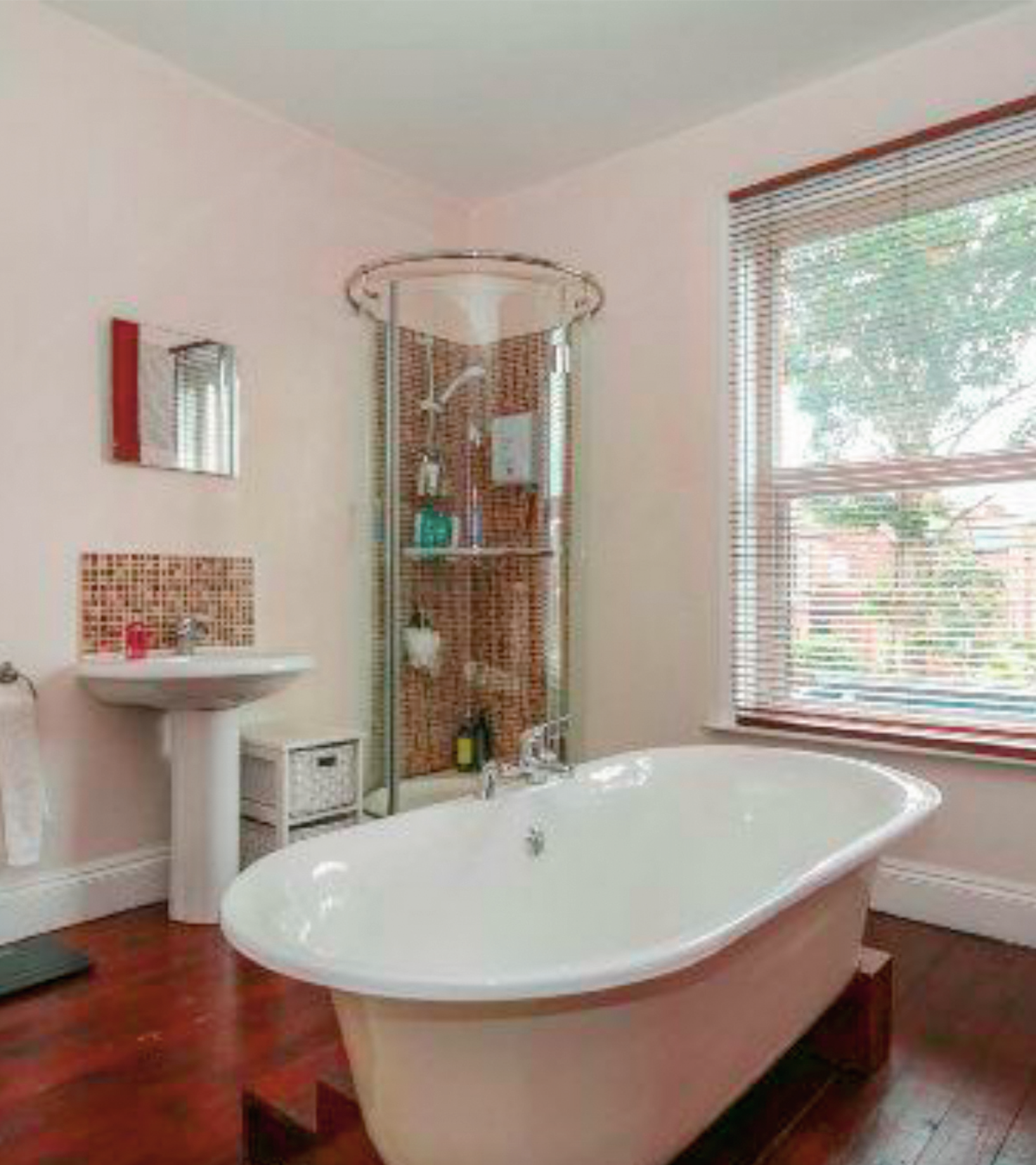
‘I think originally the room must have been a bedroom and was changed into a bathroom one or two owners ago,' says Peter. 'It is really nice still having the fireplace as a feature in the room. The bath was where it is now, and the shower cubicle was a small corner unit. It wasn’t very nice to look at and leaked every time you had a shower. Plus there wasn’t much space in it, which was quite frustrating as it is quite a big room and could take a larger enclosure.'
‘The room is south facing and the bath faces the window looking out over gardens. The previous owner used to have blinds, but as no one can see in directly it’s completely private. '
Join our newsletter
Get small space home decor ideas, celeb inspiration, DIY tips and more, straight to your inbox!
The after
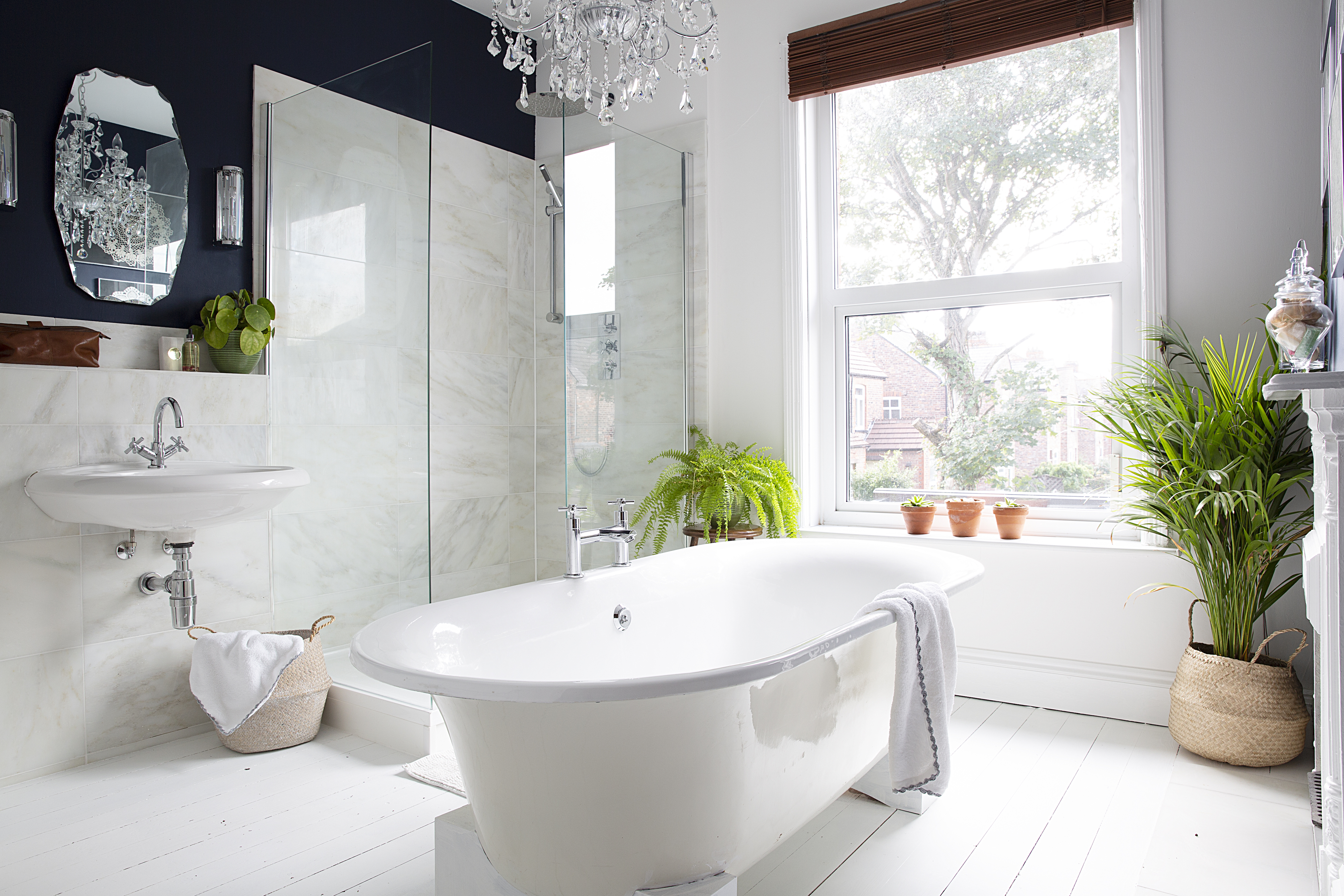
What a difference! The large frameless shower screen really opens up the space, while the marble tiles bounce natural light around the room, making it feel so much bigger than before.
‘Because we didn’t want to spend a gigantic amount of money, we reused as many of the original fittings as possible, such as the bath and toilet. We changed the bath and basin taps for smart new designs that matched. It ties everything together really well,' says Peter. The couple kept the original bath stand and painted it a fresh white, giving it a much more up-to-date look.
‘The tiles round the sink and on the shower were an extravagance, but I’ve been enamoured with marble ever since I was a child and thought the bathroom deserved it. '
'The mirror over the basin was bought from an antiques market for £8. It’s hung vertically as there isn’t a huge amount of space between the sconces. The scalloped edge adds glamour.’
Changing the floor colour has made a huge difference to the overall look. ‘I’d seen a painted floor at a friend’s house and really liked it, so we went for white paint to make the space look light and bright. It seemed like the perfect idea as it's cheaper than tiling, and you still keep the character of the original boards. We used Ronseal’s Diamond Hard white floor paint, which I think has a slight in-built varnish. It’s worn really well,' adds Peter.
The detail
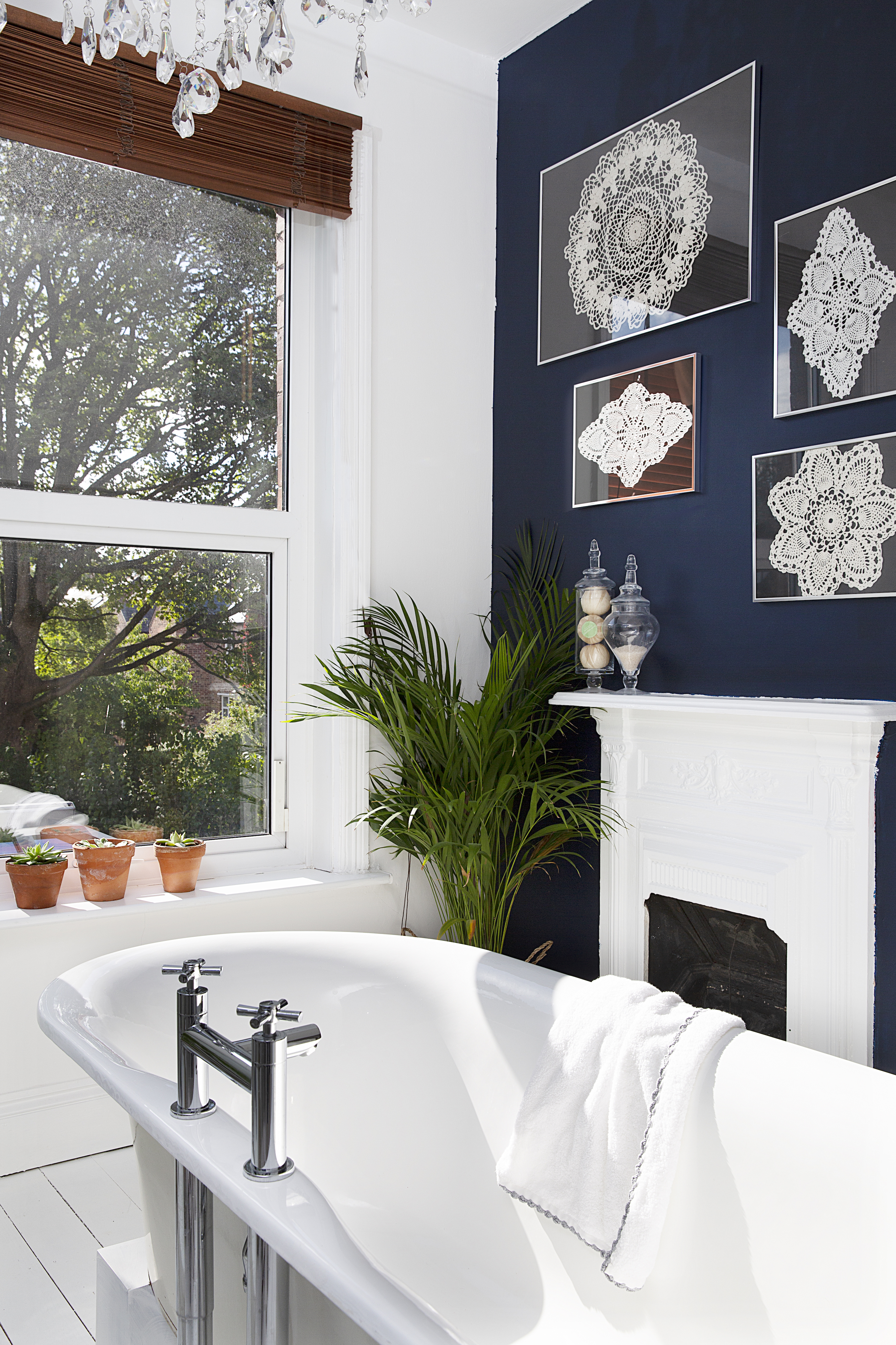
'We wanted the bathroom to be calming and luxurious. We chose dark blue for the chimney breast and the wall opposite to balance the room and give it a cosy feel. If the rest of the walls were all white, it might have seemed a bit too stark,' says Peter.
‘The doilies are my grandmother’s work. She used to be an amazing knitter. She has severe Alzheimer’s and my parents asked if I’d like to have these. Having doilies round the house wasn’t what I was going for, but by framing them, it’s an homage to her hard work. They’re like pieces of art.’
Alison is Assistant Editor on Real Homes magazine. She previously worked on national newspapers, in later years as a film critic and has also written on property, fashion and lifestyle. Having recently purchased a Victorian property in severe need of some updating, much of her time is spent solving the usual issues renovators encounter.
