There's so much advice about the features that buyers want that it can be difficult to decide what actually matters if you want to know how to sell a house faster. Do people care about the furniture or not? Do they like personal items or do they want everything neutral? Now we have answers based on...people's eye movements when they browse property listings online.
New eye-tracking research* has revealed exactly what buyers look for when looking through home listings. The technology was used to see what catches a buyers' attention when scrolling through homes, and what aspects of property listings get ignored, or even put viewers off. Some of these will confirm what you already know, but others may come as a surprise.
1. Color accents
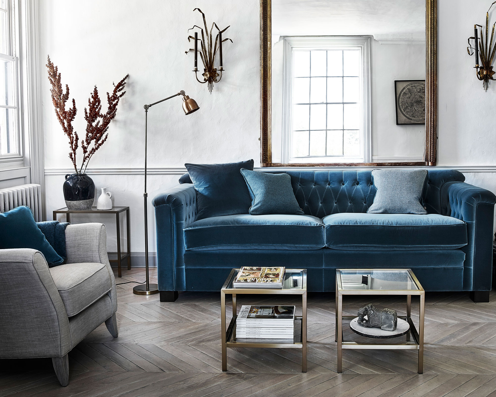
When flicking through property photos, buyers are drawn to bright colors — as well as any unusual objects. While particularly loud or garish features were found to be off-putting, little flashes of color caught people’s attention and were received positively.
If looking to make your own listing stand out, you don’t necessarily need to go for something large like a feature wall – buyers are drawn to even small bits of contrast, such as colorful flowers or fruit. A few little touches could get you a lot more attention.
2. Family photos – but not too many

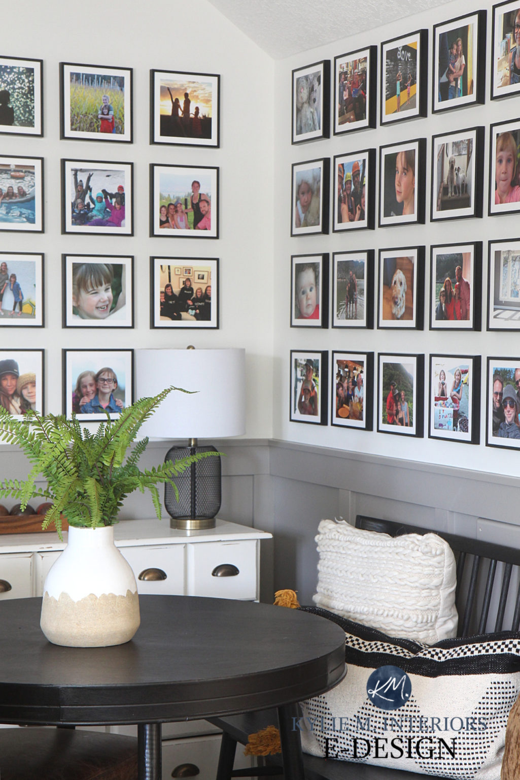
Forget everything you've been told about depersonalizing your home when staging it for sale. It turns out that people actually like personal accents in a home, particularly family photos. Study participants often lingered on images where family or personal elements were present. So, don't put all the family photos away – just make sure there aren't too many of them. Find inspiration for arranging your photos in our gallery wall ideas.
3. The furniture

This again may seem illogical, but the study found that people looked at the existing furniture a lot, and the furniture had a large impact on their overall impression of the home — whether it’s included in the property or not. The study found that buyers are often unable to separate a room from the furniture and decorations in it, so if they don’t like them, they will quickly move on.
4. Floor plans
If your online listing doesn't included a floorplan, you won't get very far. Participants often sought them out quickly after arriving on the page. They checked to see if the listing had a floor plan, then would view the images, and then return to look at the layout. The more detail you can give about the layout, the better.
Join our newsletter
Get small space home decor ideas, celeb inspiration, DIY tips and more, straight to your inbox!
5. Clutter

If there's mess in your home, buyers will instantly spot it in your images. The testing found that buyers’ eyes are instantly drawn to clutter and that they can form a negative impression instantly, often leading to them leaving the listing. A little cleaning can go a long way. If you're finding it difficult to declutter, try the Marie Kondo tidying up method.
6. Local area information
This is not strictly about the home itself, but the study found that the participants regularly scrolled to find maps in order to visualise where the property sits compared to nearby amenities — so giving a sense of the area and why it’s a great place to live can make a big difference. Emphasising a good school, access to supermarkets or open places is a major draw, and people actively look for this information.
* Research data kindly provided by Strike
Anna is a professional writer with many years of experience. She has a passion for contemporary home decor and gardening. She covers a range of topics, from practical advice to interior and garden design.