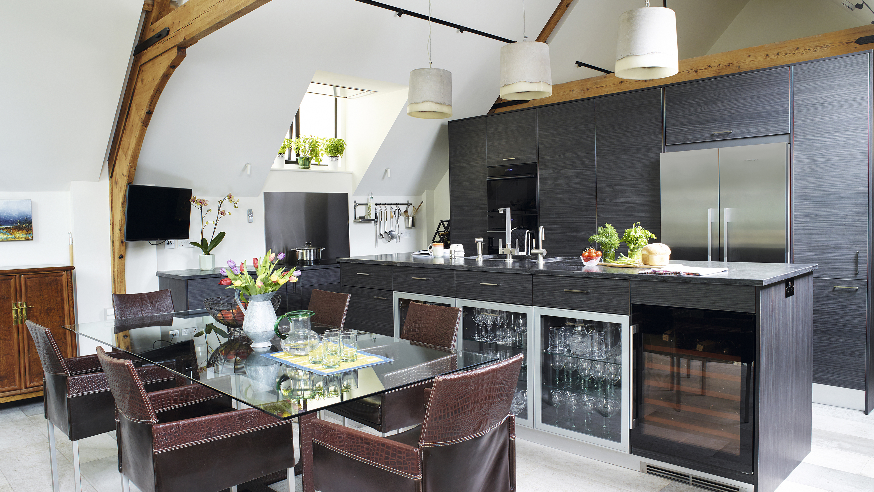
Even though Tina can’t quite remember where she first saw a ‘for sale’ advert for her converted chapel, she clearly recalls instantly falling in love with the thought of giving such an historic building a contemporary renovation.
Project notes
The owner: Tina Macfarlane, a dentist, lives here with her student daughter
The property: A three-bedroom converted chapel, originally built in the 1880s in west London
Total project cost: £26,500
Having never done something like this before, Tina called on the services of an experienced architect and builder who could transform the empty building into a welcoming home.
‘I had the chapel completely stripped out, leaving just the roof, walls and parquet flooring intact on the ground floor,’ explains Tina. ‘It gave me a blank canvas to create exactly what I wanted within the stunning space.’
In addition to insulating, damp-proofing, adding several new windows and replacing the existing ones with double-glazed versions, Tina wanted a new mezzanine level for her kitchen and dining space, which would be reached
by a bespoke steel staircase.
‘The light on the top floor is wonderful under the pitched roof,’ she explains.
Find out what she did next, then browse more real home transformations and find out how to tackle a barn, school or church conversion.
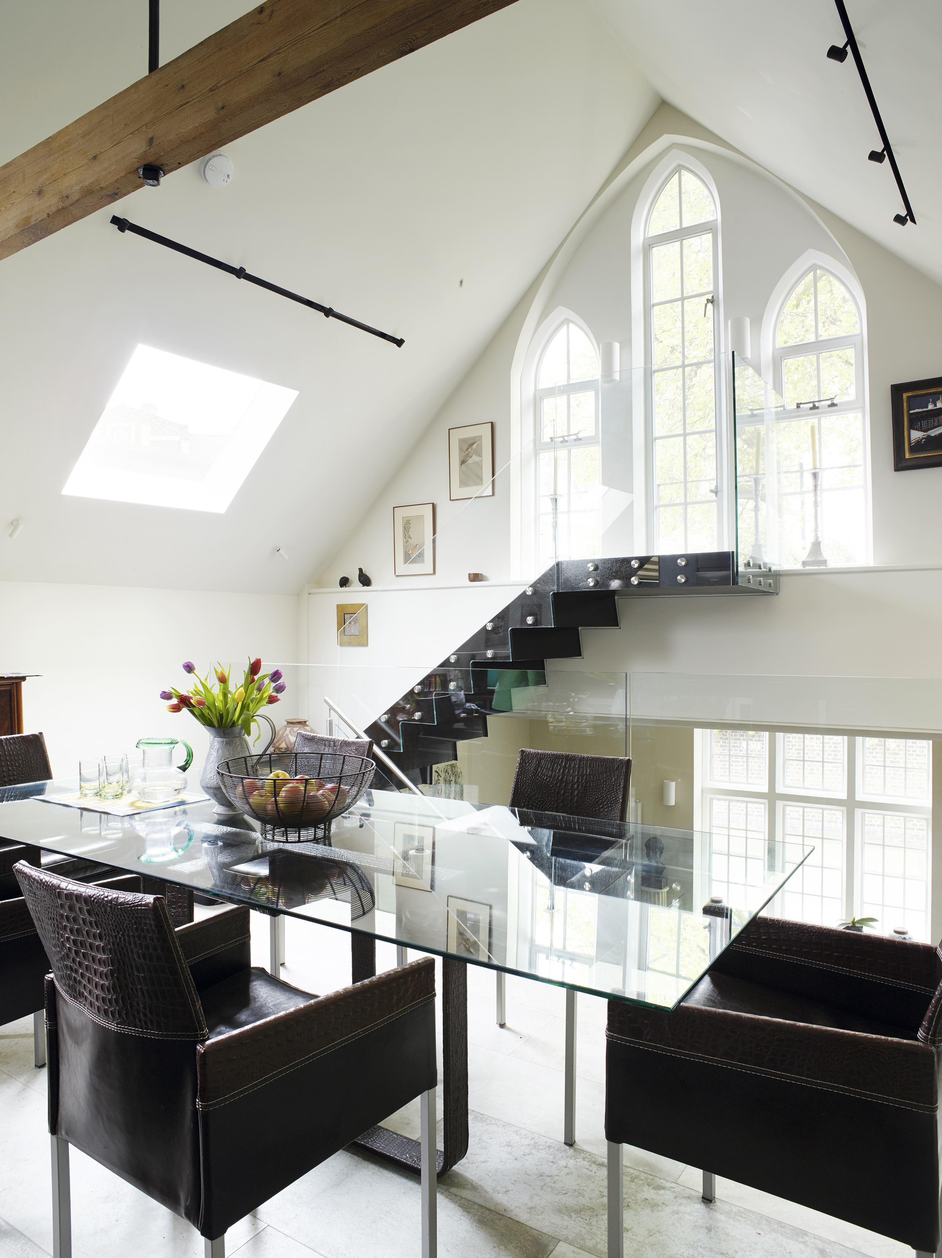
Tina found her table and chairs in a Farnham antique shop and had a large piece of glass cut to fit the table; for similar, try Dwell
Tina lived with a friend nearby during the year-long renovation of the chapel. During this time, she came across a local kitchen showroom and found units she
loved that were within her budget.
‘I had a clear idea of the contemporary style I was after, but felt I needed help with the finer details,’ she explains.
Kitchen designer Hylie Stretton at Imaggio Interiors took on board Tina’s ideas and helped her create a high-spec, open-plan kitchen perfectly tailored to her needs.
My daughter and I are both fairly tall, so one of my main requests was for slightly higher work surfaces so we didn’t have to bend down all the time
Tina
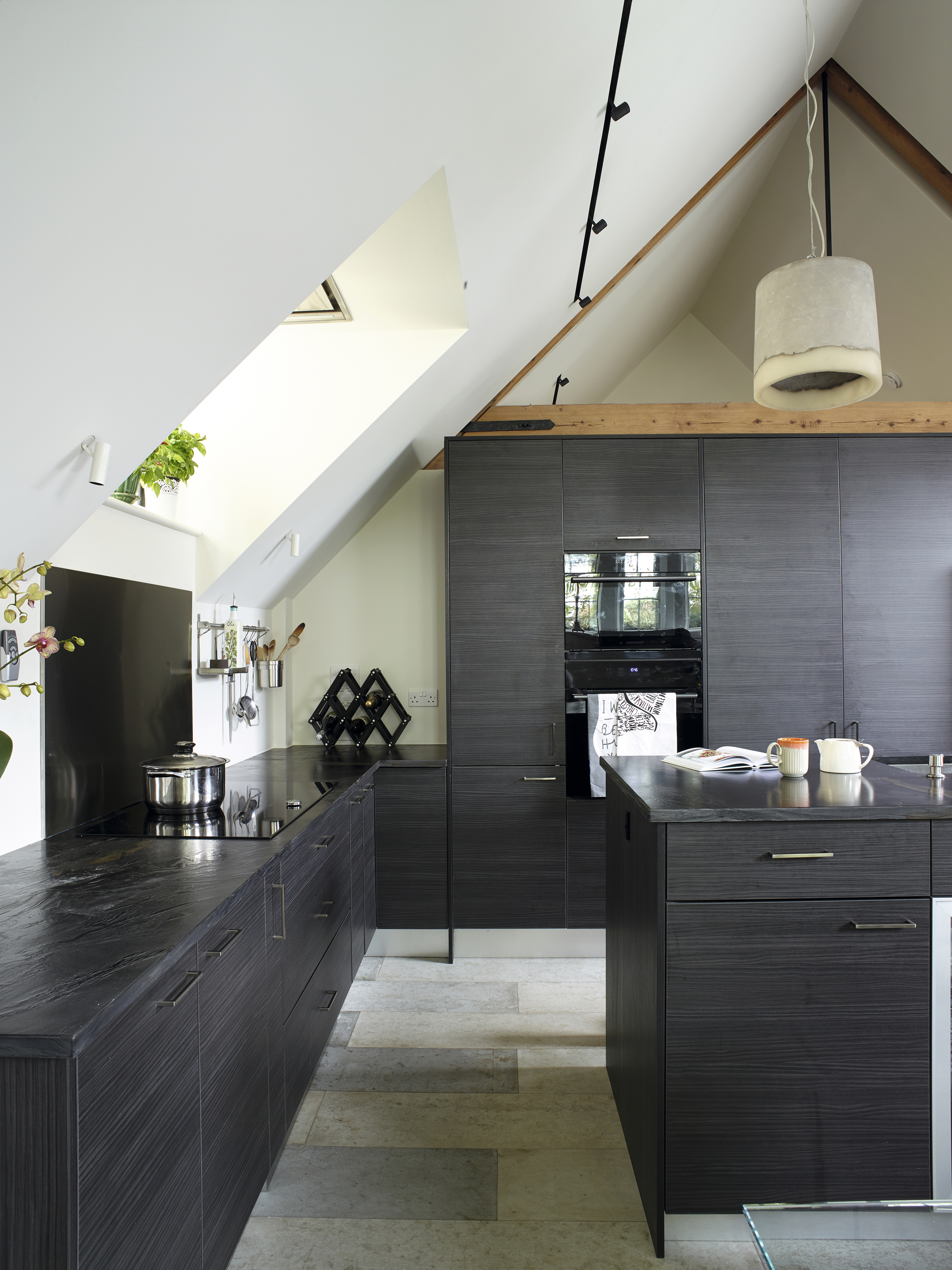
Tina opted for concrete tiles over a poured concrete floor to save money. The tiles, from Concreate Flooring at Floorcraft Ltd, tie in with the texture of the large pendant lights. Walls painted in Linen Wash by Little Greene
MORE FROM REAL HOMES

Get inspiration, ideas and advice straight to your door every month with a magazine subscription.
Hylie created two different worktop heights throughout the space; the island unit was raised so Tina wouldn’t have to stoop while washing up, but the units where the hob is situated were built a little lower to make cooking more comfortable.
‘The worktops either side of the hob are ideal for food preparation as it’s ergonomically easier when the chopping board is a bit lower,’ says Tina.
Another of Tina’s requirements was plenty of storage to help keep surfaces clutter-free. ‘I love the brilliant larder cupboard with its pull-out wire baskets and the double pocket door cupboard in the bank of units behind the sink,’ says Tina.
‘The doors slide out of the way and on one side there is an extra pull-out work shelf.
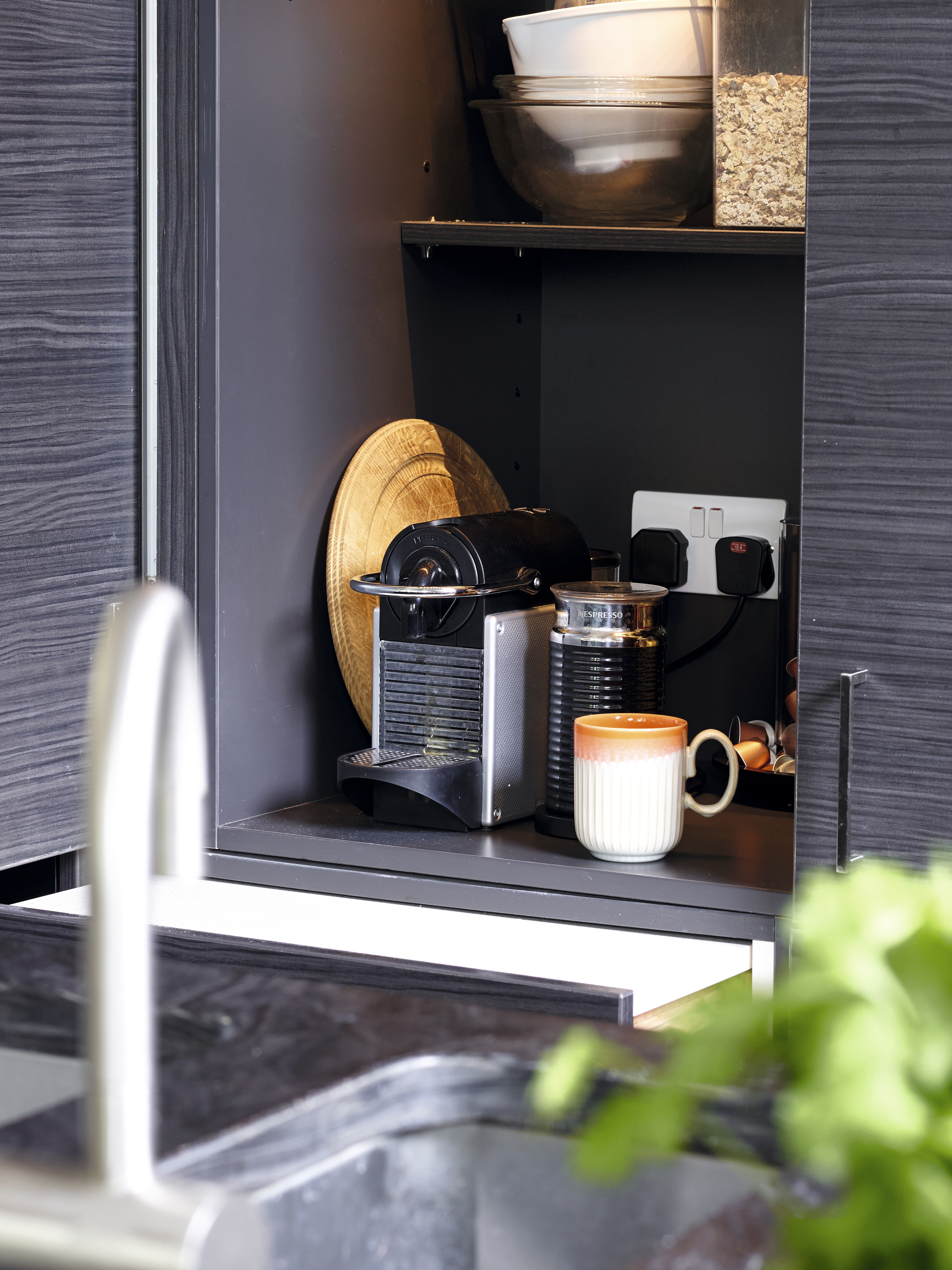
A small cupboard with sliding doors hides kitchen equipment out of sight
Inside there are electric sockets so I can keep my food processor, mixer and coffee machine tucked neatly away, as well as items like flour, cereal and coffee pods. It’s easy to shut everything away so the kitchen becomes a relaxed space for entertaining.
The central island, with its smart wine fridge and glass-fronted units that light up, has become Tina’s favourite feature of the new scheme. ‘As the space is so light and airy, I felt I could go for dark units and work surfaces,’ she explains.
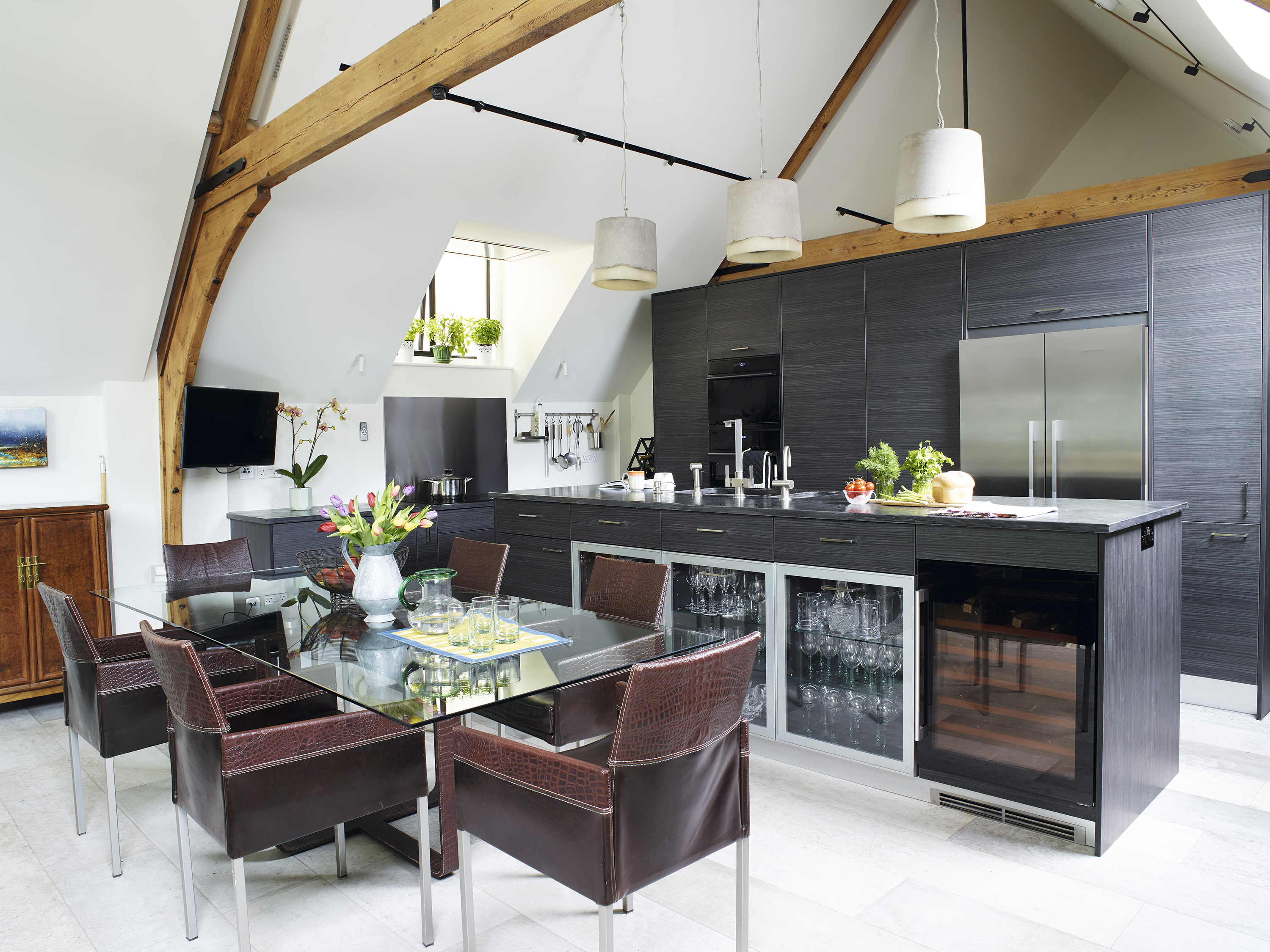
Ultima Modena Horizon units in a contemporary dark wood grain have been teamed with a textured stone worktop for big hit of drama. The textured Breton pendants are from Holloways of Ludlow. For a similar wine fridge and fridge-freezer, try Smeg
Tina opted for graphite units with a subtle horizontal wood grain to complement the organic finish of the stone worktop. ‘It’s softer than quartz so I have to be careful not to scratch it, but I love its texture and that it’s not as harsh as a solid black surface,’ she adds.

The texture of the work surface complements elements such as the floor tiles and pendant lights
Tina admits that the process of converting the chapel has been a steep learning curve. ‘There were some unforeseen costs in the budget, but I think that’s fairly normal when you’re renovating an old building,’ she says. ‘I also didn’t realise the estimate for the conversion didn’t include VAT, and that’s very expensive.’

he vaulted roof makes the kitchen feel spacious. The bespoke metal staircase contrasts with the original church-style windows at the far end of the chapel, which flood the mezzanine level with light. The small basin has a waste disposal unit, while the large basin includes a mixer tap as well as a pull-out spray tap; for similar, try Tap Warehouse. For a similar worktop, try Mayfair Granite
I’m thrilled with the dramatic combination of dark textures and tones. I don’t think of it as a converted chapel, it’s just a wonderful, light-filled, modern home now.
Tina
Contacts
- Architect: Pencil & Ink pencilandink.co.uk
- Builder: Bleriot Construction bleriot.co.uk
- Kitchen: design and installation Imaggio Interiors imaggiointeriors.co.uk
- Flooring: Floorcraft floorcraft.uk.com
- Lighting: Holloways of Ludlow hollowaysofludlow.com
Browse more real home transformations:
Join our newsletter
Get small space home decor ideas, celeb inspiration, DIY tips and more, straight to your inbox!
-
 This colourful home makeover has space for kitchen discos
While the front of Leila and Joe's home features dark and moody chill-out spaces, the rest is light and bright and made for socialising
By Karen Wilson
-
 How to paint a door and refresh your home instantly
Painting doors is easy with our expert advice. This is how to get professional results on front and internal doors.
By Claire Douglas
-
 DIY transforms 1930s house into dream home
With several renovations behind them, Mary and Paul had creative expertise to draw on when it came to transforming their 1930s house
By Alison Jones
-
 12 easy ways to add curb appeal on a budget with DIY
You can give your home curb appeal at low cost. These are the DIY ways to boost its style
By Lucy Searle
-
 5 invaluable design learnings from a festive Edwardian house renovation
If you're renovating a period property, here are 5 design tips we've picked up from this festive Edwardian renovation
By Ellen Finch
-
 Real home: Glazed side extension creates the perfect garden link
Louise Potter and husband Sean's extension has transformed their Victorian house, now a showcase for their collection of art, vintage finds and Scandinavian pieces
By Laurie Davidson
-
 I tried this genius wallpaper hack, and it was perfect for my commitment issues
Beware: once you try this wallpaper hack, you'll never look back.
By Brittany Romano
-
 Drew Barrymore's new FLOWER Home paint collection wants to give your walls a makeover
Drew Barrymore FLOWER drops 27 brand-new paint shades, and every can is made from 100% post-consumer recycled plastic.
By Brittany Romano