
There’s something dreamy about a feed full of expertly curated sitting rooms and bedroom ideas; aside from leisurely browsing Zillow for vision board-worthy listings, getting a peek inside curated homes on Instagram comes as a great form of escapism and inspiration for our own homes.
That being said, while we love heading to social media for home decor inspiration or savvy DIY hacks, there are certain home trends that we could probably do without—and as it turns out, many design professionals agree that social media has created trends that might do better being better shelved than going viral.
Below, we reached out to a handful of top interior designers and home decorating experts in our network to get their insights on the Instagram decor trends that have simply gone too far. From the dreaded “live laugh love” signage to more nuanced social media trends, here are the top Instagram decor trends that make interior designs cringe when they spot them in their feed.
Signs or decals with words or mottos
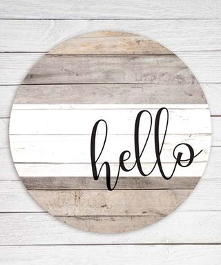
People either love them or hate them but Beth Halpern Brown, Interior Designer and Home Design Expert in Atlanta, strongly believes they retract from a space and diminish from smart home decor and design.
“One of the wonderful things about art and home décor is that it speaks for itself,” she explains. “If you have to write it out on a wall, it's probably not creating the aesthetic and providing the purpose you think it is.”
Painted “shabby chic” frames
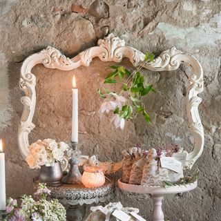
“While I understand the design intention here, these never seem to come out the way you think about them in your head,” says Brown. “The mix of new paint with distressed features just doesn't visually translate in this context.” You can find these even being sold by huge retailers, but homemade always comes to mind with these frames given its lackluster finish and appeal.
Macrame everywhere
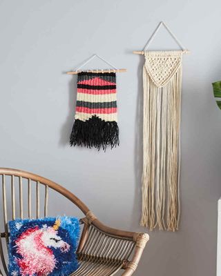
Macramé has become popular among Instagram bloggers and home décor enthusiasts for its relative affordable price tag and ease of use—but according to Lisa Queen, Founder and Principal Designer at Lisa Queen Design, it’s gone too far. “I'm so over macramé and am ready to see some creative new materials used for wall coverings and other accessories!” she says.
Join our newsletter
Get small space home decor ideas, celeb inspiration, DIY tips and more, straight to your inbox!
All gold finishes
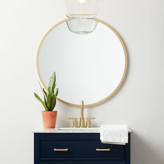
The eighties called—and they want their brass finishes back! While gold and brass hardware may be quickly overtaking silver and chrome, according to Queen, going all the way with gold is a very easy way to ensure your home decor will look dated in the near future. “Mix it up; we love seeing mixed finishes even if it's subtle! I think the all gold look is going to fatigue fast,” she shares.
Barn doors
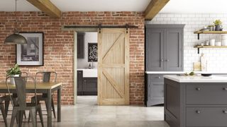
“You see barn doors all over Instagram, but in reality, they’re a terrible idea,” explains Andra DelMonico,Lead Interior Designer for Trendey. “You lose the ability to decorate the wall the door covers. It also won’t create a solid seal between the two rooms, so light, sounds, and smells will easily flow from one room to the next.”
While barn doors might work in a cabin or particularly small space, DelMonico believes that they really don’t make sense in the majority of homes—which makes them look inauthentic and out of place.
Furniture made from pallets
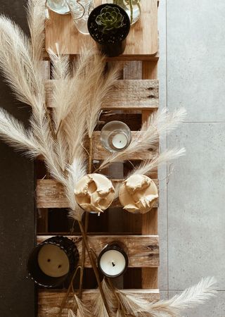
According to DelMonico, the majority of pallet wood is terrible for building with. Think about it: it’s dirty and most likely covered in some food or other liquid product. Choose the wrong pallet, and the wood will have been treated with dangerous chemicals that will leech out into your home’s air. What’s more, the wood isn’t finished, so you’ll need to do a ton of prep work before you start building anything. “Do yourself a favor and buy new wood or the furniture already made,” she suggests.
All white everything
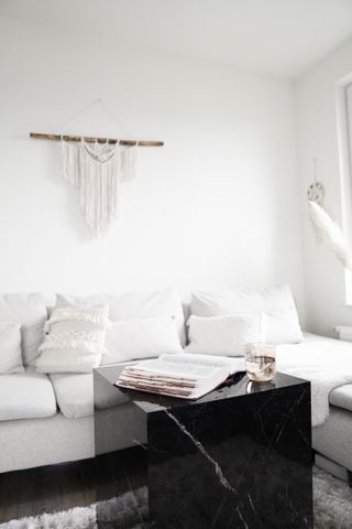
“Pure white is blindingly bright and sterile-looking,” says DelMonico. “It’s also insanely hard to keep clean, making it impractical for anyone that actually lives in their home.”
According to DelMonico, it’s high time to say goodbye to the boring all-white rooms and start incorporating a variety of neutral shades and textures. “This will add warmth to the room and make it more comfortable to be in. It’ll also be much easier to keep clean,” she says.
Confusing clutter with maximalism
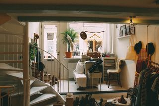
“There’s nothing worse than a mess confused with maximalist design,” says Leni Calas, CEO, Ward 5 Design. “When I see posts on Instagram highlighting sloppy looking ‘maximalist interiors’ it makes me want to wash my eyes out with bleach! Maximalism should never be confused with a mess.”
Lazy DIY projects

Instagram and TikTok are full of valid life hacks and DIY projects, but, according to Bre Hance, Principal Designer and Owner of InHance Interiors, there’s a very significant difference between savvy DIY and, well, putting a bandage over a much bigger design issue.
“Some IG reels make DIY work look like tiling over tile or putting up wall paneling,” explains Hance. “They give it this sense of ease and low cost, but it’s not and it’s probably not done the right way.”
Kaitlyn is an experienced travel and lifestyle writer with a keen interest in interior decorating and home optimization. An avid traveler, she's currently splitting her time between her apartment in a century-old châteauesque building in Montreal and her cozy chalet in the woods (that she built with her own two hands... and many YouTube tutorials!). Her work has been published in Travel + Leisure, Tatler Asia, Forbes, Robb Report Singapore, and various other international publications.
-
 New Desenio prints made entirely of candy take mosaics in a sweet new direction — and start at just $29.95
New Desenio prints from "Candy Garden" will give Willy Wonka and maximalists everywhere something to love
By Danielle Valente Published
-
 7 sweet spring front door ideas to try this season
We love these fresh and fabulous spring front door ideas
By Eve Smallman Published
-
 I'm a home stylist — but these are my regret buys
No judgment
By Holly Phillips Published
-
 8 thoughtful ideas to elevate a guest's stay
Welcome favorite faces
By Holly Phillips Published
-
 I just spent a week visiting my fam in France, and I now have 5 new home decor cravings
La deco à gogo
By Camille Dubuis-Welch Published
-
 5 colors you should skip using in a small apartment, according to a designer
(And what to go for instead)
By Kara Thompson Published
-
 Sick of winter? Bring these spring colors into your home now
It’s official: These hues are having a moment
By Kara Thompson Published
-
 This is how I'm styling my home to snap out of the January blues
Right in time for my birthday
By Holly Phillips Published
